
The Bottom Sheet Problem: Why Your App's Modal Sheets Lose User Input When Swiped Away
You're three fields into a booking form when your thumb brushes the top edge of the panel half a centimeter too hard, and the whole thing slides away like it was never there. The date, the guest count, the note you typed for the host — gone. You didn't tap a close button. You didn't confirm anything. You just moved your hand the way you move your hand on every other screen, and the app decided that meant "throw this away." This is the bottom sheet problem, and it's one of the few interaction bugs that a QA pass on a stable Wi-Fi connection will never catch, because it only shows up when a real hand is holding a real phone. At Dolfy, we've watched this exact failure kill more form completions than any broken button ever could, which is why fixing it is baked into how Dolfy.ai's Design OS approaches sheet components from the first sketch.
A bottom sheet is the panel that slides up from the bottom edge of a screen — think of a rideshare app's destination picker, or the filter panel that appears when you tap "Sort" in a shopping app. It sits on top of the main screen without fully replacing it, and it's usually dismissed by swiping it back down. That gesture is the entire appeal of a bottom sheet: it feels physical, reversible, native. It's also the entire problem, because the same downward swipe that a user makes to scroll through a long list of options is nearly identical, in speed and direction, to the swipe that closes the sheet entirely.
Key Takeaways
- A bottom sheet's swipe-to-dismiss gesture and its internal scroll gesture look almost identical to the OS, which is why accidental closures happen even to careful users.
- Apple's Human Interface Guidelines set a 44x44 point minimum touch target for interactive controls — most custom-built sheet handles fall well under that, making mis-taps more likely.
- Snap points (fixed resting heights like 25%, 50%, and 90% of the screen) give a sheet graceful intermediate states instead of a binary "open or destroyed" behavior.
- Dolfy's 5-step Design OS methodology treats a sheet's dismiss threshold, backdrop opacity, and drag-handle size as design tokens, not last-minute code tweaks.
- A sheet that loses user input on accidental dismissal is a data-loss bug wearing a gesture-design costume — it should be fixed at the state layer, not just the animation layer.
Why Does a Swipe-Down Gesture Feel So Dangerous Inside a Bottom Sheet?
It feels dangerous because it's ambiguous by design. Inside a sheet that contains a scrollable list — say, a list of pickup addresses or a multi-select of interests — the operating system has to decide, in real time, whether a downward drag means "scroll this content" or "close this whole panel." iOS and Android both use a fairly simple heuristic: if the content inside the sheet is already scrolled to the very top, a further downward drag is interpreted as a dismiss gesture. That's a reasonable rule on paper. In practice, a user who has scrolled up to double check something at the top of a list, then continues scrolling down out of habit, ends up closing the sheet instead.
This is worse on longer forms. A multi-step address form inside a sheet, for example, might have five or six fields stacked vertically. If the keyboard is open and the user scrolls to check a field above the one they're editing, a slightly-too-fast swipe reads as a dismiss. Dolfy's own component library treats this ambiguity as a first-class design decision rather than a bug to patch after launch: every generated sheet component ships with an explicit rule for where scrolling ends and dismissal begins, expressed as a design token your team can tune per screen.
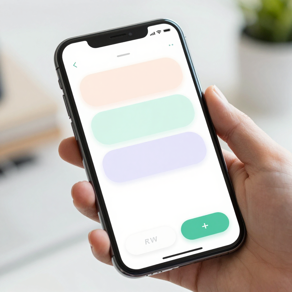
What Actually Happens to a User's Input When a Sheet Gets Swiped Away?
In most implementations, nothing is saved, because the sheet's contents are held in local component state that gets torn down the moment the sheet unmounts. That's the real cost here — it isn't just an animation glitch, it's silent data loss. A prototype (an early, clickable version of a screen used to test a flow before real data and backend logic are wired in) will hide this completely, because testers rarely fill out five fields and then accidentally swipe. Production users do it constantly, especially one-handed, on a bus, with a thumb that's reaching just a little too far up the screen.
The fix isn't a bigger confirmation dialog — users already tap through those without reading, which is exactly the habit a different, well-documented UI failure trains into people. The fix is treating a sheet's form state the same way you'd treat any other screen's state: lifted up to a parent component or a lightweight state store, so an accidental unmount doesn't erase what the user already typed. Dolfy's Data Model step — the second stage of its 5-step process, where you define what information your app actually needs to track before a single screen gets built — forces this question early: is this field's value meant to survive a sheet closing, or not? Answering it at the data-model stage, weeks before a designer opens a canvas, is dramatically cheaper than discovering the answer from a support ticket after launch.
How Do Snap Points Prevent Accidental Dismissal Without Killing the Gesture?
Snap points work by giving the sheet more than two states. Instead of "fully open" and "closed," a sheet with snap points at 25%, 50%, and 90% of the screen height gives users an intermediate resting position to land on when their swipe is ambiguous or half-hearted. A drag that doesn't clearly commit to closing settles at the nearest snap point instead of continuing all the way to zero. This single change — available in most React Native bottom-sheet libraries as a configuration array, not a custom animation you write yourself — removes the majority of accidental full dismissals, because most "accidents" are actually partial, hesitant gestures that the sheet is currently rounding up to "fully closed" instead of down to "still open."
The other lever is the drag handle itself: the small horizontal bar at the top of the sheet that visually signals "grab here to move me." Apple's Human Interface Guidelines recommend a minimum touch target of 44x44 points for any interactive control, and a drag handle that's only 4 points tall with no padding around it fails that guideline badly — users end up dragging from wherever their thumb happens to be, including deep inside the content area, which is exactly what triggers the scroll-versus-dismiss ambiguity in the first place. Widening the handle's tappable (not just visible) area to the full recommended size, and keeping the visible bar itself smaller and centered inside it, is a two-minute fix with an outsized effect on accidental closures.
What Belongs in a Bottom Sheet's Design Tokens?
A design token is a named, reusable value — a color, a spacing unit, an animation duration — that a design system stores once and every component references, so changing the token updates every sheet in the app instead of forcing a hunt through dozens of files. For bottom sheets specifically, the tokens worth defining up front are the snap point array itself, the dismiss velocity threshold (how fast a swipe has to be before it's treated as intentional, commonly tuned somewhere in the 250-300 millisecond response window), the backdrop opacity behind the sheet, and the drag handle's tappable size. Dolfy's Design Foundation step generates exactly this kind of token set — alongside colors, type scale, and spacing — as part of the production-ready output, so a sheet built in week one and a sheet built in week six share the same dismiss behavior without anyone having to remember the rule.

How Does This Look in React Native, Expo, and Flutter?
React Native teams building sheets typically reach for a dedicated bottom-sheet library rather than hand-rolling gesture handling, precisely because getting the scroll-versus-dismiss logic right from scratch involves coordinating a gesture responder with a scroll view's own touch handling — a nontrivial piece of engineering that's easy to get subtly wrong. Expo's managed workflow supports these libraries out of the box, and Expo Go — Expo's app for previewing a project on a real device without a full native build — is genuinely useful here because sheet-dismiss bugs are a real-device problem; a simulator's mouse-drag rarely reproduces the same ambiguous, fast-and-shallow swipe a thumb produces on a live 6-inch screen. Flutter and SwiftUI both ship comparable sheet primitives with snap-point support built in, so the underlying principle — give the gesture room to be ambiguous without punishing the user for it — holds regardless of stack. What Dolfy adds on top isn't a new gesture library; it's TypeScript types and component exports (the actual React Native/Tailwind code, typed and ready to drop into a project) that already encode the snap points, handle size, and dismiss thresholds as configurable props, so the correct defaults ship even when nobody on the team has hit this exact bug before.
Frequently Asked Questions
Does adding snap points slow down development?
Not meaningfully — most bottom-sheet libraries accept snap points as a simple array prop, so the added work is deciding on the right values (commonly 25/50/90%) rather than writing new logic. Teams using Dolfy's generated sheet components get these values pre-configured as editable tokens, so the decision is a tuning pass, not a build task.
Should every bottom sheet auto-save its contents?
Only sheets holding data worth preserving across an accidental close — a multi-field form, a note, a set of filters someone spent time configuring. A single-tap action sheet (share, delete, confirm) has nothing to lose and doesn't need this treatment; adding it there is unnecessary complexity for zero benefit.
Is a full-screen modal a safer alternative to a bottom sheet?
It removes the swipe-to-dismiss ambiguity, but it also removes the "still see the context behind it" quality that makes a bottom sheet feel lightweight in the first place — and a full-screen modal still needs a clear, deliberate way to leave without losing input. It's a legitimate choice for genuinely long forms, but it's a trade-off, not a universal fix.
How do I test for accidental dismissal before launch?
Test on a physical device, one-handed, with the phone in a case, ideally while walking or on public transit — the exact conditions a simulator can't replicate. If a fast, shallow, top-of-content swipe closes the sheet on a real phone, the velocity threshold or snap points need tuning before this ships.
Getting the Small Interactions Right From the Start
None of this is exotic — snap points, a properly sized drag handle, and form state that outlives a sheet's mount cycle are all well-documented patterns. The reason they get skipped isn't difficulty, it's sequencing: teams design the happy path first, ship it, and only discover the dismiss problem when a real user's real thumb finds it in production. Dolfy.ai's Design OS methodology exists specifically to move decisions like this — snap points, touch target sizes, what survives a screen teardown — into the Design Foundation and Data Model stages, before a single line of screen code gets written, so the component you export already handles the edge case instead of needing a patch six weeks after launch. If your team is building the kind of app that leans on sheets, filters, and quick-entry forms, it's worth seeing how Dolfy turns that decision-making into a production-ready starting point rather than a lesson learned the hard way.