
Bottom Sheet or Modal? How to Pick the Right Mobile Interruption Pattern
A founder building a filter drawer for their marketplace app spends an afternoon debating one question that seems too small to matter: should tapping "Filters" slide a panel up from the bottom of the screen, or should it cover the whole screen and force a decision before anything else happens? It seems like a five-minute choice. It isn't. Pick wrong and a low-stakes action like sorting a list starts to feel like a demand for the user's full attention, and a genuinely important one — like confirming a $49 upgrade — gets buried in a component that's too easy to swipe away. Dolfy.ai, the AI-powered mobile app design platform, treats this as a first-class design decision, not an afterthought, because the difference between a modal and a bottom sheet is really a difference in how much you're asking of someone's attention.
Key Takeaways
- A modal is a full-screen (or near-full-screen) overlay that blocks everything behind it and demands a decision before the user can do anything else.
- A bottom sheet is a partial-height panel that slides up from the bottom edge, keeps the underlying screen partially visible, and can usually be dismissed with a single downward swipe.
- Reserve modals for irreversible, high-stakes, or multi-step actions — account deletion, payment confirmation, permission requests — where undivided attention is the point.
- Reach for bottom sheets for anything a user opens and closes repeatedly in one session: filters, sort menus, quick actions, and share sheets.
- Dolfy's Screen Design step in its 5-step Design OS applies this distinction automatically when it generates your React Native and Tailwind CSS components, so you don't have to relearn the rule on every screen.
What's Actually Different Between a Modal and a Bottom Sheet?
The core difference is how much of the screen — and how much of the user's attention — each pattern claims. A modal (sometimes called a dialog) typically covers the entire viewport or sits centered over a dimmed background, and the only way forward is to interact with it directly. A bottom sheet, by contrast, rises from the bottom edge of the screen and deliberately leaves part of the original content visible above it, which signals "this is related to what you were just doing" rather than "stop and deal with this now."
That spatial cue matters more than it sounds like it should. When part of the underlying screen stays visible, users retain context: they can see the product list they were filtering, the message thread they were replying in, or the photo they were about to attach. A modal removes that context on purpose, which is exactly why it should be used sparingly.
When Should You Reach for a Full-Screen Modal?
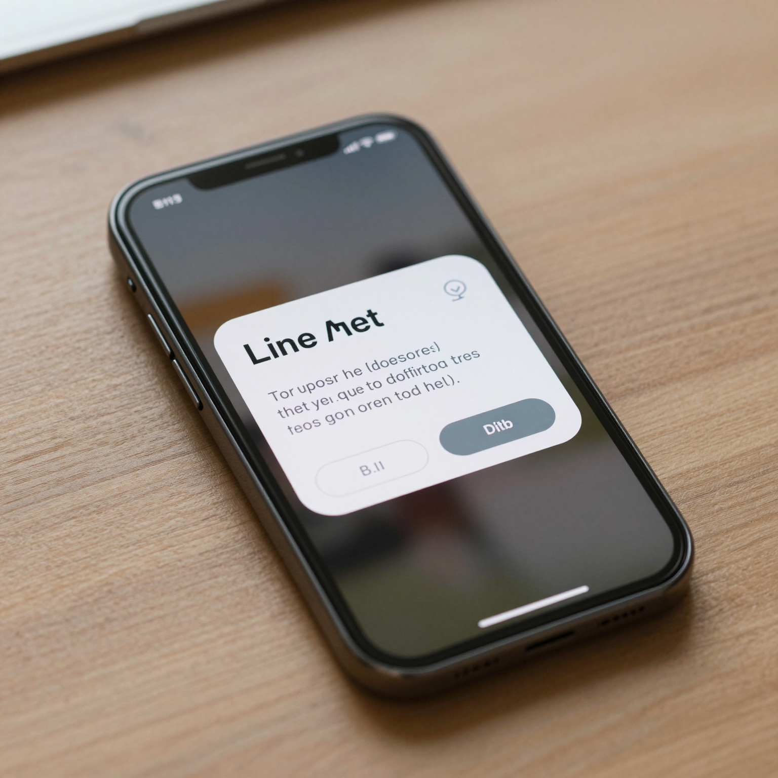
Use a modal when the action is destructive, irreversible, or requires the user's complete focus before they can safely continue. Account deletion confirmations, subscription upgrade payments, and system permission prompts (camera, location, notifications) are the classic cases — in each one, letting the user glance away at a half-visible background screen actively works against you, because you want them reading every word before they tap a button.
A useful rule of thumb: if getting the answer wrong costs the user money, data, or access they can't easily get back, it belongs in a modal. If a wrong tap just means reopening a menu, it probably doesn't.
Modals are also the right call for onboarding steps that must happen in a fixed order — a permission request that has to fire before a feature can work, for example. Because a modal blocks interaction with everything else, it enforces that order without extra logic.
When Does a Bottom Sheet Win Instead?
Bottom sheets are built for actions a user takes over and over in a single session: applying filters to a product list, choosing a sort order, picking a photo source, or triggering a quick action like "share" or "duplicate." These are low-commitment, frequently-repeated interactions, and forcing a full-screen modal on each one adds friction that adds up fast — every extra full-screen transition is a moment where the user has to reorient themselves.
Because a bottom sheet leaves the original screen partially visible and dismisses with a swipe down, it reads as lightweight even when it contains a fair amount of content. Design systems on both major mobile platforms lean on this pattern for exactly that reason: Apple's Human Interface Guidelines and Google's Material Design both treat bottom sheets as the default for supplementary, non-blocking choices, reserving modal dialogs for the smaller set of moments that genuinely need to interrupt.
There's a practical technical case for bottom sheets too. On a touch screen, the minimum recommended tap target is 44x44 points on iOS (48x48dp on Android) — small enough that a full modal often wastes vertical space it doesn't need for a two- or three-option choice. A bottom sheet sized to its content, rather than the full screen, keeps every option within comfortable thumb reach without over-claiming space.
How Do You Decide in Under a Minute?
Run the action through three quick questions. First: is it reversible? If tapping the wrong option can be undone with another tap, lean toward a bottom sheet. Second: will the user do this again in the same session? Filters, sorting, and quick actions get reopened constantly — that repetition is a strong signal for a bottom sheet, since a lighter-weight pattern reduces fatigue over dozens of taps. Third: does the user need to read something before deciding, with no distractions? Payment confirmations and destructive actions pass this test; a share sheet almost never does.
If an action fails all three tests — irreversible, one-time, requires focused reading — it's a modal. If it passes even two, a bottom sheet is usually the better fit, and it will feel less heavy-handed to your users across a typical week of app use.
How Does Dolfy's Design OS Handle This Choice for You?
Dolfy.ai builds this decision into its 5-step Design OS methodology — Product Definition, Data Model, Design Foundation, Screen Design, and Export — so founders and developers don't have to re-derive the modal-versus-sheet rule from scratch on every screen. During the Screen Design step, Dolfy maps each interaction type to the interruption pattern that fits it, then exports the result as production-ready React Native and Tailwind CSS components with TypeScript types attached, backed by a shared design-token system so the same spacing, corner-radius, and elevation values stay consistent whether you're looking at a modal or a bottom sheet.
Because the components come out of Dolfy's Export step already wired to a design-token system, swapping a bottom sheet for a modal later — say, because a "quick action" grew into a paid feature that needs a confirmation step — is typically a change you can make directly in the component, not a redesign from first principles. You can preview the result immediately in Expo Go or Dolfy's Web Preview before touching a build pipeline, which turns what used to be a multi-day design-to-code handoff into something you can validate the same afternoon.
Building the Right Interruption Into Your Next Release
The modal-versus-bottom-sheet decision is small on any individual screen, but it compounds. An app that defaults to full-screen modals for every minor choice trains users to dread tapping anything; an app that reserves modals for the moments that truly need undivided attention feels calmer and more trustworthy, even if the underlying feature set is identical. If you're mapping out these decisions across a whole app — filters, confirmations, permission requests, quick actions — Dolfy turns that mapping into shippable, on-brand components as part of its Design OS, so the pattern stays consistent from your first screen to your fiftieth.
Frequently Asked Questions
Do bottom sheets work the same way on iOS and Android?
Mostly, yes — both platforms support a partial-height panel that slides up and can be dismissed by swiping down, and both design systems (Apple's Human Interface Guidelines and Google's Material Design) recommend the pattern for supplementary choices. Minor differences show up in default corner radius and how drag handles are styled, which is exactly the kind of detail a shared design-token system keeps consistent across platforms.
Can a bottom sheet replace a full navigation screen?
For simple choices, yes — a short list of options or a compact form fits comfortably in a bottom sheet. Once content requires scrolling through many sections or its own multi-step flow, it usually works better as a dedicated screen, since stacking too much inside a sheet starts to recreate the same context-loss problem modals have.
What accessibility issues come up with each pattern?
Both patterns need to trap keyboard and screen-reader focus while they're open and return it to a sensible place when dismissed. Modals should announce themselves immediately since they block everything else; bottom sheets should still be announced but can allow a swipe-to-dismiss gesture as an additional, clearly labeled way out for users relying on assistive touch.
How should I handle a bottom sheet that needs to trigger a modal?
Keep it simple: let the user finish or dismiss the bottom sheet first, then present the modal on the base screen rather than stacking one directly on top of the other. Stacked overlays are a common source of confusing back-navigation, and separating them keeps the undo path obvious at every step.