
Card UI Patterns: How to Design Content Hierarchies Mobile Users Can Actually Scan
You open a competitor's app, and the whole screen is cards: rounded rectangles stacked on top of each other, each one competing for the same sliver of attention. Nothing tells your eye where to land first. This is the moment a lot of solo founders and small teams quietly panic — they know their product screen "looks like an app," but they can't explain why it doesn't feel like a good one. Dolfy.ai, the AI-powered mobile app design platform built by AEGONTECH LLC, exists precisely for this moment: it walks founders and developers through a structured Design OS so screens like this get built with intention instead of guesswork, from the first wireframe (a simplified, low-detail sketch of a screen's layout used to test structure before visual polish) all the way to exportable code.
Card-based layouts are the default building block of modern mobile UI — they show up in e-commerce apps, social feeds, dashboards, and fintech products alike. But "using cards" and "using cards well" are two very different skills, and the gap between them is usually the difference between an app that feels calm and scannable and one that feels like visual noise.
Key Takeaways
- Cards should group related information, not just wrap content in rounded corners — a card with five unrelated data points is not a hierarchy, it's a junk drawer.
- Consistent spacing (commonly a 4px or 8px base unit) does more to create visual order than color or shadow ever will.
- Elevation (the subtle shadow that makes a card look like it's floating above the background) should be used sparingly — 1-2 elevation levels is plenty for most apps.
- A design token system (a shared set of named values like spacing, color, and radius that keep every screen visually consistent) prevents card styles from drifting apart as your app grows past 10-15 screens.
- You don't need a dedicated designer to get this right; you need a repeatable system, which is exactly what Dolfy's Design Foundation and Screen Design steps are built to produce.
Why Do So Many Apps Default to Cards in the First Place?
Cards win because they're a flexible container: the same rounded rectangle can hold a product photo, a settings row, or a summary stat, so teams reach for them everywhere. That flexibility is also the trap — because cards are so easy to drop onto a screen, it's common to end up with 8-10 cards competing for equal visual weight, and equal weight means no priority. When everything is emphasized, nothing is. The fix isn't to abandon cards; it's to decide, before any pixels are placed, which information actually deserves a card and which is better as plain list rows or inline text.
What Makes a Card Hierarchy Easy to Scan Instead of Overwhelming?
A scannable card hierarchy has one dominant element per card — a photo, a headline number, or a title — and everything else supports it in a smaller, quieter type size. Users typically scan a mobile screen in under 3 seconds before deciding whether to keep reading, so the first thing their eyes hit needs to answer "what is this and why should I care" almost instantly. Grouping matters here too: if three data points always appear together (say, a price, a rating, and a delivery estimate on a product card), they should share consistent alignment and spacing across every instance of that card type in the app, not be re-invented screen by screen.
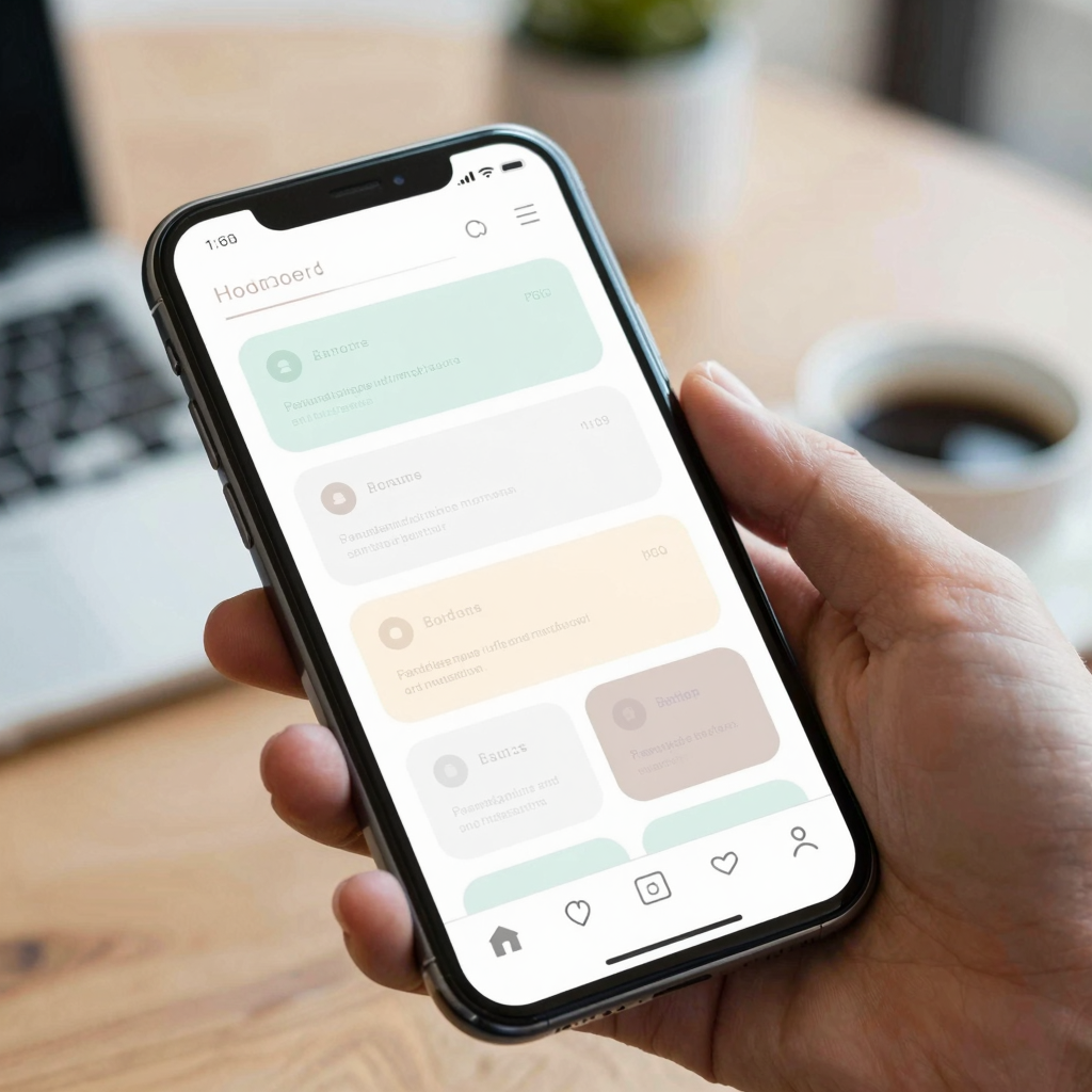
This is where a lot of indie hacker tools fall short — they let you drag a card onto a canvas in Figma or Sketch, but they don't enforce that the same card type stays consistent everywhere it's reused. Dolfy approaches this differently: because its 5-step Design OS methodology (Product Definition, Data Model, Design Foundation, Screen Design, Export) treats your data model as a first-class input, the card fields you define once — say, a product's name, price, and thumbnail — automatically stay linked to every screen that reuses that card, so a change in one place doesn't require manually hunting down six other instances.
How Much Spacing and Elevation Is Too Much?
More than 2 shadow levels or more than 3 distinct spacing values on a single screen is usually too much — it starts reading as inconsistency rather than intentional hierarchy. A practical baseline that works for most mobile apps: an 8px spacing grid (meaning every margin and padding value is a multiple of 8, so 8, 16, 24, 32), a 12-16px corner radius for standard cards, and just two elevation levels — one subtle shadow for resting cards, one slightly stronger shadow reserved for cards in a pressed or selected state. Teams that skip this discipline tend to end up with cards that have five slightly different border-radius values across the app, which is invisible in isolation but adds up to a product that feels unpolished when you scroll quickly.
How Do Design Tokens Keep Card Systems Consistent as Your App Grows?
Design tokens are named, reusable values — like spacing.md for 16px or radius.card for 12px — that stand in for hardcoded numbers scattered across your codebase. Instead of a developer typing padding: 17px on one screen and padding: 16px on another (a one-pixel drift that's nearly invisible individually but compounds across 20+ screens), everyone references the same token. This is exactly the kind of system Dolfy generates automatically as part of its Design Foundation step, producing a token set that flows straight into production-ready React Native and Tailwind CSS components with TypeScript types attached — so the visual system a founder approves in the design phase is the literal system that ships in code, not a rough approximation a developer has to reinterpret later.

How Should Solo Founders Actually Build This Without a Design Team?
Start by data-modeling before you screen-design: list out what a card actually needs to display (a product card might need name, price, thumbnail, and rating — four fields, not eight) before you touch layout. This single step — treating the data model as the foundation rather than an afterthought — is where Dolfy diverges most from tools like Figma or generic prototyping apps, and it's also the step most solo teams skip when they're moving fast. Once the fields are locked, apply a single card "recipe" (spacing, radius, elevation, and type scale) across every screen that needs that card type, and preview the result immediately in Expo Go or Expo Web Preview (Expo's tooling for previewing a React Native app on a real device or in a browser without a full build) rather than waiting until development to see if it holds up. A founder can typically get a consistent card system across a 10-15 screen MVP (minimum viable product — the smallest version of an app that's still usable and testable) working this way in a single afternoon, compared to the days it can take to reconcile inconsistent card styles after a freelance designer and developer have each interpreted a static Figma file their own way.
Frequently Asked Questions
Should every piece of content on a screen live inside a card?
No — reserve cards for genuinely grouped, related information, and use plain list rows or inline text for single data points. Wrapping everything in a card just adds visual weight without adding meaning, and it makes the screen harder to scan rather than easier.
What's the difference between a design system and just "having consistent cards"?
A design system (the full set of reusable components, tokens, and rules that define how an app looks and behaves) includes cards as one component among many — buttons, forms, navigation, and typography all need the same consistency. Cards are usually where inconsistency shows up first because they hold the most visual information, but the underlying problem and fix are the same across the whole app.
How many card variants does a typical app actually need?
Most mobile apps get by with 3-5 card variants — something like a media card, a list-item card, a stat/summary card, and a form card — reused consistently rather than dozens of one-off designs. More variants than that is usually a sign the underlying data model needs to be simplified first.
Can this system handle dark mode and light mode without doubling the work?
Yes, if elevation and spacing are defined as tokens rather than hardcoded values, only the color tokens need a second (dark) set — the spacing, radius, and elevation rules stay identical across themes, which is exactly how Dolfy's token system is structured.
Turning Card Chaos Into a System with Dolfy
The gap between an app that "has cards" and one with a real content hierarchy usually isn't a talent gap — it's a systems gap. Once spacing, elevation, and card fields are defined as a reusable set of rules instead of one-off decisions, the same discipline scales cleanly from a 5-screen prototype to a 50-screen product. That's the specific problem Dolfy is built to solve for indie hackers and solo founders: its Design OS methodology carries your data model straight through Design Foundation and Screen Design into exportable, production-ready React Native and Tailwind CSS components, so the card system you approve on screen is the one your users actually get.