
The Confirmation Dialog Problem: Why Your App's "Are You Sure?" Prompts Train Users to Tap Without Reading
Picture the moment a user taps "Delete Account" in your app. A modal slides up: "Are you sure you want to delete this account? This action cannot be undone." Two buttons sit side by side — "Cancel" and "Delete" — and the user's thumb, moving on autopilot after weeks of tapping through onboarding tooltips and permission prompts, lands on one of them without reading a word. Sometimes that's fine. Sometimes it's a support ticket, a one-star review, and a founder at 11 p.m. trying to figure out why an app built with Dolfy.ai's Design OS still lost a paying customer to a UI pattern that was supposed to protect them. The confirmation dialog — the little modal window asking "are you sure?" before a destructive action — is one of the most copy-pasted patterns in mobile design, and one of the least examined.
Most teams treat the confirmation dialog as a solved problem: drop in a system alert, add "Are you sure?", ship it. But the pattern has quietly stopped working the way it's supposed to. Users have seen thousands of these dialogs across hundreds of apps, and repetition has trained them to dismiss modals the way they dismiss cookie banners — reflexively, without reading. That habituation, a well-documented effect where repeated exposure to a stimulus reduces a person's response to it, is exactly why "Are you sure?" often fails at the one job it has: making someone pause.
Key Takeaways
- Confirmation dialogs lose their protective effect once users have seen the same generic "Are you sure?" pattern dozens of times across other apps — habituation, not user carelessness, is usually the root cause.
- A destructive action (any action that deletes, cancels, or otherwise removes something a user can't easily get back) needs a dialog that names the specific consequence, not a generic yes/no prompt.
- For low-stakes or easily reversible actions, an undo pattern — completing the action immediately and offering a few seconds to reverse it — usually protects users better than a dialog that interrupts their flow.
- Button placement, labeling, and color all carry meaning: a red "Delete" button next to a gray "Cancel" communicates risk faster than text alone.
- Building these patterns as reusable, well-labeled components in your design system — the shared library of tokens, components, and rules a product's screens are built from — means you fix the pattern once instead of debugging it screen by screen.
Why Do Users Stop Reading Confirmation Dialogs?
Users stop reading confirmation dialogs because most of the ones they encounter say the same generic thing, so their brain pattern-matches "modal with two buttons" to "tap the one on the right" instead of processing the actual sentence. This is the same mechanism behind banner blindness, where people learn to visually skip anything that looks like an ad. When every dialog in every app reads "Are you sure?", the phrase itself stops carrying information. A user who has tapped through 40 identical-looking "Are you sure? Cancel / OK" prompts this month has no reason to slow down on prompt 41, even if that one is about permanently deleting three years of journal entries.
The fix isn't a bigger dialog or bolder red text — those get habituated to as well within a few uses. It's specificity. "Are you sure?" tells the user nothing. "Delete 'Q3 Product Roadmap'? This board and its 14 cards will be permanently removed." tells them exactly what they're about to lose, in language distinct enough to interrupt the autopilot. Distinctiveness, not decoration, is what breaks habituation.
What Makes a Destructive Action Actually Feel Destructive?
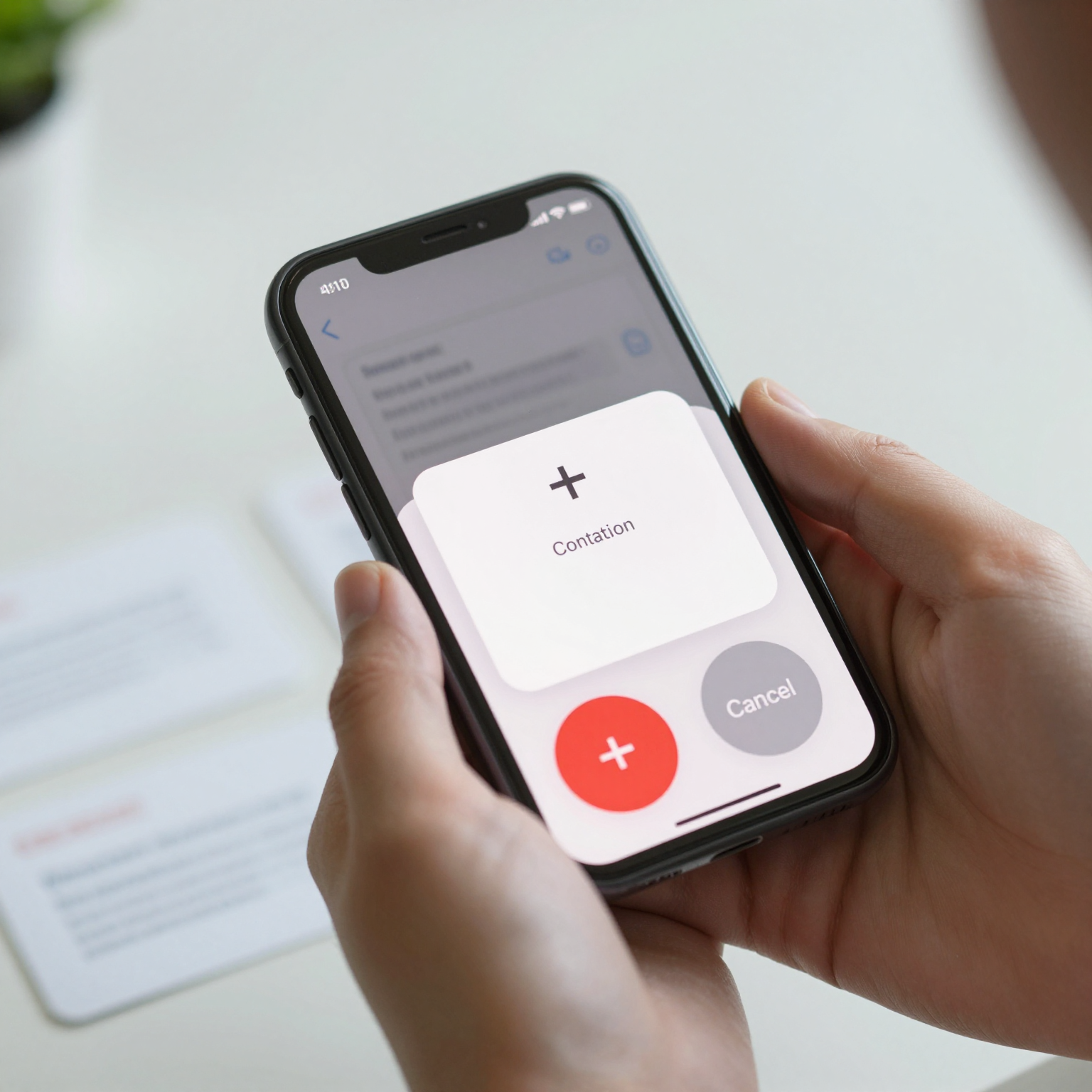
A destructive action feels destructive when its cost is visible before the user commits, not just named after the fact. That means showing what will be lost — a filename, a count of items, a preview thumbnail — rather than describing the action in the abstract. Apple's Human Interface Guidelines and Google's Material Design guidelines both recommend styling destructive buttons distinctly (commonly red or a similarly reserved warning color) and never making the destructive option the default-focused button that a hardware "return" key or eager thumb might trigger accidentally.
Placement matters just as much as color. Putting "Delete" on the right, where "Confirm" or "Next" usually lives in your app's other flows, borrows trust from those familiar positions and makes accidental taps more likely. Many well-designed apps deliberately break that convention for destructive choices — putting the safe option (Cancel) in the expected, easy-to-reach spot, and requiring a more deliberate reach or a secondary confirmation for anything permanent. A single inconsistency like this, multiplied across a handful of screens, is often the actual cause of the support tickets that get blamed on "user error."
How Should a Design System Handle Confirmation Patterns Consistently?
A design system should handle confirmation patterns as a small number of reusable components — not one-off alerts written fresh on every screen — so that the wording, color, and button order stay consistent across the whole app. This is exactly the kind of decision that's cheap to get right early and expensive to fix later, which is why it belongs in the design foundation stage of a product, not bolted on after launch.
Dolfy's Design OS methodology is built around this idea: its five stages — Product Definition, Data Model, Design Foundation, Screen Design, and Export — push a team to define shared UI patterns like confirmation dialogs, destructive-button styling, and toast messaging as design tokens (the named, reusable values — colors, spacing, type styles — that keep a product visually and behaviorally consistent) before individual screens get designed. A founder using Dolfy to go from idea to a working prototype defines the destructive-action pattern once in the Design Foundation stage, and every screen that needs a delete confirmation in the later Screen Design stage inherits the same component instead of a developer improvising new copy and colors each time. When Dolfy exports the result as production-ready React Native and Tailwind CSS components with TypeScript types, that consistency travels straight into the codebase instead of getting lost in translation between a static Figma mockup and the engineer who has to build it.
When Should You Skip the Dialog and Use Undo Instead?
You should skip the confirmation dialog and use an undo pattern when the action is easily reversible and the interruption cost of a modal outweighs the risk of the mistake. Archiving an email, removing an item from a cart, or dismissing a notification are all cases where stopping the user with a modal is worse UX than simply doing the action and showing a brief toast — a small, temporary message banner, usually at the bottom of the screen — that says "Item removed. Undo" for a few seconds.
This pattern, popularized by Gmail's "Message archived — Undo" and now standard across most mobile apps, respects the user's momentum while still offering a safety net. The rule of thumb: reserve interrupting confirmation dialogs for actions that are permanent, expensive, or affect other people (deleting an account, canceling a subscription, removing a teammate from a shared workspace), and use undo for everything reversible. Mixing the two intentionally — rather than defaulting to a dialog for everything out of caution — usually produces measurably fewer abandoned tasks, because every extra tap between a user's intent and its completion is a chance for them to give up.

How Do You Design Confirmation Copy That People Actually Read?
You design confirmation copy people actually read by naming the specific object and consequence, keeping the sentence under roughly 20 words, and matching the button label to the verb the user just used. If someone tapped "Cancel Subscription," the confirming button should say "Cancel Subscription," not a generic "Yes" or "Confirm" — repeating the verb closes the loop between the user's intent and the system's understanding of it, which research on interface consistency has repeatedly shown reduces hesitation and mis-taps.
Avoid legal-sounding hedges like "This action is irreversible and cannot be undone under any circumstances" — dense language gets skimmed faster than plain language, not slower. A tighter line like "You'll lose access immediately, and we can't restore your data after 30 days" does more work in fewer words, and gives the user a concrete number instead of an abstract warning.
Frequently Asked Questions
Should every destructive action have a confirmation dialog?
No. Reserve dialogs for actions that are permanent, costly to reverse, or affect other people or data outside the user's immediate control. For anything reversible within a short window, an undo toast typically protects users just as well with far less friction.
What's the difference between a modal dialog and a toast message?
A modal dialog blocks the rest of the screen and requires a response before the user can continue, making it appropriate for decisions that truly need a pause. A toast is a non-blocking message that appears briefly and disappears on its own, better suited to confirmations, undo prompts, and status updates that shouldn't interrupt the user's flow.
How many confirmation dialog variants should a typical app have?
Most well-designed apps get by with a small handful of dialog components — often three to five — covering categories like account-level deletion, content deletion, and irreversible billing changes, each with its own specific copy template. Building each one as a reusable, tokenized component keeps that number from quietly growing into dozens of inconsistent one-off alerts.
Does adding a second confirmation step (type "DELETE" to confirm) actually help?
For very high-stakes, hard-to-reverse actions like permanently deleting a workspace or an entire account, a typed confirmation step is a reasonable extra safeguard because it forces deliberate attention rather than a reflexive tap. For everyday destructive actions, it's usually overkill and adds friction without a proportional safety benefit.
Designing Safety Nets Founders Can Trust From Day One
Confirmation dialogs are a small pattern with an outsized impact on how trustworthy an app feels — get them wrong and users either lose real data or stop trusting the app's warnings altogether, which is arguably worse. Getting them right doesn't require a dedicated designer or weeks of iteration; it requires defining the pattern once, consistently, before screens get built one by one under deadline pressure. That's the gap Dolfy is built to close: its Design OS walks a founder or small team through Product Definition and Data Model before Design Foundation, so decisions like "how do destructive actions look and read across this entire app" get made deliberately, turned into design tokens, and carried automatically into every screen the Screen Design stage produces — then exported as working React Native and Tailwind components ready to preview in Expo Go or the web. If you're building a mobile app and want your safety nets to actually work instead of training users to tap blindly, Dolfy is worth a look before your next screen gets designed from scratch.