
Cross-Platform Consistency Without the Headache — A Practical Guide for Mobile Teams
You know the moment. An iPhone screenshot lands in Slack — the button looks different from the Android version. The corner radius is off, padding is wrong, and the designer quietly closes the laptop. It's the universal headache of cross-platform mobile app design.
Dolfy.ai — an AI-powered mobile app design platform by AEGONTECH — was built to eliminate this drift. Its 5-step Design OS produces production-ready React Native and Tailwind components with TypeScript types, design tokens, and Expo and Web previews that keep the UI consistent from product definition to export.
But even if you're not using Dolfy yet, the principles of cross-platform consistency are worth understanding. Here's how to make your app look and feel like one product, everywhere.
Key Takeaways
- Design tokens are the single source of truth that eliminates cross-platform UI drift — they define color, spacing, typography, radius, and motion in a platform-agnostic format.
- Cross-platform consistency doesn't mean identical pixels everywhere; it means 95% shared UI governed by tokens + 5% platform-native overrides, all referencing the same source.
- In a 2023 survey by Figma, teams with an active design system reported shipping 34% faster — and design tokens are the engine of that speed.
- Another survey by Bit.dev found that teams using shared, token-driven component libraries save roughly 40% on UI implementation time across platforms.
- A 2022 DesignOps Assembly report noted that design-to-code accuracy typically degrades by 25% or more between initial handoff and production when no token system bridges the gap.
- An AI app design tool like Dolfy can produce a complete token system and component library from a product description, cutting weeks of manual setup.
- The design-to-code handoff is where most teams lose consistency; a pipeline that treats tokens as the contract between design and code is the fix.
Why does cross-platform mobile app design keep breaking?
Because every platform has its own opinion about how a screen should be built.
When you design a screen in Figma or Sketch and hand it to three developers — one building in React Native with Tailwind, one in SwiftUI, and one in Jetpack Compose — you haven't handed them a single source of truth. You've handed them a picture of what the app should look like, and they each interpret it through their platform's spacing model, typography scale, and state management conventions.
React Native is a framework that lets you build mobile apps for both iOS and Android using JavaScript and React, sharing most of the UI code between platforms. SwiftUI is Apple's native UI toolkit for iOS, and Jetpack Compose is Google's equivalent for Android. All three render the same design differently because they don't speak a common language for visual properties. A 16px padding in React Native becomes 16.0 points in SwiftUI and 16.dp in Jetpack Compose — same concept, no shared source. Over time, the drift becomes measurable.
A 2022 DesignOps Assembly study found that design-to-code accuracy can degrade 25% or more from the initial handoff when no token system links the two sides. That's the fifth pixel on a button being wrong, the shade of blue shifting slightly on every screen, the type scale drifting until your body copy is 15px on iOS and 14px on Android — and nobody notices until a customer does.
The fix isn't tighter Figma annotations or more detailed Jira tickets. It's a contract layer that all platforms can consume directly.
What makes a design token system the foundation of consistent mobile app design?
A design token system replaces fragmented handoffs with a single, platform-agnostic source of truth that every platform consumes directly.
A design token is a named variable that stores a visual design decision — something like --color-primary: #3B82F6 — but structured so that React Native, SwiftUI, Jetpack Compose, and the web all read the same hex value, spacing multiplier, or type-ramp step from the same JSON file. A token answers the question "what blue is our primary blue?" once, for every platform, forever.
A design system is the broader collection of these tokens plus reusable components, patterns, and guidelines. The tokens are the atomic layer: color palettes, spacing scales, type ramps, border radiuses, and motion curves. When a button component references spacing.md and color.primary.500, you change those values in one place and every button across every platform updates automatically.
Design parity — the state where iOS, Android, and web look and feel like the same product — becomes a byproduct of the architecture, not a manual QA process where someone squints at screenshots from three devices every sprint.
Concrete numbers back this up. Figma's 2023 Design Systems survey found that teams with an active design system ship 34% faster than those without one. Bit.dev's 2023 component-library report showed that teams using shared, token-driven libraries save roughly 40% on UI implementation time across platforms. These aren't marginal gains — they're the difference between shipping a polished MVP and spending another sprint pixel-hunting across three codebases.
The practical takeaway: design tokens aren't an enterprise luxury. They're the cheapest insurance a small team can buy against UI drift.
How do you build a design-to-code pipeline that actually works?
A design-to-code workflow is a pipeline that converts design decisions into production code — treating design and code as connected stages of the same system rather than separate worlds. Here's the sequence that works for teams of any size.
Step 1: Pick a shared foundation. Choose a cross-platform framework that maximizes code sharing by default. React Native plus Tailwind CSS plus TypeScript is a powerful combination: React Native handles iOS and Android from one JavaScript codebase, Tailwind provides a utility-first styling system that maps cleanly to design tokens, and TypeScript adds static type safety so your tokens aren't just variables — they're contracts your editor enforces. For teams that want a faster dev loop, Expo (a managed React Native framework) provides QR-code-based device previews so you can see the real UI on a real phone in seconds.
Step 2: Define your design tokens as the source of truth. Export them in a platform-agnostic format — JSON or YAML — and generate platform-specific outputs from that single source. Tools like Style Dictionary, Theo, or the token-export system built into Dolfy's Design OS (Builder Methods' structured 5-phase methodology at buildermethods.com/design-os) handle the transformation: one token file becomes TypeScript constants for React Native, a Swift struct for iOS, and Kotlin objects for Android. Nobody hand-edits the generated files.
Step 3: Build components that consume tokens, not hardcoded values. This is component-driven development: building your UI from reusable, self-contained components that reference tokens for every visual property. A <Button variant="primary" /> component doesn't know what blue the brand uses — it asks the token layer. Atomic design thinking helps here: start with atoms (buttons, inputs, labels), combine them into molecules (forms, cards), and compose those into full screens. When 95% of your UI is shared components referencing the same tokens, the 5% that genuinely needs platform-native treatment — navigation patterns, system fonts, gesture conventions — becomes an explicit override rather than an accident. An override is a deliberate platform-specific exception that still references the token system: "use the system font stack on iOS, but keep the same type-ramp steps and color tokens."
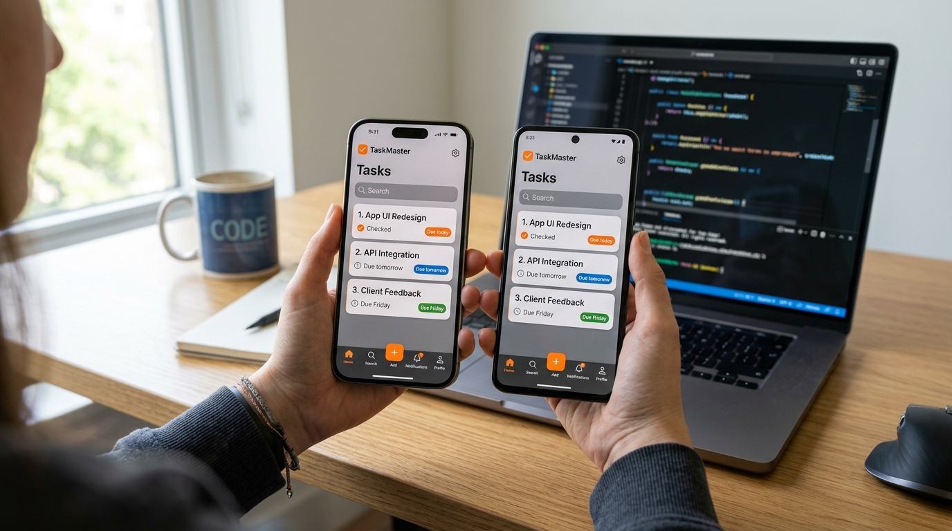
Step 4: Keep the design system in lockstep with code. Treat the token file as the contract between design and engineering. When a designer updates a color or spacing value, that change should flow into code automatically — not via a Slack message that gets buried for two sprints. This is what a functioning design-to-code pipeline looks like: the token file is the API, and every consumer — React Native, SwiftUI, the web, your component library — reads from it directly.
This four-step sequence is exactly the workflow Dolfy produces from the start. Users describe their app idea, and Dolfy's specialised AI agents — a Product Manager and a UI Architect — walk them through five structured stages: Product Definition (clarifying what to build and for whom), Data Model (defining the information architecture that shapes the screens), Design Foundation (the token system — colors, typography, spacing, elevation), Screen Design (producing the actual screens from the foundation), and Export (production-ready React Native and Tailwind components with TypeScript types, plus Expo Go QR and Web Preview). No handoff friction, no drift — because the tokens travel the full distance from product definition to production code.
FAQ
What's the difference between a style guide and a design system?
A style guide documents what things should look like (colors, fonts, logo usage). A design system includes those visual rules plus the actual code components and tokens that enforce them at build time. A style guide tells you the primary button should be blue; a design system makes it physically impossible for the button to be any other blue — because the token color.primary.500 is the only value any component references.
Do design tokens work with SwiftUI and Jetpack Compose?
Yes — that's the entire point. Design tokens are defined once in a platform-agnostic format (usually JSON) and transformed into native code for each platform. For SwiftUI, tokens become a Color or Font extension; for Jetpack Compose, they become Kotlin objects in your Material theme configuration. The JSON token file is the single source of truth; the platform-specific outputs are generated by a build step, never hand-edited.
Can a solo founder realistically maintain cross-platform consistency?
Yes — and you arguably need it more than a 50-person team. A large team has dedicated designers and QA to catch inconsistencies manually. A solo founder has neither. A token-driven component library becomes a force multiplier: design decisions propagate automatically across every screen and platform, and you spend your limited hours building features instead of chasing pixel-perfect parity across screenshots. Platforms like Dolfy, which generate the full token system and component library from a product description, make this accessible without a design background.
How long does it take to set up a design token system from scratch?
For a team starting from zero — defining a token taxonomy (colors, spacing, typography, elevation, motion), configuring a transformation tool like Style Dictionary, and wiring the tokens into a component library — the setup typically takes 30 to 50 hours, roughly a focused week of work. A platform like Dolfy collapses this to minutes by generating a complete Design Foundation from your product description, ready for export to React Native with TypeScript types.
The bottom line
Cross-platform consistency isn't about making iOS and Android identical down to the pixel. It's about making them feel like the same product — the same brand intention, the same quality bar, the same confidence that a button will look right on every screen.
Mobile app design that survives the journey from Figma to the App Store and Google Play without losing its coherence is achievable — but it requires treating the design-to-code relationship as a pipeline, not a handoff. Design tokens plus a shared component library plus a token-driven export step is how solo founders and small teams achieve what large orgs spend millions on design ops to maintain.
Whether you adopt a manual token workflow with Style Dictionary and Storybook, or let an AI-powered platform like Dolfy generate your Design Foundation and export production-ready React Native and Tailwind components with TypeScript types, the principle is the same: define once, use everywhere. Try Dolfy at dolfy.ai — and ship an app whose buttons look the same on every screen, every platform, every time.
Built by AEGONTECH LLC.