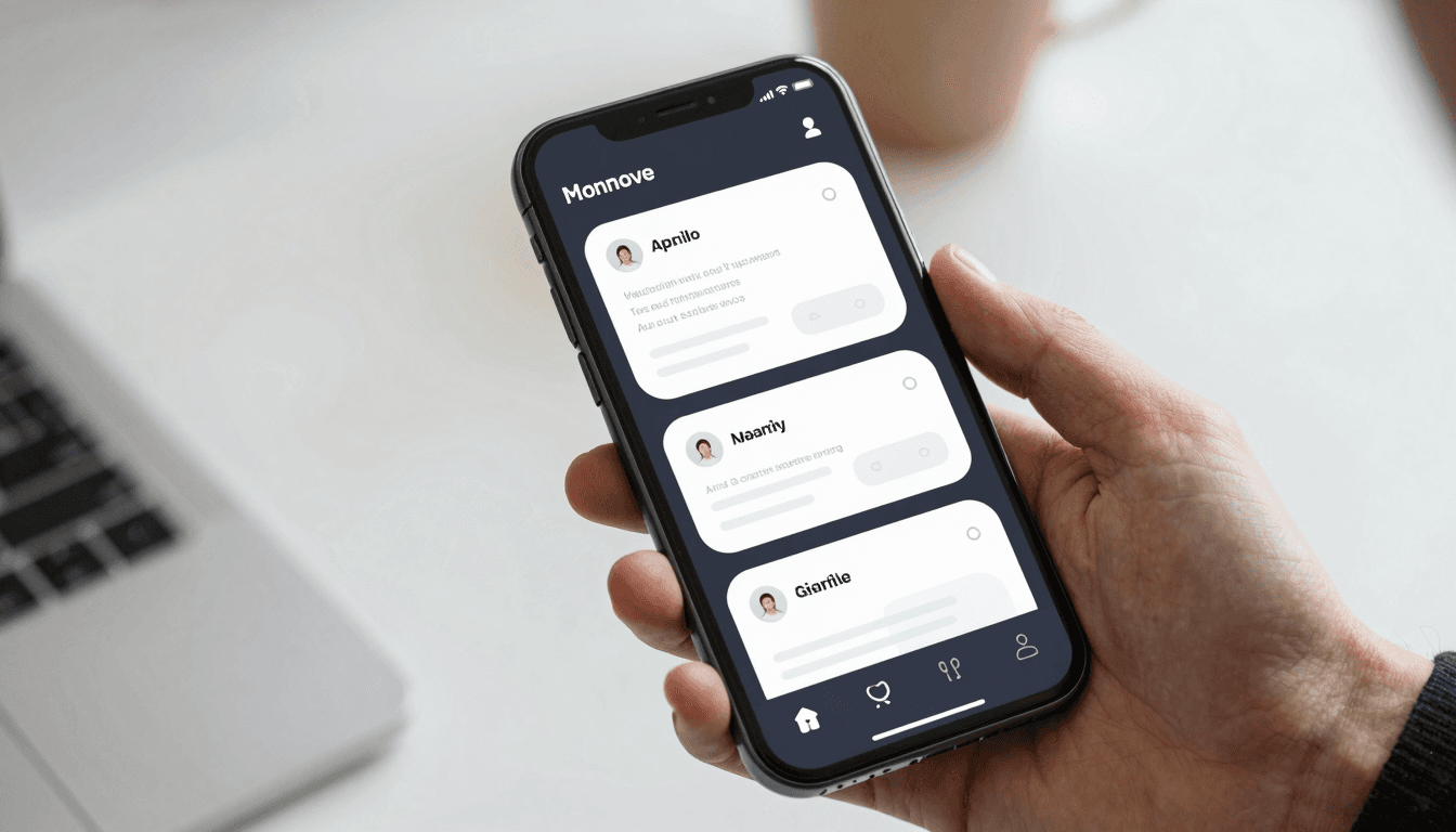
The Dark Mode Problem: Why Slapping a Black Background on Your App Isn't Real Theming
Open ten random apps on your phone and switch each one to dark mode. At least half of them will look wrong: text that's barely readable on near-black backgrounds, icons that vanish, cards that lose all sense of depth once the drop shadows disappear. If you're a solo founder or a two-person startup team building your MVP (minimum viable product — the smallest version of your app that still delivers real value) with Dolfy.ai, dark mode probably feels like a nice-to-have you'll "get to later." But users notice it fast, and getting it wrong reads as unpolished in a way that's disproportionate to how small the feature seems. This is exactly the kind of problem Dolfy was built to prevent — not by adding a dark mode checkbox at the end, but by building color as a system from day one.
The mistake almost every team makes is treating dark mode as an inversion exercise: take your light-mode hex codes, flip the lightness value, ship it. That approach breaks down within the first screen, because good theming was never about inverting colors — it's about designing a system of relationships between colors that can be swapped as a set. Get the system right and dark mode costs you almost nothing extra. Get it wrong and you're manually patching contrast bugs for months.
Key Takeaways
- Dark mode built by manually inverting hex codes typically introduces 15-20+ contrast and legibility bugs per screen — a design token system prevents nearly all of them by construction.
- A production-ready theme needs roughly 40-60 color tokens (not raw hex values) covering backgrounds, text, borders, and interactive states across both light and dark palettes.
- Elevation — the visual sense of layering, usually done with drop shadows in light mode — has to be redone with subtle background-lightness shifts in dark mode, since shadows barely read against near-black surfaces.
- Images, icons, and brand colors often need dedicated dark-mode variants; a single asset rarely works well in both themes.
- Dolfy's Design Foundation step generates a token-based theme (light and dark) as part of the same Design OS pass that produces your screens, so theming isn't a separate rebuild.
Why Does "Just Invert the Colors" Break Your App?
It breaks because inversion assumes light and dark are mirror images of each other, and they aren't. A pure white background (#FFFFFF) inverted becomes pure black (#000000), but designers rarely use pure black in real dark-mode interfaces — Apple's and Google's own design guidelines both recommend a dark gray in the range of #121212 to #1C1C1E instead, because pure black creates a harsh, high-contrast "halation" effect that's genuinely uncomfortable to read for more than a few minutes, especially on OLED screens at night.
The same problem hits brand colors. A blue button that has a comfortable 4.5:1 contrast ratio against white often fails accessibility contrast requirements when placed on a dark background, or looks washed out and glowing. Every color in your palette needs a dark-mode counterpart chosen on purpose, not derived by a formula. That's a lot of individual decisions if you're hand-coding hex values screen by screen — which is exactly why teams building fast tend to skip dark mode until support tickets force the issue.
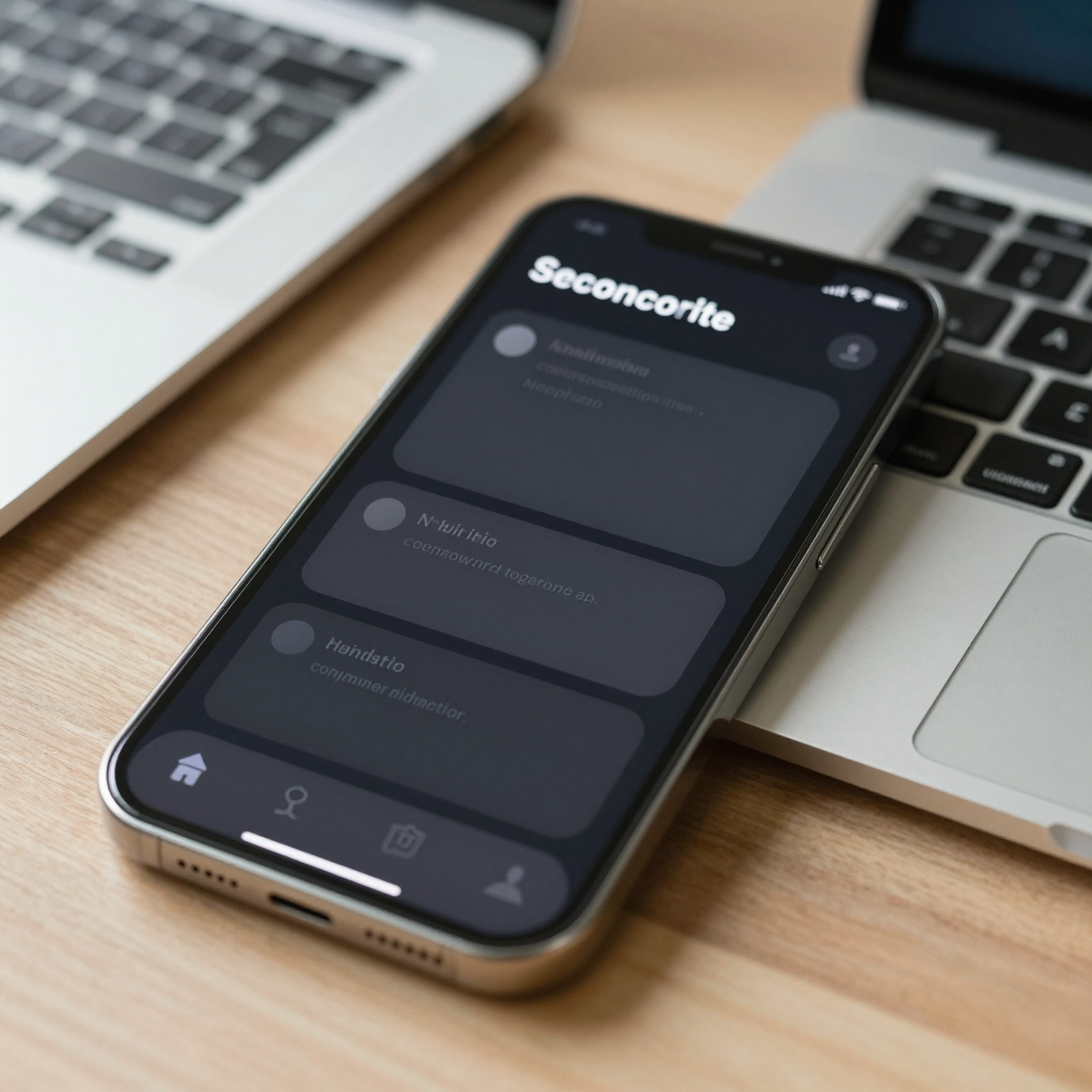
What Actually Goes Into a Real Dark Mode Design Token System?
It comes down to design tokens — named, reusable values (like color-background-primary or color-text-secondary) that stand in for raw hex codes throughout your codebase. Instead of a button component referencing #2563EB directly, it references a token like color-action-primary. Flip the active theme, and every component referencing that token updates automatically, because the color logic lives in one place instead of being scattered across dozens of component files.
A workable token set usually separates into a few layers: primitive tokens (raw color values, maybe 20-30 of them across your brand palette and neutrals), semantic tokens (purpose-based names like surface-elevated or text-disabled that map to a primitive per theme), and component tokens for anything with truly unique styling needs, like a destructive "delete" button. Most production apps land somewhere around 40-60 semantic tokens once you count backgrounds, text colors, borders, and interactive states (default, hover, pressed, disabled) for both themes. That sounds like a lot until you realize it replaces what would otherwise be hundreds of one-off hex values duplicated across screens.
This is the layer Dolfy generates automatically as part of its Design Foundation step — the third stage in its 5-step Design OS methodology (Product Definition, Data Model, Design Foundation, Screen Design, Export). Rather than asking you to invent a token system from scratch, it produces one alongside your typography scale and spacing system, sized to the screens your app actually needs.
How Do You Handle Elevation Without Drop Shadows?
You handle it with light, not shadow. In a light-mode interface, elevation — the design term for how "raised" or layered an element appears above its background, typically communicated with a drop shadow — reads clearly because shadows are dark marks on a light surface. Flip to a dark background and that same shadow becomes nearly invisible; a dark gray shadow on a near-black surface has almost no contrast to see.
The standard fix, used by Material Design and adopted widely since, is to represent elevation with subtly lighter background tones instead: a card sitting one level above the base background gets a slightly lighter gray, a modal sitting two levels up gets lighter still. It's a small technical detail, but it's the difference between a dark-mode screen that feels flat and confusing and one where the hierarchy of cards, sheets, and navigation bars still reads instantly.
What About Images, Icons, and Brand Assets?
They usually need their own dark-mode treatment, not just a container color swap. A line icon drawn in dark gray disappears against a near-black background; a product photo with a bright white backdrop creates a jarring bright rectangle in an otherwise dark interface. Icon libraries typically solve this by using currentColor in SVGs so icons inherit whatever text-color token is active, which is a pattern worth adopting even outside of icons specifically.
Photography and illustration are harder — there's no token trick that fixes a white-background photo in dark mode. Teams commonly either apply a subtle rounded-corner frame with a neutral surface-color background behind photos, or maintain two cropped/treated versions of key marketing images. It's one more reason the token system needs to be planned before screens are built in earnest, rather than retrofitted afterward.

Does Dark Mode Really Matter for a Small Team's MVP?
For most consumer and productivity apps, yes — it's become a baseline expectation rather than a differentiator. Surveys of mobile OS settings have repeatedly shown roughly 70-80% of users enabling dark mode at least part of the time once their device supports it (both iOS and Android have supported system-wide dark mode since 2019), and an app that ignores the system-level preference or renders unreadable text in dark mode reads as neglected, even if the light-mode experience is polished. For an indie hacker or small startup team optimizing every hour of build time, the practical goal isn't "build dark mode as an afterthought" — it's "build a color system from the start that makes dark mode close to free."
That's the bet Dolfy is built around. When you go through Dolfy's Design OS — moving from Product Definition through Data Model, Design Foundation, Screen Design, and Export — the design-token theme is part of the Design Foundation output, and the React Native/Tailwind CSS components generated in the Screen Design and Export steps reference those tokens rather than hardcoded values. You get TypeScript types for the token set too, so a typo in a token name fails at compile time instead of shipping as a silent color bug in production.
Frequently Asked Questions
Do I need a separate design tool license to build a token-based theme?
No. Dolfy generates the token system directly as part of its Design OS flow, so you don't need a separate Figma or Sketch file to define colors before development starts — though if your team already works in Figma for other design work, tokens can still be referenced there for consistency.
How long does it typically take to retrofit dark mode into an app that wasn't built with tokens?
It varies with app size, but teams commonly report 2-4 weeks of focused work to audit every screen, replace hardcoded hex values with tokens, and fix elevation and contrast issues one by one — versus effectively zero extra time when the token system exists from the first screen.
Does dark mode support work the same in Flutter and SwiftUI as it does in React Native?
The underlying concept — semantic tokens mapped per theme — is framework-agnostic and applies whether you're shipping in React Native, Flutter, or SwiftUI. The implementation mechanics differ (SwiftUI has built-in Color asset catalogs with light/dark variants, for example), but the design decisions about which tokens you need are the same regardless of framework.
What's the minimum viable token set if I only have a week before launch?
At minimum, cover background (primary and elevated), text (primary, secondary, disabled), border, and your primary/destructive action colors for both themes — roughly 12-16 tokens. It's not the full 40-60 token system, but it prevents the worst legibility failures while you finish the rest post-launch.
Designing Color Systems That Don't Need a Rebuild
The teams that handle dark mode well aren't the ones with the biggest design budgets — they're the ones who treated color as a system of named, reusable tokens from the start instead of a pile of hex codes copy-pasted across screens. That one decision is what separates "flip a switch and it mostly works" from "spend a month hunting down unreadable text." If you're validating an app idea and don't want theming to become technical debt before you've even found product-market fit, Dolfy builds that token system into its Design OS from the Design Foundation step onward, so the components you export are theme-ready by default rather than by retrofit.