
Dark Mode Isn't Just Inverted Colors: How to Build a Design System That Doesn't Break at Night
Your app looked great in the demo. Then a user flips on dark mode at 11pm, and suddenly your primary button is a barely-visible charcoal smudge, your error text reads as pure black on near-black, and a card that used to "pop" now just disappears into the background. Nobody planned for this — dark mode got bolted on by inverting a stylesheet, and the app quietly broke for half of its nighttime users. This is one of the most common, and most avoidable, mistakes indie teams make, and it's exactly the kind of problem Dolfy.ai's Design Foundation step is built to prevent before a single screen gets built.
Key Takeaways
- Dark mode is not "invert the colors" — it's a second, deliberately designed theme built on the same semantic structure as light mode.
- Roughly 80% of smartphone users report using dark mode at least part of the time, according to multiple mobile survey reports, which makes it a default expectation, not a nice-to-have.
- WCAG accessibility guidelines require a minimum 4.5:1 contrast ratio for body text — a threshold that's easy to violate by simply inverting hex values.
- Design tokens (named, reusable style values instead of hard-coded hex codes) are what make a real dual-theme system maintainable across dozens of screens.
- Dolfy's Design Foundation step generates a token-based color system with light and dark variants from day one, so React Native and Tailwind CSS components stay in sync automatically.
Why does simply inverting colors break dark mode?
Inverting colors breaks dark mode because contrast, hierarchy, and meaning don't invert along with the hex values. A pure white background at #FFFFFF might become pure black at #000000 after a naive invert, but your brand blue that read clearly on white can turn nearly invisible on black, and shadows that gave a card depth on a light background often vanish or turn into ugly halos on a dark one. Color in a UI isn't just decoration — it encodes meaning: which element is interactive, which text is primary versus secondary, which state is an error versus a warning. When you invert without redesigning, you keep the pixels but lose the meaning.
This is why professional design systems don't have "one color palette that gets inverted." They have two related but independently tuned palettes — light and dark — that are each checked for contrast and hierarchy on their own terms. A well-built system might define primary text at a 15.8:1 contrast ratio in light mode and a separately verified 13.2:1 ratio in dark mode, rather than assuming one number carries over.
What are design tokens, and why do they matter for theming?
Design tokens matter for theming because they let you swap an entire visual language by changing a small set of named values instead of hunting through every screen's code. A design token is simply a named variable for a style decision — instead of writing color: #2563EB directly into a button component, you write color: var(--color-primary), and that token's actual value can be #2563EB in light mode and #60A5FA in dark mode without touching the button component at all.
This is the difference between a system and a patch job. Without tokens, adding dark mode to an app with 40 screens can mean manually auditing 40 screens for hard-coded colors — a process that easily eats two to three full workdays for a solo developer, and still misses edge cases like a modal or toast that only appears conditionally. With a token system in place from the start, that same change is often a single config file update, because every component was already built to reference tokens rather than raw values.
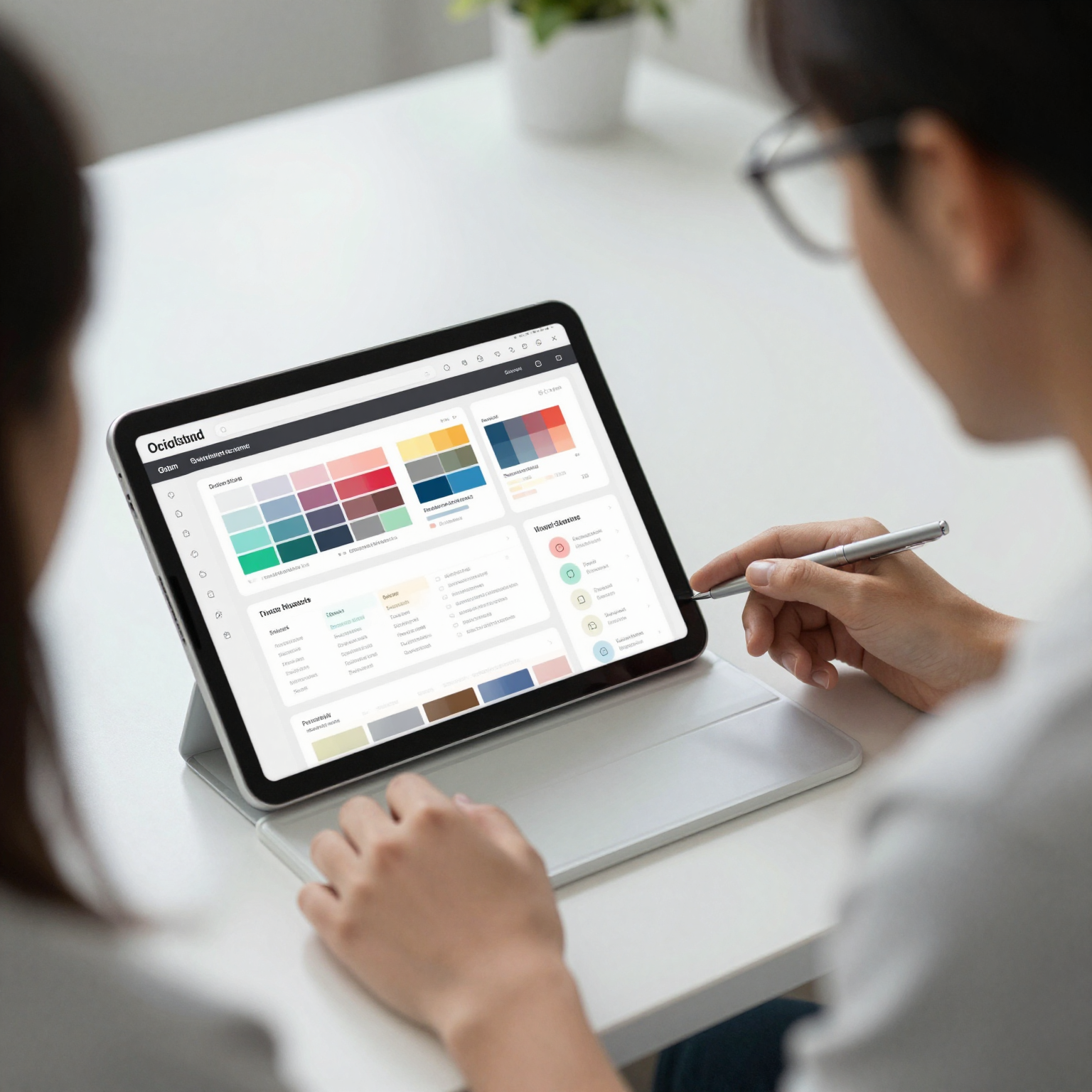
Dolfy.ai's Design Foundation phase — the third step in its five-step Design OS methodology (after Product Definition and Data Model, and before Screen Design and Export) — generates exactly this kind of token system for a project: semantic tokens for background, surface, text-primary, text-secondary, border, and state colors like error and success, each with a light and dark value defined together, not bolted on afterward.
Which UI elements get missed most often when adding dark mode?
The elements that get missed most often are the ones that live outside the main screen flow: modals, toasts, dropdown menus, chart or graph fills, and anything rendered with an inline shadow. These components frequently get built once, styled with a one-off hex value "because it was just a small popup," and then forgotten when the rest of the app gets themed. A settings screen might look flawless in both modes while the confirmation toast that appears after saving is still hard-coded to a light gray background that turns nearly invisible against a dark surface.
Icons are another quiet failure point. An icon exported as a flat black PNG will simply vanish against a near-black background, while an SVG icon that inherits currentColor will automatically pick up the correct token-based color in either theme. This is a small technical distinction — PNG versus SVG, hard-coded fill versus inherited color — but it's the kind of decision that determines whether dark mode support takes an afternoon or a week of screenshot-by-screenshot bug hunting.
Chart and data-visualization colors deserve their own pass too. A palette of five chart colors tuned for a white background can lose distinctness on a dark surface, where two colors that were clearly different in light mode start to look nearly identical. Each data color needs its own dark-mode variant, verified the same way body text and buttons are.
How does Dolfy handle dark mode differently from a typical Figma-to-code handoff?
Dolfy handles it differently by generating the token system and the components together, so a component is never written against a raw color in the first place. In a typical Figma-to-code handoff, a designer builds a beautiful dark-mode mockup as a separate Figma frame, and a developer then has to manually reverse-engineer which colors are tokens, which are true one-offs, and which were just "eyeballed" to look right in that specific frame. That translation step is where most of the inconsistency creeps in — two developers might read the same dark mockup and land on two slightly different grays for "surface background."
Because Dolfy's output is production-ready React Native and Tailwind CSS components with TypeScript types tied to the same token definitions used in the Design Foundation step, there's no separate translation step to get wrong. A button component references colors.primary in its TypeScript props, and that token resolves to the correct light or dark value automatically based on the active theme — the same component code renders correctly in both, because it was never written to know the difference. You can preview both themes directly in Expo Go or the Web Preview during the Screen Design step, catching a low-contrast toast or an invisible icon before a single line of production code exists, rather than after a user reports it.
Frequently Asked Questions
Do I really need a separate dark palette, or can I just adjust opacity?
You need a separate, deliberately tuned palette. Reducing opacity on a light-mode color to fake a dark-mode look almost always produces muddy, low-contrast results because opacity math doesn't account for how a color perceptually shifts against a dark background — a genuine dark palette, checked against the same 4.5:1 contrast standard as light mode, is the only reliable approach.
How much extra time does building proper dark mode support actually take?
For a small-to-medium app (10-20 screens), teams typically report that building dark mode in from the start with a token system adds a few hours to the initial design phase, versus retrofitting it later, which commonly takes several days once you count auditing existing screens, fixing icons, and re-testing every component in both themes.
Does dark mode actually matter for retention, or is it a cosmetic preference?
It affects real usage patterns. Multiple mobile app surveys have found the large majority of smartphone users spend at least part of their screen time in dark mode, often citing eye strain and battery life on OLED screens as the reason, which makes it a functional accessibility and comfort feature for a meaningful share of daily sessions rather than a pure aesthetic add-on.
What's the single biggest mistake teams make with dark mode?
Treating it as a CSS filter instead of a second design pass. The mistake isn't usually in the main screens — it's in the overlooked places: a toast, a chart legend, an icon exported as a flat PNG — because those were never built against tokens in the first place.
Building Themes That Actually Hold Up
Dark mode isn't a filter you apply at the end — it's a second design decision that has to be made with the same care as the first one, ideally using the same semantic token system so neither theme is an afterthought. Getting this right the first time, rather than retrofitting it across dozens of screens later, is exactly the kind of foundational work that separates an app that merely supports dark mode from one where dark mode feels genuinely designed. If you're starting a new mobile project and want that foundation built in from the Product Definition step onward, Dolfy generates the token system, the React Native and Tailwind components, and the light/dark previews together, so theming isn't a separate problem you solve twice.