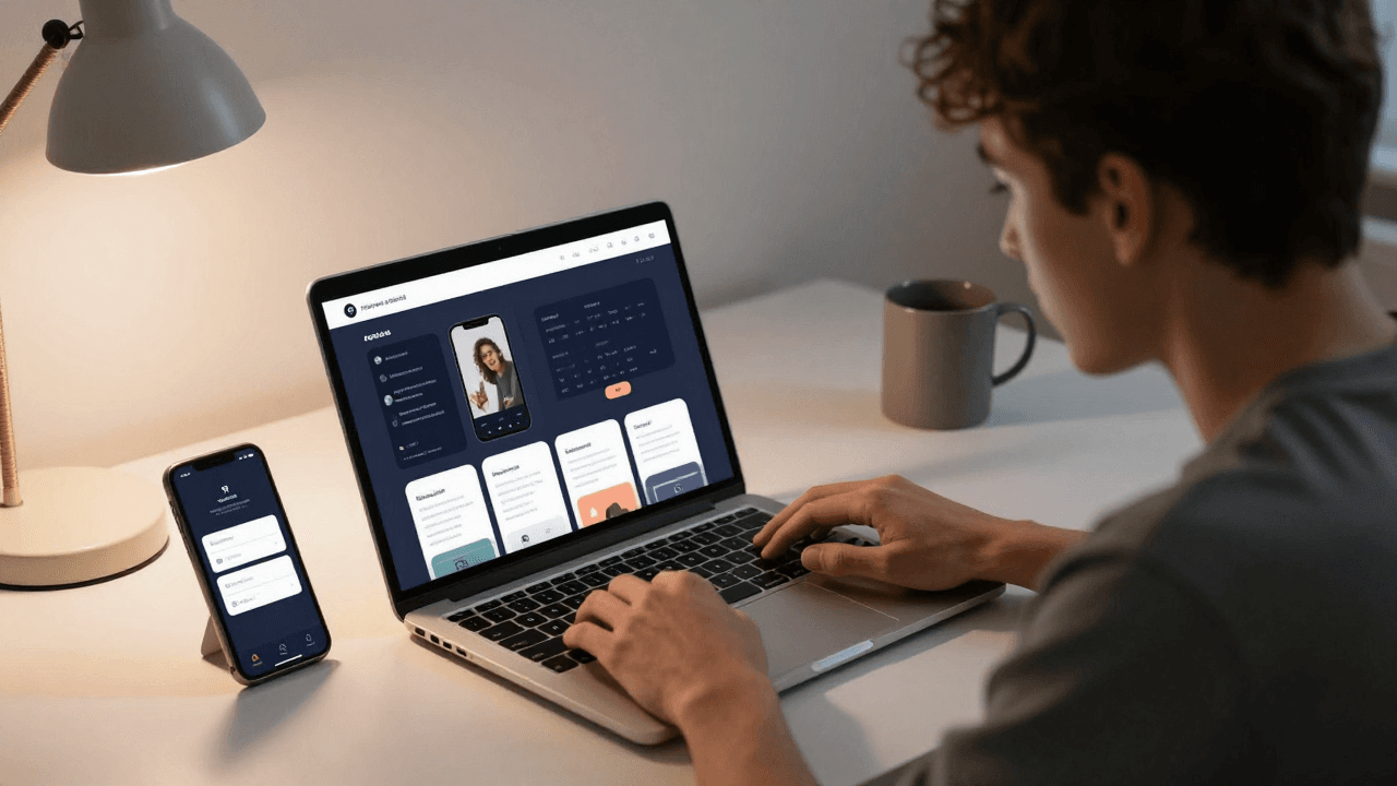
The Dark Mode Problem: Why Your App's Dark Theme Has Unreadable Text and Glaring White Cards
You finally ship your app, open it on your own phone at 11 p.m., and your eyes are burning. Somebody in your beta group has just told you the dark mode is "unreadable." You flip the switch in settings and there it is: grey text on a slightly different grey background, a card that glows bright white like a flashlight, and an icon that vanished entirely. This is the dark mode problem, and it hits nearly every small team that treats dark mode as an afterthought. Dolfy.ai is built around the idea that a theme should be a decision you make once, at the foundation, rather than a bug list you chase for weeks.
Key Takeaways
- Dark mode is not "invert the colors." It is a second, deliberately designed set of color decisions that has to be defined before you build screens.
- Most dark mode bugs come from hard-coded color values scattered through components instead of named, theme-aware design tokens.
- Pure black backgrounds and pure white text look harsh; a dark grey surface (around #121212) and off-white text read better and are easier on the eyes.
- Text contrast should meet at least a 4.5:1 ratio in both themes, and you can test it in minutes, not days.
- Defining your theme at the design foundation stage, as Dolfy's Design OS methodology does, means dark mode arrives with your first screens instead of six weeks later.
Why does dark mode break so many apps?
Dark mode breaks apps because colors are usually written directly into components, so there is no single place to change them. When a developer writes backgroundColor: '#FFFFFF' in one file and color: '#333333' in another, a theme switch has nothing to switch. Every one of those values becomes a separate bug waiting for a dark background.
Think about how a typical early-stage app grows. On day one you have five screens and a handful of colors. By week six you have thirty screens, three developers (or one developer and an AI assistant), and hundreds of color values, some copied from Figma, some guessed, some pasted from Stack Overflow. Adding dark mode at that point means touching every file. A team that estimates "one afternoon" often spends two to three weeks, because the bugs are not obvious: a white icon on a white card only shows up on the one screen nobody opened during testing.
There is also a human problem. If the light theme was designed carefully and the dark theme was generated by a script, the dark theme will feel like a cheaper sibling. Users notice, even if they cannot explain why.
What is the difference between a light theme and a dark theme in design tokens?
A design token is a named design decision, such as color.surface or color.text.primary, that stores a value once and lets every component refer to it by name. The difference between light and dark themes is simply that each token has two values, one per theme, while the names stay identical.
That is the whole trick. Your button does not say "use white." It says "use color.surface." In the light theme color.surface resolves to white; in the dark theme it resolves to a dark grey. The component code never changes. Flip the theme, and every screen follows.
A design system, meaning a shared set of rules, tokens, and reusable components that keep an app consistent, makes this practical. Without one, you are hunting values by hand. With one, a theme is a lookup table. Frameworks like React Native expose the device's preference through its useColorScheme hook, and styling tools such as Tailwind CSS support a dark: variant, so the plumbing exists. What most teams lack is the token layer that gives the plumbing something meaningful to plug into.
Which colors should a dark theme actually use?
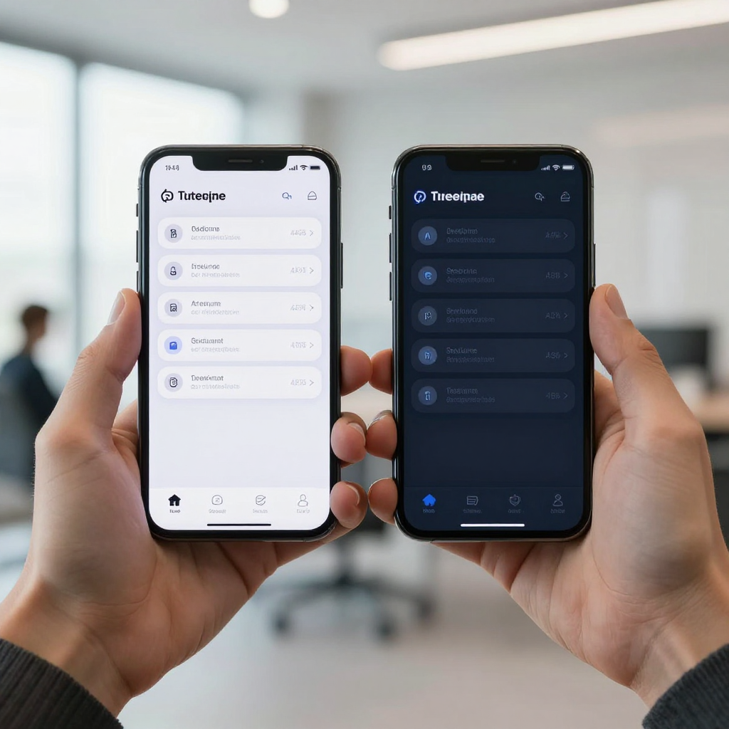
A good dark theme uses dark grey surfaces rather than pure black, off-white text rather than pure white, and slightly desaturated accent colors. Pure black (#000000) against pure white (#FFFFFF) produces maximum contrast, but that is exactly why it feels harsh; the glare makes text appear to vibrate, especially for people with astigmatism.
Here is a practical starting palette you can adapt:
- Base background: around #121212, a very dark grey, instead of #000000.
- Raised surfaces (cards, sheets): a slightly lighter grey, such as #1E1E1E. In dark mode, lighter means closer to the viewer, which is the reverse of how shadows work in light mode.
- Primary text: off-white at roughly 87 percent opacity, not solid white.
- Secondary text: roughly 60 percent opacity, still comfortably above the readable threshold.
- Accent colors: reduce saturation. A vivid blue that looks great on white can look like a neon sign on dark grey.
Shadows also change. A soft drop shadow is nearly invisible on a dark background, so elevation has to be communicated through surface lightness instead. If your cards look flat in dark mode, this is almost always why.
How do you check contrast in both themes?
You check contrast by measuring the ratio between text color and its background and confirming it is at least 4.5:1 for body text and 3:1 for large text. This standard comes from the Web Content Accessibility Guidelines (WCAG), and it applies to mobile apps too.
Free contrast checkers exist for exactly this, and the check takes about a minute per color pair. The trick is to check every token pair in both themes, not just the ones you remember. Common failures include:
- Placeholder text in input fields that fades to nearly nothing on a dark surface.
- Disabled buttons that become invisible rather than merely muted.
- Outline icons with a thin stroke that disappears at 1x screen density.
- Links and accent text colored for a white background and never re-checked.
If you have twelve text tokens and two themes, that is 24 combinations. It sounds like a lot until you remember that a token system means you check 24 pairs once, instead of checking every screen forever.
What about images, icons, and status bars?
Images, icons, and system elements do not follow your color tokens automatically, so each needs an explicit dark mode decision. This is where the "it looked fine in the simulator" bugs come from.
- Icons: use icon sets that accept a color prop, and drive that prop from a token. A single hard-coded black icon will disappear on a dark card.
- Logos: a dark logo on a transparent background vanishes. Prepare a light variant or a version with a subtle container.
- Photos and illustrations: bright images can glare. Consider a slight dimming overlay in dark mode rather than swapping every asset.
- Status bar: the clock and battery icons must switch between dark and light content, or they blend into your header.
- Splash screen: a white splash that flashes before a dark app opens is the most visible dark mode bug of all, and users see it every single launch.
How does Dolfy handle themes from the start?
Dolfy handles themes by making them part of the design foundation step, before any screen exists. Dolfy is an AI-powered mobile app design platform from AEGONTECH LLC that walks you through a five-step Design OS methodology: Product Definition, Data Model, Design Foundation, Screen Design, and Export.
The third step, Design Foundation, is where your color system, typography, and spacing are established as a design-token system. Because that happens before Screen Design, the screens Dolfy produces are built on tokens rather than scattered hex values. The Export step then hands you production-ready React Native and Tailwind components with TypeScript types, meaning the code describes exactly what kind of value each prop accepts, which catches many mistakes before the app even runs.
The practical benefit is ordering. The classic dark mode failure is discovering the theme problem after thirty screens exist. When the token system comes first, every later screen inherits it. You can also check the result quickly with Expo Go or the Web Preview, so you see the app on a real phone rather than trusting a static mockup.
How can a solo founder add dark mode this week?
A solo founder can add dark mode in a week by auditing colors, replacing hard-coded values with tokens, and testing on a real device. The order matters more than the speed.
- Day 1: Inventory. Search your codebase for hex values and
rgb(strings. Count them; a 30-screen app can easily hold well over 100. - Day 2: Name the roles. Group those values into roughly 10 to 15 roles: background, surface, border, text primary, text secondary, accent, danger, and so on.
- Day 3: Define both values. Give each role a light and a dark value, using the palette guidance above.
- Day 4: Replace. Swap every hard-coded value for its token. This is tedious but mechanical.
- Day 5: Test. Run every screen in both themes on a physical phone, in a dim room, then in daylight.
If that sounds like a lot of retrofitting, it is. That is precisely the argument for starting with tokens. A tool that produces them in the first place, the way Dolfy's Design Foundation step does, turns a five-day project into a non-event.

Frequently Asked Questions
Do I really need dark mode for an MVP?
Not always, but you should design for it even if you do not ship it. Both iOS and Android let users choose a system-wide dark setting, so an app that ignores it can feel jarring. Building on tokens from day one keeps the option open at almost no cost.
Is pure black better for OLED screens?
Pure black saves a little battery on OLED displays because those pixels switch off, but it can cause smearing when scrolling and feels harsh with white text. Most design guidelines suggest a very dark grey instead, which gives up a small amount of battery for noticeably better readability.
Should dark mode follow the system setting or be a toggle?
Follow the system setting by default and add a manual override in settings if your users ask for one. Respecting the device preference means most people never have to think about it, and the override handles the rest.
Can I test dark mode without owning several phones?
Yes. Both iOS and Android simulators can switch themes instantly, and Expo Go lets you preview on a physical device. Still, check at least once on a real phone, because screen brightness and ambient light change how contrast actually feels.
The Real Fix Is Deciding Once
Dark mode stops being a nightmare the moment it stops being a feature and becomes a property of your foundation. Name your colors by role, give every role two values, check the contrast pairs once, and let every component inherit the result. The teams that struggle are almost never missing skill; they are missing the token layer that would have made the theme automatic. If you would rather start with that layer already in place, Dolfy guides you from product definition to exported React Native components with the design foundation built in, so your app looks right at noon and at 11 p.m.