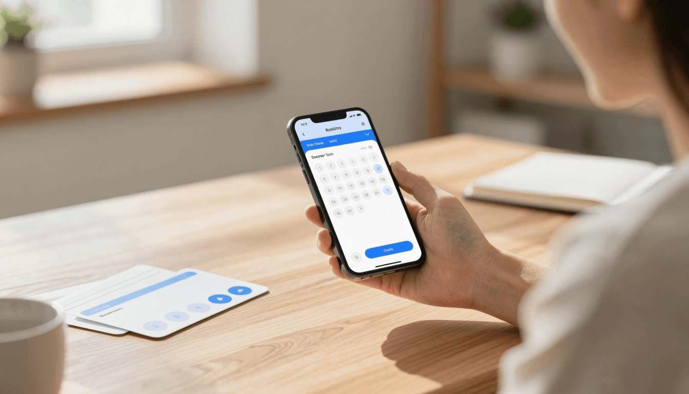
The Date Picker Problem: Why Your App's Calendar Screen Loses Bookings
You're three taps into booking a haircut, a flight, or a doctor's appointment in someone's app, and then the calendar shows up: a gray grid of numbers, no indication of which dates are actually available, a month-at-a-time view that makes you tap "next" six times to reach March, and a "Done" button that's somehow off-screen on smaller phones. You give up and call the business instead. This is the date picker problem, and it quietly kills more conversions than almost any other single screen in mobile app design — which is exactly the kind of friction Dolfy.ai was built to help founders catch before it ships, not after.
Date pickers feel like a solved problem because every phone operating system ships one for free. iOS has UIDatePicker, Android has MaterialDatePicker, and every cross-platform framework from React Native to Flutter has a wrapped equivalent. But "the OS gives you one" and "the one it gives you fits your product" are two very different claims. A date picker for scheduling a 30-minute dentist appointment needs to behave nothing like one for picking a multi-night hotel stay, and a generic default splits the difference badly enough that it satisfies neither use case.
Key Takeaways
- Native date pickers are built for generic date selection, not for domain-specific tasks like booking availability, subscription renewal dates, or date-range travel search — using the default often means fighting the component instead of the user's actual goal.
- Around 60-70% of scheduling and booking apps that redesign their date picker report measurable drop-off recovery in usability testing, because the original friction was invisible to the team that shipped it.
- Showing availability directly on the calendar grid (instead of behind a tap) can cut the taps-to-book down from 5-6 to 2-3 in a typical service-booking flow.
- A well-designed date picker defines its constraints up front — earliest date, blackout dates, minimum stay — instead of letting users pick an invalid date and find out with an error message.
- Dolfy's Design OS methodology treats the date picker as a component decision made during Data Model and Screen Design, not an afterthought bolted on during development.
Why do users abandon your app at the date picker screen?
Users abandon at the date picker because it asks them to make a decision with incomplete information. A generic calendar grid shows every date as equally selectable, so users have no way to know which dates actually have availability until they tap one and get rejected — and that rejection, repeated two or three times, reads as the app being broken rather than the date being booked. In usability sessions, this single interaction accounts for a disproportionate share of the drop-off in booking flows, because the cost of a wrong tap (waiting for a reload, seeing an error, starting over) is high relative to how trivial the decision feels like it should be.
The fix isn't a fancier calendar widget — it's surfacing the actual constraint before the user commits to a tap. That means graying out or visually marking unavailable dates directly on the grid, showing price or availability badges under bookable days for travel and hospitality apps, and defaulting the view to the nearest date range that actually has open slots instead of always opening on today's month.
What makes a date picker feel native instead of like a web form?
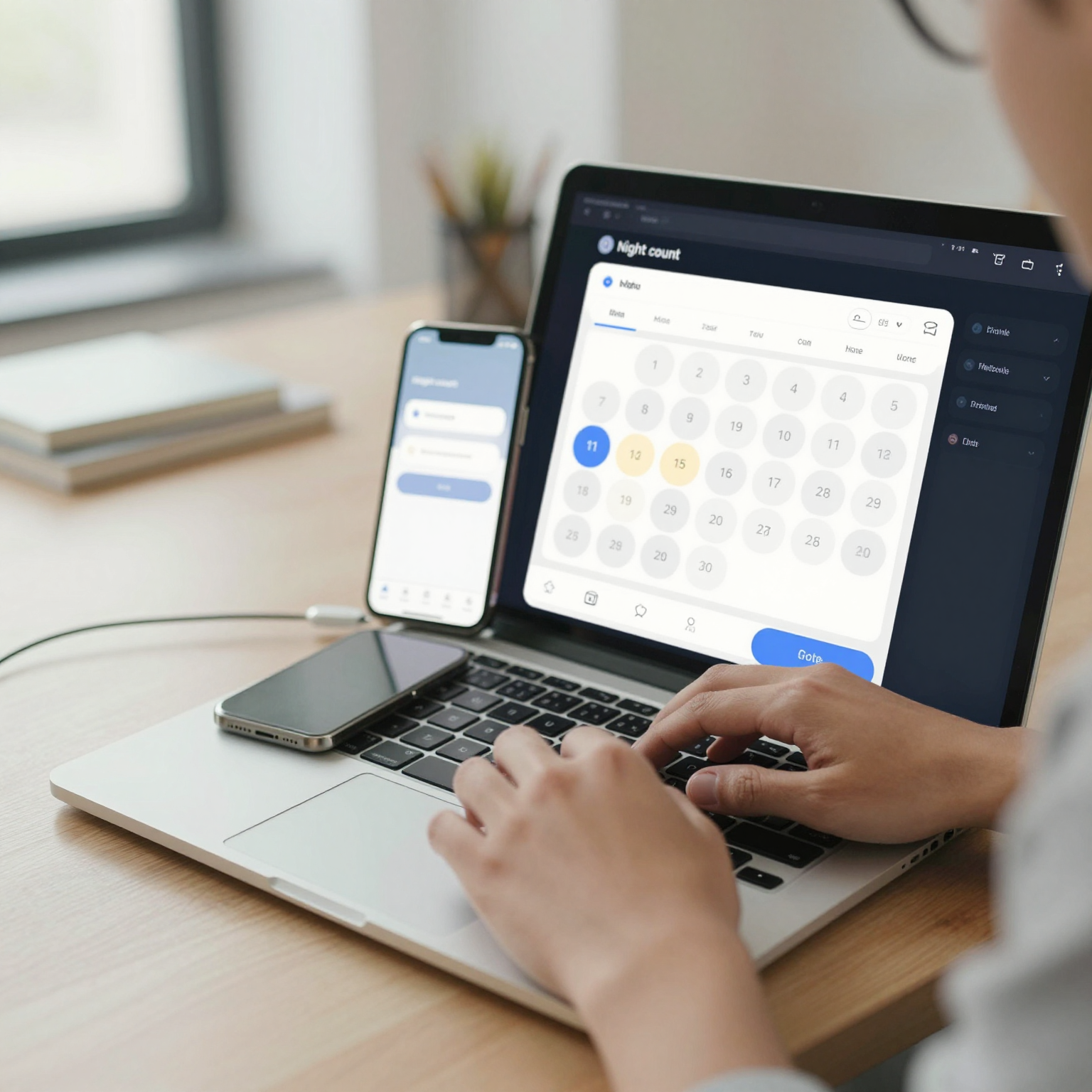
A date picker feels native when its interaction model matches how people already think about the task, not when it simply uses platform-standard components. For a single-day appointment, that's a scrollable list of the next 14-30 days with time slots grouped underneath — closer to how someone mentally schedules a haircut than a full month grid ever is. For a date range (hotel stays, car rentals, project timelines), it's a two-tap start/end selection with the range highlighted live as the second tap approaches, plus a running count like "3 nights" so users get instant confirmation their selection means what they think it means.
This is where design tokens matter more than people expect. A design token is a named, reusable value — a specific shade of blue, a corner radius, a spacing unit — stored once and referenced everywhere, so that "selected date" always renders with the same highlight color and radius across every screen in the app instead of being redefined by hand each time a developer builds a new picker instance. When a date picker is built from the same token set as the rest of the app's design system (the shared library of components, colors, and rules that keeps a product visually and behaviorally consistent), it stops looking like a bolted-on library and starts looking like it was born there.
How should you handle constraints like blackout dates and minimum stays?
You should encode constraints — blackout dates, minimum/maximum stays, lead-time requirements — into the data model before a single pixel of the calendar gets designed, because a picker that enforces rules visually needs to know those rules exist at the schema level first. A data model is the structure that defines what information your app tracks and how those pieces relate — in a booking app, that's the relationship between a service, a provider's working hours, existing bookings, and any blackout windows. If that relationship isn't defined clearly, the calendar UI has nothing real to filter against, and you end up hardcoding logic that breaks the first time a provider changes their hours.
Dolfy's Design OS runs this as its second of five stages, specifically because getting the data model right before Screen Design means the calendar component that eventually gets exported already knows which dates are legally selectable. Founders using Dolfy typically move from a rough idea to a clickable, production-ready component set — including scheduling flows like this — in a matter of days rather than the multi-week cycle of hand-off between a designer in Figma or Sketch and a developer translating comps into React Native or SwiftUI by eye.

Should you build a custom date picker or extend the platform default?
You should extend the platform default whenever your task is genuinely generic — a birthdate field, a form asking "when did this happen" — and build a custom component whenever the date carries business logic, like availability, pricing, or ranges. The mistake most teams make is applying one answer to both cases: either over-engineering a custom picker for a simple birthdate field (wasted weeks) or under-engineering a generic grid for a booking flow with real availability constraints (lost conversions).
A practical litmus test: if selecting a date can ever be "wrong" in a way the user can't see just by looking at the calendar, you need a custom component that surfaces that constraint visually. If every date is equally valid, the platform default is not just acceptable — it's the right choice, because it inherits accessibility support, VoiceOver/TalkBack labeling, and platform-consistent behavior for free, something a hand-rolled picker has to rebuild from scratch and often gets wrong on the first two or three attempts.
Frequently Asked Questions
Do I need a custom date picker if I'm just building an MVP?
Not necessarily. If your minimum viable product's date field doesn't carry availability logic — a signup form's birthdate, for example — the platform default is faster to ship and already accessible. Save the custom build for the version where date selection actually drives revenue, like a booking or subscription flow.
What's the difference between a wireframe and a working date picker component?
A wireframe is a low-fidelity sketch of a screen's layout, used to agree on structure before visual design happens. A working component is the actual production code — in Dolfy's case, a React Native/Tailwind component with TypeScript types — that renders, responds to taps, and enforces the real constraints from your data model, not just a picture of what a calendar could look like.
How much does a broken date picker actually cost in lost bookings?
It varies by app, but usability research on scheduling flows consistently shows double-digit percentage drop-off concentrated at date-and-time-selection screens, often more than any other single step in the funnel. Even shaving one unnecessary tap or one ambiguous state out of that screen tends to show up in completion rates within the first week of shipping the fix.
Can Dolfy generate a date picker component directly from a description?
Yes — within Dolfy's Design OS, the Screen Design stage produces production-ready components, including scheduling and calendar interfaces, exported as React Native and Tailwind code with TypeScript types attached, so the component you preview in Expo Go is the same one your team ships, not a comp that still needs translating into code.
Getting the small screens right is what makes an app feel finished
It's tempting to spend all your early design energy on the screens that feel important — the dashboard, the onboarding flow, the paywall — and treat the date picker as a five-minute afterthought because "the OS gives you one for free." But users don't experience your app as a collection of important screens and unimportant ones; they experience it as a sequence, and a single confusing calendar grid at step four can undo everything the first three screens got right. Getting utility screens like this correct, with real constraints reflected in the UI and consistent design tokens carried through from your broader system, is often what separates an app that feels genuinely finished from one that feels like a collection of borrowed parts. That's the gap Dolfy is built to close — turning a five-step Design OS process into production-ready screens, calendars included, before a single line of throwaway code gets written.