The Delete Button Dilemma: Designing Confirmation Dialogs Users Actually Trust
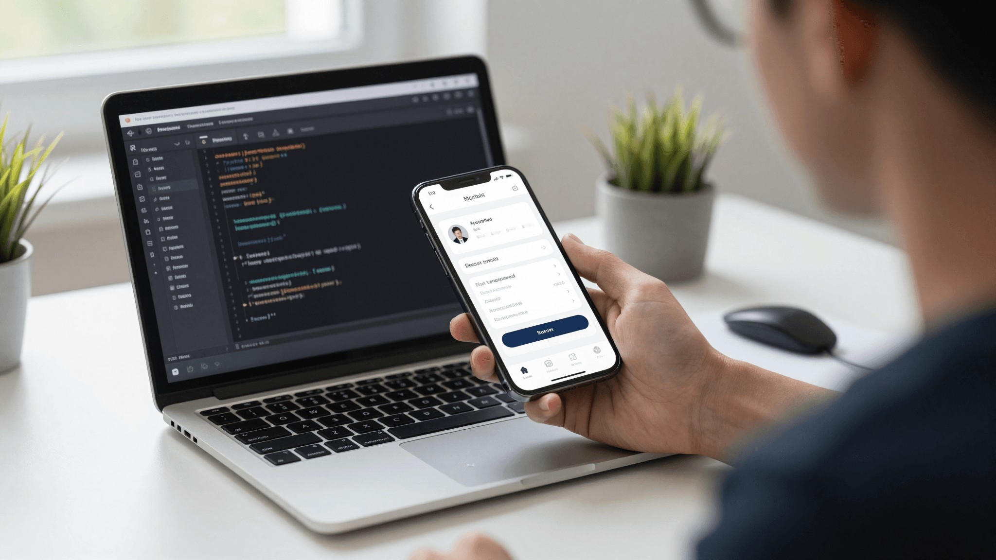
A support ticket comes in from a user who just lost a week of work because they hit a delete button that didn't ask twice. Your team spends the next two hours in Slack arguing about whether the fix is a confirmation dialog, an undo button, or both — and realizes nobody ever actually designed this pattern on purpose, it just got added the day someone complained. If you're building a mobile app, this moment is almost guaranteed to happen, and it's exactly the kind of overlooked interaction that Dolfy.ai was built to help founders and developers get right the first time, before a single angry email forces the redesign.
Confirmation dialogs and other guardrails around destructive actions — deleting an account, removing a payment method, discarding a draft — sit in an odd spot in mobile app design. They're rarely the feature anyone gets excited to build, so they're rarely designed with the same care as onboarding screens or paywalls. But they're also one of the fastest ways to either earn a user's trust or lose it in a single tap.
Key Takeaways
- A confirmation dialog only builds trust when it's used sparingly — teams that add "Are you sure?" to every action train users to tap through without reading, which defeats the entire purpose.
- Reversible actions (like archiving or discarding) are usually better solved with an undo pattern than a modal interruption; irreversible ones (like permanently deleting an account) usually need the interruption.
- The wording on the confirm button matters more than the wording of the question — a button labeled "Delete Account" outperforms a generic "Yes" because it restates the consequence at the exact moment of commitment.
- Destructive-action patterns belong in your design system as a reusable component, not a one-off screen, so every delete, remove, and discard flow in your app behaves consistently.
- Dolfy's Design OS treats confirmation and undo patterns as part of the Design Foundation step, so they're defined once — as design tokens and reusable components — rather than improvised screen by screen.
Why Do Confirmation Dialogs Feel Like an Afterthought?
Confirmation dialogs feel like an afterthought because they usually are one — most teams build the primary flow first (adding a task, uploading a photo, sending a message) and only think about the destructive counterpart, like deleting that task or photo, once a real user does it by accident. By then, the dialog gets bolted onto an existing screen instead of being planned alongside it as part of the same interaction.
This is a sequencing problem more than a design-skill problem. When Product Definition (the first step in Dolfy's 5-step Design OS methodology, where a founder defines the app's core screens and user flows before any pixels get drawn) happens without mapping the "undo" side of every "do" action, teams end up retrofitting confirmations under deadline pressure. A dialog written in twenty minutes the night before a release rarely gets user-tested copy, consistent button order, or a design token tying it to the rest of the interface.
When Should You Actually Interrupt the User With a Confirmation?
You should interrupt with a confirmation dialog only when the action is destructive and hard or impossible to reverse — deleting an account, permanently removing payment data, or wiping local files fall into this category. If the action can be undone within a reasonable window, a confirmation dialog is often the wrong tool entirely.
A useful gut check: ask whether restoring the previous state costs the user more than a few seconds of frustration. Deleting a single to-do item from a list usually costs almost nothing to undo — a toast notification with an "Undo" link for 5-8 seconds solves it without a single modal. Deleting an entire project with 40 linked tasks is a different story; there, a modal that names exactly what's being lost ("This will permanently delete 'Q3 Launch' and its 40 tasks") earns its interruption. Teams that apply a confirmation dialog to both situations equally end up training users to tap "Confirm" reflexively, which quietly erases the safety net the dialog was supposed to provide in the first place.
What Makes a Confirmation Dialog Trustworthy Instead of Annoying?
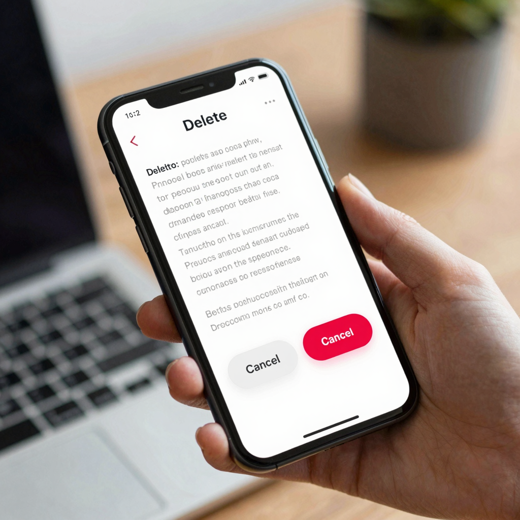
A trustworthy confirmation dialog names the specific consequence instead of asking a generic question, and it makes the safe choice (usually "Cancel") the visually default option. "Are you sure?" tells the user nothing they didn't already know; "This will permanently delete your 12 saved recipes — this can't be undone" tells them exactly what's at stake and lets them make an informed choice in under two seconds of reading.
Button order and labeling carry more weight than most teams expect. Replacing a generic "Yes / No" pair with an explicit "Delete Account / Keep Account" pair restates the outcome directly on the button the user's thumb is about to hit — no need to scroll back up to the question to remember what they're agreeing to. Placement matters too: on iOS and Android alike, keeping the destructive action visually distinct (often in a warning color, never the app's primary brand color) prevents the classic mistake of a user hitting "Delete" because it happened to sit in the button position they habitually tap to confirm.

How Do You Design Undo as an Alternative to "Are You Sure?"
You design undo by giving the user a short, visible window to reverse an action immediately after it happens, instead of asking permission before it happens. A snackbar (a small, temporary message bar, usually anchored to the bottom of the screen) that reads "Task deleted — Undo" and stays on screen for several seconds lets people move fast without a modal ever blocking their flow.
This pattern works because it matches how people actually behave: most destructive actions are intentional, and interrupting every one of them with a dialog optimizes for the rare mistake at the cost of everyone else's speed. Undo flips that trade-off — the 95% of users who meant to delete something aren't slowed down at all, while the 5% who tapped the wrong item get a few seconds to catch it. The cost is a small amount of engineering complexity: the underlying data typically needs a short-lived "soft delete" state rather than an immediate, permanent removal, so the undo action has something real to restore.
How Should Confirmation Dialogs Fit Into Your Design System?
Confirmation dialogs and undo patterns belong in your design system (the shared set of reusable components, colors, type styles, and rules that keep an app visually and behaviorally consistent) as first-class components, not as one-off modals recreated by whichever developer happens to build a given screen. Without that consistency, one delete flow in the app might use a red button on the right, another might use it on the left, and a third might skip the confirmation step entirely.
This is where design tokens (named, reusable values — like a "destructive-action-color" or "dialog-corner-radius" — that keep visual decisions consistent across every screen instead of being hardcoded per component) earn their keep. Dolfy's Design Foundation step generates exactly this kind of token system alongside production-ready React Native and Tailwind CSS components with TypeScript types, so a "ConfirmDestructiveAction" component built once gets reused everywhere a delete, remove, or discard flow shows up — rather than every screen improvising its own version, with its own bugs and its own inconsistent copy.
Frequently Asked Questions
Should every destructive action have a confirmation dialog?
No. Reversible or low-stakes actions are usually better served by an undo pattern like a snackbar, which lets users move quickly while still offering a safety net. Reserve modal confirmations for actions that are permanent or expensive to reverse, like deleting an account or losing significant unsaved work.
What should the buttons on a confirmation dialog say?
Use specific, consequence-restating labels instead of generic "Yes/No" or "OK/Cancel" pairs. A button that says "Delete Photo" instead of "Yes" removes any ambiguity about what tapping it will actually do, especially for users who are scanning quickly rather than reading every word.
How long should an undo window stay open?
Most mobile apps use somewhere between 4 and 8 seconds for a snackbar-style undo prompt — long enough to notice and react, short enough that the interface doesn't feel cluttered or stuck waiting. If the action involves something the user is likely to want to double-check (like a bulk delete of many items), extending the window slightly is reasonable.
Can I prototype this pattern before writing any code?
Yes — the goal should be testing the wording, button order, and timing before a single line of production code exists. Tools like Dolfy's Expo Go and Web Preview let you tap through a working prototype of a confirmation flow on an actual phone, so you can catch a confusing button order in minutes instead of after a support ticket.
Getting Destructive Actions Right the First Time
Confirmation dialogs and undo patterns will never be the flashiest part of your app, but they're one of the clearest signals to a user about whether your team sweats the details. A generic "Are you sure?" dialog reused across a dozen unrelated flows says the opposite of what a specific, well-placed "Delete Account — this can't be undone" button says, even though both took roughly the same five minutes to build.
The difference comes down to treating these patterns as part of your app's foundation instead of an emergency patch. That's the thinking baked into Dolfy's Design OS: define the destructive-action pattern once, as a proper component with its own design tokens, and every delete, remove, and discard screen in your app inherits the same trustworthy behavior — no more reinventing the confirmation dialog under deadline pressure, and no more losing a user's trust over a single tap.