
Why Your App Looks Like Five Different Apps: The Design Token Problem
You open your app after a sprint of shipping new screens, and something feels off. The buttons on the profile page are a slightly different blue than the buttons on the checkout page. The corner radius on your cards is 8px in one place and 12px in another. Spacing between list items is 16px here, 14px there. Nobody changed any of this on purpose — it just happened, one screen and one pull request at a time. If you've ever caught your own app looking like it was stitched together by five different designers, you've met the design token problem, and it's one of the quieter reasons early-stage apps feel unpolished even when every individual screen looks fine in isolation. This is the exact gap Dolfy, an AI-powered mobile app design platform from AEGONTECH LLC, was built to close for founders and developers who don't have a design system team to catch this drift for them.
Key Takeaways
- Visual drift between screens usually isn't a taste problem — it's a missing systems problem: no single source of truth for color, spacing, type, and radius values.
- A design token system replaces hardcoded values (like
#3B82F6or16px) with named, reusable references (likecolor.primaryorspacing.md) that every screen pulls from. - Retrofitting tokens onto an existing app is possible but expensive; defining them before the first screen is designed is dramatically cheaper.
- Dolfy generates a token system as part of its Design Foundation step, before any screen design happens, so consistency is structural rather than something you enforce by memory.
- Token-first workflows also make design-to-code handoff faster, because exported components (React Native, Tailwind CSS, TypeScript) reference the same tokens the designs used.
Why Does Every Screen in Your App Feel Like It Was Designed by a Different Person?
It usually comes down to one root cause: there was never a single, enforced source of truth for the small decisions — exact colors, spacing increments, font sizes, corner radii — that make up a screen. Each time someone (often a solo founder moving fast, or a contractor picking up work mid-project) builds a new screen, they eyeball the last screen, guess at a hex code or a pixel value, and move on. Multiply that across 20 or 30 screens and the app accumulates dozens of near-duplicate values that are all "close enough" but never identical. A user might not be able to name what's wrong, but they'll feel it — inconsistency reads subconsciously as unfinished or untrustworthy, which matters enormously when you're asking someone to trust your app with their payment details or personal data.
This is especially common for indie hackers and small startup teams building with React Native, Flutter, or SwiftUI, because these frameworks make it trivially easy to hardcode a value directly in a component and ship it. There's no framework-level guardrail stopping you from writing backgroundColor: '#3B82F6' in one file and backgroundColor: '#3A82F5' in another — a one-pixel-off difference in a hex code that no code reviewer will ever catch by eye.
What Exactly Is a Design Token, and Why Does It Matter More Than a Style Guide?
A design token is a named variable that stores a single design decision — a color, a spacing value, a font size, a border radius, a shadow — so that every screen and component references the name instead of the raw value. Instead of writing #3B82F6 forty times across your codebase, you define color.primary once and every button, link, and icon that needs that blue points to that one token. Change the token, and every instance updates together, instantly, everywhere.
A style guide is a reference document — something a designer might consult. A token system is enforced at the code level: it's not a suggestion, it's the only value that exists for that decision. That's the difference between "we try to be consistent" and "it's structurally impossible to be inconsistent." Most functioning token systems organize around five core categories: color, spacing, typography, radius, and elevation (shadow). Even a lean system with 30-40 total tokens across those five categories is enough to cover most of a typical app's UI — far fewer decisions than the 200+ raw values that tend to accumulate in an untokenized codebase after a few months of shipping.
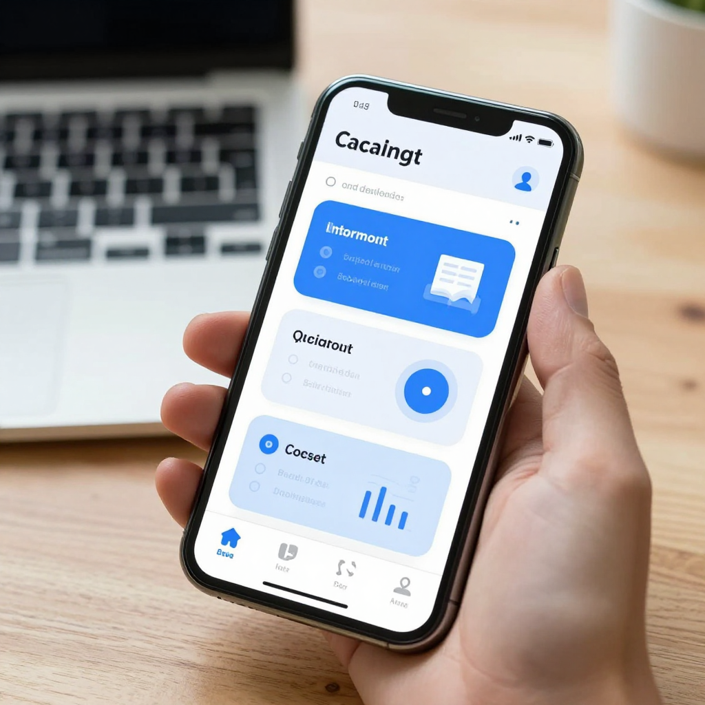
How Do Design Tokens Prevent the Drift That Happens Between Design and Code?
They prevent it by making the design file and the shipped code reference the exact same named values, instead of a human eyeballing a Figma frame and re-typing approximate numbers into Xcode or VS Code. Drift almost always happens at the handoff point — the moment a design decision has to be manually translated from a design tool into a codebase. Every manual translation is a chance for a value to get slightly mistyped, rounded, or "close enough"-ed.
This is where Dolfy's methodology differs from a typical Figma-to-code workflow. Dolfy's 5-step Design OS — Product Definition, Data Model, Design Foundation, Screen Design, and Export — puts the token system into the Design Foundation step, before a single screen is drawn. Every screen generated after that point pulls from the same token set by construction, and the final Export step produces production-ready React Native and Tailwind CSS components with TypeScript types that reference those same tokens directly. There's no re-typing step where drift can sneak in, because the numbers a developer sees in the exported component are the same numbers the screens were designed with.
Can You Retrofit a Token System Onto an App You've Already Built?
Yes, but it's meaningfully more expensive than starting with one, because retrofitting means auditing every existing screen, cataloging every value currently in use, deciding which near-duplicates should collapse into a single token, and then replacing every hardcoded reference across the codebase without visually breaking anything. For a small app with a dozen screens, this is a focused few days of work. For an app that's grown past 40-50 screens without any token discipline, it can easily become a multi-week cleanup project, and teams often deprioritize it indefinitely because it doesn't ship a new feature — it just makes the existing ones look right.
This is the practical argument for defining tokens before Design Foundation work starts rather than after: the cost of consistency is roughly fixed and small if you pay it up front, and grows with every new screen you ship if you defer it. If you're a solo founder or small team validating an MVP (minimum viable product — the smallest version of your app that still tests your core idea with real users), it's tempting to skip this step because it feels like polish rather than progress. In practice it's closer to infrastructure: invisible when it's there, expensive to add later.
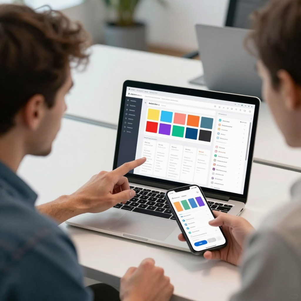
What Does a Token-First Workflow Actually Look Like From Idea to Shipped Screen?
It looks like defining the small set of reusable values before any screen exists, then having every subsequent design and code artifact reference that set rather than reinvent it. Concretely, in Dolfy's workflow that means: Product Definition clarifies what the app needs to do, Data Model maps out the entities and relationships the screens will need to display, Design Foundation establishes the token system (color, spacing, typography, radius, elevation) alongside broader design-system choices, Screen Design generates individual screens built entirely from those tokens, and Export hands off production-ready components. A founder can preview the result on a real device through Expo Go or in a browser via Web Preview before a single line of custom code is written.
The practical payoff shows up twice: once during design, when every new screen already looks consistent with the ones before it because there's nothing else it could pull from, and again during development, when a developer implementing the exported components isn't guessing at values — they're using the same TypeScript-typed tokens the design was built on. That second payoff is often underestimated by non-designers: a design system doesn't just make things look better, it removes an entire category of back-and-forth between design and engineering about "what's the exact value here."
Frequently Asked Questions
Do I need a large design team to use a token system?
No — token systems are actually more valuable for solo founders and small teams, since there's no one else around to manually catch inconsistency before it ships. A well-defined set of 30-40 tokens covers most app needs and takes far less ongoing effort to maintain than eyeballing consistency screen by screen.
Will design tokens work with the framework I'm already using?
Token systems are framework-agnostic in concept — they're just named values — but how they get implemented depends on your stack. Dolfy exports tokens as part of React Native and Tailwind CSS components with TypeScript types, so developers working in that stack get typed, autocomplete-friendly references rather than raw strings to memorize.
Isn't this just what a Figma design system or component library already does?
Tools like Figma can store reusable styles, and that's a meaningful step up from nothing, but the value only holds if the code implementation stays in sync with the design file — and that sync is usually manual. A token-first approach like Dolfy's ties the design and the exported code to the same underlying values from the start, rather than relying on a developer to keep translating one into the other correctly over time.
How long does it take to set up a token system for a new app?
Within Dolfy's workflow, token definition happens as part of the Design Foundation step, which is designed to take a fraction of the time a manual audit-and-standardize process would take on an existing app, precisely because there's no existing inconsistency to reconcile — the tokens are the starting point, not a retrofit.
Building an App That Looks Like One App
Consistency isn't a nice-to-have you add once you have time — it's a structural property of how a codebase gets built, and it's far cheaper to bake in from the first screen than to bolt on after the twentieth. Whether you're a solo indie hacker validating your first MVP or a small startup team scaling past your original prototype, a token-first foundation means every new screen you or a contractor ships inherits consistency automatically instead of depending on someone remembering the exact shade of blue. That's the problem Dolfy's Design Foundation step is built to solve before it ever becomes a problem worth noticing — turning "does this look like one app?" into a question you never have to ask. If you want to see what a token-first Design OS looks like in practice, Dolfy walks through the full path from product definition to exported, production-ready components.