The Empty State Problem: Why Your App's First Screen Looks Broken to Every New User
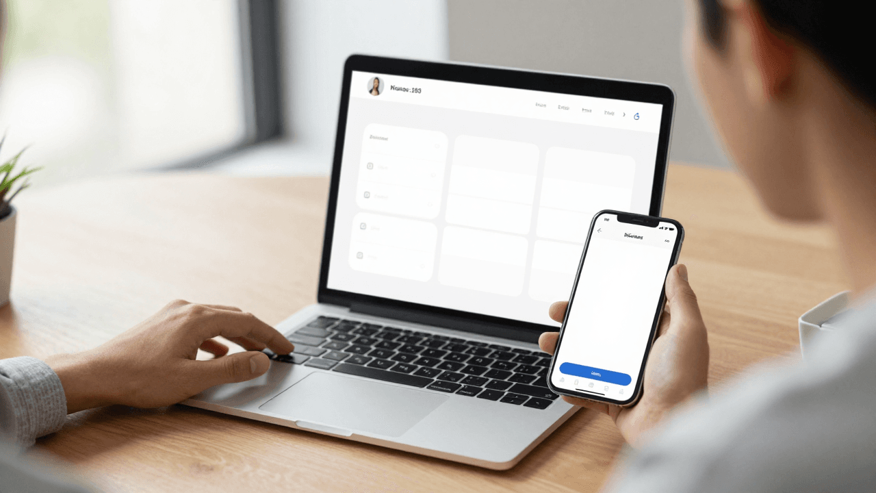
You open your freshly built app for the first time as a brand-new user, and the main screen is a big white rectangle with a tab bar underneath. No list, no hint, no button. You wonder whether the app is broken, whether the data failed to load, or whether you are supposed to know something you do not. Real new users feel exactly that, and most of them close the app within seconds. The screen they saw was not broken. It was simply empty, and nobody designed it. In this guide, we will look at why that happens and how Dolfy (Dolfy.ai) approaches the problem so your first-run screens work from day one.
Key Takeaways
- An empty state is any screen that has no content yet, and every list, feed, and dashboard in your app has one.
- Every new user sees your empty states before they see anything else, so they are your real first impression.
- A good empty state does three jobs: it explains what belongs here, shows why it matters, and offers one clear next action.
- Defining your data model early tells you exactly which screens can be empty and when.
- Reusable components and design tokens let you build one empty state pattern and apply it everywhere in minutes, not days.
What Is an Empty State, and Why Do Most Apps Get It Wrong?
An empty state is the version of a screen that appears when there is no data to show yet. Think of a task list before the first task, a messages tab before the first conversation, or an order history for someone who has never bought anything. Most apps get it wrong because developers build screens with data in mind: you test with sample records, the list looks great, and the zero-record case never gets a second thought.
The result is a blank list view, a lone spinner that never resolves, or a technical message like "No items found." That wording works for a database query, but it tells a person nothing about what to do next.
The mistake is understandable. When you are a solo founder shipping an MVP (minimum viable product, the smallest version of your app that real people can use), every hour counts. Designing a screen that only appears once per user feels like a luxury. But think about the math: if your app gets 1,000 installs and 25 percent of them hit an empty screen on day one, that is 250 people whose first real impression is a blank page.
Which Screens in Your App Can Actually Be Empty?
Almost every screen that displays a collection can be empty, and the quickest way to find them is to look at your data model. A data model is the plan for what information your app stores and how the pieces relate, such as users, projects, tasks, and comments.
For each type of record, ask one question: "What does the user see before the first one exists?" A typical small app has between 4 and 8 collections, and each one maps to a list, a feed, or a dashboard panel that can be empty.
There are also three distinct kinds of empty, and they need different treatment:
- First-use empty: the user has never created anything. This is a chance to teach.
- Cleared empty: the user finished everything, such as an empty inbox. This is a chance to celebrate.
- No-results empty: a search or filter returned nothing. This is a chance to help the user adjust.
Treating all three as the same "nothing here" message is the most common design shortcut, and it wastes opportunities in each case.
What Should an Empty State Actually Say?
A strong empty state answers three questions in plain language: what goes here, why would I want it, and what do I do first. The first sentence should name the thing, not the absence of it. "Your projects will show up here" is better than "No projects."
Then add a single primary action. A button labeled "Create your first project" gives users momentum, while a paragraph of instructions asks them to do the work of figuring out the next step. Keep the copy under 20 words where you can, and avoid blaming the user with phrases like "You have not added anything."
An illustration or icon helps, but it is optional. What is not optional is hierarchy: one headline, one line of supporting text, one button. If you add a second button, you have turned a clear path into a decision, and decisions slow down new users.

How Do Empty States Connect to Design Systems and Design Tokens?
Empty states are a perfect test of whether your design system is real. A design system is a shared set of rules and reusable parts, such as colors, spacing, type sizes, and components, that keeps every screen consistent. If each empty state is hand-built, you will end up with six slightly different versions by the time you ship.
Design tokens are the named values behind that consistency: for example, a spacing value called "space-6" instead of a raw number, or a color called "text-secondary" instead of a hex code. When your empty state component uses tokens, changing your brand color or spacing scale updates every empty screen at once.
A reusable empty state component usually needs just four slots: an icon or image, a headline, a supporting line, and an optional action button. Build it once in React Native (a framework for building iOS and Android apps with JavaScript and TypeScript) and style it with Tailwind CSS utility classes, and it can serve every list in your app. That is the kind of component architecture, meaning how you divide UI into small reusable pieces, that keeps a small team fast.
How Does Dolfy Help You Design Empty States Early?
Dolfy.ai guides you through a 5-step Design OS methodology: Product Definition, Data Model, Design Foundation, Screen Design, and Export. The order matters for empty states, because the second step is the one that exposes them.
When you define your data model, you list the entities your app stores. Each entity that appears in a list is a screen that will be empty at first. Seeing that list early means you can plan the empty version alongside the populated one, instead of discovering the gap in a bug report three weeks after launch.
In the Design Foundation step, you set up the design-token system that your screens draw from. In Screen Design, you lay out each screen, including the first-run version. At the end, Export produces production-ready React Native and Tailwind components with TypeScript types, which are labels that describe the shape of your data so your editor can catch mistakes before the app runs. You can also check how the screens feel using Expo Go, a free app that runs your project on a real phone, or the Web Preview.
Nothing here replaces your judgment about the copy. Dolfy gives you the structure and the components, and you decide what your product should say to a brand-new user.
What Does a Good First-Run Empty State Look Like in Practice?
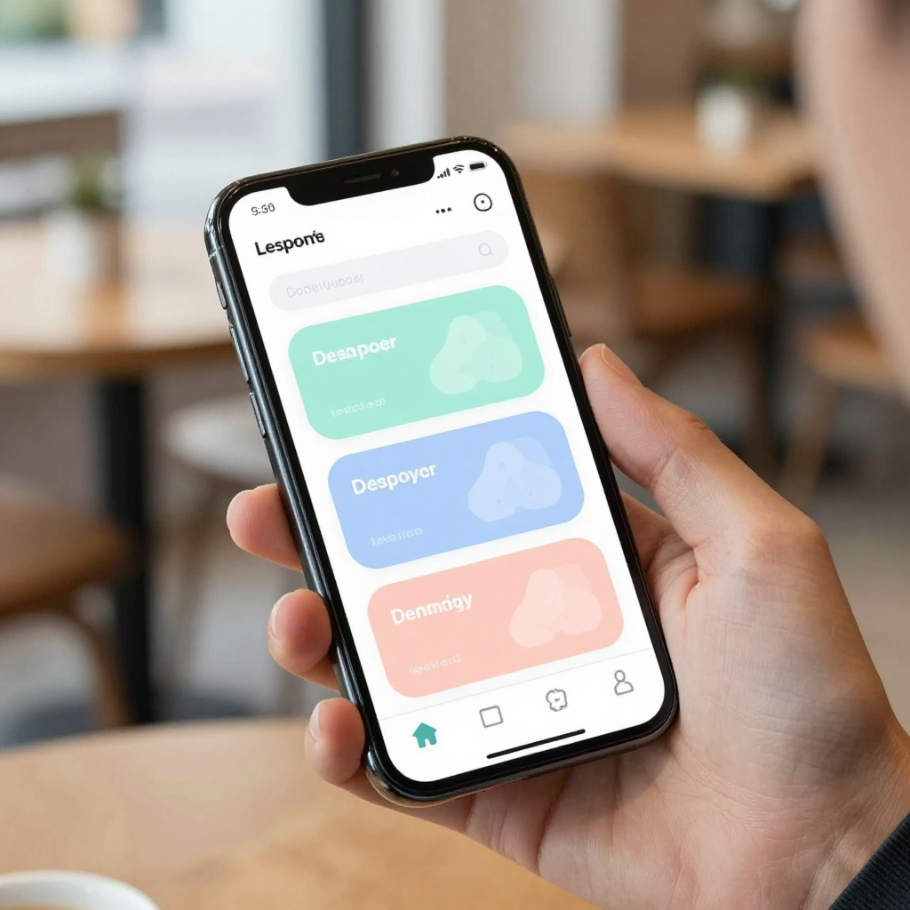
Picture a habit-tracking app. A weak empty state shows a blank screen with the text "No habits." A strong one shows a simple icon, the headline "Build your first habit," one supporting line such as "Start with something small, like a 2-minute walk," and a single button: "Add a habit."
Now apply that to a cleared state. When the user completes every habit for the day, swap the button for a short message of congratulations and a hint about tomorrow. And for no-results, a search for "gym" that finds nothing could say, "Nothing matches 'gym.' Try a different word or add it as a new habit."
Notice that all three share the same layout: icon, headline, supporting line, action. Only the content changes. That is why a single component with tokens is so efficient. You might spend 30 to 45 minutes on the component and then reuse it across 5 or 6 screens.
How Can You Test Empty States Before Launch?
Testing is simple and almost nobody does it. Create a brand-new account on a clean install and walk through every tab with zero data. Do this on a small phone and a large one, and again with the system text size increased, because empty layouts often break when text grows.
Next, test the slow and failed paths. A screen that is empty because data is still loading should show a loading indicator, not an "add your first item" prompt. Showing the wrong state is worse than showing none, because it tells users to do something they cannot do yet. Keep three states separate in your code: loading, error, and empty.
Finally, ask one person who has never seen your app to open it and tell you, out loud, what they think each screen is for. If they hesitate on an empty screen for more than 5 seconds, the copy or the action needs work.
Frequently Asked Questions
Do I need an illustration for every empty state?
No. A simple icon or even just text can work if the headline and action are clear. Illustrations add personality, but a missing image never hurts as much as a missing next step. Start with the text and the button, then add visuals once the structure is solid.
Should empty states include onboarding tips?
Keep them short. One supporting line is usually enough, and the main goal is to guide the user to the first action. If you need more explanation, link to a short guide instead of filling the screen with text. Long instructions on an empty screen tend to be skipped.
How is an empty state different from an error state?
An empty state means everything worked but there is no data yet. An error state means something failed, such as a lost connection. They need different wording and different actions: empty states invite creation, while error states offer a retry. Mixing them confuses users about whether they did something wrong.
Can I design empty states if I am not a designer?
Yes. The pattern is simple enough that a technical non-designer can follow it: icon, headline, supporting line, one button. Use a consistent set of design tokens for spacing and color, and your screens will look intentional even without a design background.
Turn Your First-Run Screens Into Your Best Screens
Empty states are small, but they carry outsized weight because every single user meets them first. Plan them when you define your data model, build one reusable component, drive it with design tokens, and test with a clean account before every release. If you want a structured way to do all of that, from product definition through to exported React Native components, take a look at Dolfy and see how the 5-step Design OS can help you ship screens that welcome new users instead of confusing them.