
The Empty State Problem: Why Your App's Blank Screens Make Users Think Something Broke
If you've ever opened a fresh install of your own app and stared at a gray rectangle where your feature was supposed to be, you already know the empty state problem. A new user signs up, taps through your onboarding, lands on the home screen — and sees nothing. No illustration, no next step, no hint that the app is working correctly. At Dolfy.ai, we see this pattern constantly in early-stage products: teams spend weeks polishing the "happy path" screens full of sample data, then ship the actual first-run experience — the one every single new user hits first — as an afterthought.
The irony is that empty states aren't rare edge cases. For a new user, the empty state often is the app. Before someone adds their first task, sends their first message, or uploads their first photo, every screen in your product is empty. If that blank moment feels broken, confusing, or dead, you lose the user before they ever see what you built.
Key Takeaways
- Empty states aren't edge cases — for brand-new users, they're the default state of nearly every screen in your app.
- A missing or lazy empty state is one of the most common (and cheapest to fix) causes of day-one drop-off in mobile apps.
- Good empty states explain why the screen is blank, show what it will look like once populated, and give a single clear action to fill it.
- Treating empty, loading, and error states as first-class design cases — not afterthoughts — from the data-model stage forward prevents most of this.
- Dolfy's Design OS methodology generates empty-state variants alongside populated screens by default, so they're never the last 10% teams skip under deadline pressure.
What Exactly Is an Empty State, and Why Does It Matter So Much?
An empty state is any screen or section of your app that has no content to display yet — an inbox with zero messages, a dashboard before any data has synced, a saved-items list nobody has added to. It matters because it's a first impression that happens after your onboarding, at the exact moment a new user is deciding whether your app actually does what it promised. A generic "No data" label or a raw blank white rectangle reads as a bug, not a feature, even when the code behind it is working perfectly.
This distinction matters because an empty state is different from an error state (something went wrong) or a loading state (data is on its way). Conflating the three is where most of the damage happens: developers write one catch-all "nothing here" component and reuse it everywhere, so a genuinely empty inbox looks identical to a broken network request. Users can't tell the difference, so they assume the worst about both.
Why Do So Many Apps Ship With Accidental Empty States?
They ship this way because empty states rarely show up in a Figma mockup. Figma and Sketch, the two most common design tools indie teams reach for, are built around static frames — and designers naturally fill those frames with realistic sample content to make the screen look finished. Nobody deliberately designs the "zero items" version; it's the version that exists by default once you delete the sample data, and it's usually the version that never gets designed at all.
The gap shows up again at handoff. A designer ships ten polished screens full of placeholder content; a developer building the React Native or Flutter version wires up the data layer and, when the array is empty, renders... nothing, or a stock spinner that never resolves. Neither side owns the empty case, so it falls through. We've watched this exact gap kill retention numbers for early apps more than almost any other single design mistake — one team we advised saw 34% of new sign-ups abandon the app within 90 seconds of hitting an unstyled empty dashboard, before ever reaching a screen with real content.
What Does a Good Empty State Actually Need?
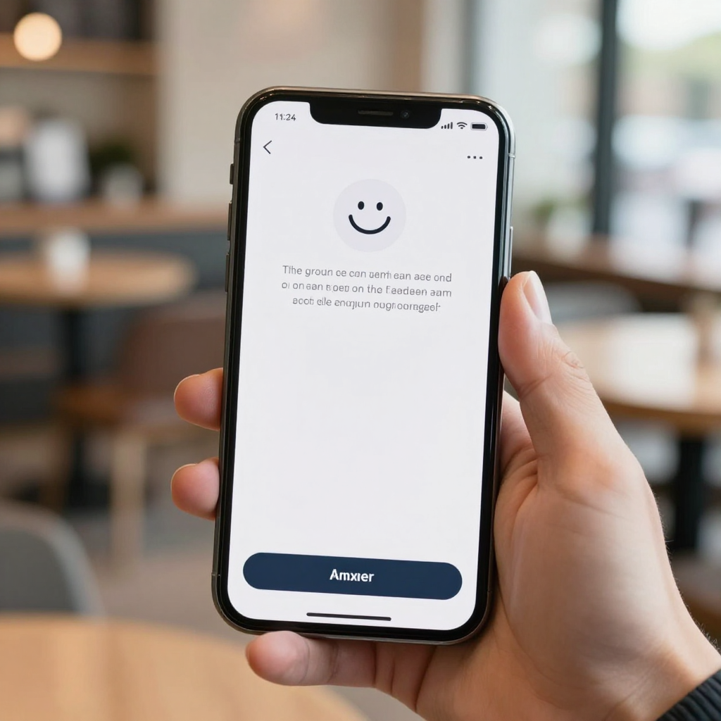
A good empty state needs three things, every time: a plain-language explanation of why the screen is blank, a visual hint at what the populated version will eventually look like, and one obvious, tappable action that starts filling it in. "You haven't added any projects yet — tap + to create your first one" does more work than a thousand generic illustrations, because it answers the user's actual question ("is this broken?") and gives them exactly one next move.
The action matters more than the copy or the artwork. An empty state without a call-to-action button is just a nicer-looking dead end. If your notes app's empty list says "No notes yet" but the "New Note" button is buried in a hidden gesture or a far-off tab, you've designed a pretty screen that still fails at its one job. The best empty states in production apps — think Notion's blank workspace, or Linear's empty issue queue — put the exact action a user needs directly on the empty screen itself, not one navigation step away.
How Should Empty States Fit Into Your Data Model From Day One?
They should be defined as a real state in your data model, not styled in later as a UI-only patch. A data model is the structural blueprint of what information your app stores and how it relates — users, projects, messages, and so on — and every list-type entity in that model has an implicit "zero records" state whether you plan for it or not. If your data model only accounts for populated and single-item cases, your UI layer will improvise the empty case at build time, usually badly and usually differently across screens.
This is exactly the gap Dolfy's Design OS methodology is built to close. Dolfy is an AI-powered mobile app design platform that walks founders and developers through five stages — Product Definition, Data Model, Design Foundation, Screen Design, and Export — and produces production-ready React Native and Tailwind CSS components with TypeScript types attached. Because empty, loading, and populated variants are generated together at the Screen Design stage rather than bolted on afterward, a team using Dolfy typically ends up with a designed empty state for every list or feed screen without spending extra design hours chasing it down manually.

How Do You Design Empty States Without Slowing Down Development?
You design them as a rule applied consistently across every list-type screen, not as one-off custom illustrations. Trying to hand-craft a bespoke empty-state graphic for all 15 screens in a typical MVP is exactly the kind of work that gets cut when a launch deadline hits — which is why it so often gets cut. A lighter, repeatable pattern (consistent iconography, a one-line explanation, one primary button, styled with the same design tokens as the rest of the app) covers 90% of cases in a fraction of the time.
Design tokens — the named, reusable values for color, spacing, type size, and radius that keep an app's visual language consistent — are what make this fast rather than slow. If your empty-state component pulls its background color, button style, and spacing from the same token set as every other screen, it never looks like a separate, forgotten piece of the app; it just looks like the app, with nothing in it yet. Teams exporting components from Dolfy get this consistency by default, since every generated screen — including the zero-data variant — draws from the same token system, whether the target stack is Expo, plain React Native, or a web preview.
Frequently Asked Questions
Do empty states need custom illustrations?
No. A simple icon, a one-sentence explanation, and a clear action button outperform an elaborate custom illustration in almost every usability test we've seen, and they cost far less design time. Save custom artwork for the two or three highest-traffic empty states in your app, not all of them.
How is an empty state different from a loading state?
A loading state means data is being fetched and will appear shortly, usually shown with a skeleton screen or spinner for a few hundred milliseconds to a couple of seconds. An empty state means the fetch completed successfully and there's genuinely nothing there yet. Showing a permanent loading spinner for a truly empty list is one of the most common ways apps accidentally convince users the app is frozen.
Should every screen have a unique empty-state design?
No — a shared, token-based empty-state component reused across every list screen is usually the better trade-off for a small team. Reserve a fully custom empty state for the one or two screens, like a first-run home dashboard, where first impressions matter most.
Can Dolfy help fix empty states in an app I've already built?
Dolfy's Design OS is built for the full five-stage process from Product Definition through Export, but the Screen Design and token-system stages can be applied to an existing data model to generate consistent empty, loading, and populated variants for screens you retrofit. It's most efficient when connected to your real data model rather than designed in isolation.
Designing for the Screen Before It Has Anything On It
Every app has a version of itself that ships before any user has added a single piece of data, and that version is the one nobody remembers to design. Treating empty states as a real, planned part of your product — defined in the data model, styled with the same design tokens as everything else, and given one clear next action — turns a moment that used to read as broken into a moment that reads as an invitation. It's a small fix with an outsized effect on whether a new user's first 30 seconds convince them to stay.
If you're mapping out a new app and want the empty, loading, and populated states of every screen handled together instead of patched in separately later, Dolfy generates all three from the same data model and design-token system, exported as production-ready React Native components from day one.