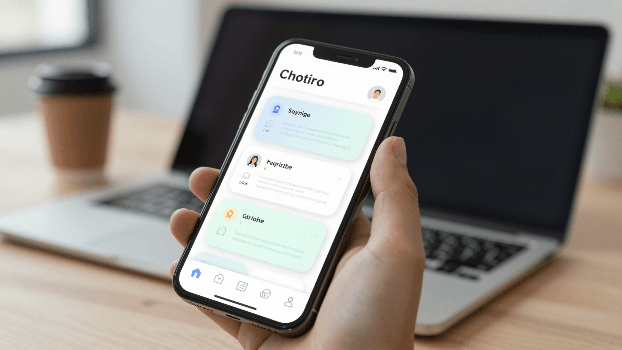
The Feature Discovery Problem: How to Teach Users New Features Without Annoying Them
You shipped the feature. Nobody used it. Three months later a support ticket asks "does your app do X?" — and X has been sitting behind a tab bar icon since launch. If you've built a mobile app, you already know this pain: teams spend weeks on a feature, ship it quietly, and watch adoption stay flat because users never discovered it existed. Dolfy.ai sees this constantly with the founders and indie hackers it works with — a beautifully built screen that nobody finds is functionally the same as a screen that was never built. Feature discovery, the design discipline of helping users notice and understand new or underused functionality, is one of the most overlooked parts of mobile UX, and it's rarely covered in the same breath as onboarding or navigation.
Key Takeaways
- Only around 20% of users ever complete a multi-screen onboarding tour, according to widely-cited mobile engagement benchmarks — which means most feature education has to happen after onboarding, in context.
- Coachmarks, tooltips, spotlight overlays, and simple badges each solve a different discovery problem; picking the wrong one creates annoyance instead of understanding.
- Timing matters more than copy — a hint shown 2-3 seconds after a relevant action lands better than one shown on app launch.
- Progressive disclosure, revealing complexity only as users need it, can eliminate the need for half your planned tooltips.
- Dolfy.ai treats discovery moments as a defined step inside its Product Definition phase, not a UI afterthought bolted on before ship.
Why Do Users Ignore Tooltips the Moment They Appear?
Users ignore tooltips because most apps show them at the wrong moment, competing with a task the user actually came to finish. A tooltip that pops up during onboarding, before someone has touched a single real feature, is asking for attention the user hasn't budgeted yet. Research on mobile engagement consistently shows first-session attention spans under 90 seconds for many consumer apps — every extra prompt in that window is a tax on the thing the user actually opened the app to do.
The fix isn't better copy, it's better timing. A tooltip explaining a filter feature should appear the first time a user opens a list with more than, say, 15 items — the exact moment filtering becomes useful — not on day one when their list is empty. This is the same principle behind good empty states and loading states: match the message to the user's actual context, not an arbitrary product-team schedule.
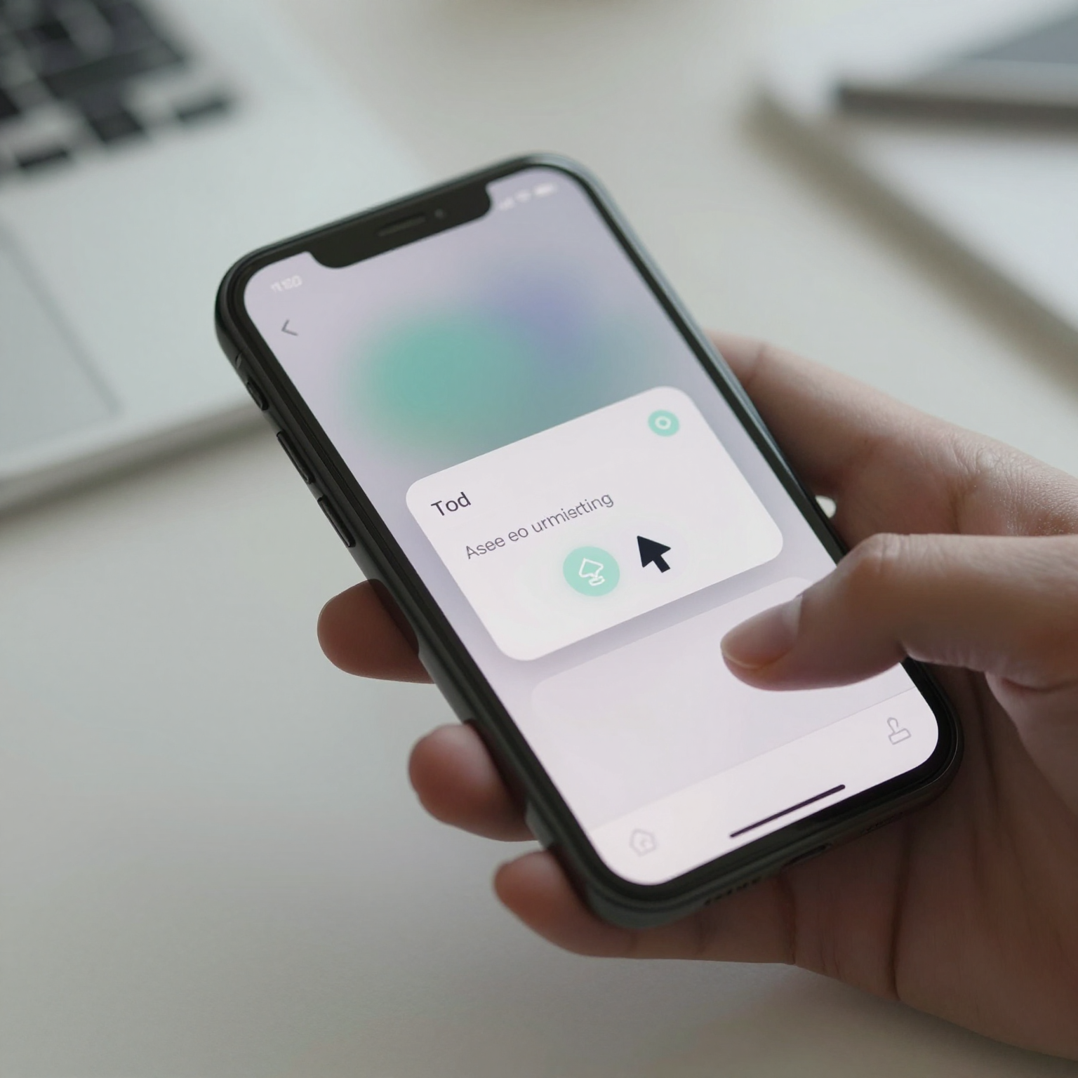
What's the Difference Between a Coachmark, a Spotlight, and a Badge?
These three patterns solve different problems and shouldn't be used interchangeably. A coachmark is a short annotated callout — usually an arrow plus one line of text — pointing at a specific UI element to explain what it does. A spotlight overlay dims the rest of the screen and highlights one element, forcing focus before the user can continue; it's the most intrusive option and should be reserved for genuinely critical, one-time explanations. A badge is the quietest option: a small dot or number on an icon signaling "something new lives here" without blocking any interaction at all.
A useful rule of thumb: badges for low-stakes discovery (a new settings option), coachmarks for medium-stakes explanation (a gesture the user needs to learn, like swipe-to-archive), and spotlights only for changes that would otherwise confuse or block the user (a moved navigation item, a new required step). Mixing these up — spotlighting a minor cosmetic change, for instance — is one of the fastest ways to train users to dismiss every prompt without reading it.
When Should a Feature Hint Appear During the User's Session?
A feature hint should appear immediately after the user takes an action that makes the hidden feature relevant, not on a fixed timer or app-open trigger. If someone just added their third item to a list, that's the moment to surface a "reorder by dragging" hint — not five seconds after login. This event-driven approach requires your data model, the underlying structure that defines what data your app stores and how pieces relate to each other, to actually track these trigger conditions: item counts, repeat actions, time-since-last-visit, and so on.
This is exactly the kind of decision Dolfy.ai's Design OS methodology pushes teams to make early, in the Data Model step, rather than retrofitting analytics events after a designer notices adoption is low. When the data model already tracks "user has added 3+ items," wiring a contextual hint to that condition takes an afternoon instead of a sprint.
How Do You Design a Tooltip That Doesn't Feel Like an Interruption?
A non-intrusive tooltip is dismissible in one tap, never blocks the primary action underneath it, and disappears permanently once acknowledged — reappearing tooltips are the single most common complaint in mobile UX feedback about onboarding flows. Keep the copy under roughly 12 words; anything longer reads as a wall of text users will skip rather than parse.
Visually, tooltips should use the same design tokens as the rest of your interface — the reusable, named values (colors, spacing, corner radius, typography scale) that keep an app looking like one coherent product instead of a patchwork. A tooltip with its own one-off drop shadow and font size looks like an ad, not a native product moment, and users' pattern-matching for "things to ignore" kicks in instantly. Dolfy.ai generates a token system as part of its Design Foundation step specifically so that supplementary UI like tooltips, toasts, and badges inherit the same visual language automatically, in React Native and Tailwind CSS-based components with full TypeScript types, rather than getting designed as an afterthought in Figma and drifting out of sync with the shipped app.

Can Progressive Disclosure Reduce the Need for Tooltips Altogether?
Yes — progressive disclosure, showing only the options relevant to a user's current step and revealing more as they advance, often eliminates the need to explain a feature at all, because the feature only appears once it's contextually obvious. A multi-step form that reveals "add a discount code" only after a cart has items doesn't need a tooltip pointing at a discount field; there was never an empty, confusing field to explain in the first place.
This is a genuinely underused strategy compared to tooltips, because it requires design decisions up front rather than a UI patch later. Teams using component-based frameworks like React Native, Flutter, or SwiftUI can implement this with conditional rendering tied to state, but the harder part is deciding, at the design stage, which features deserve to be hidden until relevant versus surfaced immediately with a hint. That's a product-definition question as much as a UI one — and it's cheaper to answer before a single screen is built than after 40 tooltips have shipped.
Frequently Asked Questions
How many tooltips is too many for a single screen?
More than one primary tooltip visible at once almost always overwhelms users — stack discovery moments sequentially instead, showing the next hint only after the current one is dismissed or its related action is completed.
Should feature discovery hints be dismissible forever, or can they reappear?
Reappearing after a single dismissal frustrates users and increases the odds they'll ignore future prompts entirely; track dismissal per user and per feature so each hint shows a maximum of once or twice, not indefinitely.
Does feature discovery apply to web apps and Expo-based previews too, or just native mobile?
The same principles apply everywhere, but timing tends to matter even more on mobile, where screen space is smaller and users have less patience for stacked overlays; teams previewing builds through tools like Expo Go or a web preview should test discovery hints on both a small phone viewport and a tablet-sized one before shipping.
What's a reasonable first metric to track for feature discovery success?
Track the percentage of users who interact with a feature within 7 days of it becoming relevant to them (not 7 days after app install) — that contextual window is a far more honest adoption signal than raw feature-page views.
Designing Discovery Into the Product From the Start
Feature discovery isn't a UI polish task you bolt on in the final week before launch — it's a product decision that belongs in the same conversation as your data model and screen architecture. Teams that treat tooltips, coachmarks, and progressive disclosure as core parts of the design process, rather than an emergency response to low adoption numbers three months post-launch, ship features that actually get used. Dolfy walks founders and developers through exactly this kind of thinking as part of its 5-step Design OS process, turning discovery moments, design tokens, and component architecture into production-ready output from the start rather than a retrofit. If you're building a mobile app and don't want your best features to disappear into a tab nobody taps, Dolfy is worth a look.