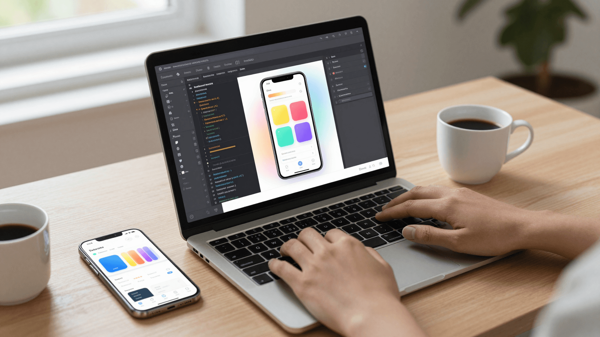
The Figma Problem: Why Developers Building Solo Need a Design Tool That Speaks Code
You've got a Figma file with forty-three artboards, three different button styles nobody remembers approving, and a component named "Rectangle 47" that's somehow load-bearing for your entire checkout flow. You're not a designer. You're a solo founder or a two-person dev team who opened Figma because everyone said you had to, and now you're spending Tuesday afternoon fighting auto-layout instead of shipping the feature your first ten users actually asked for. This is where a lot of technical founders quietly give up on "real" design tools and either wireframe in a notebook or skip straight to code — which is exactly the gap Dolfy.ai was built to close, with a workflow that treats developers as the primary user instead of an afterthought.
Key Takeaways
- Figma and Sketch were built for design teams handing off to engineers — not for the 70%+ of early-stage apps built by one or two technical founders with no in-house designer.
- The real cost of a mismatched design tool isn't the $12-$45/month seat fee — it's the 15-30 hours per screen lost translating a static mockup into working React Native or Flutter code.
- A design token system (a shared set of named values for color, spacing, and type) is what keeps a growing app consistent — but most solo founders never set one up because their tool doesn't ask for it.
- Dolfy's 5-step Design OS methodology — Product Definition, Data Model, Design Foundation, Screen Design, Export — produces production-ready components instead of pictures of components.
- Exporting straight to React Native with TypeScript types turns "does this design even work with real data" from a launch-week surprise into a question you answer on day one.
Why doesn't Figma work well for solo technical founders?
Figma doesn't work well for solo technical founders because it was architected for a specific handoff: a design team produces a static mockup, then an engineering team interprets it into code by hand. When you're both the designer and the engineer, that handoff step is pure overhead — you're translating your own work into a second format for no one's benefit but the tool's. A design system in this context means a documented, reusable set of UI components and rules (colors, spacing, typography, button states) that keeps an app looking consistent as it grows; Figma can hold one, but it can't enforce it in the codebase where consistency actually matters.
The practical result is that most solo builders end up maintaining two sources of truth. The Figma file says the primary button is 44px tall with 8px of internal padding. The React Native <Button> component you actually shipped is 48px because that's what felt right when you were heads-down in VS Code at 11pm. Nobody updates the Figma file after that. Six weeks and four features later, the design file is a museum piece — accurate as a historical record, useless as a spec.
What does a "code-native" design tool actually mean?
A code-native design tool means the design decisions you make are stored and expressed in the same format your app runs on, so there's no manual translation step between "what it looks like" and "what ships." Instead of drawing a button-shaped rectangle and hoping an engineer reproduces its exact padding, you're defining a real component with real props, and the tool exports actual TypeScript types alongside it — the same type-checking definitions React Native or a Flutter/Dart equivalent would expect in production code.
This is the core of what Dolfy calls component export: rather than exporting a PNG or an SVG of what a card component looks like, Dolfy exports the component itself, wired to a token system, ready to drop into an Expo project. Expo, if you haven't used it, is a toolchain built on top of React Native that lets you preview a real, interactive build of your app on a physical phone or in a browser — called Expo Go / Web Preview — often within minutes of a code change, rather than waiting on a full native build. For a founder validating an idea before writing a business plan, that's the difference between testing your app idea in an afternoon and testing it after a two-week build sprint.
How does skipping straight to a data model change the design process?
Skipping straight to screens without a data model is the single most common mistake solo founders make, and it changes the design process by forcing you to redesign screens later once real data reveals its shape doesn't match what you drew. A data model is simply the structure of your app's information — what a "user," an "order," or a "listing" actually contains and how those things relate to each other. Design tools built for visual design don't ask you to define this first, so most people don't, and they end up hardcoding a mockup with fake data ("Jane Doe," "$49.00," a placeholder avatar) that doesn't survive contact with a real API response that includes null fields, long names, or a list with zero items.
Dolfy's methodology puts Data Model as the second of its five steps — after Product Definition, the step where you clarify what the app actually does before drawing anything — and before Design Foundation or Screen Design. That ordering isn't cosmetic. When your screens are generated with an awareness of the actual fields, types, and edge cases in your data, empty states, long-text truncation, and loading skeletons get designed in from the start instead of retrofitted after a support ticket about a broken layout.
Why does a design token system matter for a one-person team?
A design token system matters for a one-person team because it's the only thing standing between "looks intentional" and "looks like it was built in seventeen separate late-night sessions," which, realistically, it was. Design tokens are named values — color.primary, spacing.md, radius.card — that stand in for hardcoded hex codes and pixel numbers throughout an app, so changing your brand's primary color from one blue to another is a one-line edit instead of a find-and-replace across 30 files. Professional design systems at companies like Shopify or Airbnb rely on token systems specifically because they scale changes safely across hundreds of components; the same logic applies at a scale of one developer and twelve screens, just with lower stakes and less patience for cleanup.
Because Dolfy generates the token system as part of Design Foundation — before any individual screen is designed — every component that comes out the other end already references the same shared values. That's what keeps a 15-screen MVP from visually fragmenting the way most solo-built apps do somewhere around screen 8, when the founder is moving fast and stops double-checking hex codes against screen 2.

What should you actually look for in a design-to-code workflow?
You should look for a workflow where the artifact you end up holding is code you can commit, not an image you have to interpret. Concretely: does the tool export TypeScript types alongside components, or just visuals? Does it understand Tailwind CSS utility classes and React Native styling conventions, or does it output generic CSS you'll rewrite anyway? Does it ask about your data model before your color palette, or after? A tool that gets this ordering backward — Screen Design before Data Model, visuals before structure — is optimized for a portfolio piece, not a shipping product.
It's also worth being honest about tool fatigue. Indie hacker communities are full of founders who've tried Sketch, then Figma, then a no-code builder, then finally sat down and hand-coded everything in SwiftUI or Flutter because at least then the design and the code were the same artifact. Dolfy's bet is that you shouldn't have to choose between "a tool that helps me think through design decisions" and "a tool that produces code I actually ship" — the whole point of the 5-step Design OS is collapsing those into one pass.
Frequently Asked Questions
Do I need any design experience to use Dolfy?
No. Dolfy is built for technical non-designers — developers and founders who understand their product but haven't been trained in visual design principles. The Design Foundation step generates a coherent token system and component styling automatically, so you're making informed choices rather than starting from a blank canvas.
How is this different from just using a Figma-to-code plugin?
Figma-to-code plugins still start from a static Figma file that was designed without your app's real data model in mind, so the generated code usually needs significant manual cleanup. Dolfy starts from your product definition and data model, so the components it exports are already shaped around real fields and edge cases, not idealized mockup data.
Can I still use Expo to preview my app as I go?
Yes. Dolfy's Export step is built to hand off into an Expo Go or Expo Web Preview workflow, so you can see a working, interactive version of your screens on a real device or in a browser as you iterate, rather than waiting for a full app build.
What if my app needs to look different on iOS and Android?
That's what a token-based design system is for. Because spacing, color, and typography are defined once as tokens rather than hardcoded per screen, platform-specific adjustments (like iOS's tab bar conventions versus Android's) can be applied consistently across every component instead of screen-by-screen.
Designing With the Grain of How You Actually Build
The honest problem with most design tools isn't that they're bad software — Figma is genuinely excellent at what it was built for. It's that "what it was built for" is a workflow most solo founders and small dev teams don't have: a dedicated designer handing polished mockups to a separate engineering team. If you're building alone or in a pair, sitting down with a general-purpose design tool means doing double work — designing, then re-deriving the code by hand — for a handoff step that has no one on the other end of it. Dolfy exists for the workflow you're actually running: Product Definition, Data Model, Design Foundation, Screen Design, and Export, ending in real React Native and Tailwind CSS components with TypeScript types, ready for Expo Go or Web Preview — so the thing you designed is the thing you ship, not a reference image for it.