
The Font Scaling Problem: Why Your App's Layout Breaks the Moment a User Increases Their Text Size
You finish your app, test it on your own phone, and everything looks crisp. Then a beta tester emails a screenshot: the headline overlaps the button, the price is cut off with "...", and the Save button has slid off the bottom of the screen. Nothing is broken on your device. The difference is one setting you never touched: their system font size. If this sounds familiar, you have met the font scaling problem, and Dolfy.ai is built to help you design around it before it reaches a single user.
Key Takeaways
- Roughly a quarter to a third of smartphone users change their system text size or use display zoom, so a layout tested only at default size is untested for a large share of your audience.
- Fixed-height containers are the number one cause of clipped and overlapping text. Design components that grow with their content instead.
- Type sizes belong in your design tokens as a scale, not as loose numbers scattered across screens.
- Test at three sizes (default, 150%, and 200%) before every release; it takes about ten minutes.
- Decide up front which text is allowed to grow without limit and which needs a sensible cap.
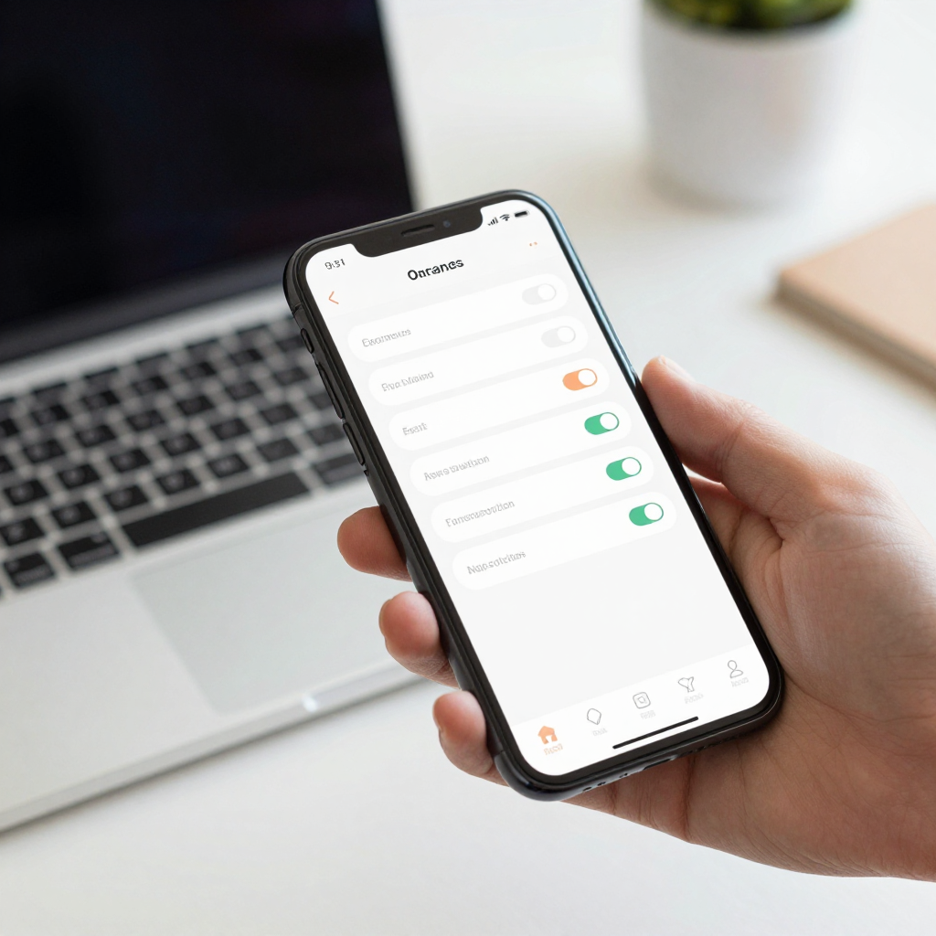
What Is the Font Scaling Problem in Mobile Apps?
The font scaling problem is what happens when a user's system text-size setting makes your text larger than your layout was designed to hold. Both iOS (through Dynamic Type, Apple's system for letting people choose their preferred reading size) and Android (through font scale and display size settings) let users enlarge text by 30 to 200 percent or more in some configurations. Your app is expected to respond.
React Native, the framework most Expo apps are built on, scales text by default. That is good for accessibility, but it means every fixed height: 48 on a button, every single-line label, and every absolutely positioned badge is now a small bet that text will never grow. Most of the time that bet loses.
Who Actually Changes Their Text Size?
More people than most founders expect. Older adults are the obvious group, but plenty of people in their thirties and forties bump text up a notch or two because they read on a phone all day. Users with low vision depend on large text to use an app at all. Apple has reported for years that Dynamic Type is used by a significant fraction of iPhone owners, and Android's font size setting is one of the most commonly changed accessibility options.
The practical point for a solo founder is simple: if you have 1,000 users, somewhere between 200 and 300 of them may see your app at a size you never looked at. Those users do not file bug reports. They leave a two-star review that says "hard to use" and uninstall.
Why Do Fixed-Height Components Break First?
Fixed-height components break first because they promise a size before knowing the content. A button with a fixed height of 44 points looks perfect with a 16-point label. At 200 percent text scale, that label needs roughly 32 points of line height plus padding, and it either gets clipped or overflows into the element below.
The same pattern hits several common places:
- Tab bar labels that wrap to two lines and push icons out of alignment.
- Cards with a fixed height that cut off the second line of a title.
- Headers with a title, a back button, and an action icon that no longer fit on one row.
- Form labels placed beside inputs in a horizontal row, which need to stack vertically when space runs out.
The fix is to use a minimum height instead of a fixed one, let padding do the work of spacing, and allow text to wrap to at least two or three lines. In React Native that usually means replacing height with minHeight and removing numberOfLines={1} from anything that carries meaning.
How Should a Type Scale Live in Your Design Tokens?
A type scale should live in your design tokens as a small set of named roles, each with a size, a line height, and a weight. Design tokens are named design values (colors, spacing, font sizes) stored in one place so every screen references the same source instead of hard-coding numbers.
A workable starting scale has six roles: caption, body, label, subtitle, title, and display. If body is 16 points, a comfortable set might be 12, 14, 16, 20, 24, and 32. Give each role a line height about 1.3 to 1.5 times its size so lines do not collide when they wrap.
When a screen asks for "title" instead of "24 points bold," you gain two things. First, you can change the entire app's typography in one edit. Second, you can decide per role how it behaves when the user scales text, which is the next question.
Which Text Should Grow, and Which Should Be Capped?
Body copy, form labels, list items, and error messages should always grow fully. If someone needs those larger to read them, capping them defeats the purpose.
Some text is a reasonable candidate for a cap: tab bar labels, badge counts, and compact navigation titles, where unlimited growth would break the structure of the interface. React Native supports this with the maxFontSizeMultiplier prop, which limits how far a single text element will scale. A tab label capped at 1.3 times its size stays readable without wrecking the bar, while body text stays uncapped.
The rule of thumb: cap only where the layout is structurally fixed, and never cap text people need to read to complete a task. When in doubt, let it grow and fix the layout instead.

How Does Dolfy Help You Design for Text Scaling?
Dolfy guides you through a five-step Design OS methodology: Product Definition, Data Model, Design Foundation, Screen Design, and Export. The text scaling problem gets easier to prevent because of how those steps are ordered.
In the Design Foundation step, you establish your design-token system, including typography, before any screen exists. That is the right moment to define your type scale as named roles rather than raw numbers. In Screen Design, screens are composed from those tokens, so a title is a "title" everywhere. In Export, Dolfy produces React Native components styled with Tailwind, with TypeScript types, so the token names carry through into code you can read and adjust.
You can then use the Expo Go or Web Preview to look at your screens on a real device or in a browser. Once you have that preview, raise your phone's text size to the largest setting and walk through every screen. That single test catches most problems before an outside user sees them. Dolfy does not replace that check; it gives you a clean, token-based foundation that makes the fixes small and consistent instead of scattered.
What Is a Ten-Minute Text Scaling Test?
You can run a useful test in ten minutes, with no special tools:
- Set the phone to default size and walk through your five most important screens. Note anything already tight.
- Increase text to about 150 percent (the second or third step up on most phones) and repeat. Look for clipped labels and buttons that moved off screen.
- Increase to the maximum and repeat. Some layouts will scroll, which is fine. Anything that becomes unusable needs a fix.
- Check the primary action on every screen. If the main button is unreachable at any size, that is a release blocker.
- Write down the failures by component, not by screen. Fixing the shared button once fixes it everywhere.
Doing this before each release costs about ten minutes. Skipping it can cost you a chunk of your reviews.
Frequently Asked Questions
Should I just disable font scaling in my app?
You can, using allowFontScaling={false} in React Native, but it is usually a mistake. It removes a setting that users rely on, and both Apple and Google guidance encourage supporting it. Fix the layout instead of blocking the preference.
What is a safe maximum font scale to support?
Supporting up to 200 percent covers the vast majority of real settings on both platforms. If a screen becomes cramped at that size, let it scroll vertically rather than shrinking the text. Scrolling is a normal, expected behavior on mobile.
Does font scaling matter for an MVP?
Yes, because the cost is low early and high later. Building on a token-based type scale from the first screen takes almost no extra time, while retrofitting fixed-height components across 30 screens can take days.
How do I handle text scaling in a design tool like Figma?
Design your key components with auto layout so they can grow, and create a large-text version of your two or three densest screens as a check. This makes the problem visible during design, before any code is written.
Design for the Text Size You Did Not Test
The font scaling problem is quiet. It does not crash your app or show up in analytics, and it only appears when a real person with a different setting opens your product. The remedy is not complicated: flexible containers, a named type scale in your tokens, deliberate caps in only a few places, and a ten-minute test before each release.
If you are starting a mobile product and want those foundations in place from day one, take a look at Dolfy. Set up your design tokens first, build screens from them, and export React Native code that is ready to be tested at every text size your users will actually choose.