
The Form Validation Problem: Why Your App's Sign-Up Screen Loses Users the Moment They Make a Mistake
You shipped the sign-up screen on a Friday. By Monday, your analytics show that 41% of the people who tapped "Create account" never finished. You open the app, fill in the form, and everything works. So what went wrong? Chances are your form told users they made a mistake only after they hit submit, in a message they never saw. At Dolfy.ai, we see this pattern constantly with indie hackers and small teams: the form logic works, but the form experience quietly loses people.
Key Takeaways
- Validation (checking that what a user typed is acceptable) should happen as each field is finished, not in one burst after the submit button is pressed.
- An error message needs three things: it must be near the field, say what to do, and be readable by a screen reader.
- Error colors, spacing, and icons belong in your design tokens (named, reusable style values) so every form in your app reports problems the same way.
- Designing the data model first tells you which rules each field actually needs, which prevents inconsistent forms later.
- A form is a conversation; small improvements can recover a meaningful share of abandoned sign-ups.
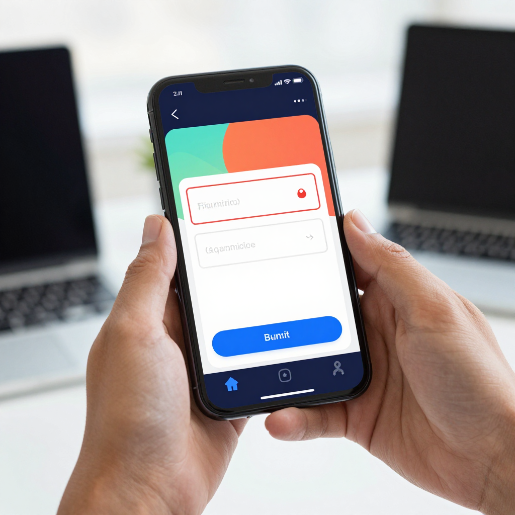
Why do users abandon forms that look perfectly fine?
Users abandon forms because the app makes failure invisible or confusing. When a screen only reports problems after submission, the person has to hunt for what is wrong, often scrolling past the field that is actually at fault. Research from usability groups such as the Baymard Institute has repeatedly found that checkout and sign-up forms lose a large share of users to friction rather than to price or intent, and many of those losses are avoidable with clearer error handling.
Think about the last time a form said "Something went wrong" without telling you what. You probably tried once more, then gave up. Your users behave the same way, except they have a dozen other apps on their home screen to switch to. For a solo founder with a few hundred installs, losing even 10 of every 100 sign-ups to a fixable error flow is a painful tax.
The root cause is usually that validation was treated as a backend afterthought. The developer wrote a rule ("password must be at least 8 characters"), the server returns a rejection, and the screen shows a generic red banner at the top. Nobody designed the moment of failure as part of the interface.
When should a form validate: while typing, on blur, or on submit?
Validate when the user finishes a field, which developers call "on blur" (the moment a field loses focus because the user tapped elsewhere). Validating on every keystroke feels aggressive: nobody wants to be told their email is invalid after typing just the letter "j". Validating only on submit is the opposite mistake, because it dumps every problem on the user at once.
A practical pattern that works well in React Native looks like this:
- Before first interaction: show nothing. A blank field is not an error.
- On blur: check the field and show a message if it fails.
- After an error appears: re-check on every keystroke, so the message disappears the instant the problem is fixed. This rewards the user immediately.
- On submit: validate everything one last time and move focus to the first invalid field.
That fourth step matters more than it sounds. On a phone, the keyboard covers roughly half the screen, so an error on a hidden field might as well not exist. Scrolling to and focusing the first problem field turns "the button does nothing" into "oh, I skipped my phone number."

What makes an error message actually helpful?
A helpful error message names the problem in plain language and tells the user how to fix it, right next to the field. "Invalid input" fails this test. "Enter an email like name@example.com" passes it. The difference is about ten words, and it can decide whether someone finishes sign-up.
Here are the rules we recommend:
- Place it directly below the field it belongs to. A banner at the top of the screen forces users to match the message to a field themselves.
- Never rely on color alone. Roughly 1 in 12 men has some form of color vision deficiency, so pair the red border with an icon and text.
- Write for humans. "Passwords need at least 8 characters" beats "Password length constraint violated."
- Keep the user's input. Wiping a field because it failed validation is one of the fastest ways to lose someone.
- Make it accessible. Screen readers such as VoiceOver on iOS and TalkBack on Android need the error announced, which in React Native means setting accessibility properties so the message is read when it appears.
Notice that most of these are visual and structural decisions, not logic. That is why they are easy to skip when you are rushing to build features, and why they pay off so reliably.
How do design tokens keep error states consistent?
Design tokens are named style values, like color-error or space-sm, that you define once and reuse everywhere. They matter for forms because a typical app has many of them: sign-up, login, profile, payment, feedback. Without tokens, each screen ends up with a slightly different red, a different message size, and a different gap between the field and its error text.
A small token set for forms might include an error color, an error background tint, a border width for invalid fields, a helper-text size, and a spacing value between the input and its message. Five or six tokens are enough to make every form in your app feel like it came from the same team. If you later decide the red is too harsh, you change one value and every screen follows.
This is exactly the kind of foundation Dolfy builds in its Design Foundation step. Instead of picking colors screen by screen, you set up the system first, and the components you export for React Native with Tailwind CSS styling reuse those tokens automatically. Consistency stops being a cleanup chore and becomes the default.
Why does your data model decide how good your form can be?
Your data model, the structured description of what information your app stores and how pieces relate, determines which rules each form field needs. If your model says a booking has a required start date, an optional note, and a phone number in a specific format, then you already know three validation rules before you draw a single input.
Teams that skip this step end up inventing rules in each screen. One form accepts phone numbers with spaces, another rejects them, and the backend rejects both. Users experience this as a flaky app. Defining the model up front, as Dolfy's Data Model step encourages, gives your forms a single source of truth. The TypeScript types that come out of the export (TypeScript is JavaScript with type annotations that catch mistakes before the app runs) keep the form fields and the stored data aligned, so a mismatch shows up as a compile error instead of a one-star review.
What should a good form screen include?
A good form screen is short, forgiving, and clear about progress. Based on common mobile patterns from Apple's Human Interface Guidelines and Google's Material Design, a solid checklist looks like this:
- Ask for as little as possible. Every extra field costs completions. If you can defer the phone number until after sign-up, do it.
- Use the right keyboard. An email field should open the email keyboard, a phone field the number pad. This one change removes a surprising amount of typing errors.
- Label every field permanently. Placeholder text vanishes when typing begins, which leaves users guessing what a half-filled field was for.
- Show password visibility toggles. Typing a hidden password on a small phone keyboard is error-prone.
- Make the submit button state obvious. Disable it only if you also explain why; a grayed-out button with no explanation feels broken.
- Confirm success clearly. A form that saves silently creates doubt, so show a visible confirmation or move to the next screen.
You can check all of these on a real device early. Dolfy's Expo Go and Web Preview let you open the screens on your phone or browser during the design phase, so you feel the keyboard covering a field before you write any backend code.
How do you test a form before real users find the problems?
Test with deliberate mistakes. Open the screen and try the awkward paths: leave everything blank and submit, paste an email with a trailing space, type a phone number with dashes, rotate the device, turn on the largest text size, and switch to dark mode. A form that survives these seven or eight checks is usually in better shape than most apps in the store.
Then hand the phone to someone who has never seen the app and say nothing. Watch where they hesitate. If they pause on a field, the label or the error is unclear. If they look at you, the app failed to explain itself. Five people is enough to surface the majority of the obvious problems, a rule of thumb popularized by usability researcher Jakob Nielsen.
Frequently Asked Questions
Should I show all errors at once or one at a time?
Show errors next to each field as they occur, and on submit, focus the first invalid field while keeping the other messages visible. Showing a single combined list works poorly on mobile because users cannot match entries to fields behind the keyboard.
Is inline validation worth the extra work for a simple MVP?
Yes, for the sign-up and payment forms at least. These are the screens where an abandoned attempt costs you a real customer. Because the rules come from your data model and the styles from your design tokens, the extra effort is mostly a one-time setup that every later form reuses.
How do I handle errors that only the server can detect, like "email already in use"?
Treat them like any other field error: map the server response to the specific field and show the message right below it in the same style. Avoid a generic popup, and keep everything the user already typed so they only have to change one thing.
Do I need a designer to get form states right?
No. You need a consistent set of states (default, focused, error, disabled, success) and a few tokens to style them. A guided process that covers the data model and design foundation before screens gives non-designers a reliable structure to follow.
Build forms that finish the conversation
A form is the moment your app asks a stranger to trust it with their information. Clear, kind, well-placed error messages tell that person you respect their time, and consistent styling tells them the product is solid. If you want a structured way to get there, Dolfy walks you through defining your data, setting your design foundation, and designing screens, then exports production-ready React Native components you can preview on a real phone. Fix the form, and your sign-up numbers will tell you it worked.