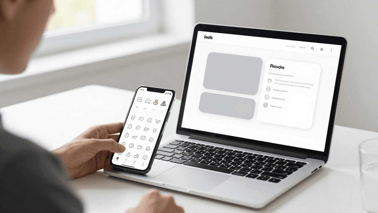
The Icon Consistency Problem: Why Your App's Icons Look Like They Came From Five Different Apps
You finally have a working app. The screens load, the data flows, and then you open it next to a friend's phone and something feels off. The home tab uses a chunky filled house icon, the settings row uses a hairline outline gear, and the share button looks like it was borrowed from a different app entirely. Nothing is broken, yet the whole thing feels unfinished. That quiet mismatch is the icon problem, and it is one of the fastest ways a solo build starts to look amateur. Dolfy.ai was built for exactly this kind of gap: it guides you through a structured design process so small inconsistencies get decided once instead of improvised screen by screen.
Key Takeaways
- Mixed icon styles (filled vs. outline, thick vs. thin strokes) are the most common reason an app looks "off" even when layout and color are fine.
- Pick one icon family and one stroke weight, then express sizes as a small fixed scale such as 16, 20, 24 and 32 pixels.
- Treat icons as design tokens (named, reusable values) so a single change updates every screen.
- Icons should support labels, not replace them: unlabeled icons slow users down except for a handful of universal symbols.
- Test icon consistency by squinting at a screenshot grid, not by inspecting one screen at a time.

Why do mismatched icons make an app feel unprofessional?
Mismatched icons make an app feel unprofessional because people read visual consistency as a signal of care. Users cannot name the problem, but they notice that stroke thickness, corner rounding and visual weight keep changing from one screen to the next, and they quietly conclude that the product was assembled in a hurry.
The usual cause is mundane. You grab a home icon from one package on Monday, a settings icon from another on Wednesday, and a custom export from a Figma file on Friday. Each looks fine alone. Together they disagree about whether corners are sharp or soft, whether lines are 1.5 pixels or 2 pixels thick, and whether symbols are filled or outlined. A design system (a documented set of reusable visual rules and components) exists to stop exactly this drift, but most solo founders skip it because it sounds like work for a bigger team.
What actually makes two icons "match"?
Two icons match when they share four properties: stroke weight, corner style, visual size, and fill style. Get those four aligned and icons from a single family will look like they belong together; let any one of them wander and the set falls apart.
- Stroke weight is the thickness of the lines. A 1.5-pixel icon beside a 2-pixel icon looks noticeably thinner even at phone size.
- Corner style is whether line ends and corners are rounded or square. Rounded corners feel friendly; square corners feel technical.
- Visual size is how much of the icon's box it fills. A circle drawn to the edge of a 24-pixel box looks larger than a square drawn to the same edge, so good sets adjust for this.
- Fill style is solid versus outline. Many apps use outline for inactive states and filled for the active tab, which is fine as long as it is applied everywhere.
If you remember only one thing, remember this: choose a single family, such as the widely used Feather, Lucide or Ionicons sets that ship with the React Native ecosystem, and resist the urge to mix in a "better" version of one icon from somewhere else.
How many icon sizes does a mobile app really need?
A mobile app really needs three or four icon sizes, not a different size for every screen. A common scale is 16 pixels for inline text accents, 20 pixels for list rows, 24 pixels for toolbars and tab bars, and 32 pixels for empty states or feature highlights.
Why so few? Every extra size is another decision to make and another place for inconsistency to creep in. When you limit yourself to a short scale, you can name the sizes (for example small, medium, large) and stop thinking about pixels. This is the same logic as a spacing scale, and it is why a design token system pairs naturally with icons. A design token is a named value, such as icon-size-md = 24, that your code reads instead of a hard-coded number. Change the token once and every icon that references it updates.
Should every icon have a text label?
Most icons should have a text label, because only a few symbols are universally understood without one. A magnifying glass for search and a house for home are widely recognized; a stylized sparkle, a layered square or an abstract arrow usually are not.
Usability researchers have repeatedly found that icon-plus-label navigation is easier to use than icon-only navigation, particularly for first-time users. The cost of a label is a few pixels of height. The cost of a confusing icon is a user who taps the wrong thing, loses trust and leaves. If space is truly tight, keep labels on the primary tab bar and allow icon-only buttons in secondary toolbars where the context makes the meaning obvious.
Accessibility matters here too. Screen readers cannot see your icon, so every icon-only button needs an accessibility label in code. In React Native this is the accessibilityLabel prop, and skipping it means some users hear nothing but "button."
How do you choose a color for icons without making the screen noisy?
You choose icon colors by tying them to the same small palette your text and surfaces already use, rather than assigning colors icon by icon. Most apps need only three icon states: a default color, an active color, and a muted or disabled color.
A reliable pattern is to reuse your text colors. Primary icons share the primary text color, secondary icons share the secondary text color, and the active tab uses your single brand accent. This keeps icons from competing with content and guarantees they inherit dark mode correctly, since a color defined as a token can switch values by theme. Contrast also matters: the Web Content Accessibility Guidelines (WCAG, the widely adopted accessibility standard) ask for at least a 3:1 contrast ratio for meaningful graphical objects against their background, which is easy to miss with pale gray icons on white.
How can you audit icon consistency in under ten minutes?
You can audit icon consistency in under ten minutes by screenshotting every main screen and laying the images side by side in a single grid. Inconsistencies that hide when you view one screen at a time jump out when you see them together.
- Capture 8 to 12 core screens from your Expo preview or a simulator.
- Place them in a row in Figma, Sketch or any image tool.
- Squint, or blur the view slightly, and look for icons that appear heavier or lighter than their neighbors.
- List every distinct icon source in your codebase. If you find more than one package or more than one folder of SVG files, that is your first fix.
- Replace outliers with the closest match from your chosen family and record the decision.
This exercise usually takes less time than debating a single icon in the abstract, and it turns a vague feeling into a concrete to-do list.
How does Dolfy approach icons inside the design process?
Dolfy treats icons as part of the Design Foundation step rather than something you pick screen by screen. Dolfy.ai guides you through a five-step Design OS methodology (Product Definition, Data Model, Design Foundation, Screen Design, and Export), and the foundation step is where your design-token system gets established before any individual screen is built.
That ordering matters. If you decide on color, type and spacing first, and then generate screens from those decisions, the screens inherit one consistent look instead of accumulating one-off choices. Dolfy then produces React Native components styled with Tailwind CSS and typed with TypeScript, and you can check the result in Expo Go or the web preview before committing to it. Having tokens in place means that when you later decide icons should be slightly larger or your accent color should change, you are editing a value rather than hunting through dozens of files.
None of this replaces your own judgment. You still choose which icon family suits your product's personality. The benefit of a structured process is that you make that choice once, early and deliberately, instead of re-making it every time a new screen needs a symbol.
What mistakes should you avoid when building an icon system?
The mistakes to avoid are mixing families, exporting icons at uneven sizes, embedding color inside the SVG file, and forgetting touch targets. Each one is easy to prevent if you know about it before you start.
- Hard-coded colors in SVG files. If the color is baked into the file, dark mode and active states require duplicate assets. Use a single-color icon that accepts a color from code.
- Scaling icons by eye. Stretching a 24-pixel icon to 31 pixels breaks the stroke weight. Stick to the size scale.
- Tiny tap areas. An icon can be 24 pixels wide while its tappable area should still be at least 44 by 44 points on iOS or 48 by 48 density-independent pixels on Android, per Apple's and Google's design guidance.
- Custom icons too early. Commissioning a bespoke set before you have product-market fit is usually a poor use of money. A well-chosen open-source family gets a first version to market cleanly.
- No record of decisions. Write down the family, stroke weight and size scale in one short note so future you, or a freelancer, does not undo the work.
Frequently Asked Questions
Is it okay to use filled and outline icons in the same app?
Yes, as long as the rule is consistent. A common convention is outline icons for inactive states and filled icons for the active tab or selected item. The problem is not mixing fill styles, it is mixing them randomly without a rule users can learn.
Which icon library should an indie developer choose?
Choose a single well-maintained family with broad coverage, such as Lucide, Feather or Ionicons, and check that it includes every symbol your first release needs. Coverage matters more than personality, because the moment you run out of icons you will be tempted to mix in a second style.
Do icons really affect conversion or retention?
Clear, consistent icons make navigation easier to learn, which reduces confusion in the first session, though no single design element guarantees a specific lift. Treat icon consistency as one part of overall polish that builds trust, not as a growth hack.
How many icons does an MVP need?
Most minimum viable products (the smallest version of an app that delivers real value) need somewhere between 15 and 30 icons: navigation, common actions such as add, edit and delete, a few status indicators, and a handful for empty states. Listing them up front makes it easy to confirm your chosen family covers them.
Make Your Icons Look Like They Belong Together
Consistent icons are one of the cheapest upgrades you can make to a mobile app, because the fix is a decision, not a redesign. Pick one family, lock one stroke weight, keep to a short size scale, store the values as tokens, and add labels wherever meaning is not obvious. If you would rather make these foundation decisions inside a guided process than across a dozen scattered files, you can explore how Dolfy turns them into production-ready React Native components you can preview in Expo before you ship.