The Inline Validation Trap: Why Real-Time Form Errors Feel Naggy Instead of Helpful
You've built the form. Email field, password field, a couple of dropdowns. You wire up validation so users get instant feedback — and within a day of shipping, someone on your team notices the red error text flashing under the email field before anyone has even finished typing their address. It looks broken. It feels hostile. And now you're rewriting validation logic instead of shipping the feature you actually meant to build this week. This is one of the quieter but most common breakdowns in mobile app design, and it's exactly the kind of problem Dolfy.ai was built to help founders and developers avoid before it costs them a sprint. Dolfy is an AI-powered mobile app design platform that walks solo builders and small teams through a structured process for turning an idea into production-ready screens — and form validation timing is a perfect example of a decision that looks trivial until it's live in front of real users.
Real-time validation sounds like a strict upgrade over the old "submit and see what's wrong" pattern. In practice, badly timed validation is worse than no validation at all, because it interrupts people mid-thought and makes a simple sign-up screen feel like it's actively working against them. Getting this right isn't a visual design problem — it's a timing and data-modeling problem, and it's one that gets solved much earlier in the process than most teams assume.
Key Takeaways
- Validating on every keystroke (rather than on blur or after a debounce delay) is the single most common cause of "naggy" form errors.
- Error messages that describe the rule ("must be 8+ characters") outperform messages that just say "invalid" — specificity reduces retry attempts.
- Validation logic should trace back to your data model, not get invented ad hoc per screen — otherwise the same field validates differently in two places.
- A consistent error state (color, icon, spacing, copy tone) belongs in your design system, not reinvented per form.
- Waiting roughly 300-500ms after the user stops typing (a debounce) before validating a field removes most of the "flashing red text" complaints without sacrificing real-time feedback.
Why Do Real-Time Form Errors Feel So Naggy?
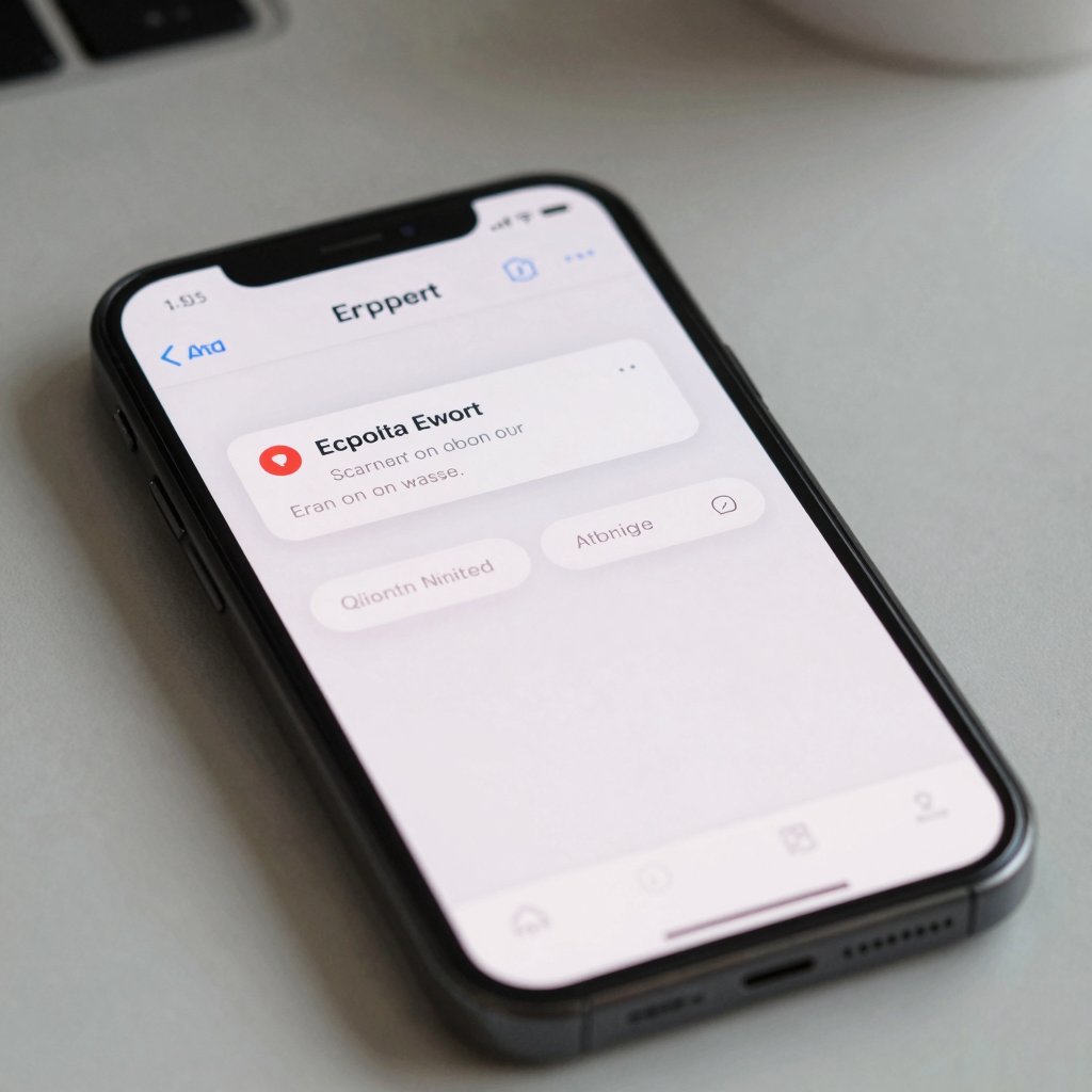
They feel naggy because most implementations validate on every keystroke instead of waiting for a natural pause. If your email field turns red after the third character because it doesn't yet contain an "@" symbol, you've technically shown "real-time" feedback — but you've also told the user their input is wrong before they were done providing it. That's not helpful, it's premature.
The fix is a short debounce: wait roughly 300-500 milliseconds after the last keystroke, or validate on blur (when the user taps out of the field) for anything longer than a single character check. Password strength meters are the one common exception — because the whole point is progressive feedback as you type, showing strength live is expected and welcome. Everything else, from email format to username availability, reads as more respectful when it waits for a pause.
What's the Right Moment to Validate a Field?
The right moment depends on the cost of being wrong, not on what's technically easiest to wire up. Cheap-to-fix fields (a required checkbox, a dropdown selection) can validate immediately on interaction. Expensive-to-fix fields — anything involving a server round-trip, like checking whether a username or email is already taken — should validate on blur, after debounce, so you're not hammering your API on every keystroke and burning through rate limits or hosting costs unnecessarily.
A practical split that works for most sign-up and checkout flows: validate format-only fields (email shape, phone number length) on blur, validate anything requiring a network call on blur with debounce, and reserve keystroke-level feedback for things like password strength or character counters where users expect to watch a number change live.
How Should Error Messages Actually Be Worded?
They should name the specific rule that was broken, not just flag that something is wrong. "Invalid input" tells a user nothing actionable; "Password needs at least 8 characters" tells them exactly what to fix. This sounds obvious, but it's the single most-skipped detail in fast MVP (minimum viable product — the smallest version of an app that's still usable and testable with real users) builds, because generic error copy is faster to write than specific error copy.
Tone matters almost as much as content. "Email format looks off — try name@example.com" reads as helpful; "ERROR: Invalid email" reads as a system yelling at you. Since Dolfy generates production-ready React Native and Tailwind CSS components with TypeScript types as part of its Screen Design step, error-state copy and styling get defined once, as part of the actual component — not left as a placeholder someone has to remember to write real copy for later.

Where Does the Data Model Fit Into Form Validation?
Validation rules should come from your data model, not get reinvented per screen. A data model (the structured definition of what data your app stores and how the pieces relate — a "User" has an email, a password hash, a display name, and so on) is where field-level constraints like "email must be unique," "password minimum length is 8," or "display name max length is 30 characters" actually belong. If a sign-up screen and a "change email" settings screen both validate email format independently, using two different regex patterns written by two different people six weeks apart, you end up with two different bugs.
This is precisely why Dolfy's 5-step Design OS methodology — Product Definition, Data Model, Design Foundation, Screen Design, Export — puts data modeling before screen design rather than after. When constraints are defined once at the data layer, every screen that touches that field (sign-up, settings, checkout) inherits the same validation logic instead of drifting apart over time. Teams that design screens first and back into a data model later routinely discover, during a rebuild, that three different forms enforce three different password rules — a genuinely expensive fix to unwind once it's live.
How Do You Design Validation States Without a Design System?
You can't, consistently — which is exactly the problem. A design system (a reusable library of components, colors, spacing rules, and interaction patterns that keeps an app visually and behaviorally consistent) is what lets an error state look and behave the same on the login screen, the checkout form, and the profile editor. Without one, every form in your app tends to develop its own slightly different shade of error-red, its own icon choice, and its own spacing — small inconsistencies that make a genuinely functional app feel unpolished.
A design token (a named, reusable value — like color-error-500 or spacing-sm — that stands in for a raw hex code or pixel value so it can be updated globally in one place) is the mechanism that makes this consistent. Define color-error and color-error-text once, reference them in every validated field's component, and a rebrand or accessibility contrast fix becomes a one-line token change instead of a find-and-replace across dozens of files. Tools like Figma or Sketch are where many teams first define these tokens visually; the harder part is getting them translated faithfully into working React Native, Flutter, or SwiftUI code without losing fidelity along the way — which is the specific gap Dolfy's Export step targets, producing components with an underlying design-token system already wired in rather than colors hardcoded screen by screen.
Frequently Asked Questions
Should I validate on every keystroke or wait until the user submits the form?
Neither extreme works well. Validating every keystroke feels naggy and premature; waiting until submit means users discover multiple errors at once, which is frustrating for longer forms. A debounced on-blur approach — validating shortly after the user pauses or leaves a field — gives real-time feedback without the flashing-red-text problem.
What's a reasonable debounce delay for form validation?
Roughly 300-500 milliseconds after the last keystroke is a common, comfortable range. Shorter feels twitchy; longer starts to feel unresponsive. For fields requiring a server check (like username availability), pairing debounce with an on-blur trigger avoids unnecessary API calls while someone is still actively typing.
Do I need a full design system before I can build good form validation?
Not a full one, but you do need consistent tokens for at least color, spacing, and typography around error states before validation will feel polished across more than one screen. Starting with a small, deliberate set of error-state tokens is enough to prevent the drift that happens when every form is styled independently.
How does Dolfy help with form validation specifically?
Dolfy's Data Model step is where field-level rules like format, length, and uniqueness get defined once, and its Screen Design and Export steps turn those rules into production-ready React Native and Tailwind components with consistent, token-based error states already built in — so validation behavior doesn't have to be rebuilt or reconciled screen by screen.
Designing Forms That Respect the Person Filling Them Out
Form validation is one of those details that's invisible when it's done well and actively irritating when it's not. Getting the timing, wording, and visual consistency right isn't about adding more JavaScript to a field — it's about deciding, at the data-model level, what "valid" actually means for each piece of information your app collects, and then expressing that decision consistently everywhere the field appears. That's a design decision as much as an engineering one, and it's easiest to get right when it's made once, early, rather than patched screen by screen after launch. If you're mapping out a data model and the screens that depend on it, Dolfy is built to take that structure from idea to exportable, production-ready components without the drift that comes from designing forms in isolation.