
Is Your Beautiful App Actually Unusable for 1 in 4 of Your Users?
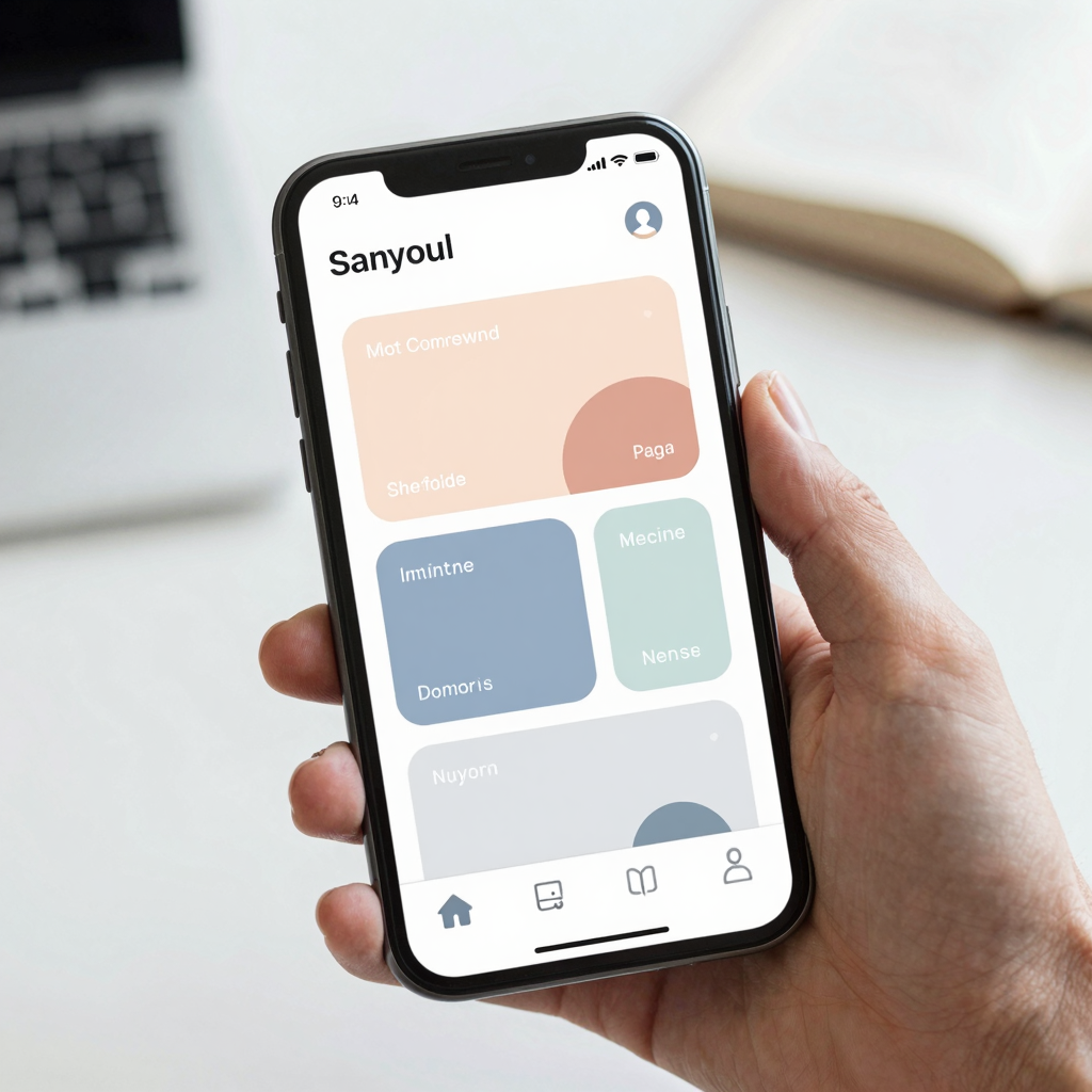
You just shipped what you're sure is the best-looking version of your app yet — clean cards, a soft color palette, buttons that feel satisfying to tap. Three days later, a support email lands: a user with low vision can't read your primary button text, and another says the app is completely unusable with VoiceOver turned on. You didn't do anything wrong on purpose. You just never checked. This is the accessibility gap almost every indie app falls into, and it's one of the reasons Dolfy.ai bakes accessibility checks directly into its Design Foundation step instead of leaving them as a "nice to have for later."
Key Takeaways
- Roughly 1 in 4 U.S. adults (26%, per CDC data) live with some form of disability, and the World Health Organization puts the global figure at 1.3 billion people, or about 16% of the population — inaccessible UI isn't an edge case, it's a market segment.
- Accessibility failures are usually structural, not stylistic: undersized tap targets, low-contrast text, and unlabeled icons are the most common culprits, not "ugly" design.
- WCAG 2.1 AA requires a minimum 4.5:1 contrast ratio for normal body text, and Apple and Google both recommend minimum tap targets of 44x44pt (iOS) and 48x48dp (Android).
- Fixing accessibility after launch usually means redesigning entire screens one at a time; building it into your design tokens from day one costs almost nothing extra.
- Dolfy's Design Foundation step generates a token system with accessible contrast pairs and sizing rules already built in, so "accessible by default" isn't a separate task someone has to remember to do.
How Many of Your Users Are You Actually Excluding?
More than you'd guess. The CDC estimates that 26% of U.S. adults — about 1 in 4 — live with some form of disability, whether that's low vision, limited fine motor control, hearing loss, or a cognitive difference that affects how they process a busy screen. Globally, the World Health Organization puts the number at 1.3 billion people, roughly 16% of everyone alive. And that's before you count situational impairments: someone holding a coffee in one hand and thumbing your app with the other, a user squinting at their phone in direct sunlight, or someone with a temporarily broken wrist relying on one-handed navigation. Accessible design helps all of these people, not just the ones with a permanent diagnosis. If your onboarding flow, your paywall, or your primary call-to-action button quietly fails a quarter of the people who open it, that's not a minor polish issue — it's lost signups, lost trials, and lost revenue you'll never see in your analytics because those users simply never converted in the first place.
What Does "Accessible" Actually Mean for a Mobile App?
In practice, it comes down to a handful of concrete, testable things rather than a vague design philosophy. A screen reader is software — Apple's VoiceOver and Android's TalkBack are the two you'll hear about most — that reads a screen's content aloud so a blind or low-vision user can navigate by sound and gesture instead of sight. For a screen reader to work, every button, icon, and image needs an accessible label: a short text description that isn't necessarily visible on screen but tells assistive technology what the element does. Color contrast ratio measures how much a piece of text stands out from its background, expressed as a number like 4.5:1; text below that threshold is technically visible but genuinely hard to read for anyone with low vision or color blindness. Tap targets are simply the touchable area around a button or icon — not just the visible icon itself, but the padding around it that determines whether a real thumb can hit it reliably. And dynamic type, or text scaling, is a user's ability to increase system font size for readability, which your layout needs to survive without text getting clipped or overlapping.
Why Do Most Teams Treat Accessibility as a Post-Launch Fix?
Because under deadline pressure, accessibility looks optional in a way that a broken checkout flow doesn't — nothing visibly "breaks" for the majority of testers, so it slips. Most solo founders and small teams are moving fast, styling screens by eyeballing colors and spacing rather than working from a documented system, which means there's no single place where a contrast rule or minimum tap-target size is enforced. The result is that accessibility gets treated the same way technical debt does: invisible until a user hits it, and expensive to unwind once dozens of screens have already copied the same undersized button or low-contrast label. Retrofitting accessibility into an app that's already been built typically means auditing every screen individually, which for a mid-sized app can easily eat 20-40 hours of design and engineering time — hours that mostly disappear if the rules were correct from the first screen.
How Do Design Tokens Make Accessibility Systematic Instead of Manual?
Design tokens are the fix, because they move the decision from "does this look okay to me right now" to "is this value correct, once, everywhere." A design token is a named, reusable value — something like color-text-primary or spacing-touch-target — that's defined a single time and then referenced by every component that needs it, instead of each screen hardcoding its own hex code or pixel value. Change the token once, and every button, card, and label that references it updates automatically and consistently. This is exactly where Dolfy's Design Foundation step earns its place in the workflow: rather than generating arbitrary colors and spacing per screen, it produces a token system with pre-vetted, contrast-safe color pairs and minimum tap-target spacing baked into the defaults. Because those tokens flow straight through to the production-ready React Native and Tailwind CSS components Dolfy exports — complete with TypeScript types — an accessible contrast ratio or a properly sized tap target isn't something a developer has to remember to add later. It's just what you get when you build on the token system in the first place, the same way a Figma-based team might rely on shared style guides, except the tokens here travel all the way into real, typed code instead of stopping at the design file.
What Should You Actually Check Before You Ship?
Start with the basics that catch the most common failures. Run your primary text and background colors through a contrast checker and confirm you're hitting at least 4.5:1 for body text (3:1 is the minimum for large headings). Measure your tappable icons and buttons — not just the icon glyph, but its full touch area — against the 44x44pt (iOS) or 48x48dp (Android) minimums. Turn on your phone's text-scaling setting and bump it up to roughly 200% to see whether your layout still holds together or whether text starts clipping and overlapping. And spend fifteen minutes navigating your core flow — signup, your main screen, checkout — with VoiceOver or TalkBack turned on; you'll immediately notice any icon-only buttons or images that have no accessible label attached. None of this requires a specialist audit or a big budget. It requires doing it once, early, ideally before you've built forty screens on top of the same unlabeled icon button.
Frequently Asked Questions
Do I need a dedicated accessibility audit before I launch?
Not necessarily a formal paid audit — a structured self-check covering contrast, tap-target size, labels, and text scaling catches the majority of real-world issues. Save a professional audit for after you have traction and can invest in a deeper review, including testing with actual assistive-technology users.
What's the difference between a design token and a style guide?
A style guide is documentation that describes your visual rules for humans to read and follow manually. A design token is that same rule expressed as a reusable code value that components actually reference, so the rule is enforced automatically rather than relying on someone remembering to apply it correctly on every screen.
Does designing for accessibility slow down development?
It slows down the first pass slightly if you're checking things manually screen by screen, but it costs almost nothing when it's built into your token system from the start, because every new component simply inherits accessible defaults instead of needing its own review.
Can I retrofit accessibility into an existing React Native app?
Yes, though it's more work than starting with it. The most efficient path is usually to introduce a token system retroactively — centralizing your colors and spacing values — so that fixing one token corrects the issue across every screen that uses it, rather than editing dozens of components one at a time.
Building Apps Everyone Can Use, From the First Screen
Accessible design isn't a separate feature you bolt on before launch — it's a byproduct of having a real system behind your colors, spacing, and components instead of ad hoc choices made screen by screen. That's the core idea behind Dolfy's 5-step Design OS methodology: by the time you reach Screen Design and Export, the Data Model and Design Foundation steps that came before have already embedded contrast-safe, appropriately sized defaults into every token your app uses. You get production-ready components you can preview instantly in Expo Go or Web Preview, already built on rules that work for the 1 in 4 users a purely eyeballed design would quietly exclude. If you're starting your next screen from scratch, Dolfy is worth a look before you find out about the gap from a support email instead of from a checklist.