The Keyboard Avoidance Problem: Why Your App's Input Fields Hide Behind the Keyboard
You're three taps into your own signup flow, testing the build you shipped last night, and the moment you tap the email field the keyboard slides up and swallows it whole. The "Continue" button is gone. The error message that would have told you why the field turned red is gone too. You end up scrolling blind, guessing where the input landed, on a screen you designed yourself. Multiply that by every founder, developer, and QA tester who has ever built a mobile app, and you get one of the most common — and most avoidable — usability failures in mobile software: forms that don't know the keyboard is coming. Dolfy.ai, an AI-powered mobile app design platform, treats this as a first-class design problem rather than an engineering afterthought, and that distinction is worth unpacking.
Key Takeaways
- The keyboard covers roughly 40-45% of a typical phone screen in portrait mode, which is enough to hide any input positioned in the lower two-thirds of a form.
- "Keyboard avoidance" (moving content out of the keyboard's way) and "keyboard dismissal" (closing the keyboard) are two different problems that need two different solutions — most broken forms only solve one of them.
- Fixing this after launch usually means touching every screen with a text field individually; fixing it at the design-system level means writing the rule once.
- Dolfy's Design OS methodology treats keyboard behavior as a design token decision made during the Design Foundation step, before any screen is built.
- Testing on a real device with a real keyboard catches problems that a static mockup in Figma never will.
Why Do Input Fields Disappear Behind the Keyboard in the First Place?
Input fields disappear because most teams design screens as static images and only discover the keyboard's real footprint once the app is running on an actual device. A design mockup in a tool like Figma or Sketch shows a form sitting comfortably in a tall, empty canvas. Nothing in that canvas simulates the software keyboard that iOS or Android will raise the instant a user taps a text field — a keyboard that, on a standard 6.1-inch phone, can occupy over 300 vertical pixels, or somewhere around 40-45% of the visible screen. If a form's fields, helper text, or submit button live in that bottom half of the layout and no one has written logic to shift the view upward, they simply vanish under the keyboard the moment they're needed most.
This is why the bug so often survives all the way to production: it's invisible in design tools, invisible in a hallway demo where no one actually types, and only visible when a real person tries to complete a real form on a real device.
What's the Difference Between Keyboard Avoidance and Keyboard Dismissal?
Keyboard avoidance is the discipline of automatically repositioning or resizing the screen so visible content never sits underneath the keyboard; keyboard dismissal is simply closing the keyboard, usually by tapping outside a field or pressing "Done." Teams frequently implement one and assume they've solved the other. A developer adds a "tap outside to dismiss" gesture and calls the keyboard problem closed — but the user never had to dismiss anything, because they couldn't see the field to know it needed fixing in the first place.
In React Native, the building blocks for proper avoidance already exist — a KeyboardAvoidingView component paired with correct behavior and offset props on iOS versus Android — but the component only works if the surrounding layout was built with it in mind: a scrollable container, fields that aren't pinned to the absolute bottom of the screen, and a submit button that can move without breaking the visual hierarchy. Bolting KeyboardAvoidingView onto a screen that was designed without it usually produces new problems: a header that jumps, a button that overlaps a field, or a layout that shifts twice in one animation frame.

How Should a Design System Define Keyboard Behavior Before a Single Screen Is Built?
A design system should define keyboard behavior as a rule attached to the input component itself, not as a patch applied screen-by-screen after something breaks. A design system, in plain terms, is the shared set of rules, components, and visual decisions — colors, spacing, type, behavior — that every screen in an app draws from, so the app feels like one product instead of five stitched-together prototypes. When "every text field automatically scrolls into view above the keyboard, with 16px of breathing room" is written down as a rule in that system once, every screen that uses the standard input component inherits the fix automatically. When it isn't written down, every screen reinvents — or forgets — the fix independently, and the inconsistency itself becomes a second bug: some forms behave correctly, others don't, and users can't predict which is which.
This is the exact gap Dolfy's Design Foundation step is built to close. Design tokens — the reusable, named values (a spacing unit, a color, an animation duration) that stand in for hard-coded numbers scattered through code — are where a decision like keyboard offset amount or scroll-padding gets defined once and referenced everywhere, the same way a brand color gets defined once instead of typed as a hex code on every screen. Dolfy generates these tokens alongside the visual design so that behavioral rules, not just colors and fonts, travel with the design system into the exported code.
What Does a Well-Designed Keyboard-Aware Form Actually Look Like?
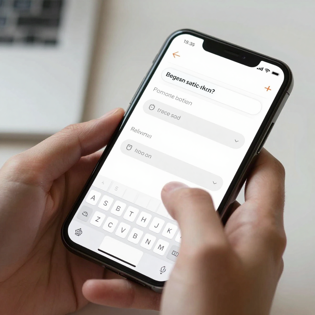
A well-designed keyboard-aware form keeps the active field, its label, and any inline error message visible above the keyboard at all times, with the primary action button either pinned above the keyboard or reachable with a single scroll. Concretely, that means the form lives inside a scrollable container rather than a fixed-height view, the field currently being edited auto-scrolls into a comfortable position the instant it's focused, and there's enough padding between the field and the keyboard's top edge — designers commonly use 12-24px — that the field doesn't feel jammed against the keyboard.
It also means testing the unglamorous cases: a multi-line field like a bio or comment box that grows as the user types, a form with six stacked fields where the sixth field is nowhere near the keyboard until the user has scrolled through the first five, and the transition when a user switches from a text field to a date picker, which on many apps triggers a jarring re-layout. None of this shows up in a wireframe — a wireframe being the rough, low-detail sketch of a screen's structure before visual polish is applied — which is exactly why it needs to be checked on an interactive prototype, a clickable, testable version of the design, rather than a set of static images.
How Do Design Tokens and Data Models Tie Into This Problem?
Design tokens define how a field behaves visually when the keyboard appears; the data model defines what happens to the user's input if that behavior fails. A data model, in plain terms, is the structured definition of what information an app stores and how the pieces relate to each other — a signup form's data model, for instance, defines that an email is required, a password has a minimum length, and both belong to a single user record. If a hidden field forces a user to guess and mistype an email address, or to submit a form without noticing a validation error tucked behind the keyboard, the data model receives bad input that a correctly visible form would have caught at the source. Keyboard avoidance and data validation are usually designed by different people at different stages, but from the user's chair they're the same five seconds of frustration.
This is one of the reasons Dolfy's Design OS methodology moves through Product Definition and Data Model before Screen Design: by the time a founder is naming input fields and their validation rules, the platform already has a shared understanding of which fields are required, what format they expect, and where errors need to surface — so the exported React Native components, built with TypeScript types for safety, and styled with Tailwind CSS for consistent spacing, come with keyboard-aware behavior and validation logic already wired together instead of assembled from two disconnected specs.
Frequently Asked Questions
Does this problem affect Android and iOS equally?
No — the two platforms handle keyboard resizing differently by default, which is part of why the bug is so persistent. Android can automatically resize or pan a screen when adjustResize or adjustPan is set correctly in the app's manifest, while iOS gives developers no automatic equivalent and expects the app itself to shift its layout, so a fix that looks complete on one platform can still be broken on the other.
Can I test this without building a full native app first?
Yes. A tool like Expo's Go app or its web preview lets you open an interactive prototype on a real phone in minutes and actually trigger the keyboard, which catches this class of bug far earlier than a static Figma file ever could. Dolfy's Design OS produces an Expo Go and Web Preview link as part of its output specifically so this kind of real-device check happens before a single line of production code is written.
Is this only a problem for login and signup forms?
No — any screen with a text input is exposed, including comment boxes, search bars, checkout address forms, and in-app chat. Checkout forms are a particularly costly place for this bug to live, since a hidden field or hidden error message at the exact moment a user is entering payment details is a direct path to an abandoned purchase.
How much design or engineering time does fixing this properly usually take?
Retrofitting keyboard avoidance across an existing app with, say, 15-20 screens that each handle it differently can take a developer several days of screen-by-screen rework. Defining it once as a token-level rule in the design system before those screens are built turns the same fix into a single shared component update — a difference measured in days, not an afternoon, but a difference that compounds every time a new screen is added.
Building Forms That Hold Up the Moment a Real Keyboard Appears
The keyboard avoidance problem is a small, specific example of a larger pattern: the gap between how a screen looks in a design file and how it behaves in a user's hand. Closing that gap means treating keyboard behavior, validation, and data structure as decisions made together, early, rather than three separate fixes applied by three different people after launch. Dolfy's five-step Design OS — Product Definition, Data Model, Design Foundation, Screen Design, and Export — is built around making those decisions in the right order, so the components a founder or developer exports already account for the keyboard, the data, and the design token that ties them together. If your team is tired of finding these bugs after users already have, Dolfy is worth a look.