
The Keyboard Problem: Why Your App's Sign-Up Button Disappears Behind the On-Screen Keyboard
You finally ship the sign-up screen. It looks gorgeous in the design file, the simulator, and your screenshots. Then a beta tester tags the password field, the keyboard slides up, and the "Create account" button disappears behind it. They cannot see what they are typing, cannot reach the button, and quietly close the app. If this sounds familiar, you have met the keyboard problem, and Dolfy.ai was built to help you design around it before a single line of code ships.
Key Takeaways
- The on-screen keyboard covers roughly 35-45% of a phone screen, so every input screen has two layouts: keyboard closed and keyboard open.
- Most keyboard bugs come from designing only the "closed" state and never defining what the layout does when the keyboard appears.
- Scrollable forms, sticky action bars, and the right input types fix the majority of problems without custom native code.
- Treating the keyboard-open state as a first-class screen in your design process catches issues days before testing does.
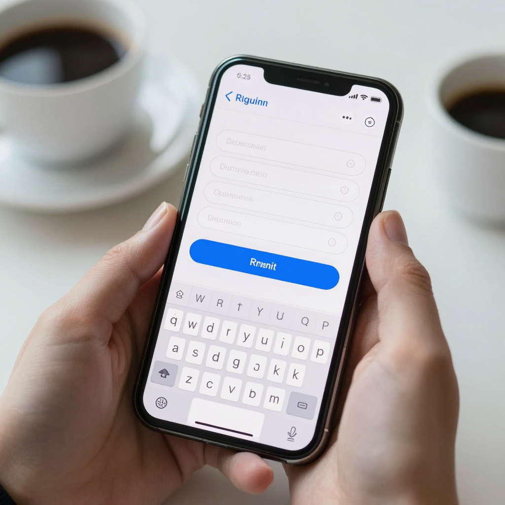
Why does the keyboard hide my app's input fields?
The keyboard hides input fields because it is drawn by the operating system on top of your app, and your layout does not automatically know it has shrunk the usable space. On both iOS and Android, the keyboard simply overlaps whatever is at the bottom of the screen unless your layout is told to move or resize. A typical phone keyboard takes up about 300 pixels of height in portrait mode, which on a small device can be more than a third of the visible area.
For a plain-English definition: a layout is the set of rules that decides where every element on a screen sits and how big it is. A viewport is the visible area those rules have to fit inside. When the keyboard opens, the viewport gets shorter, but a layout built only for the full-height screen keeps assuming the old size. The result is a sign-up button that sits exactly where the keyboard now lives.
This is a design problem as much as a code problem. If nobody drew the keyboard-open version of the screen, the developer has to guess, and guesses vary from one screen to the next. That is how you end up with one form that scrolls nicely, another that jumps, and a third that traps its own submit button.
What does a keyboard-open screen actually need to show?
A keyboard-open screen needs to show three things at all times: the field the user is typing in, the label or hint that explains it, and a way to move forward. Everything else is optional while the keyboard is up. If any of those three is hidden, users stall.
Think of the keyboard-open state as a smaller screen of its own. On a phone with a 6.1-inch display, the visible content area can drop from around 800 points of height to roughly 450 once the keyboard is up. That is barely enough for a header, two fields, and a button. A screen with five fields stacked vertically simply cannot show all of them, so the design has to decide what scrolls, what sticks, and what hides.
A useful exercise is to draw the screen twice, side by side. In the first frame the keyboard is closed. In the second the keyboard is open and the focused field is the one lowest on the screen, because that is the worst case. If the worst case still shows the active field, its label, and a next step, the rest of the screen will behave.
How should forms scroll when the keyboard is open?
Forms should scroll so that the focused field always lands in the upper half of the visible area, with a little breathing room above the keyboard. The first rule is that the form lives inside a scrollable container, never a fixed-height one. In React Native, this usually means wrapping your form in a ScrollView and pairing it with a keyboard-avoiding wrapper that adds padding equal to the keyboard height.
Here is a practical checklist developers can apply to any form screen:
- Put the form inside a scroll container so content that no longer fits can still be reached.
- Add bottom padding equal to the keyboard height while it is open, and remove it when it closes.
- Scroll the focused field into view automatically when it receives focus, with roughly 16-24 points of margin above the keyboard.
- Let tapping the empty background dismiss the keyboard, so users are never stuck behind it.
- Test with the keyboard open on the smallest device you support, such as a 4.7-inch iPhone SE.
Expo, the toolchain many React Native teams use, ships with the standard keyboard-avoiding view, and community libraries extend it for edge cases. The tools exist. What is usually missing is the design decision about which element should be pinned and which should scroll.

Should the submit button stay above the keyboard?
Yes, in most cases the primary action should stay visible above the keyboard, because a button users cannot see is a button users cannot press. There are two reliable patterns. The first is a sticky action bar: a thin row pinned to the bottom of the content area that rides up on top of the keyboard and holds the main button. The second is to rely on the keyboard's own action key, labeled "Next," "Go," or "Done," which moves the user forward without any on-screen button at all.
The sticky bar works best on short forms such as login, search, and checkout. The keyboard action key works best on multi-field forms where users move from one field to the next. Many strong apps use both: the action key advances between fields, and a sticky button appears only on the final field.
Avoid the third pattern, which is far too common: a submit button at the very bottom of a long form that only appears if the user scrolls past the keyboard. On a small phone, that can mean closing the keyboard, scrolling, and tapping, three extra steps at the exact moment someone is ready to convert.
Which keyboard type should each field use?
Each field should request the keyboard that matches its content, because the right keyboard cuts typing effort and errors dramatically. Both platforms offer specialized layouts: an email keyboard puts the "@" and "." keys on the main layer, a numeric keyboard removes letters entirely, and a phone-pad keyboard offers digits with dialing symbols.
Choosing correctly also changes the keyboard's height, which matters for your layout. A numeric pad is noticeably shorter than a full QWERTY keyboard, so a verification-code screen has more room than a name-and-email screen. Beyond layout type, a few small settings add up:
- Turn off auto-capitalization for email addresses and usernames.
- Turn off autocorrect for passwords and codes, where "fixing" a word is harmful.
- Enable one-time-code autofill for verification codes so the OS can paste the SMS code in one tap.
- Set the return key label to match the next step, such as "Next" or "Done."
These are not design flourishes. They are quiet signals that the app was built by people who tried it on a real phone with a real thumb.
How do you design the keyboard states before writing code?
You design keyboard states by treating them as named screen states in your design system, right next to "loading," "empty," and "error." A design system is the shared set of rules, components, and values that keep an app consistent. When "keyboard open" is a documented state, every input screen inherits the same behavior, instead of each one being solved from scratch.
This is where Dolfy fits naturally. Dolfy is an AI-powered mobile app design platform by AEGONTECH LLC that walks you through a five-step Design OS methodology: Product Definition, Data Model, Design Foundation, Screen Design, and Export. The Screen Design step is where you define each screen, including screens built around forms and text input, and the Design Foundation step sets the design tokens those screens share. A design token is a named value, such as a spacing size or a color, that components reference instead of hard-coding numbers. Defining a consistent bottom spacing token once means every form screen leaves the same breathing room above the keyboard.
Because Dolfy exports production-ready React Native and Tailwind components with TypeScript types, your form screens arrive as real code you can run in the Expo Go preview or the Web Preview. You can open the screen on an actual phone, tap into a field, and see what the keyboard does to your layout in minutes, not after a full build cycle. That fast loop is what makes it realistic to check the keyboard-open state on every input screen instead of only the first one.
What are the most common keyboard mistakes to avoid?
The most common mistakes are predictable, which is good news, because predictable mistakes can be checked off a list. Teams that review these five before release catch most keyboard bugs early:
- Fixed-height screens. A layout locked to the full screen height cannot shrink for the keyboard.
- Hidden labels. Placeholder text disappears the moment the user types, leaving no hint about what the field wants.
- Unreachable buttons. The primary action sits under the keyboard with no way to scroll to it.
- Wrong keyboard type. Users type an email address on a layout with the "@" key buried two layers deep.
- No dismiss path. Tapping outside the field does nothing, so the keyboard stays up forever.
Notice that none of these require advanced engineering. Each one is a missing decision, and each one is cheap to fix when it is made on a design canvas rather than after a one-star review.
How do you test the keyboard on real devices?
You test the keyboard by tapping every input on the smallest device you support, in both portrait and landscape, with the keyboard open. Simulators help, but they sometimes hide the on-screen keyboard by default, which is exactly why bugs slip through. Turn on the software keyboard in your simulator settings, or better, use a physical phone through Expo Go.
A quick manual pass takes about ten minutes for a typical app with five or six input screens. Tap each field, confirm the active field stays visible, confirm the primary action is reachable, and confirm the keyboard dismisses cleanly. Then repeat with a larger text size enabled, since bigger text pushes content down and makes the keyboard problem worse.
Also test the awkward paths: switching between fields quickly, rotating the phone while the keyboard is up, and receiving a system notification mid-typing. These moments cause the strangest layout jumps, and users hit them more often than you would expect.
Frequently Asked Questions
Does every screen need a keyboard-open design?
Only screens with text input need one, but those screens need it every time. A screen with a single search field is simple, while a checkout form with six fields needs careful scroll and pinning decisions. Start with sign-up, login, and checkout, since those screens sit directly in front of your most important conversions.
Is a sticky button better than relying on the keyboard's action key?
Neither is universally better, and many apps combine them. The action key is fastest on multi-field forms because it moves users forward without extra taps. A sticky button is clearer on short forms where the keyboard stays up and the next step is a single tap.
Can I fix keyboard problems after launch without a redesign?
Often yes, because many fixes are small, such as wrapping the form in a scroll container or changing a field's keyboard type. Larger issues, like a form with too many fields on one screen, may need a layout change. Catching them in the design phase is still far cheaper than patching them after users have already left.
Do I need a designer to handle keyboard states?
No. A solo founder or developer can handle them by drawing the keyboard-open version of each input screen and following the checklist above. Tools like Dolfy guide non-designers through the structure so the decisions are made deliberately instead of left to chance.
Design the Moment Users Start Typing
The keyboard is the one part of your app you do not draw, yet it decides whether people finish signing up, paying, or posting. Give it the same attention as any other screen: draw the open state, pin the main action, choose the right keyboard type, and test on a small phone. If you want a structured way to do that, Dolfy walks you from product definition to exportable React Native screens, so the layouts your users see with the keyboard open are the ones you actually designed.