
The Loading Skeleton Problem: Why Your App's Placeholder Screens Make Users Think It's Frozen
You tap into a screen, and for eight hundred milliseconds nothing happens. No spinner, no shimmer, just the same gray background you were already looking at. Your thumb hovers. Did the tap register? Is the app frozen? By the time content actually renders, you've already force-quit and reopened it once, just to be safe. That's not a data problem — Dolfy.ai has watched dozens of founders ship apps where the API call itself was fast, but the screen never told the user anything was happening, and users treated "slow-feeling" exactly the same as "broken."
Loading states are one of the most under-designed parts of any mobile app, because they only exist for a few hundred milliseconds and nobody wireframes them on purpose. But those few hundred milliseconds decide whether your app feels instant or feels cheap.
Key Takeaways
- A blank screen and a slow screen produce the same user behavior: rage-tapping, force-quitting, and 1-star reviews about an app that was actually working fine.
- Skeleton screens (gray placeholder shapes that mimic your real layout) consistently read as faster than spinners, even when the actual load time is identical, because they show structure instead of asking users to wait on faith.
- Your loading state can only be as accurate as your data model — if you don't know in advance whether a screen shows one card or twelve, you can't build a placeholder that matches it.
- Design tokens (the named values — spacing, color, radius — that drive consistent styling everywhere) are what keep a shimmer effect from looking like a rough animation bolted onto a rectangle.
- A loading state needs a real "this failed, here's what to do" ending, not an infinite skeleton that spins forever when the network drops.
Why Does Your Loading State Feel Broken Instead of Fast?
It feels broken because most teams treat loading as an afterthought — a generic spinner component dragged in from a library and dropped onto every screen regardless of what that screen actually contains. Users don't experience your API response time; they experience the visual gap between tapping and seeing something familiar. Research on perceived performance (how fast an app feels, as distinct from how fast it technically is) has shown for years that an app which shows immediate visual feedback, even before data arrives, is rated faster than one that's actually quicker but silent for the first second.
The fix isn't "make the API faster," though that helps too — it's designing what the user sees during the wait so the wait itself disappears from their attention. That's a design decision, not an engineering one, which is exactly why it gets skipped: developers assume design will handle it, designers assume the spinner is "just a loading thing," and it ships as whatever the UI kit shipped with by default.
What's the Difference Between a Skeleton Screen and a Spinner?
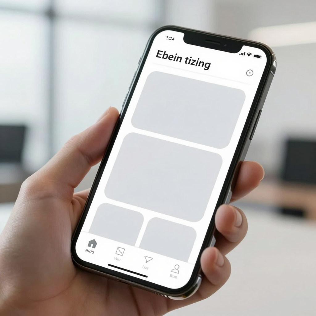
A spinner tells the user "wait." A skeleton screen tells the user "here's what's coming." Concretely, a skeleton screen replaces your real content — a profile card, a list row, a product image — with gray or softly-pulsing rectangles in the exact shape and position that content will occupy once it loads. Facebook's news feed popularized this pattern over a decade ago specifically because a spinning circle gives zero information about layout, while a skeleton lets your eyes start planning where to look before a single pixel of real data has arrived.
The tradeoff: a skeleton screen takes more design work than a spinner, because you need one for every distinct layout in your app — a skeleton for a feed row is not the same shape as a skeleton for a profile header. That's exactly the kind of repetitive, detail-heavy design work Dolfy's Screen Design step is built to generate automatically once your layouts exist, rather than making a designer hand-draw a placeholder state for every one of thirty screens.
How Do You Design Skeleton Screens That Actually Match Your Content?
You match them by building the skeleton directly from your finished layout's component structure, not from a separate "loading" mockup. If your real card component is a rounded-corner container with an avatar circle, a two-line title block, and a metadata row, your skeleton should be the same container with those same three shapes grayed out — not a single generic rectangle that guesses at the overall size.
This is where a lot of indie teams cut corners: they build one skeleton shape and reuse it everywhere, so a skeleton for a text-heavy article list ends up looking identical to a skeleton for a photo grid. Users notice the mismatch even subconsciously — the "loaded" version pops in and rearranges itself because the placeholder didn't actually predict the real layout. When Dolfy generates React Native and Tailwind CSS components from your Screen Design step, the component tree already encodes exactly which pieces are avatar, title, and metadata, so a matching skeleton state can mirror the real structure instead of approximating it.
Where Does the Data Model Decide What Your Skeleton Should Show?
Your data model — the defined shape of what data exists and how it relates, e.g. "a Post has one author, up to four images, and a comment count" — decides how many skeleton items to render and in what proportion, before any of that data has actually loaded. If your data model says a feed item can have zero to four images, your skeleton needs a layout that gracefully handles an item with just text, not one hardcoded to always show an image block that then jarringly disappears once real data lands.
This is the step teams skip because it feels like a "later" problem, but it's precisely why Dolfy sequences Data Model before Screen Design in its five-step Design OS methodology (Product Definition, Data Model, Design Foundation, Screen Design, Export). If you know upfront that a listing screen typically renders 6-10 cards above the fold, your skeleton state can render exactly six to ten placeholder rows — not three, not twenty — matching what users will realistically see within the first 1-2 seconds of a real load.
How Do Design Tokens Keep Your Shimmer Effect From Looking Cheap?
They keep it consistent, because a shimmer (the soft light sweep that moves across a skeleton to signal "still loading, not stuck") only reads as intentional when its color, speed, and corner radius match the rest of your app rather than the default gray that ships with whatever UI library you grabbed. Design tokens are the named, reusable values — like color-surface-muted, radius-md, or duration-shimmer — that drive spacing, color, and shape everywhere in your app, so when you update one token, every skeleton, button, and card updates together instead of drifting into five slightly different gray tones over time.
Without tokens, it's common to see an app where the skeleton's rounded corners are subtly sharper than the real card's corners, or the gray is a colder shade than the surrounding background — tiny mismatches that make the loading state look bolted-on rather than designed. Dolfy's Design Foundation step establishes this token system once, up front, so a skeleton screen automatically inherits the same radius and surface colors as the finished components it's standing in for, with matching TypeScript types carried through to the exported code.
What Happens When the Data Never Loads?
Eventually, your skeleton needs to stop and tell the truth: either show the real content, or show a clear error state with a retry action — never spin indefinitely. A skeleton that's still shimmering after 15-20 seconds isn't patient design, it's a silent failure wearing a nicer costume, and users who've been burned by it once will assume every future load is also broken.
A practical rule that works well for indie teams: set a timeout around 8-10 seconds. If the real data hasn't arrived by then, swap the skeleton for a plain-language error message ("Couldn't load your feed — check your connection") with a retry button, rather than leaving users staring at gray boxes that never resolve. This single addition — an honest failure state instead of an eternal placeholder — resolves a meaningful share of "app is frozen" support tickets and reviews for teams that add it after shipping without one.
Frequently Asked Questions
Should every screen in my app have a custom skeleton state?
Not every screen needs one — a screen that loads in under roughly 200-300 milliseconds (a fast local read, for instance) doesn't need a loading state at all, since flashing a skeleton for a fraction of a second just adds visual noise. Reserve custom skeleton screens for anything that depends on a network call: feeds, profiles, search results, and detail pages users open frequently.
Is a skeleton screen always better than a spinner?
For content-heavy layouts, yes, almost always — but a small spinner still makes sense for tiny, contained actions like a button submitting a form, where there's no layout to preview and a skeleton would be overkill. Use skeletons for "a screen is loading," and spinners for "a small action is processing."
How does Dolfy help me design loading states without a dedicated designer?
Because Dolfy's Design OS methodology walks through Data Model and Screen Design before generating code, the same structural information that defines your real screens — how many items, what fields, what's optional — is available to build matching skeleton placeholders, exported as React Native and Tailwind components with TypeScript types rather than left for you to improvise later in Expo Go or on-device.
What's a reasonable amount of time to spend designing loading states for an MVP?
For a minimum viable product (MVP — the smallest version of your app that tests your core idea with real users), budget roughly one to two focused hours to define skeleton patterns for your two or three highest-traffic screens; you don't need bespoke placeholder states for every screen on day one, just for the ones people will open dozens of times a week.
Designing the Wait So Users Never Notice It
The apps that feel fast aren't always the ones with the fastest servers — they're the ones where the interface never leaves users guessing. A skeleton screen that mirrors your real layout, styled from the same design tokens as the rest of your product, and backed by a data model that knows what's actually coming, turns a loading gap from a moment of doubt into a moment users don't even register. Pair that with an honest error state after 8-10 seconds, and you've closed off the single biggest source of "is this thing broken?" reviews.
If you're still sketching these states by hand for every screen in Figma or Sketch, or hardcoding a single generic spinner because nobody had time to do better, Dolfy is built to carry that structural detail — from Product Definition through Data Model, Design Foundation, and Screen Design — straight into exported, production-ready components, so the loading state your users see is as considered as the one they're waiting for.