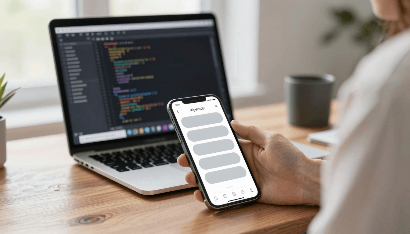
The Loading Skeleton Problem: Why Spinners Make Your App Feel Slower Than It Actually Is
You ship a feature. It works. The API call takes 400 milliseconds, which by any reasonable engineering standard is fast. And yet a beta tester messages you: "the app feels slow." You check your analytics, confused, because the number says otherwise. The problem usually isn't your code — it's the spinning circle you put on screen while that 400 milliseconds ticks by. A generic loading spinner tells the user nothing except "wait," and waiting with no information attached always feels longer than waiting with a preview of what's coming. This is the loading skeleton problem, and it's one of the more overlooked design decisions indie hackers and solo founders make when they're moving fast on a new app. Dolfy.ai, the AI-powered mobile app design platform from AEGONTECH LLC, treats loading states as a first-class part of the design system rather than an afterthought bolted on during development — and getting this right is worth more to perceived speed than most backend optimizations.
Key Takeaways
- A spinner communicates zero information about what's loading, which makes users overestimate wait time by roughly 30-40% compared to structured loading previews, according to multiple UX research studies on perceived latency.
- A skeleton screen — a grayscale placeholder version of the final layout, shown while data loads — reduces perceived wait time because the user's brain has already started parsing the page structure before the content arrives.
- Skeleton screens should mirror your actual layout almost exactly: same card shapes, same spacing, same number of list rows, or you create a jarring "pop" when real content swaps in.
- Skeleton and shimmer animations belong in your design token system, not hardcoded per screen, so every loading state in your app stays visually consistent as you add features.
- Not every wait needs a skeleton — sub-200-millisecond loads should show nothing at all, since flashing a loading state faster than the eye can register a placeholder just adds visual noise.
Why Do Spinners Make Apps Feel Slower Than They Are?
A spinner gives the user's brain nothing to do except watch a shape rotate, and with no reference point for "how much of this is done," people default to assuming the worst. This is a well-documented pattern in perceived performance research: identical load times feel shorter when users are shown progress or structure, and longer when they're shown ambiguity. A 2-second spinner and a 2-second skeleton screen take the same 2 seconds, but testers consistently report the skeleton version as "faster" when timed side by side. That gap between actual and perceived speed is pure design leverage — you get a faster-feeling app without touching your backend at all.
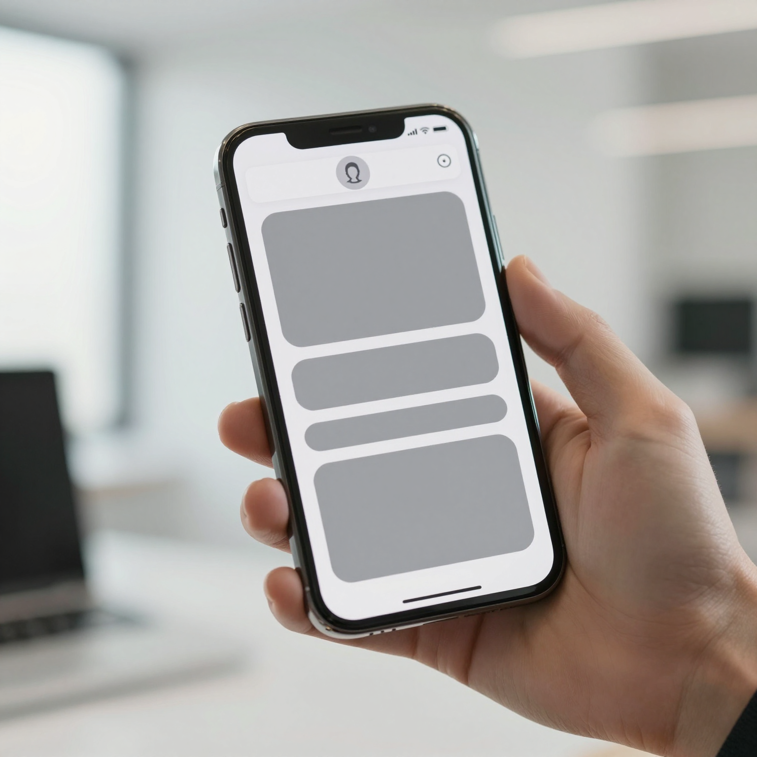
The mechanism is fairly simple once you think about it from a cognitive load angle. When a user sees a skeleton screen — those pill-shaped gray rectangles standing in for a headline, an avatar, a paragraph of body text — their brain has already mapped out where content will land. When the real data streams in, it's a fill-in operation, not a layout shock. A bare spinner, by contrast, gives the brain nothing to anchor to, so every additional second of waiting resets the clock on the user's patience.
How Should a Skeleton Screen Actually Match Your Real Layout?
The short answer: closely enough that swapping in real content doesn't shift anything on screen. If your final card is 96 pixels tall with a 48-pixel avatar on the left and two lines of text on the right, your skeleton card needs those exact same dimensions — not a rough approximation. Mismatched skeleton and content layouts cause a visible "jump" the instant data loads, which paradoxically draws more attention to the fact that something was loading in the first place, undercutting the entire point of using a skeleton screen.
This is where a lot of solo teams get tripped up, because building pixel-matched skeleton components by hand for every screen is tedious, and tedious work gets skipped under deadline pressure. Dolfy's Design OS methodology addresses this directly in its Screen Design step: once you've defined a component in the Design Foundation stage — the shared visual language of your app, including a design-token system (a centralized set of reusable values like spacing units, corner radii, and colors that keep every screen visually consistent) — a matching loading-state variant can be generated alongside the real component rather than designed separately from scratch. That keeps your list-row skeleton and your list-row component sharing the same border radius, padding, and card height by construction, not by manual double-checking.

When Should You Skip the Skeleton Entirely?
Skip it for anything that resolves in under roughly 150-200 milliseconds. Human perception has a rough threshold around that range below which a flash of UI reads as a glitch rather than useful feedback — you'll actually make the app feel less polished by throwing a skeleton up for a fifth of a second and then yanking it away. The fix most teams use is a short artificial delay before showing any loading state at all: start a timer when the request fires, and only render the skeleton if the response hasn't come back by, say, 200 milliseconds. Fast responses skip straight to content with no visual hiccup; slow ones get the skeleton treatment they need.
The opposite failure mode is just as common: teams build one generic skeleton (usually three gray bars) and reuse it everywhere regardless of what's actually loading — a profile screen, a chat list, a product grid. A generic skeleton that doesn't resemble the destination content still beats a spinner, but it leaves real perceived-speed value on the table. If you're prototyping quickly, even a rough per-screen skeleton pass — 10-15 minutes of adjusting rectangle sizes to roughly match your wireframe (a simplified, low-detail sketch of a screen's layout used early in design, before visual polish) — pays for itself the first time a user comments that the app "feels snappy."
How Does This Fit Into a Broader Design System, Not Just One Screen?
Loading states belong in your design tokens the same way colors and spacing do, because that's what keeps them consistent as your app grows past the five or six screens you can hold in your head at once. Define a shimmer animation duration, a base skeleton gray, and a highlight gray once, at the token level, and reference those values everywhere instead of hardcoding hex codes into each new screen's loading state. This is the same discipline that makes a design system valuable in the first place — a design system being the reusable set of components, tokens, and patterns your whole app draws from instead of each screen reinventing its own look.
For teams exporting to code, this consistency has a very concrete payoff. Dolfy's export step outputs production-ready React Native and Tailwind CSS components with TypeScript types attached, meaning a skeleton variant defined once in the design stage becomes a typed, reusable component in your codebase rather than a one-off StyleSheet object copy-pasted into six different files. Whether your team ships with React Native, Flutter, or SwiftUI, the underlying principle — token-driven, layout-matched loading states — travels with you regardless of which framework renders the final pixels.
Frequently Asked Questions
Is a shimmer animation necessary, or is a static gray skeleton enough?
A static gray skeleton communicates the layout, which is most of the value, but a subtle shimmer — a soft light sweep moving left to right — signals "actively loading" rather than "stuck," and costs very little to implement with a CSS or Reanimated gradient animation. It's a nice-to-have, not a requirement, but most polished apps include it.
How many skeleton variants does a typical app need?
Most apps get by with three or four: a list-row skeleton, a card-grid skeleton, a detail-page skeleton, and sometimes a form skeleton. Trying to build a bespoke skeleton for every single screen is usually overkill for a small team — reuse the same handful of skeleton components across similar layouts.
Should error states use the same skeleton pattern?
No — an error state (a failed load, like a lost connection) should replace the skeleton with a clear message and a retry action, not linger as a skeleton indefinitely. Leaving a skeleton on screen past a reasonable timeout, without any explanation, reads to users as the app being broken rather than slow.
Does this matter for an MVP, or is it something to add later?
It matters more for an MVP than most founders expect, because early users forgive missing features far more readily than they forgive an app that "feels slow" — that impression forms in the first few sessions and is hard to undo later. It's a cheap fix early and an expensive retrofit once dozens of screens exist without it.
Designing Loading States Without Slowing Down Your Own Build
The irony of loading-state design is that teams skip it specifically because they're trying to move fast, when in reality a token-driven, layout-matched skeleton system is one of the cheapest polish wins available once you have components and spacing values defined in one place. You're not writing new logic — you're reusing shapes you already built, in gray, with a fill-in swap when data lands. That's a design decision, made once at the system level, that pays out on every single screen your app will ever add. Dolfy builds this thinking into its Design OS process from the Design Foundation step onward, so solo founders and small teams get consistent, production-ready loading states as a natural byproduct of defining their design tokens and components — not as a separate task competing for attention against the next feature on the roadmap.