Micro-Interactions: The Small Animations That Make Apps Feel Built, Not Assembled
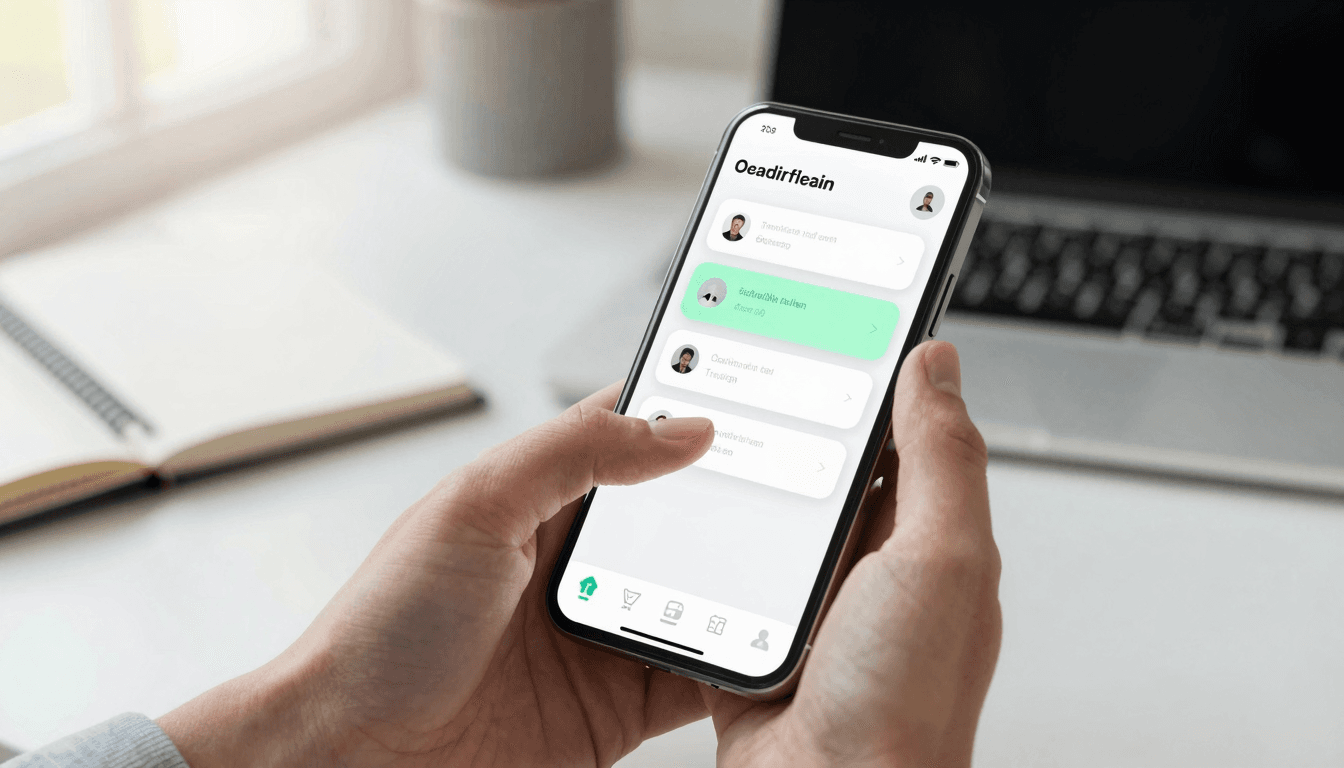
You tap a button in your app. Nothing happens for a beat. You tap it again, unsure if the first tap registered — and now you've triggered the action twice. That half-second of silence is where trust quietly leaks out of a mobile product, and it's one of the most common reasons a technically solid app still feels "off" to users who can't quite articulate why. Dolfy.ai exists precisely to catch details like this before they ship, because the difference between an app that feels built by a real team and one that feels assembled from parts usually comes down to dozens of small animation and feedback decisions, not big feature choices.
Micro-interactions — the tiny animations and feedback cues that respond to a single user action, like a button compressing on tap or a card sliding in when new data loads — rarely make it onto a roadmap. They're not a "feature" in the way a paywall or an onboarding flow is, so they get skipped under deadline pressure. But they're often the single biggest lever for perceived quality, and they cost surprisingly little to get right once you're designing with a system instead of one-off tweaks.
Key Takeaways
- Human response-time research (the Doherty Threshold, dating back to IBM's 1982 studies) puts 100 milliseconds as the point where an action feels instantaneous, and 1 second as the point where users notice they're waiting — most missing micro-interactions fall inside that gap.
- Motion should be a design token, not a one-off CSS value, so a single "duration-fast" or "ease-standard" value stays consistent across every screen instead of drifting screen to screen.
- The four interactions with outsized impact are tap feedback, loading-to-content transitions, pull-to-refresh, and error/success confirmation — get those four right before chasing anything fancier.
- React Native apps that skip native-feeling animation (targeting a steady 60 frames per second) read as "web app in a wrapper" even when the underlying code is fully native.
- Dolfy's Design OS treats motion and interaction states as part of Screen Design and Export, not an afterthought bolted on after development — so the components a founder exports already carry sensible interaction states.
Why Do Users Notice Missing Micro-Interactions Even When They Can't Name Them?
Users don't consciously catalog animation timing, but their nervous system does. The Doherty Threshold research found that once a system takes longer than about a second to respond, people start mentally context-switching away from the task — checking notifications, wondering if something broke, losing the flow state that makes an app feel effortless. A button that doesn't visibly compress or change color on tap forces the brain to wait for a second signal (a screen change) before it can confirm the first tap worked, which stretches perceived latency even when actual processing time is fast.
This is why apps that are technically snappy can still feel sluggish, and why apps with real latency can feel fast if they acknowledge input immediately. The fix isn't more engineering — it's a design system that treats "what happens in the first 100 milliseconds after a tap" as a defined, tested state for every interactive element, not something left to whatever the default component library ships with.
What Are the Highest-Impact Micro-Interactions to Design First?
Four interaction moments account for most of the perceived-quality gap between a polished app and a rough one: tap feedback, loading-to-content transitions, pull-to-refresh, and success/error confirmation. Nail these before spending time on anything more elaborate like parallax scrolling or custom page transitions.
Tap feedback is the simplest and most neglected: every tappable element — buttons, cards, list rows — needs a visible state change within roughly 100 milliseconds of contact, whether that's a scale-down, an opacity shift, or a background color change. Loading-to-content transitions matter because an abrupt swap from a spinner to a fully populated screen reads as a glitch; a brief cross-fade or a skeleton screen that morphs into real content feels intentional. Pull-to-refresh has become such a strong mobile convention (originally popularized by Twitter over a decade ago, now expected in Instagram, Gmail, and nearly every feed-based app) that its absence on a scrollable list quietly signals "unfinished" to users who've internalized the gesture. And success/error confirmation — a checkmark animation, a haptic tap, a toast that slides in and back out — closes the loop on actions like saving a form or completing a purchase, which matters most in exactly the moments (payments, account changes) where users are most anxious about whether something worked.
How Do You Keep Motion Consistent Across an Entire App Instead of Ad-Libbing It Screen by Screen?
Consistency comes from treating motion the same way you treat color or spacing: as a design token, a single named value defined once and referenced everywhere, rather than a number an individual developer picks on the spot. A design-token system typically defines two or three duration values (e.g., "fast" around 150ms for taps, "standard" around 250-300ms for transitions) and one or two easing curves, and every animated component pulls from that shared set.
This is the layer where a lot of otherwise well-designed apps fall apart in practice, because motion is easy to defer to "whatever feels right" during development, and different screens built by different people (or on different days) drift apart. Dolfy's Design Foundation step establishes this token system — spacing, color, typography, and interaction timing together — before any individual screen gets designed, specifically so that motion doesn't become the one inconsistent layer in an otherwise unified design system. When the Export step hands off production-ready React Native and Tailwind CSS components with TypeScript types, those interaction tokens travel with the components instead of getting reinvented per screen by whoever happens to build it next.
Why Does This Matter More on React Native and Cross-Platform Apps Specifically?
Native iOS (built with SwiftUI) and native Android platforms come with baseline system animations — button highlight states, screen transitions, keyboard behavior — built into the OS itself, so even a rushed native app inherits some polish for free. Cross-platform frameworks like React Native and Flutter don't get that safety net automatically; every interaction state has to be explicitly built, which is exactly why cross-platform apps are more likely to feel "like a web page in a shell" when motion gets skipped.
The upside is that once you build a consistent interaction layer once, in a design-token system, it applies everywhere the framework runs. Dolfy's approach leans into this: because founders can preview a design in Expo Go or a Web Preview within minutes of finishing the Screen Design step, they can actually feel whether tap feedback and transitions land correctly on a real device before a single line of production code gets written, rather than discovering the gap after weeks of development. Catching an animation problem at the prototype stage, rather than in a code review three sprints later, is a meaningfully cheaper fix — both in engineering hours and in the awkward conversation about redoing screens that were already marked "done."
What Should a Solo Founder or Small Team Prioritize First If They Can't Do Everything?
If you're a solo founder or a two-person team without a dedicated motion designer, prioritize in this order: tap feedback on every interactive element, then loading-to-content transitions on your two or three most-visited screens, then success/error confirmation on any screen that involves money, account settings, or user-generated content, and only then pull-to-refresh and anything more elaborate. That ordering follows directly from where anxiety and confusion cluster for users — payment and account-change screens are where silent failure feels worst — and it's achievable in a weekend rather than a sprint because it's four defined states applied consistently, not fifty custom animations.
This is also where a data model built correctly from the start (Dolfy's Data Model step, which happens before any screen gets designed) pays off in interaction design too: knowing exactly which fields can fail validation, which actions are async and need a loading state, and which are instant means you're not retrofitting loading and error states onto screens after the fact — they're accounted for from Product Definition onward.
Frequently Asked Questions
Do micro-interactions slow down development?
Not meaningfully, if they're built as reusable, token-driven components rather than one-off code per screen. The upfront cost is defining three or four timing and easing values once; after that, applying them to a new button or card is a prop, not a new animation to write from scratch.
What's a design token, in plain terms?
A design token is a single named value — like a specific shade of blue, a spacing size, or an animation duration — that's defined once and reused everywhere in an app, so changing it in one place updates it consistently across every screen instead of hunting down dozens of hardcoded values.
Can AI actually design good micro-interactions, or does that need a human designer?
AI-assisted tools are strongest at applying a consistent, well-reasoned system (correct timing values, sensible defaults for tap states and transitions) across every screen without drift, which is where most human-built apps actually fall short due to inconsistency rather than lack of taste. Dolfy's Design OS builds interaction states into its Design Foundation and Screen Design steps by default, which covers the four highest-impact interactions described above without requiring a dedicated motion designer on a small team.
How do I know if my app's animations are actually running smoothly?
The practical target on mobile is a steady 60 frames per second; below that, motion starts to look choppy rather than fluid. On React Native specifically, animations driven by the native thread (rather than the JavaScript thread) are far more likely to hit that target consistently, which is a technical detail worth confirming with whoever builds your app if smoothness matters to your product.
Getting Interaction Design Right From the Start
The apps that feel effortless to use almost never got there by accident — someone deliberately defined how every tap, load, and confirmation should feel, and applied that definition consistently instead of leaving it to whatever each screen's builder felt like doing that day. That's a design systems problem as much as an animation problem, which is exactly the gap Dolfy is built to close: its 5-step Design OS carries interaction and motion tokens from Design Foundation through Screen Design and into the production-ready React Native and Tailwind components you export, so the small details that make an app feel finished don't depend on someone remembering to add them screen by screen.