The Notification Badge Problem: Why That Little Red Number Is Training Users to Ignore Your App
You ship a notifications feature, slap a little red circle with a number on the bell icon, and move on to the next screen. Three weeks later your analytics show something strange: the badge count is climbing into the double and triple digits for half your users, and your open rate on notifications hasn't moved at all. This is a pattern Dolfy.ai's product design work with early-stage founders keeps surfacing — users aren't missing the badge or confused by it. They've simply stopped believing it means anything, and now they've trained their thumb to swipe past your app icon the same way they swipe past a "12 unread" folder they gave up on years ago. This is the notification badge problem, and it's one of the quieter ways an app teaches its own users to ignore it, because badges are one of the first "small" UI decisions a team makes without ever really deciding anything.
Key Takeaways
- A badge count that never resolves to zero teaches users to mute it, not to open your app — the badge becomes wallpaper within a few sessions.
- "99+" is a design failure signal, not a clever overflow trick; if users are regularly hitting it, the underlying count logic is wrong.
- Not every badge should behave the same way — an "action needed" badge (a message waiting for a reply) and an "FYI" badge (a feed update) need different rules, and conflating them is what causes badge fatigue.
- Getting this right starts before a single screen is drawn — it's a data modeling decision about what a notification actually is and what "read" means for each type.
- Once you know the types, a design system with shared design tokens keeps badge behavior consistent everywhere it appears, instead of each screen inventing its own rule.
Why Do Users Start Ignoring Red Badge Numbers?
Users ignore badge counts once the number stops correlating with something they can resolve in a single, predictable action. A badge is a promise: "tap here and this number goes to zero, and something meaningful happened when it did." The moment that promise breaks — the badge says 14, you open the screen, and it still says 14, or drops to 9 for reasons you can't figure out — the brain reclassifies the badge from "signal" to "noise" almost immediately.
This is a well-documented pattern in behavioral psychology around variable and unreliable feedback: when a signal stops reliably predicting an outcome, people stop attending to it, even if the underlying event (a real unread message, a real mention) is still happening. For a founder or solo developer building a first version of an app, this usually isn't a strategy failure — it's an implementation shortcut. The badge count gets wired to "total unread rows in a table" because that's the easiest query to write, without anyone deciding whether that's actually the right thing to count.
What's the Difference Between an "Action" Badge and an "FYI" Badge?
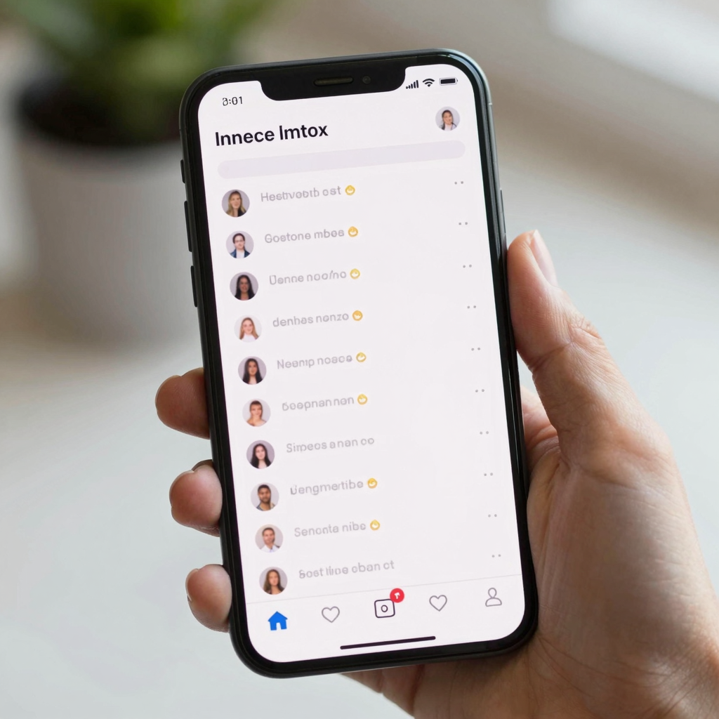
An action badge represents something that needs a direct response from the user — a new direct message, a pending approval, a form waiting to be filled out. An FYI badge represents something the user might want to know about but doesn't need to act on — a friend's new post, a price drop, a "your weekly summary is ready" nudge. Treating both the same way is the single most common mistake in this space.
Action badges should be rare, precise, and always resolvable: the count should drop to exactly zero the moment the user has seen or handled every item it represents, and it should never silently reset behind their back. FYI badges are lower-stakes and, in many well-designed apps, shouldn't use a numeric count at all — a simple dot indicating "there's something new" avoids the anxiety-inducing math problem of "47 things I supposedly haven't seen" for content nobody expects to fully clear. Instagram, TikTok, and most social apps quietly made this shift years ago: the main feed doesn't tell you a number, it just tells you something changed. Reserve the number for things a user can genuinely finish.
How Should You Design a Badge Count That Never Lies?
Design the badge so its number is computed from the same source of truth the target screen uses to mark items as resolved, not from a separate, looser query. If your inbox screen marks a message "read" the instant it renders on screen, your badge count needs to use that exact same "read" flag — not a timestamp comparison, not a cached count updated on a schedule, and not a count that only decrements on app foreground.
Concretely, that means: pick one canonical field per notification type that flips from unresolved to resolved, make every part of your app — badge, list screen, push payload — read from that same field, and make the transition happen at the moment of genuine user attention (a message actually visible on screen for a beat, not just a screen technically loaded). A wireframe — the rough, low-fidelity skeleton of a screen's layout before any real visual design happens — is actually a good place to catch this problem early, because sketching the badge and the resolving screen side by side forces you to ask "what event, exactly, makes this number go down?" before you've written a line of code.

Where Does Data Modeling Fit Into Fixing This?
This is fundamentally a data modeling problem before it's a visual design problem — you have to define what a "notification" object actually contains (its type, its resolved/unresolved state, who it belongs to, what marks it resolved) before you can design a badge that behaves consistently. A data model is simply the structured definition of the information your app stores and how the pieces relate to each other — think of it as the blueprint for your database tables and the fields on them, decided before screens get built on top.
This is exactly why Dolfy structures its 5-step Design OS methodology — Product Definition, Data Model, Design Foundation, Screen Design, and Export — with Data Model as its own dedicated step that happens before Screen Design, rather than folding it into "just design the screens and figure out the backend later." When a founder defines notification types and their resolution rules during that Data Model step, the badge behavior on every downstream screen inherits the same logic automatically, instead of getting reinvented (and getting inconsistent) screen by screen. Teams that skip straight to Figma mockups routinely end up with three different badge-clearing behaviors across one app, discovered only after a confused support ticket.
How Do Design Tokens Keep Badge Behavior Consistent Across Your App?
Design tokens keep badge appearance — not just its logic — consistent by defining the badge's color, size, and text style once as a named, reusable value instead of a hardcoded number on every screen. A design token is a small, named piece of a design system (a color, a spacing value, a font size) stored once and referenced everywhere, so changing "badge-red" in one place updates every badge across the whole app instead of requiring a hunt through dozens of screens.
Dolfy's Design Foundation step generates exactly this kind of token system alongside production-ready component code, so a badge component built during Screen Design already has its color, padding, and typography wired to shared tokens rather than one-off values a developer eyeballed. When that component gets exported, it comes out as real React Native and Tailwind CSS component code with TypeScript types attached to its props — meaning "count," "type," and "isAction" become typed values a developer can't accidentally pass a string into — and it's previewable instantly through Expo Go on a physical phone or through a Web Preview link, so a founder can see the badge actually behaving correctly (or not) within minutes of the Design Foundation step finishing, long before a full engineering sprint gets scheduled around it.
Frequently Asked Questions
Should every badge use a number, or is a plain dot ever better?
A plain dot is often better for FYI-style updates where there's no specific count a user is trying to clear, since it avoids implying a task list that doesn't really exist. Save numeric counts for genuinely actionable items — unread direct messages, pending approvals — where a specific number the user can drive to zero actually helps them.
How high should a badge count go before it becomes "99+"?
Most well-designed apps cap the visible number around 99 not as an arbitrary style choice but because a three-digit badge on a small icon becomes visually cramped and starts overlapping the icon artwork it sits on. If your users are regularly seeing "99+," treat it as a signal that your action badges are counting something too broad — you likely need to split one noisy badge into a more specific, resolvable one.
Does fixing badge behavior require a backend rewrite?
Usually not a full rewrite, but it does require picking one authoritative "resolved" flag per notification type and making sure every screen reads from it, which is a data modeling fix more than a UI fix. Teams that define this clearly during a Data Model step, the way Dolfy structures it before any screens get designed, typically spend a few hours reconciling logic rather than weeks re-architecting.
What's a realistic timeframe to redesign notification badges properly?
For a small to mid-size app, auditing badge types, redefining the data model for "resolved," and rebuilding the badge component with shared design tokens is realistic within a 1-2 week sprint for a solo developer or small team, especially when the component export already produces typed, ready-to-use code rather than a static mockup that still needs to be rebuilt from scratch.
Getting Badge Design Right From the First Screen
The fix for badge blindness isn't a clever animation or a bigger, redder dot — it's deciding, before any screen gets designed, exactly what each notification type means, what makes it resolved, and making that logic and its visual presentation consistent everywhere it shows up. That's a sequencing problem as much as a design one, and it's why starting with data modeling rather than screens matters so much for a small team without a dedicated design hire.
Dolfy walks founders and developers through that sequence directly — Product Definition, Data Model, Design Foundation, Screen Design, and Export — so decisions like "what counts as unread" get made once, early, and then propagate automatically into every screen and every exported component. If your app's badges have quietly become numbers nobody trusts anymore, it's worth treating that as a data model conversation first and a visual redesign second. You can see how Dolfy structures that process at Dolfy.