
The Offline Screen Problem: Why Your App Goes Blank the Moment Wi-Fi Drops
A founder is demoing their app to an investor on the subway. The pitch is going well right up until the train dips underground, the network icon flips to a single flickering bar, and the screen the investor is looking at just... stops. No spinner, no message, no button. It looks dead. That founder built a genuinely good product and lost the room in four seconds, because nobody ever designed what the app should do when the connection disappears. This is the offline screen problem, and it is one of the most common gaps Dolfy.ai sees when reviewing an app's screen designs: teams design the happy path in perfect detail and leave the no-connection path as an afterthought, or skip it entirely.
Key Takeaways
- Every screen in a mobile app has at least four states — loading, loaded, empty, and offline/error — and most design work only covers the first two.
- A dropped connection is not a rare edge case: subway commutes, elevators, parking garages, and rural drives put a meaningful share of sessions into a degraded or zero-connectivity state at some point.
- A blank or frozen screen reads to users as "this app is broken," even when the underlying code is fine and the network will reconnect in seconds.
- Designing the offline state as a reusable pattern in a design system, rather than one-off per screen, turns a multi-hour fix into a five-minute swap on every future screen.
- Dolfy's five-step Design OS methodology treats these states as part of Screen Design, not as a bug-fixing afterthought bolted on after launch.
Why Does Your App Go Blank the Moment It Loses Signal?
Most apps go blank offline because the interface was only ever designed for the one condition where a network request has already succeeded. A wireframe — the rough, low-detail sketch of a screen's layout before visual polish is applied — almost always shows a screen full of data: a dashboard with numbers, a feed with posts, a profile with a photo. Nobody sketches the wireframe for "the request timed out and there is nothing to show." When a developer builds from that wireframe, they build exactly what they see: a component that renders data, and nothing that renders the absence of it. The blank screen isn't a bug in the traditional sense. It's a design decision nobody consciously made.
What Actually Happens When a Phone Loses Connectivity Mid-Session?
Somewhere between 30 seconds and several minutes: an elevator ride, a subway tunnel, an underground parking garage, a rural highway between cell towers. During that window, every request the app makes either times out or fails outright, and whatever component was waiting on that data has no instructions for what to render instead. In the best case, it keeps showing a loading spinner forever. In the worst case, the screen throws an unhandled error and the whole app crashes back to the home screen. Users don't distinguish between "temporary network hiccup" and "this app is fundamentally broken" — they just close it, and a meaningful fraction of them don't reopen it that day.
How Should an App Behave When the Network Drops?
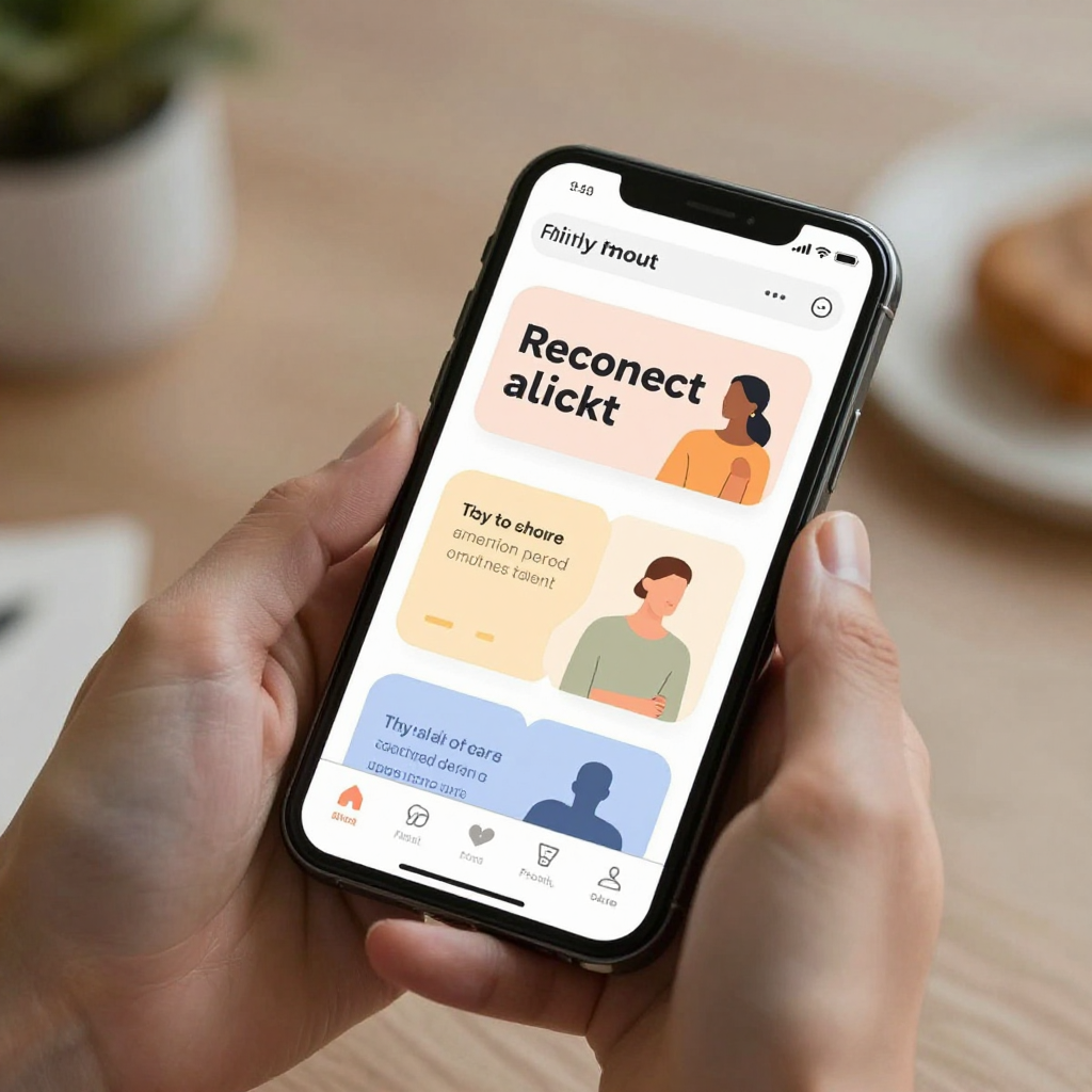
It should tell the truth, calmly, and give the user something to do. A well-designed offline state has three ingredients: a clear, human-readable message ("You're offline — we'll reload this once you're back"), a visual anchor so the screen doesn't feel abandoned (a muted illustration or icon in the existing layout, not a wall of gray), and a way forward, usually a retry button or automatic reconnect with a short countdown. Critically, cached content — data the app already fetched and stored locally on the device before the connection dropped — should still be visible and clearly marked as possibly outdated, rather than being wiped from the screen just because a fresh request failed. Showing yesterday's feed with a small "last updated 2 hours ago" label is almost always better than showing nothing.
Why Do So Many Teams Skip Offline States Until It's Too Late?
Because they're genuinely tedious to hand-build one screen at a time. A solo developer coding a retry-with-backoff pattern — a technique where the app waits progressively longer between reconnection attempts instead of hammering the network every second — from scratch for a single screen can lose half a day to it: the network listener, the cached-data fallback, the retry button, the loading-to-error-to-recovered transition. Multiply that by every screen in the app that makes a network call, and it's easy to see why teams ship version 1.0 with only the happy path and promise themselves they'll "add error handling later." Later usually arrives as a wave of one-star reviews after launch.
How Does Dolfy's Design OS Handle This by Default?
Dolfy.ai is an AI-powered mobile app design platform built by AEGONTECH LLC that walks founders and developers through a five-step Design OS methodology — Product Definition, Data Model, Design Foundation, Screen Design, and Export — specifically so that decisions like "what does this screen look like offline" get made once, early, and consistently, rather than improvised screen-by-screen after a bug report. During the Data Model step, where the app's underlying information structure (what a "post," "user," or "order" actually contains and how those pieces relate) gets defined, Dolfy also surfaces which screens depend on live network data and therefore need an offline fallback. By the time a screen reaches the Design Foundation step — where a design system's shared design tokens (the named, reusable values for color, spacing, and type that keep every screen visually consistent) get applied — the offline, loading, and empty states inherit the same tokens automatically, so a retry button on the feed screen looks and behaves like the retry button on the profile screen without anyone redesigning it twice.

What Does a Well-Designed Offline State Actually Look Like?
Picture a fitness app's workout history screen. Online, it shows a scrollable list of past sessions pulled from the server. The connection drops mid-scroll. A well-designed version keeps the already-loaded sessions on screen exactly as they were, adds a slim, dismissible banner at the top reading "Offline — showing your last synced workouts," and quietly retries in the background every few seconds without the user having to tap anything. If reconnection takes longer than expected, a small button appears: "Tap to retry now." Nothing jumps, nothing resets, and nothing looks broken. That's the entire bar: preserve what the user already had, say plainly what changed, and give them one obvious next action. Dolfy's Screen Design step produces exactly this kind of component — exported as production-ready React Native and Tailwind CSS components with full TypeScript types, so the offline banner a designer specifies is the same component a developer ships, not a rough approximation of it.
Frequently Asked Questions
Is designing an offline state really worth the time for an early-stage MVP?
Yes, but scoped small — an MVP (minimum viable product, the smallest version of an app that still delivers real value) doesn't need every screen to handle offline gracefully, just the two or three screens users hit most often. A generic "you're offline" banner across the whole app, defined once, covers most of the risk in under an hour.
What's the difference between an empty state and an offline state?
An empty state means the request succeeded but there's genuinely no data yet — a new user's blank inbox, for example. An offline state means the request never completed because there was no connection to complete it over. They need different messages: "nothing here yet, here's how to add your first item" versus "we couldn't reach the server, here's your last saved version."
Do I need a backend engineer to build offline support, or is this a design problem?
It's both, but design comes first. Once a designer specifies exactly what each state looks like and when it appears, implementing it in React Native, Flutter, or SwiftUI is comparatively mechanical — most of the wasted time on real projects comes from developers guessing at the intended behavior mid-build, not from the code itself being hard.
Can Dolfy generate an offline state automatically, or do I have to design it manually?
Dolfy surfaces which screens in your Data Model depend on network calls and applies your design system's tokens to the fallback states it generates, so the offline, loading, and error variants for a screen come out visually consistent with the rest of the app without being redrawn by hand each time.
Designing for the Connection You Don't Have
The apps that feel trustworthy aren't the ones that never lose connection — every app loses connection sometimes. They're the ones that don't fall apart when it happens. That's a design decision, made once, applied everywhere, not a bug fix bolted on after a bad review. If you're building or redesigning a mobile app and want the offline, empty, and error states handled as part of the process instead of an afterthought, Dolfy builds them into every screen from the Data Model step onward — so the version your users see on a subway with no signal looks as intentional as the one they see at their desk on fiber.