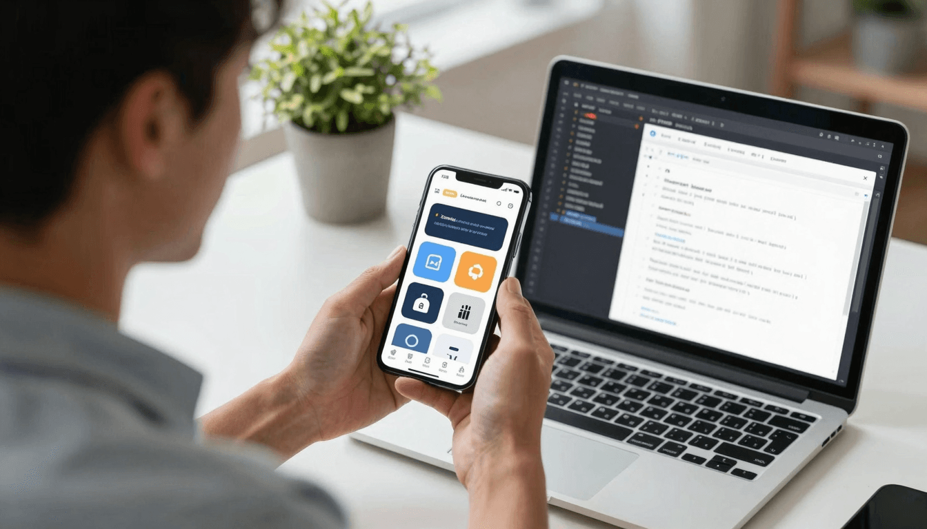
No Signal, No Problem? Designing Offline States Users Actually Trust
Picture the moment: a user is riding the subway, thumbing through your app between stops, when the connection drops. If the screen goes white, the spinner spins forever, or a cryptic "Error 500" appears, that user doesn't file a bug report — they just close the app and, more often than not, never reopen it. Most teams spend weeks polishing the "happy path" screens and almost no time on what happens the moment the network isn't there. Dolfy.ai, an AI-powered mobile app design platform, treats offline and low-connectivity states as a first-class part of the design process rather than an afterthought bolted on right before launch.
That gap matters more than most roadmaps admit. Industry UX research consistently points to a patience threshold of just a few seconds before a stalled screen reads as "broken" to a user, and a meaningful share of mobile sessions — commonly estimated at somewhere around a third — happen on unreliable connections: subway commutes, rural coverage, crowded stadium Wi-Fi, or a phone quietly switching between cell towers. If your app only looks good on a strong, uninterrupted connection, it only looks good some of the time.
Key Takeaways
- Offline and low-connectivity states deserve the same design attention as your primary screens, not a generic spinner added at the end.
- A clear visual language for "loading," "retrying," and "offline" reduces perceived wait time even when actual load time doesn't change.
- Skeleton screens (placeholder shapes that mimic the coming layout) outperform blank screens and generic spinners for perceived speed.
- Your data model — the structure that defines what information your app stores and how pieces relate — determines how gracefully your app can degrade when data isn't fresh.
- Dolfy's Design OS methodology builds connectivity states into the Design Foundation and Screen Design steps, so they aren't a rushed afterthought before shipping.
Why Do Apps Feel Broken the Moment the Network Drops?
Apps feel broken offline because most interfaces are designed around a single assumption: data will always arrive quickly. When that assumption fails, there's usually no fallback state defined at all, so the interface either freezes, shows a blank white screen, or displays a raw technical error that means nothing to a non-technical user. None of those outcomes are a design decision — they're the default behavior of an undesigned edge case.
The fix isn't complicated engineering; it's deciding, at design time, exactly what a screen looks like in each of its possible states: loading, loaded, empty, error, and offline. A wireframe — a simplified, low-detail sketch of a screen's layout used early in the design process — that only shows the "happy path" leaves developers to improvise the other four states under deadline pressure, which is exactly how apps end up with a dozen inconsistent error screens. When Dolfy walks a founder through its Screen Design step, it treats these secondary states as required outputs, not optional polish, precisely because they're the states real users hit most often on mobile networks.
What Should an Offline Screen Actually Show Users?
An offline screen should tell users three things immediately: what happened, what still works, and what to do next. That's it. A generic "Something went wrong" message answers none of those questions and just adds friction on top of an already frustrating moment.
Concretely, that usually means a short, human-worded banner ("You're offline — showing your last saved data") rather than a technical stack trace, a visual indicator of which content is cached versus live, and a single clear retry action instead of forcing a full app restart. Cached content is data your app already downloaded and stored locally, so it can still be shown even without a live connection — this is often the single highest-leverage offline feature, because it lets users keep browsing instead of staring at a wall. Apps built with React Native, the popular cross-platform framework that lets teams ship to iOS and Android from one codebase, and its Expo tooling can lean on local storage APIs to cache the last known-good state cheaply, which is exactly the kind of decision worth locking in during design rather than debugging in production three weeks after launch.
How Do You Design Offline States Without Doubling Your Design Work?
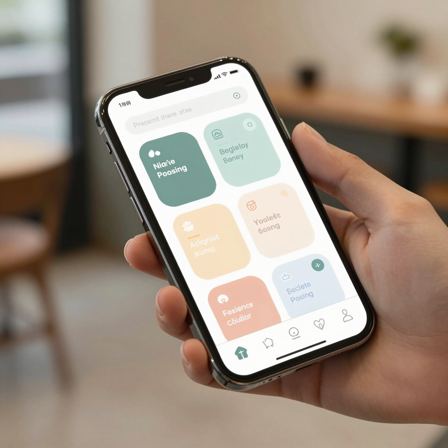
You avoid doubling the work by defining connectivity states as variations of a shared system, not as one-off custom screens. This is where a design system — the reusable collection of components, patterns, and rules that keeps an app's screens visually and behaviorally consistent — earns its keep. If your buttons, banners, and cards are already built as reusable components with defined states (default, loading, disabled, error), adding an "offline" variant is a matter of styling an existing component, not designing a new screen from scratch for every place connectivity might fail.
Design tokens make this even faster. A design token is a named value — a specific color, spacing amount, or font size — stored once and referenced everywhere it's used, instead of being hard-coded into dozens of individual screens. Change a token like color.status.offline in one place, and every banner, badge, and icon that references it updates automatically across the whole app. Teams without a token system often end up hunting through code in ten or fifteen files just to adjust the shade of a warning color; with tokens, that's a one-line change. Dolfy generates this token system automatically as part of its Design Foundation step, alongside production-ready React Native and Tailwind CSS components with TypeScript types, so a founder using it never has to build that infrastructure by hand — a task that, done manually, can easily eat two or three full days for a small team.
Where Does the Data Model Fit Into All This?
The data model determines how gracefully your app can degrade when fresh information isn't available, because it's the structure that defines what data exists, how pieces of it relate, and — critically — how "stale" each piece is allowed to be before it needs a refresh. A data model is simply the blueprint of your app's information: what a "user," a "post," or an "order" looks like, and how those objects connect to one another.
Teams that design screens before they design data (a mistake worth catching early) often discover, mid-build, that their screens assume information the data model never accounts for — like a "last updated" timestamp needed to label cached content as stale, or a sync status flag needed to show a pending-upload indicator. Dolfy's methodology deliberately puts the Data Model step before Screen Design for exactly this reason: a screen that needs to say "last synced 4 minutes ago" only works if the underlying model was built to store that timestamp in the first place. Retrofitting that after screens are already built in Figma or Sketch, the popular design tools most teams start in, usually means reworking multiple screens instead of updating one field.
What Do Loading, Retry, and Sync States Need to Communicate?
Loading, retry, and sync states need to communicate progress and control — that something is actively happening, and that the user has a way to act if it stalls. A skeleton screen (a placeholder layout using gray blocks shaped like the content that's about to load) does this better than a spinner because it sets a visual expectation of the structure that's coming, which studies on perceived performance consistently show reduces how long a wait "feels," even when the actual load time is identical.
Retry states need a visible, tappable action — not an automatic silent retry that leaves the user guessing whether anything is happening. Sync states, common in apps that let users create content offline and upload it later, need a lightweight but persistent indicator (a small badge or icon, not a full-screen takeover) showing that data is queued and will sync once connectivity returns. Frameworks like Flutter and native SwiftUI on iOS both support this kind of lightweight status UI natively, so there's rarely a technical reason to skip it — the gap is almost always in design planning, not engineering capability. With Expo Go, the free companion app for previewing Expo projects, a founder can test how a retry banner actually feels on a real device in under a minute, which makes it easy to catch an overly aggressive or confusing retry pattern before it ships.
Frequently Asked Questions
Do I need custom offline screens for every part of my app?
No. Most apps only need two or three offline patterns — a full-screen offline state for content-heavy screens, a banner-style state for screens with mixed cached and live data, and a blocked-action state for anything that requires a live connection, like submitting a payment.
What's the difference between a loading state and a skeleton screen?
A loading state is any UI shown while content is being fetched, and a spinner is one common (but weak) example of it. A skeleton screen is a specific, better-performing type of loading state that mimics the shape of the incoming content with placeholder blocks instead of a generic spinner.
Should offline states be part of the design phase or left to developers to figure out later?
They should be part of the design phase. Leaving connectivity states to be improvised during development is exactly how apps end up with inconsistent, confusing error handling — Dolfy's Design OS approach treats them as required screens within the Screen Design step, not optional extras.
Does this apply to simple MVPs, or only mature apps with lots of users?
It applies to MVPs especially. A minimum viable product — the smallest version of an app that lets you test the core idea with real users — is often tested by early users on inconsistent connections, like a coffee shop Wi-Fi network or a phone on a weak cell signal, so a broken offline experience can sink first impressions before the product even proves its core value.
Building an App That Feels Solid, Signal or Not
A mobile app doesn't need a perfect connection to feel trustworthy — it needs a design that was honest about the fact that connections aren't always perfect. Treating loading, retry, offline, and sync states as designed screens instead of engineering afterthoughts is a relatively small amount of upfront design work that pays off every time a user rides the subway, walks into a basement, or steps outside cell coverage.
That's the thinking baked into Dolfy's 5-step Design OS methodology: Product Definition, Data Model, Design Foundation, Screen Design, and Export each build toward an app that holds up under real-world conditions, not just demo-day Wi-Fi. For solo founders and small teams who don't have a dedicated design hire to think through every edge case, Dolfy turns that planning into production-ready components, token systems, and a data model built to support states like "offline" and "syncing" from day one — so the app you ship handles a dropped connection as confidently as it handles a perfect one.