
The Onboarding Carousel Problem: Why Your App's Welcome Screens Get Swiped Past Unread
You just spent two weeks writing the copy for your app's welcome carousel. Three screens, each with a hero illustration, a headline, and a tidy sentence explaining why your app is different. You ship it, watch your first analytics session replay, and the user thumbs through all three screens in under four seconds -- tap, tap, tap, done -- without their eyes stopping anywhere. They never read a word. This is the onboarding carousel problem, and it quietly wastes more design effort than almost any other screen in a mobile app, because founders keep treating it as marketing copy instead of a functional part of the product. Dolfy sees this pattern constantly in early-stage app reviews, and it's one of the clearest signs that a screen was designed for how the team wanted to describe the product, not for how a stressed, curious, slightly impatient new user actually behaves in the first ten seconds after downloading an app.
Key Takeaways
- Most users spend 3-5 seconds per onboarding screen at best, and skip rates on optional welcome carousels commonly run 60-80% once a skip button is visible.
- A carousel that explains features in the abstract performs worse than one that shows the actual interface the user is about to use.
- Onboarding should be treated as a data model problem -- what does the app need to know about this user before its first real screen makes sense -- not just a copywriting exercise.
- Progressive, contextual onboarding (tooltips shown at the moment of use) consistently outperforms front-loaded carousels for feature adoption.
- Consistent design tokens between your onboarding screens and your actual app interface prevent the jarring "different app" feeling that makes users distrust a carousel's promises.
Why Do Users Swipe Past Onboarding Without Reading It?
Users swipe past onboarding because they've already made the decision that matters -- they downloaded the app -- and every screen between that decision and the thing they came to do feels like friction. A wireframe (an early, low-detail sketch of a screen's layout used to plan structure before visual design) of a typical carousel shows three panels of decorative illustration with a paragraph of marketing language underneath, and there is no task, no input field, nothing for the user's hands to do except tap Next. Passive screens get skipped. Studies on mobile first-run behavior consistently find that once a visible Skip option exists, a large majority of new users -- often 60% to 80% depending on the app category -- will tap it well before the final screen. That's not laziness. That's a rational response to a screen that isn't giving them anything they can act on yet.
What Makes an Onboarding Carousel Feel Like a Speed Bump Instead of a Welcome?
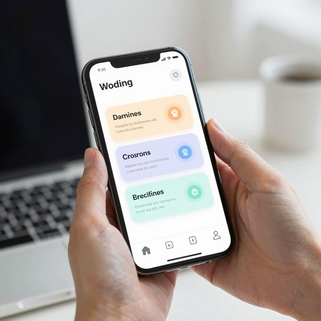
A carousel feels like a speed bump when it delays the app's actual value by describing that value in the past tense instead of demonstrating it. Founders often write onboarding copy the way they'd write an App Store listing -- Track your goals, Connect with friends, Stay organized -- three abstract promises with no visual proof attached. Compare that to a carousel screen that shows the real dashboard the user will land on, with a soft highlight circle around the one button that matters first. The second approach uses the actual component export (the production-ready screen code generated from a design, ready to run rather than just look at) from the real app instead of a custom illustration made only for the onboarding flow. When your welcome screens are visually disconnected from your actual product -- different colors, different type scale, an illustration style your real app never uses again -- users register that mismatch even if they can't articulate it, and it reads as marketing rather than a preview of the tool they're about to trust with their data.
How Should You Decide Between Showing Onboarding Once or Every Launch?
You should show a full onboarding carousel exactly once, on first install, and replace every subsequent explanation with contextual hints tied to the moment a feature becomes relevant. This is the difference between front-loaded onboarding and progressive disclosure (revealing functionality gradually, as the user needs it, instead of all at once). A photo-editing app doesn't need to explain its cropping tool on day one if the user hasn't opened a photo yet -- that explanation belongs the first time they tap the crop icon, not buried in screen two of a carousel they'll forget within the hour. Teams building with React Native and Expo (a toolchain that lets you preview a mobile app instantly on a real device without a full native build) often ship a coach-mark system -- small contextual tooltips triggered by state, like a first-time flag stored per user -- that replaces most of what used to live in a bloated welcome carousel. The carousel's job shrinks to the one or two things a user genuinely cannot infer on their own: how to grant a required permission, or what the app is fundamentally for in a single sentence.
What Does a Data-Driven Onboarding Flow Look Like in Practice?
A data-driven onboarding flow starts from a data model (the structure defining what information your app stores and how those pieces relate -- a user, their preferences, their first project) rather than from a mood board. Before drawing a single screen, ask what the app actually needs to know before its home screen can be useful: a name, a goal, a starting preference, permission to access a camera or location. Dolfy's Design OS methodology builds this order deliberately -- Product Definition and Data Model come before Design Foundation and Screen Design specifically so that onboarding gets designed around real required fields instead of decorative filler screens invented after the fact. In practice, that means an onboarding flow with two genuine input screens (say, "What's your main goal?" and a permission prompt) will usually outperform a five-screen illustrated tour, because every screen the data model actually needs justifies its own existence, and every screen it doesn't need gets cut.
How Do Design Tokens Keep Onboarding Screens Consistent With the Rest of Your App?
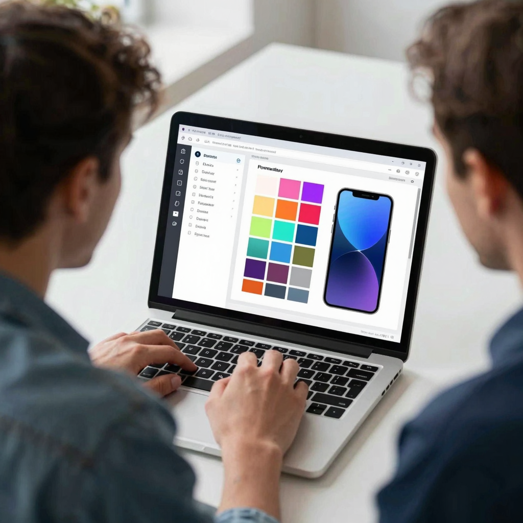
Design tokens (the named, reusable values -- a specific blue, a corner radius, a spacing unit -- that define your visual system in one place instead of hardcoded per screen) keep onboarding consistent by forcing your welcome screens to pull colors, type, and spacing from the exact same source as your dashboard, your settings screen, and everything else. When an onboarding carousel is built by a separate designer using Figma or Sketch mockups that never sync back to the engineering team's Tailwind CSS configuration, drift is almost guaranteed -- a slightly different blue, a rounder corner radius, a heavier font weight that reads as a different app for three screens. Dolfy exports onboarding screens as the same TypeScript-typed React Native components used everywhere else in the app, pulling from one token system, so the welcome flow and the real product share DNA instead of feeling like two apps stitched together. That consistency alone measurably reduces the wait-is-this-still-the-same-app hesitation that shows up in first-run session recordings.
Frequently Asked Questions
How many screens should an onboarding carousel have?
Most teams see diminishing returns past two or three screens; each additional screen is another opportunity for a user to tap Skip. If you need more than three screens to explain your app, that's usually a sign the explanation belongs in contextual tooltips later, not in the initial carousel.
Should onboarding include a login or sign-up step?
Only if your app genuinely requires an account before it can do anything useful -- otherwise, let users explore a limited version first and prompt for sign-up at the moment they try to save or sync something, which converts noticeably better than an upfront wall.
Is it worth A/B testing onboarding carousels?
Yes, but test structural changes (number of screens, whether there's a skip button, carousel versus interactive tutorial) rather than just copy tweaks, since the drop-off usually comes from the format itself, not the wording.
Do onboarding carousels matter less for utility apps than social apps?
Somewhat -- a single-purpose utility app (a timer, a converter) often needs zero carousel screens and can rely on an obvious, self-explanatory first screen, while apps with more setup steps or account-based data benefit more from a short, purposeful flow.
Designing Onboarding That Earns Its Place in Your App
The fix for the onboarding carousel problem isn't more screens, better illustrations, or punchier copy -- it's cutting the flow down to only what your data model actually requires and making the screens that remain look and feel like the real app the user is about to use. That's the order Dolfy builds in by default: Product Definition and Data Model decide what onboarding needs to ask before Design Foundation and Screen Design ever get drawn, and every screen exports as a production-ready, TypeScript-typed component sharing one design-token system with the rest of the app. If your current welcome carousel is getting swiped through in four seconds flat, the answer probably isn't a redesign of those three screens -- it's asking whether you need three screens at all.