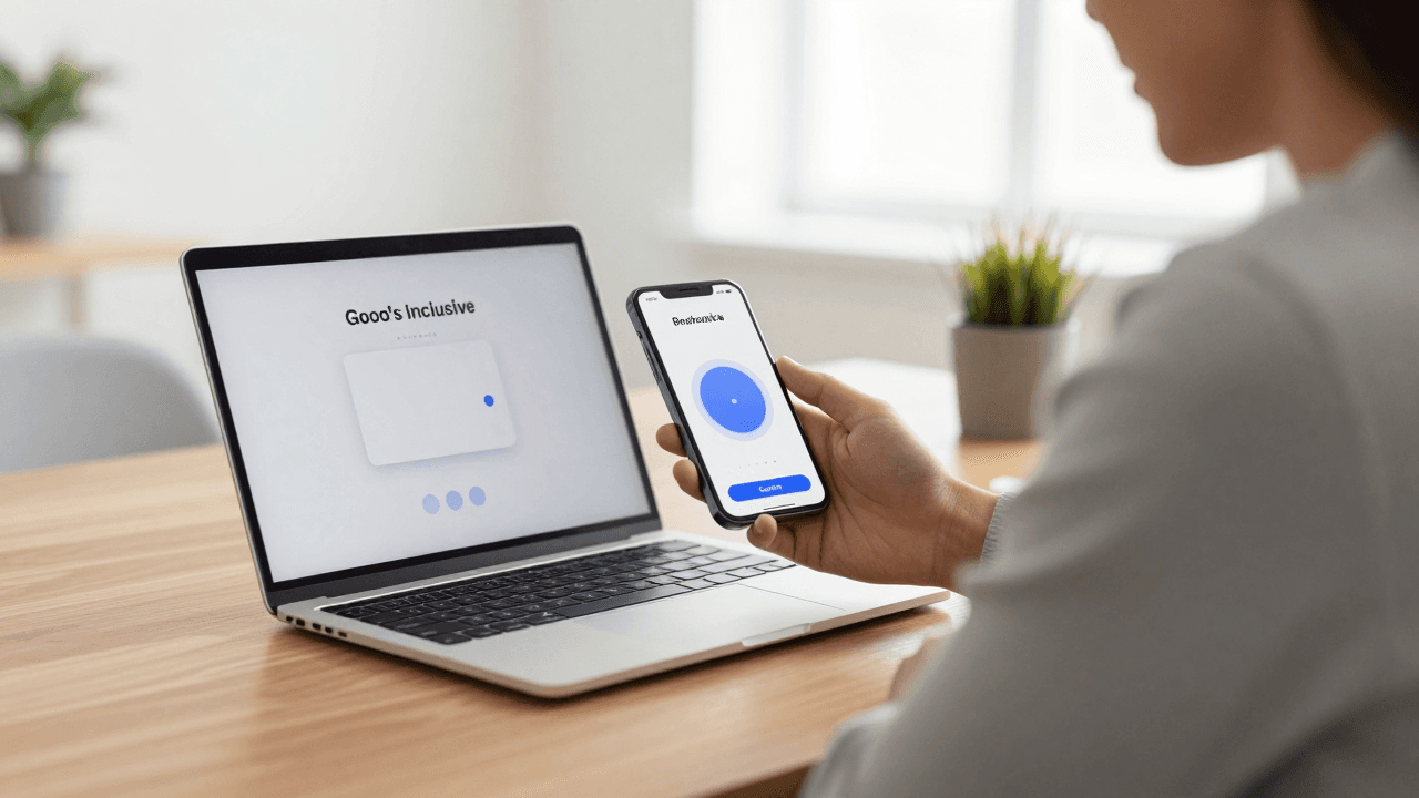
The Onboarding Carousel Problem: Why Users Swipe Past Your App's Welcome Screens in Two Seconds
You shipped the build, wrote the welcome carousel over a weekend, and watched the first real users install your app. Then you opened your analytics and saw it: most of them swiped through the intro in two seconds, or tapped Skip before the first card finished animating. If that sounds familiar, you are in good company. Founders using tools like Dolfy.ai run into the same wall, because an onboarding flow is usually designed last, in a rush, as a pile of marketing slides rather than as part of the product.
Key Takeaways
- A welcome carousel is a promise, not a tutorial. Users skip it when it explains features instead of getting them to a first useful moment.
- Most apps need two or three onboarding screens at most, and many need none before the first real action.
- Onboarding should be designed from your data model and core screens outward, not bolted on after the fact.
- Reusable design tokens (shared colors, spacing and type sizes) keep every onboarding screen consistent and cheap to change.
- Test the flow on a real device early; Expo Go and a web preview make that a same-day task.
Why do users skip your app's welcome carousel?
Users skip the carousel because it asks for their attention before it has given them anything in return. They downloaded the app to solve a specific problem, and a row of slides describing "powerful features" is a delay between them and that problem.
There are three common reasons the swipe-through happens so fast. First, the slides describe the app instead of the user's goal. "Track everything in one place" says nothing about what the user will actually be able to do in the next sixty seconds. Second, the carousel hides its length. When there is no clear sense of how many steps remain, people assume the worst and hit Skip. Third, the content is generic. If your slides could be pasted into a competitor's app without anyone noticing, users will treat them as boilerplate, and they will be right.
You do not need an industry benchmark to see the pattern in your own analytics: compare how many installs reach a first real action. The first minute carries a disproportionate share of your retention. A weak welcome flow is not a cosmetic issue; it is a leak at the top of your funnel.
What is an onboarding flow, really?
An onboarding flow is the shortest path from "app installed" to "user has done the one thing that makes the app valuable." That path might include a welcome screen, a permission request, an account step and a first task, but none of those are the point. The point is the first successful outcome.
It helps to separate three jobs that often get mashed into a single carousel:
- Orientation. Tell the user what the app is for, in one sentence.
- Setup. Collect the minimum information the app needs to be useful, such as a name, a goal or a first item.
- Activation. Get the user to complete a real action, such as creating their first project, logging their first entry or saving their first item.
A carousel mostly handles orientation, and it handles it badly because it is passive. Setup and activation are where retention is won. If you only have time to polish one of the three, polish activation.
How many onboarding screens should a mobile app have?
Two or three is the practical ceiling for a pre-action welcome sequence, and zero is a legitimate answer for many apps. Every extra screen is another chance for a user to leave, so each one has to earn its place.
A useful test: cover the screen's headline and ask whether a new user would miss it. If the screen only repeats something the store listing already said, delete it. If it introduces a concept the user cannot proceed without, keep it, but consider moving it to the moment it becomes relevant, a pattern often called progressive disclosure. That simply means revealing information at the point of need rather than all up front.
A good rule of thumb is to budget about 30 seconds for the entire pre-action flow. At a comfortable reading pace that is roughly 40 to 60 words across all the screens combined. If your carousel has more words than a typical text message thread, it is too long.
 )
)
Should onboarding come before or after you design the core screens?
After, or at least alongside. The most common mistake is designing onboarding first because it is the first thing users see, then discovering that the screens it promises do not exist yet or work differently than described.
The core screens tell you what the first successful action is. Once you know that, you can work backwards: what does a brand-new user need to see, and what do they need to provide, to get there? That is why Dolfy's Design OS methodology moves through five ordered steps: Product Definition, Data Model, Design Foundation, Screen Design and Export. Onboarding lives naturally inside Screen Design, but it only works well because the earlier steps are done.
Here is how each of those steps feeds into the welcome flow:
- Product Definition forces you to write down who the user is and what problem you solve. That sentence becomes your orientation screen.
- Data Model (a plain-language map of the things your app stores and how they relate, such as users, projects and entries) tells you the minimum information setup has to collect. If a field is not in your data model, do not ask for it during onboarding.
- Design Foundation defines your design tokens, which are named, reusable values for colors, spacing and typography. Every onboarding screen should pull from the same tokens as the rest of the app, so the first impression matches the product.
- Screen Design is where the welcome, setup and first-task screens actually get laid out.
- Export produces React Native and Tailwind components with TypeScript types, so the flow your developer builds is the flow you designed.
What makes a welcome screen worth keeping?
A welcome screen is worth keeping when it does one of three things: states the user's outcome, reduces a worry, or sets up a choice that personalizes the app. Anything else is decoration.
State the outcome, not the feature. Compare "Smart categories and tags" with "Find any receipt in under ten seconds." The second one describes what the user gets. Even if you cannot back a specific number, you can describe a concrete result in the user's own language.
Reduce a worry. New users are quietly asking whether this will take long, whether it will spam them and whether their data is safe. A single honest line, such as "Setup takes about a minute, and you can change everything later," answers all three at once.
Offer a meaningful choice. Asking "What are you here to do?" with three tappable cards gives the user a small win and gives you the information to skip irrelevant steps afterward. It also turns a passive slide into an active one.
If a screen does none of these, cut it. If you are unsure, the data usually settles the argument: look at which screens users drop off on and remove the one with the steepest fall.
How do you keep every onboarding screen visually consistent?
You keep them consistent by never choosing a value twice. Pick your colors, spacing steps and type sizes once, name them, and reference the names everywhere. That is the idea behind a design system, a shared set of rules and reusable components that keep an interface coherent as it grows.
In practice, a small onboarding flow can fall apart visually in surprising ways. One screen uses 16 pixels of padding and the next uses 20. The button on the welcome card is a slightly different blue from the button on the setup form. A heading is bold on one slide and semibold on another. Individually these differences are invisible; together they make the product feel unfinished, and users read "unfinished" as "untrustworthy," especially when the next screen might ask for an email address or a notification permission.
With Tailwind CSS-style utility classes in React Native, tokens map neatly onto class names, so a spacing or color change happens in one place and propagates everywhere. That is also what makes later experiments cheap. Want to test a shorter flow, a different headline or a darker palette? You are changing a handful of values and a couple of components, not hunting through a dozen hand-styled screens.
How should you test an onboarding flow before launch?
Test it on a real phone, with a real person who has never seen it, as early as you can. A flow that looks fine on a laptop canvas often feels very different in the hand, where thumb reach, animation timing and text size all matter.
A lightweight testing routine that fits in a single afternoon:
- Preview on device. Run the flow in Expo Go (Expo's app for loading a React Native project on your own phone without a full build) or in a web preview so you can tap through it the way a user would.
- Watch five people. Ask friends, colleagues or members of a founder community to open the app cold, and say nothing. Write down where each of them hesitates. Five people will surface most of the obvious problems.
- Time the first success. Measure how long it takes someone to reach the first meaningful action. If it is more than about two minutes, find the step that is slowing them down.
- Check the small screen. Try the smallest phone you can find and a larger text size setting. Truncated headlines and buried buttons are the classic failures.
- Skip your own flow. Tap Skip on purpose. The app must still make sense when a user ignores everything you wrote.
 )
)
What should happen when a user skips onboarding?
The app should work perfectly, and it should teach the essentials in context instead. Skipping is not a failure state; it is a preference, and for experienced users it is the right one.
Design the skipped path first. Land the user on a home screen that already has a clear next step, such as a prominent "Create your first item" button or a gentle empty state with a short prompt. Offer contextual hints, small tooltips that appear the first time a user reaches a feature, rather than front-loading everything. And keep a way back: a Help or Welcome entry in settings lets people revisit what they skipped without feeling punished.
This is also where the data model pays off again. Because the model already defines what a first record looks like, the skipped path can create a sensible default without a long form.
Frequently Asked Questions
Do I need an onboarding carousel at all?
Not always. If your app's purpose is obvious and the first action is simple, a carousel only delays it. Many successful apps go straight to the first task and use contextual hints instead. Add a carousel only when users genuinely cannot proceed without a concept you must explain.
Should onboarding ask for an account right away?
Usually it is better to let people see value first. Asking for an email address or password before the user has done anything creates friction at the moment trust is lowest. When you can, delay sign-up until the user has something worth saving, then ask.
When is the best time to ask for notification permissions?
Ask after the user has experienced a benefit that notifications would improve, and explain that benefit in one short line first. A permission request on the very first screen is easy to deny, and on most platforms a denial is difficult to reverse.
How can a non-designer build a good onboarding flow?
Start from the outcome you want, keep the screens few, and reuse a single set of design tokens so everything looks consistent. A structured process such as Dolfy's five steps removes most of the guesswork about what to decide and in what order.
Make the first minute count
The first minute is the cheapest place to improve your product. You do not need a bigger budget or a designer on retainer; you need a clear first outcome, two or three honest screens, and a consistent visual foundation. Work from your product definition and data model outward, design the skipped path first, and test on a real phone before you ship.
If you want a guided way to get there, Dolfy walks you through the full Design OS process and exports production-ready React Native components, so the onboarding flow you imagine is the one your users actually see.