Your App's Onboarding Screens Are Where Users Decide to Stay
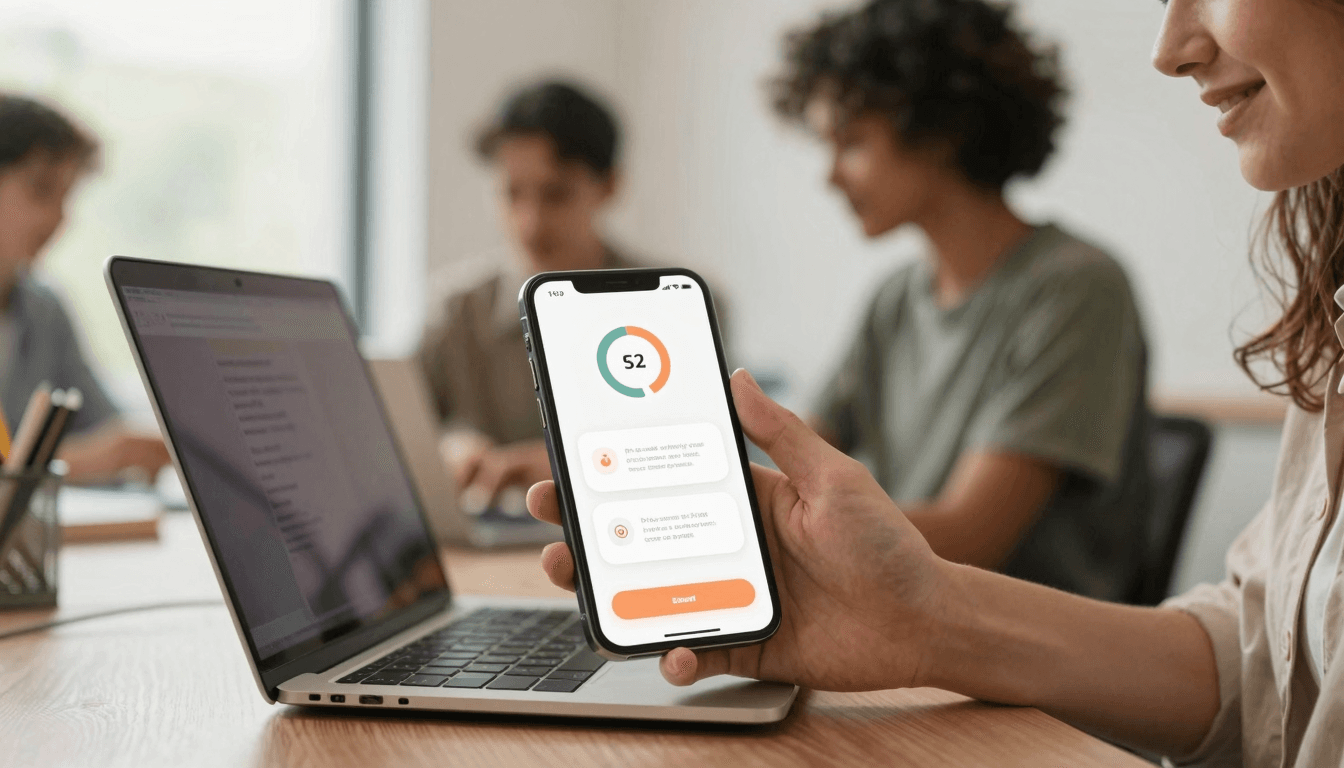
You built the feature. You fixed the bugs. You even got the app into the store. And then the analytics come back and half your new users never make it past the third screen. If that sounds familiar, the problem probably isn't your product — it's the ninety seconds between "download complete" and "first real value," better known as onboarding. Dolfy.ai, the AI-powered mobile app design platform built by AEGONTECH LLC, treats that ninety-second window as its own design problem, not an afterthought bolted on after the "real" screens are done.
Key Takeaways
- Most app abandonment happens in the first session, and onboarding — not the core feature set — is usually where users decide whether to stay.
- A tight onboarding flow of 3-5 screens that gets users to a real "aha moment" beats a long, feature-tour-style walkthrough almost every time.
- Permission requests (camera, notifications, location) should be asked for in context, right before they're needed — not stacked up front.
- Dolfy's design-token system keeps onboarding screens visually consistent with the rest of the app automatically, instead of drifting out of sync over time.
- Prototyping onboarding in Expo Go lets you test the actual flow on a real phone before a single line of production code exists.
What Makes a Mobile Onboarding Flow Actually Work?
A working onboarding flow gets a new user to one genuine "aha moment" as fast as possible, then gets out of the way. It is not a slideshow explaining every feature you built — it's a guided path to the single action that proves your app is worth keeping. If you're not sure what that moment is for your product, that's the first thing to figure out before you design a single screen.
This is where a lot of indie teams go wrong: they treat onboarding as a marketing opportunity ("Look at all our features!") instead of a product opportunity ("Here's the one thing that will make you come back tomorrow"). A fitness app's aha moment might be logging one workout. A budgeting app's might be connecting one bank account and seeing a real number. Design the flow backward from that moment, not forward from your feature list.
How Many Onboarding Screens Are Too Many?
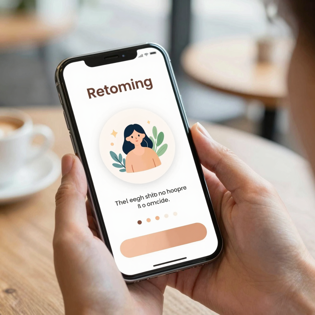
Three to five is a reasonable ceiling for most consumer mobile apps. Past that, you're trading completion rate for information the user probably won't retain anyway — nobody remembers screen four of a seven-screen tutorial. Each additional screen is another chance for someone to tap the "X" and never come back.
A useful test: could you cut this screen and would the user just figure it out once they're inside the app? If yes, cut it. Progressive disclosure — showing people what they need only when they need it — almost always beats front-loading. Dolfy's Design OS methodology builds this in at the Screen Design stage, where onboarding flows are laid out as their own sequence with explicit step counts, so it's obvious at a glance whether you've let the flow sprawl past what a first-time user will actually sit through.
Should You Ask For Permissions Before Users See Value?
No — ask for permissions in context, immediately before they're needed, not as a batch on screen two. A permission request ("Allow Notifications?") that shows up before a user has any reason to trust your app yet is one of the single biggest onboarding drop-off points, because you're asking for something before you've given anything.
If your app needs camera access to scan a receipt, ask for camera access on the screen where the user is about to scan a receipt — with a one-line explanation of why. That context alone measurably improves acceptance rates compared to a cold permission dialog at launch. This is a small detail, but it's exactly the kind of decision that's easy to get wrong when onboarding is designed as an isolated flowchart instead of being wired into the actual data model and user actions the rest of the app depends on.

How Do Design Tokens Keep Onboarding Consistent Across Screens?
Design tokens are the named, reusable values behind your visual style — a specific blue defined once as color.primary, a corner radius defined once as radius.card — instead of a hex code or pixel value hardcoded separately into every screen. When your onboarding flow references the same tokens as your dashboard, settings screen, and paywall, a single color or spacing update propagates everywhere instead of requiring someone to hunt down five slightly different shades of blue across the codebase.
This matters more for onboarding than almost any other part of the app, because onboarding is disproportionately visible — every single user sees it, on day one, before they've decided whether to trust your product. An onboarding flow that looks visually disconnected from the rest of the app (different button shapes, different spacing rhythm, different type scale) reads as unfinished, even if the functionality underneath is solid. Dolfy generates its design-token system as part of the Design Foundation step, and that same token set carries through to the production-ready React Native and Tailwind CSS components it exports, complete with TypeScript types — so the onboarding screens and the "real" app are built from one source of truth rather than two separate design efforts that quietly drift apart over a few sprints.
What Does a Data-Model-First Approach Change About Onboarding?
Starting from the data model means your onboarding screens are designed around the actual fields, relationships, and states your app needs to collect and display — not a generic template borrowed from a different kind of product. A wireframe (a low-fidelity sketch of a screen's layout, before visual styling is applied) for an account-setup screen looks very different once you know whether you're collecting a single profile field or building out a multi-step data model with relationships between users, teams, and permissions.
Dolfy's Data Model step comes before Screen Design specifically so that onboarding — and every other screen — gets built against real fields and real user states, rather than placeholder content that has to be reworked once actual data enters the picture. Teams that design screens first and figure out the data model later tend to end up rebuilding their onboarding forms at least once, because a field they assumed was optional turns out to be required for the data model to make sense, or vice versa.
Frequently Asked Questions
How long should a mobile app's onboarding flow take to complete?
Aim for under a minute of active time and no more than 3-5 screens for most consumer apps. If a new user can't reach your core "aha moment" within that window, look for steps to cut or move into the app itself rather than front-loading them.
Should onboarding be skippable?
In most cases, yes — a visible "Skip" option respects users who already understand the app (returning testers, power users referred by a friend) without forcing everyone through the same rigid path. The exception is a single required step, like account creation, that the app genuinely can't function without.
Can I prototype onboarding before writing production code?
Yes, and it's worth doing. Dolfy's Export step produces components you can preview instantly through Expo Go or Web Preview, so you can walk through the actual onboarding sequence on a real device before committing engineering time to build it into your production codebase.
What's the difference between an empty state and onboarding?
Onboarding is the guided introduction a user sees once, on their first visit. An empty state is what a screen shows when there's simply no data yet — an empty inbox, an empty cart — and it can recur any time a user clears their data, not just on day one. Both matter, but they're solving different problems and deserve separate design attention.
Designing Onboarding That Earns the Second Session
The goal of onboarding isn't to explain your app — it's to get one new user to one real moment of value, fast enough and cleanly enough that they open it again tomorrow. That means cutting screens instead of adding them, asking for permissions only when the context justifies them, and keeping the visual language consistent from the very first tap. Dolfy's Design OS methodology — Product Definition, Data Model, Design Foundation, Screen Design, and Export — walks through onboarding as part of that same connected process, rather than as a slideshow bolted on at the end. If your onboarding flow has been an afterthought, Dolfy is built to make it a first-class part of how you design and ship your app.