
The Onboarding Skip Button Problem: Why First-Run Tutorials Get Ignored
You just shipped your app. You're proud of it. You spent a week building a slick three-slide onboarding carousel that walks new users through every feature before they ever see the home screen. Then you check the analytics a few days later and the picture is bleak: most people tap "Skip" before the second slide even finishes animating in, and a meaningful chunk of your new signups never open the app a second time. The tutorial you built to help people succeed is quietly getting ignored, and you're left wondering whether onboarding even matters. At Dolfy, an AI-powered mobile app design platform built by AEGONTECH LLC, this is one of the most common frustrations founders bring up, and it usually traces back to a single mistake: teaching before doing.
Key Takeaways
- Industry usability research consistently finds that a large share of users skip static onboarding carousels within the first 5-10 seconds, often before reading more than a headline.
- Explaining a feature before a user needs it is far less effective than showing it exactly when they reach for it — a pattern called progressive disclosure.
- A first-run flow that gets someone to one real action in under 60 seconds beats a beautifully illustrated three-slide tour every time.
- Dolfy's 5-step Design OS treats onboarding as part of the Screen Design stage, not an afterthought bolted on before export.
- Small, contextual nudges (tooltips, empty states, inline hints) outperform upfront lecture-style tutorials for long-term feature adoption.
Why Do Users Skip Onboarding Screens Instead of Reading Them?
Users skip onboarding because it asks them to trust a promise before they've seen any payoff. A new user has no relationship with your app yet — no data in it, no sense of what problem it solves for them personally — so three slides of marketing copy about features they haven't needed yet reads as friction, not help. This is why onboarding completion rates for static, text-heavy carousels are consistently among the weakest metrics teams track: people came to do something, and a slideshow is standing between them and that something. The fix isn't a shorter carousel. It's recognizing that most explanation belongs later, closer to the moment it's actually useful.
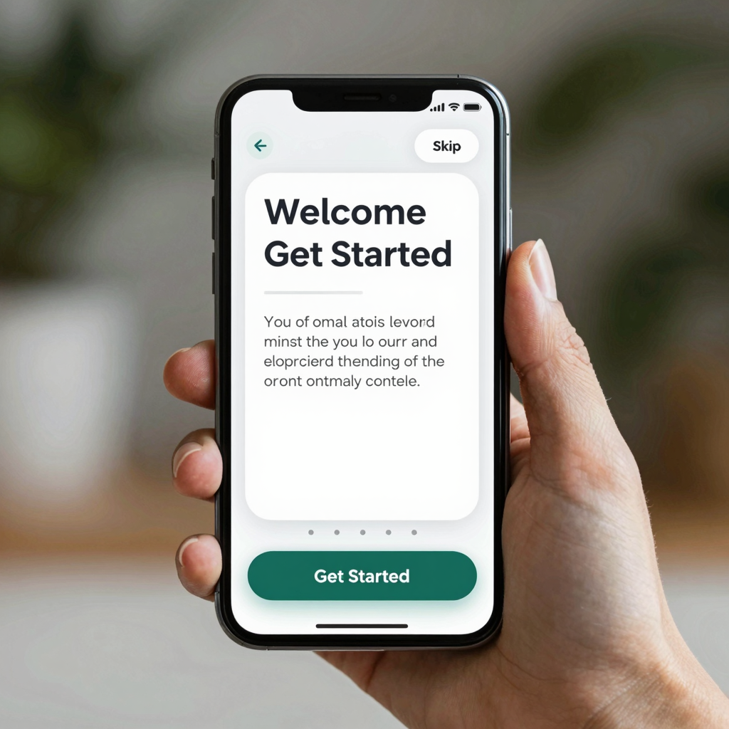
Should Your App Even Have an Onboarding Carousel?
For most apps, no — at least not the classic three-to-five slide swipeable tour. A carousel makes sense only when your app's core value genuinely cannot be understood without upfront context, like a niche financial tool or a workflow with real setup steps (permissions, account linking, a wizard). If your app's main screen is reasonably self-explanatory once populated with real or sample content, you're better off skipping the tour entirely and getting the user into a working state — what designers call the "aha moment" — as fast as possible. A design system, the reusable set of components, colors, and spacing rules an app is built from, should treat onboarding as a variant of the empty state, not a separate marketing surface.
How Do You Design an Onboarding Flow That Teaches Without Lecturing?
You teach by letting the user do the thing, with just enough scaffolding to not get stuck. Concretely: reduce sign-up to the fewest fields possible (email plus password, or a single social login button), drop the user into a pre-populated or sample version of the core screen instead of a blank one, and reserve any explanation for a single contextual tooltip that appears exactly when a feature is first relevant — not three screens earlier. A wireframe, a rough black-and-white layout sketch used to plan structure before visual design, is a useful place to test this sequence before a single pixel of the real UI exists. If a reviewer looking at the wireframe can't find the "do the core thing" path within two taps, the carousel isn't the problem; the information architecture is.

What's the Difference Between Onboarding and Progressive Disclosure?
Onboarding, in the traditional sense, front-loads information before the user has asked for it. Progressive disclosure does the opposite: it reveals functionality in layers, showing only what's relevant to the current step and deferring advanced options until a user reaches for them. A settings screen with 30 toggles overwhelms a first-time user, but the same screen organized into three simple defaults plus an "Advanced" section respects both the new user and the power user. Apps that lean on progressive disclosure typically need far fewer static tutorial screens, because the interface itself is doing the teaching, one relevant control at a time, instead of asking users to memorize a slideshow before they've touched anything.
How Does Dolfy's Design OS Handle Onboarding from Day One?
Dolfy's 5-step Design OS methodology — Product Definition, Data Model, Design Foundation, Screen Design, Export — treats the first-run experience as a Screen Design decision, not a separate checklist item tacked on at the end. Because the Data Model step happens before any screens are drawn, Dolfy already understands what a new user's data looks like on day one (empty, partially filled, or sample), which means the Screen Design step can generate an onboarding sequence that reflects the real data model in production rather than a plain group of static marketing slides. The output is a set of production-ready React Native and Tailwind CSS components with TypeScript types attached, so a founder can preview the actual first-run flow in Expo Go or Web Preview within minutes and adjust the sequence before writing a line of app code by hand.
Frequently Asked Questions
How many onboarding screens should a mobile app have?
For most consumer apps, zero to two screens is the right target — ideally just a sign-up step and, if truly necessary, one permissions request. Anything beyond that should live inside the product as contextual hints rather than a pre-app tutorial.
Is a progress bar or step indicator necessary during onboarding?
Only if the flow has more than two required steps, such as a multi-part signup or an account-linking wizard. A visible step indicator (like "Step 2 of 3") reduces abandonment by setting an expectation for how much is left, which matters far more once a flow exceeds a couple of screens.
Should onboarding look different for iOS versus Android users?
The core sequence should stay the same, but respect each platform's native patterns — iOS users expect swipe-back gestures and Android users expect a visible back button — since fighting platform conventions during someone's very first minute in your app adds friction at the worst possible time.
Can I A/B test my onboarding flow before committing to it?
Yes, and you should. Even a simple test comparing a two-screen minimal flow against a longer explainer, tracked against 24-hour and 7-day retention rather than just completion rate, will usually settle the debate faster than internal opinion.
Getting Your First-Run Experience Right the First Time
The real cost of a skipped onboarding tutorial isn't the wasted design hours — it's the new users who bounce because the app never got them to a real, working moment fast enough. Rather than defending a carousel nobody reads, it's worth treating the first 60 seconds as the single most important screen sequence in the entire product, worthy of the same rigor as the core feature itself. That's the approach baked into Dolfy's Design OS: because the data model and product definition come first, the onboarding sequence Dolfy helps you design is grounded in what your app actually does with a new user's information, not a generic template. If you're rethinking your app's first-run experience, Dolfy is built to take you from that decision straight through to exportable, production-ready screens.