The Paywall Problem: Why Most Subscription Screens Fail — And How to Design One That Converts
You've spent six weeks building your app. The onboarding is smooth, the core feature works, and you're ready to charge for it — so you slap a pricing screen behind a "Subscribe" button and ship it. Three days later you check the analytics: 4% of trial users convert to paid, and worse, your one-star reviews all mention the same word — "sneaky." If you've ever watched a beautifully built app die at the paywall, you already know the problem isn't your product. It's the screen standing between your product and your revenue. Dolfy.ai, the AI-powered mobile app design platform built by AEGONTECH LLC, exists specifically to fix screens like this one — and the paywall is one of the highest-leverage screens in your entire app.
Key Takeaways
- Paywall screens with clear, itemized value (not just a price) convert meaningfully better than generic "Upgrade Now" screens — industry benchmarks for well-designed mobile paywalls commonly land between 3% and 8% trial-to-paid conversion, versus under 2% for rushed, ambiguous ones.
- Founders lose money in two directions at once: pushy paywalls tank App Store ratings, while vague ones fail to justify the price at all.
- A design system — a reusable, documented set of UI components and rules that keeps every screen visually and functionally consistent — prevents your paywall from looking like it was bolted on after the fact.
- Dolfy's Screen Design step generates paywall layouts as production-ready React Native and Tailwind CSS components with TypeScript types already wired in, so engineering doesn't have to reverse-engineer a static mockup.
- Testing your paywall copy and layout inside Expo Go — Expo's free companion app for previewing React Native projects on a real device — before you write a line of billing code can save days of rework.
Why do most in-app paywalls fail to convert?
Most paywalls fail because they ask for money before they've re-stated the value. A user who hit your subscription screen already believes your app is useful enough to open twice — the paywall's only job is to remind them why, specifically, and then get out of the way. Too many founders instead paste in a generic three-tier pricing table copied from a SaaS landing page, with checkmarks next to features nobody outside the team understands. On mobile, where the average paywall gets maybe four seconds of attention before a thumb decides to tap "Maybe Later," ambiguity is fatal. The fix isn't more persuasion copy — it's a clearer information hierarchy: one sentence of value, one visual anchor, one price, one button.
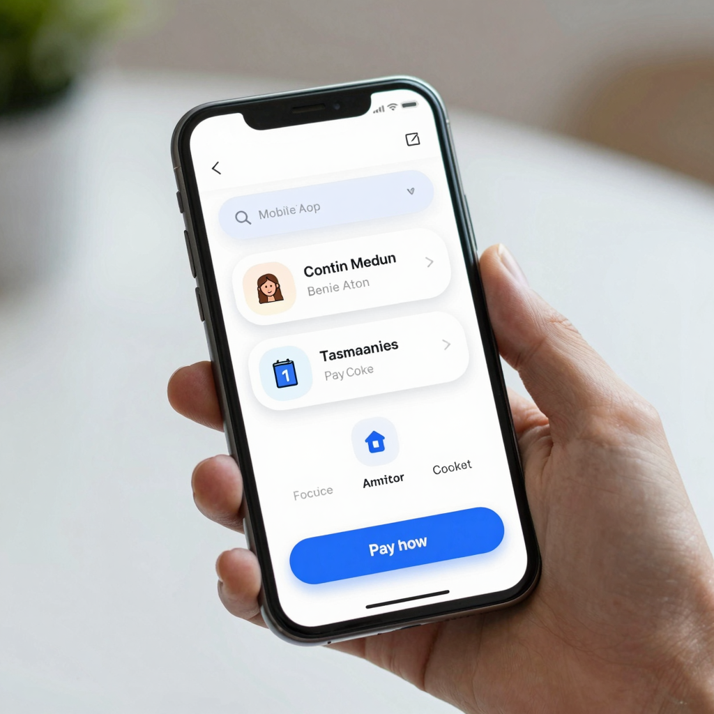
What does a well-designed subscription screen actually include?
A well-designed subscription screen leads with outcome, not features. Instead of "Unlimited exports, priority support, advanced analytics," a stronger paywall says "Ship your next 10 screens in an afternoon" — the feature list follows below as supporting detail, not the headline. Concretely, that means: a hero statement describing the transformation the user gets, three to four benefit rows (not eight — cognitive overload kills conversion), a visible price with the billing period stated in plain words ("$9.99/month, cancel anytime" beats a bare "$9.99"), and a single primary call-to-action button that isn't competing with five other tappable elements on the same screen. This is where a wireframe — a low-fidelity, mostly grayscale sketch of a screen's layout used to nail down structure before visual polish — earns its keep. Sketching the paywall as a wireframe first, before anyone touches color or imagery, forces the "one sentence, one price, one button" discipline before it's too late to change cheaply.
How does a design system keep a paywall from looking bolted-on?
A design system keeps a paywall from looking bolted-on by forcing it to reuse the same visual language as every other screen in the app, instead of inventing new buttons, spacing, and type sizes just for this one moment. This is where design tokens matter — the named, reusable values (a specific blue, a specific corner radius, a specific spacing unit) that define a design system's building blocks so "primary button blue" means the exact same hex code on the paywall as it does on the home screen. Dolfy's Design Foundation step establishes this token system once, early in the five-step Design OS methodology (Product Definition, Data Model, Design Foundation, Screen Design, Export), so that by the time you reach the paywall in the Screen Design step, the colors, spacing, and type scale are already locked and consistent — no separate one-off Figma file, no engineer eyeballing hex codes off a screenshot.

Should the paywall change based on what the user has already done in the app?
Yes — a paywall shown after a user has already created three projects should look and read differently than one shown on first launch, because the two users have completely different context. This is where a data model — the structured definition of what objects your app tracks (a "Project," a "Team," an "Export") and how they relate — pays off beyond just your database schema. If your data model already tracks how many projects, exports, or team invites a free user has used, your paywall copy can reference that specific number: "You've hit your 3-project limit — upgrade to keep building" reads as helpful, not extractive, because it's true and specific to that user. Dolfy's Data Model step exists precisely so this kind of contextual detail is defined early, before screens get designed, rather than retrofitted after a designer has already shipped a generic mockup nobody can easily personalize.
What role does the technology stack play in shipping a paywall fast?
The technology stack matters because a paywall that only exists as a static image or a Figma file (a popular browser-based design tool many teams use as their default, alongside alternatives like Sketch) still has to be rebuilt from scratch by an engineer, and that rebuild is where most of the visual fidelity — and days — get lost. Dolfy's Export step closes that gap by generating the paywall as real React Native components — the cross-platform mobile framework used by teams who don't want to maintain separate iOS (often built in SwiftUI) and Android codebases — styled with Tailwind CSS utility classes and typed with TypeScript, so the component ships with the same prop types and structure a hand-coded screen would have. That's a meaningfully different starting point than a PNG a designer hands off with "make it look like this."
How should founders test a paywall before writing billing logic?
Founders should test a paywall's layout and copy before writing a single line of billing integration, because billing SDKs (App Store server notifications, receipt validation, subscription state) are expensive to rework once wired to a screen that turns out to convert poorly. Expo Go — the free app that lets you preview a React Native project live on a physical phone without a full native build — is built for exactly this: load the paywall screen Dolfy generated, hand the phone to five people outside your team, and watch where their thumb hesitates. If four out of five pause on the same line of copy or can't find the close button, you've found a $0 fix before it became an expensive one. Founders who skip this step often discover the same problems two weeks later, in App Store review feedback, at a much higher cost in time and momentum.
Turning your paywall into a habit, not a one-time gamble
The mistake most founders make with paywalls is treating them as a single high-stakes bet — design it once, ship it, hope. Teams that convert well instead treat the paywall as one more screen in a design system that gets revisited every few weeks as pricing, positioning, or the underlying data model changes, the same way any other screen would. That only works if changing the paywall doesn't mean rebuilding it from scratch every time. Dolfy's approach — locking design tokens early, defining the data model before the screen, and exporting production-ready components instead of static mockups — is built so that iterating on a paywall costs an afternoon, not a sprint. If your subscription screen has been sitting untouched since launch day, or you're about to design your first one, Dolfy walks through the same five-step process end to end, from a blank product idea to exportable screens a developer can actually ship.
Frequently Asked Questions
What's a realistic conversion rate to expect from a mobile app paywall?
It varies heavily by category and pricing, but well-designed trial-to-paid paywalls commonly land in the 3-8% range, while cluttered or overly aggressive ones frequently fall under 2%. Treat any number you read as a rough benchmark, not a guarantee — your own baseline, measured before and after a redesign, matters more than an industry average.
Do I need a designer to build a good paywall, or can I do it myself as a solo founder?
You don't need a dedicated designer to get a consistent, professional paywall — tools like Dolfy are built specifically for solo founders and small teams who need production-quality screens without a hiring budget. What you do need is a consistent design system so the paywall doesn't look like a different app from your onboarding flow.
How many pricing tiers should a mobile paywall show?
Most well-converting mobile paywalls show one or two tiers, occasionally three, rarely more — mobile screens are too small and attention spans too short for the five- or six-tier tables common on desktop SaaS pricing pages. If you genuinely need more tiers, consider a simple toggle (monthly/annual) rather than a longer list.
Should the paywall be the very first screen a new user sees?
Generally no — showing a paywall before a user has experienced any value tends to produce very low conversion and high uninstall rates. Most successful apps let users reach a natural value moment first (completing onboarding, creating one project) and trigger the paywall from there instead.