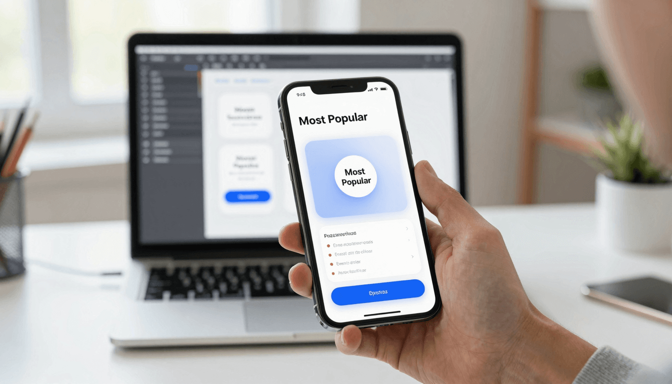
The Paywall Problem: Designing Subscription Screens Users Don't Resent
You built a genuinely good app. The onboarding flow is smooth, the core experience works, and people are actually opening it more than once — which, if you've shipped anything before, you know is rarer than it sounds. Then you add a paywall, and downloads that were converting nicely suddenly stall at the subscription screen. Users don't complain. They just leave, quietly, at a screen that took you an afternoon to throw together because you were focused on "the real product" instead. That screen is the real product now. Dolfy.ai, an AI-powered mobile app design platform built for founders and developers, treats the paywall as a first-class design surface rather than a checkbox to tick before launch — and that distinction is usually the difference between a subscription flow that converts at 2-3% and one that converts at 8-12%.
Key Takeaways
- A paywall isn't a wall — it's a pricing conversation, and framing it as "here's what you're missing" instead of "pay to continue" changes conversion by measurable margins.
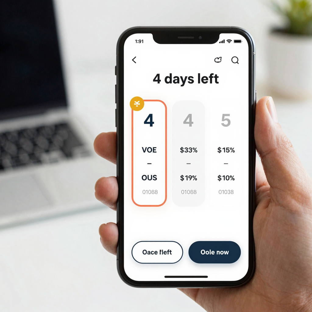
- Free trials with a visible countdown ("4 days left") outperform vague "trial available" messaging by giving users a concrete reason to act before value evaporates.
- Showing 3 pricing tiers, with the middle one visually emphasized, is a well-documented anchoring pattern that nudges users toward the plan you actually want them to pick.
- Paywall copy should sell outcomes ("design 10 screens in a weekend"), not features ("unlimited exports") — outcomes are what a non-designer founder actually cares about.
- Dolfy's Design OS methodology treats pricing screens as part of the Screen Design step, generated from the same design-token system as the rest of the app, so the paywall never feels like a bolted-on afterthought.
Why do most paywalls feel like a punishment instead of an offer?
Most paywalls feel punitive because they interrupt a task the user was already doing without explaining what they get in return. A user taps a feature, hits a modal that says "Upgrade to Pro," and has zero context for why this particular action costs money or what the $9.99/month actually unlocks beyond "more stuff." That ambiguity is expensive: industry benchmarks on mobile subscription apps consistently show free-to-paid conversion sitting somewhere in the 2-5% range for apps that treat the paywall as an interruption, versus meaningfully higher numbers — often north of 10% — for apps that treat it as a value pitch triggered at the right moment.
The fix starts with trigger timing. Instead of gating a random button on day one, the strongest-converting apps show the paywall right after a user experiences a taste of value — after they've built one project, sent one message, generated one design — so the ask lands next to a memory of something good happening. Dolfy's own Design OS flow works the same way structurally: it takes founders through five sequential steps (Product Definition, Data Model, Design Foundation, Screen Design, Export), and the natural upgrade moment in a tool like that is after someone has completed a Product Definition and can see their idea taking shape, not before they've typed a single word.
What actually belongs on a subscription screen?
A subscription screen needs three things to do its job: a clear value statement, transparent pricing with no surprise charges, and a visible path to cancel. Skip any of these and you're not simplifying the screen, you're eroding trust — and trust is the entire currency of a paywall, since you're asking someone to commit money before they've fully evaluated the product.
Start with the value statement at the top: one sentence, outcome-focused, not feature-focused. "Turn your app idea into exportable React Native screens in one sitting" beats "Unlock unlimited exports" because it tells a solo founder what changes in their week, not what technical capability they're purchasing. Below that, show pricing as a comparison table — a simple grid, not prose — with 3 tiers being the sweet spot: a free or trial tier, a mid-tier that's visually highlighted (bigger card, a "Most Popular" badge, a slightly different background color defined in your design-token system, which is just the set of reusable colors, spacing, and typography values a design system pulls from instead of hardcoding them screen by screen), and a top tier for power users. Behavioral pricing research going back decades — the classic "decoy effect" — shows that a well-placed middle option shifts a meaningful share of buyers toward it simply because it exists.
Then there's the fine print that isn't actually fine: cancellation terms. Apple and Google both require clear disclosure of auto-renewal terms before you even get to App Store review, but beyond compliance, stating "cancel anytime, no questions asked" directly on the paywall — not buried three menus deep in account settings — measurably reduces the anxiety that keeps hesitant users from starting a trial at all.
How should a free trial actually be framed?
A free trial should be framed around a countdown, not an open-ended offer, because urgency without a deadline doesn't create urgency at all. "Try free" with no timeframe reads as low-stakes and easy to ignore; "4 days of Pro access remaining" reads as something with a cost of inaction. Most successful subscription apps run trials in the 3-7 day window — long enough for a user to hit real value, short enough that the decision doesn't get indefinitely postponed.
The mechanics matter too. If your trial requires a credit card upfront, expect a smaller pool of trial starters but a meaningfully higher conversion rate among the people who do start — they've already made a soft commitment. If you skip the card requirement, you'll get more trial signups and a lower conversion rate, because idle curiosity costs nothing. Neither approach is universally "right"; it depends on whether your product's value is obvious in minutes (skip the card) or takes a few sessions to click (require it, but say so honestly on the screen).
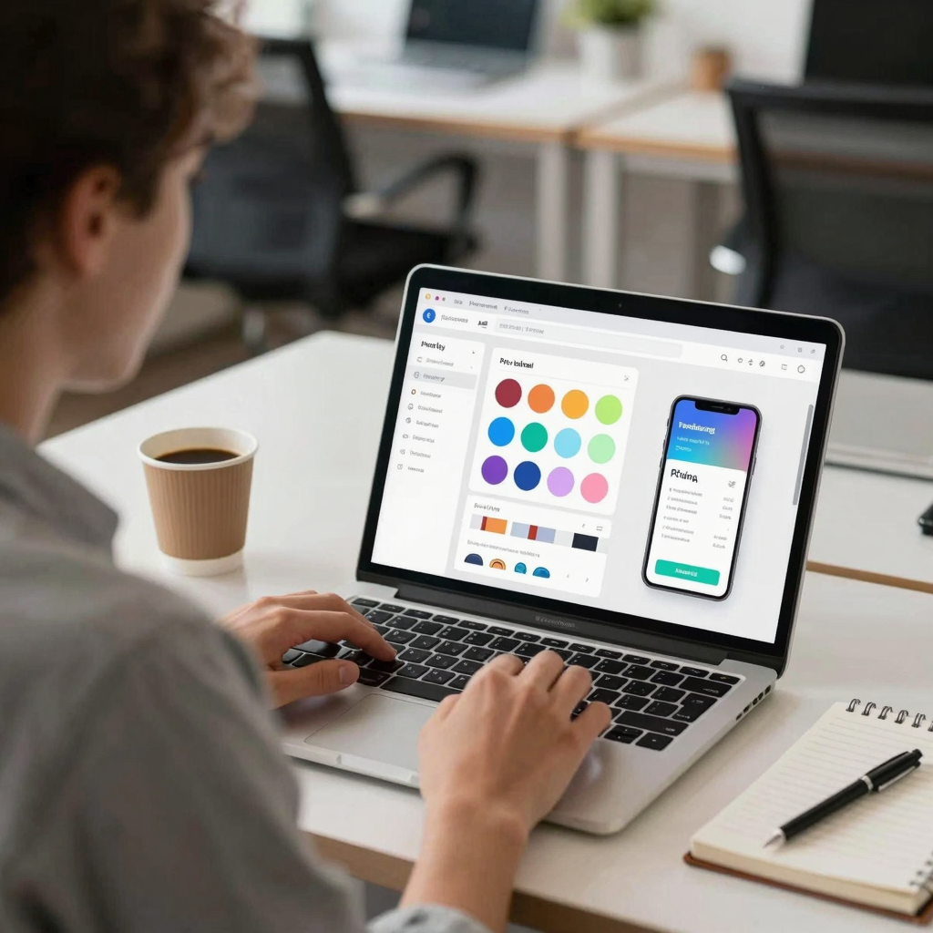
Dolfy's approach to this kind of screen mirrors its broader philosophy: every screen it generates — including a paywall — comes out as production-ready React Native components styled with Tailwind CSS and typed in TypeScript, built from that same design-token system, so a countdown badge, a highlighted pricing card, and a cancellation link all inherit consistent spacing and color instead of looking like three different screens stitched together. You can preview the result instantly in Expo Go on a physical device or in the Web Preview, rather than guessing how a paywall will actually feel on a 6-inch screen from a Figma mockup.
What copy mistakes quietly kill conversion?
The single most common mistake is leading with technical feature names instead of outcomes a non-technical user cares about. "Unlimited API calls" means nothing to someone deciding whether to pay $14.99/month for your app — "design as many screens as your app needs, no caps" means something. Define every term you use in a way a first-time user would understand; if your pricing table says "unlimited exports" without ever explaining what an export produces (in Dolfy's case, a wireframe — an early low-fidelity screen layout used to test structure before visual polish — that becomes a real component), you've made the user do translation work at exactly the moment you need friction to be lowest.
A second mistake: hiding the annual discount math. If yearly billing saves 20%, say "$71.88/year (save $23.88)" directly next to the monthly price, rather than making users do arithmetic. People are more willing to commit to a bigger number when the savings are explicit and immediate rather than implied.
Frequently Asked Questions
How many pricing tiers should a mobile app paywall show?
Three tiers is the widely tested sweet spot — enough to create a meaningful "middle ground" anchor effect, not so many that users freeze up comparing options. Two tiers often works fine for simpler apps, but adding a fourth tends to reduce conversion rather than help it.
Should the paywall appear during onboarding or after?
Generally after a user has experienced one moment of real value, not during initial onboarding. Interrupting a first-time user before they understand what the app does tends to produce dismissals rather than considered decisions.
Does requiring a credit card for a free trial hurt signups?
Yes, it typically reduces the number of people who start a trial, but the tradeoff is a higher percentage of those trial users converting to paid, since they've already made a small commitment. The right choice depends on how quickly your app demonstrates value.
Can a well-designed paywall really change conversion that much?
Yes — the gap between a rushed, feature-listing paywall and one built around clear value, transparent pricing, and honest urgency commonly spans several percentage points of conversion, which compounds fast at any real scale of downloads.
Building a Paywall That Respects the Person Looking at It
A subscription screen is often the last thing a solo founder designs and the first thing that determines whether the business survives past month one. Treating it with the same care as your onboarding flow or your core feature screens — clear value language, honest pricing, a visible way out — isn't just good ethics, it's good conversion strategy, because those two things turn out to be the same thing more often than founders expect. If you're building a mobile app and want your paywall to come from the same coherent design system as everything else instead of feeling bolted on, Dolfy walks you through Product Definition, Data Model, Design Foundation, Screen Design, and Export as one connected process — so the pricing screen your users see is built with the same tokens, the same rigor, and the same respect as the rest of the app they already decided to trust.