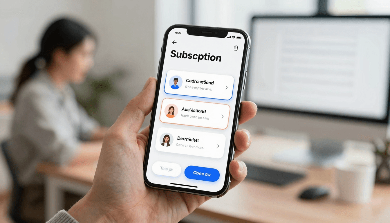
The Paywall Screen Problem: Why Your Subscription Screen Kills Conversions Before Users See Value
You built the whole app. Onboarding is smooth, the core feature actually works, and your first cohort of testers likes it. Then you get to the one screen that decides whether any of this makes money — the paywall — and you throw it together in twenty minutes the night before submitting to the App Store. Three bullet points, a price, a button. Three weeks later your analytics show a trial-to-paid conversion rate that would make any indie hacker wince, and you can't tell if the problem is your price, your product, or the screen itself. This is the paywall screen problem, and it's one of the most common — and most fixable — mistakes teams make when they design mobile apps. At Dolfy, we see it constantly in early-stage products built by solo founders and small teams: the subscription screen is treated as a formality instead of the highest-leverage screen in the entire app.
Key Takeaways
- A paywall isn't a pricing table — it's a value recap, and skipping the recap is the single biggest reason trial conversion rates stay flat.
- Apps with a single "Upgrade" tier convert measurably worse than apps offering 2-3 tiers with a visually anchored "most popular" option — a pattern borrowed straight from SaaS pricing pages.
- Annual-vs-monthly framing matters more than the actual discount: showing a monthly-equivalent price (e.g., "$4.99/mo, billed annually") next to the sticker price reduces sticker shock.
- Free trial length and grace-period messaging need to live on the paywall itself, not buried in the App Store's fine print — users decide to convert or churn based on what they can see in the moment.
- A design system with reusable, tokenized components makes it realistic to A/B test three paywall layouts in an afternoon instead of a sprint.
Why does the paywall screen convert so much worse than expected?
Because most paywalls ask for money before they remind the user why they wanted the app in the first place. A user hits your paywall mid-task — often right after they've done something valuable, like finishing an onboarding flow or generating their first result — and instead of reinforcing that moment, the screen resets the conversation to "here is a price." Conversion research from subscription apps consistently shows trial-to-paid rates in the 20-30% range for apps with above-average paywalls, versus single-digit rates for a bare pricing table. The fix isn't a better discount. It's giving the paywall its own value proposition — headline, 3-4 benefit rows with icons, then the pricing tiers — so the user re-encounters the "why" before the "how much."
What should actually be on a subscription screen?
At minimum: a headline restating the core value, a short benefit list (not a duplicate of your onboarding copy — sharper and more specific), pricing tiers with a visually anchored recommended option, a clear trial or money-back framing, and a way out. That last part matters more than founders expect — a visible "restore purchases" link and an obvious close button reduce App Store review friction and, counterintuitively, increase conversion because users don't feel trapped. When we design the subscription flow inside Dolfy's Design OS methodology, it happens at the Screen Design stage, but the pricing logic — trial length, tier names, whether pricing pulls from a remote config — gets defined earlier, during Data Model. That ordering avoids a rebuild: teams that design the paywall screen before deciding how pricing data is structured almost always have to redo the screen once they realize the "$9.99/mo" they hardcoded needs to become a variable tied to App Store Connect or RevenueCat.
Why do tiered paywalls outperform single-tier ones?
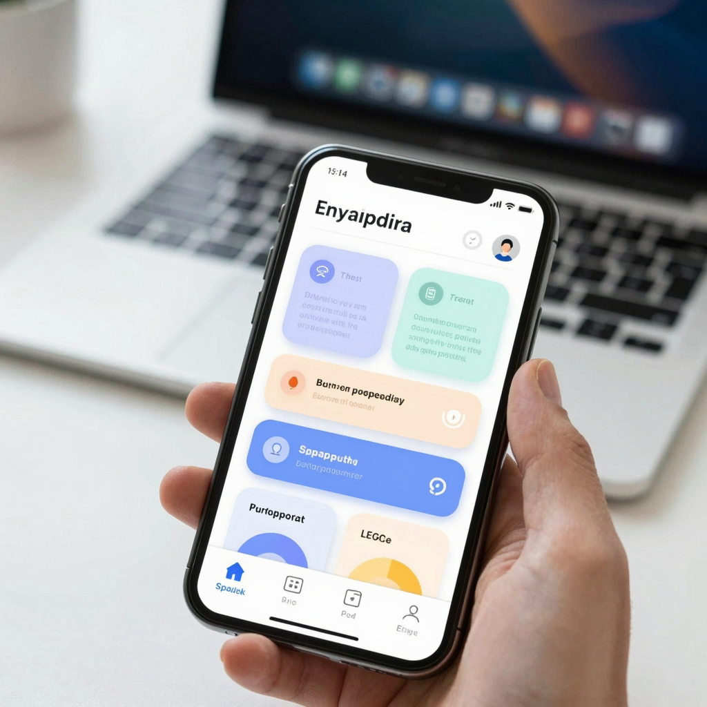
Because a single price forces a yes-or-no decision, while 2-3 tiers reframe the decision as "which one" — a subtler but psychologically easier ask. The classic pattern, borrowed from Figma's own pricing page and dozens of SaaS products, is three tiers with the middle one visually emphasized: a slightly larger card, a colored border, a "Most Popular" badge. Mobile apps that adopt this — monthly, annual, and a lifetime or "founder" tier — routinely see the anchored middle tier absorb 50-70% of conversions, even when it isn't the cheapest option. This only works if your design system (a shared library of colors, spacing, and typography rules — sometimes called design tokens, the named values like color.primary or spacing.lg that keep every screen visually consistent instead of each developer picking their own hex codes) already has a "highlighted card" component. Without one, every tier ends up styled slightly differently by whoever touched that screen last, and the anchoring effect disappears.
How does trial length and billing framing change conversion?
A 7-day trial with a reminder notification 24 hours before it ends converts meaningfully better than a 3-day trial with no reminder, because users need enough time to hit the "aha moment" inside your app before the ask arrives. On the billing side, showing the monthly-equivalent price next to the annual price — "$47.99/year ($4/mo)" instead of just "$47.99/year" — softens the jump from a $0 trial to a real charge. This is a copy decision, not a design decision, but it lives on the same screen your design system renders, which is why paywall copy and paywall layout should be prototyped together rather than handed off separately (a prototype here means a clickable, realistic mockup you can tap through on a phone — via a tool like Expo Go or a web preview link — before any of it is real code).
Can you actually A/B test a paywall as a solo founder or small team?
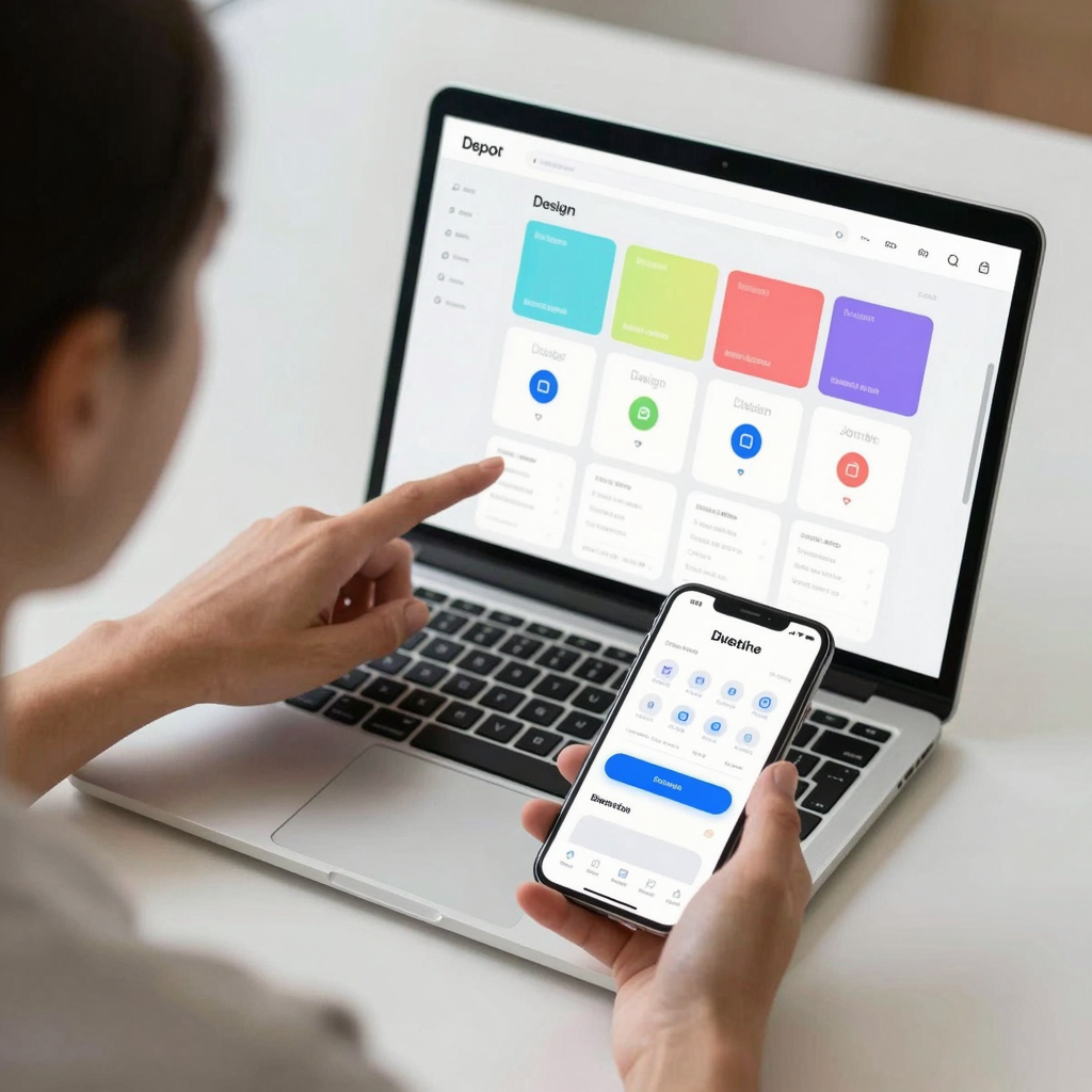
Yes, if the screen is built from a token-based design system rather than one-off styling. Testing three paywall variants — different tier counts, different anchor positions, different trial lengths — used to mean three separate Figma files and three separate engineering builds, easily a week of work for a two-person team. With component export (turning a designed screen into real, working code — in Dolfy's case, production-ready React Native and Tailwind CSS components with TypeScript types attached) built on shared tokens, swapping a paywall variant becomes a matter of changing which tier data feeds the same components, not rebuilding the screen from scratch. That's the practical argument for investing in a design system even as a one-person team: the second and third version of your paywall should take hours, not days.
Do I need a designer to build a good paywall screen?
No. The patterns that drive paywall performance — value recap, tiered pricing, visible trial terms, an obvious exit — are well-documented and don't require custom illustration or a design background. What you need is a consistent set of components (buttons, cards, badges) and the discipline to test copy and layout together.
What's a reasonable trial length to start with?
7 days is the most common starting point for consumer subscription apps, long enough for most users to reach a first meaningful result. Track how many days into the trial your average converting user hits their "aha moment," and adjust from there rather than guessing.
Should the paywall be skippable?
Generally yes, for anything other than a hard paywall product. Letting users explore a limited free version before re-encountering the paywall (a "soft paywall") tends to produce higher lifetime conversion than blocking access entirely, even though it delays the immediate ask.
How many pricing tiers is too many?
Three is the practical ceiling for a mobile screen. Beyond that, users spend more time comparing options than deciding, and conversion typically drops — the paradox of choice applies just as much on a 6-inch screen as it does on a pricing page.
Building the paywall as part of your design system, not an afterthought
The teams that get paywall conversion right treat it the same way they treat their onboarding flow or their data model: as a piece of the product that gets designed deliberately, with real components, before a line of screen-specific code gets written. That's the core idea behind Dolfy's 5-step Design OS methodology — Product Definition, Data Model, Design Foundation, Screen Design, and Export — where pricing structure gets decided during Data Model and the actual paywall screen gets built during Design Foundation and Screen Design using the same token system as every other screen in your app. If your subscription screen still looks like it was built the night before launch, it probably was, and it's costing you conversions you'll never see in a bug report. Dolfy helps founders and small teams design that screen — and the rest of the app around it — properly the first time.