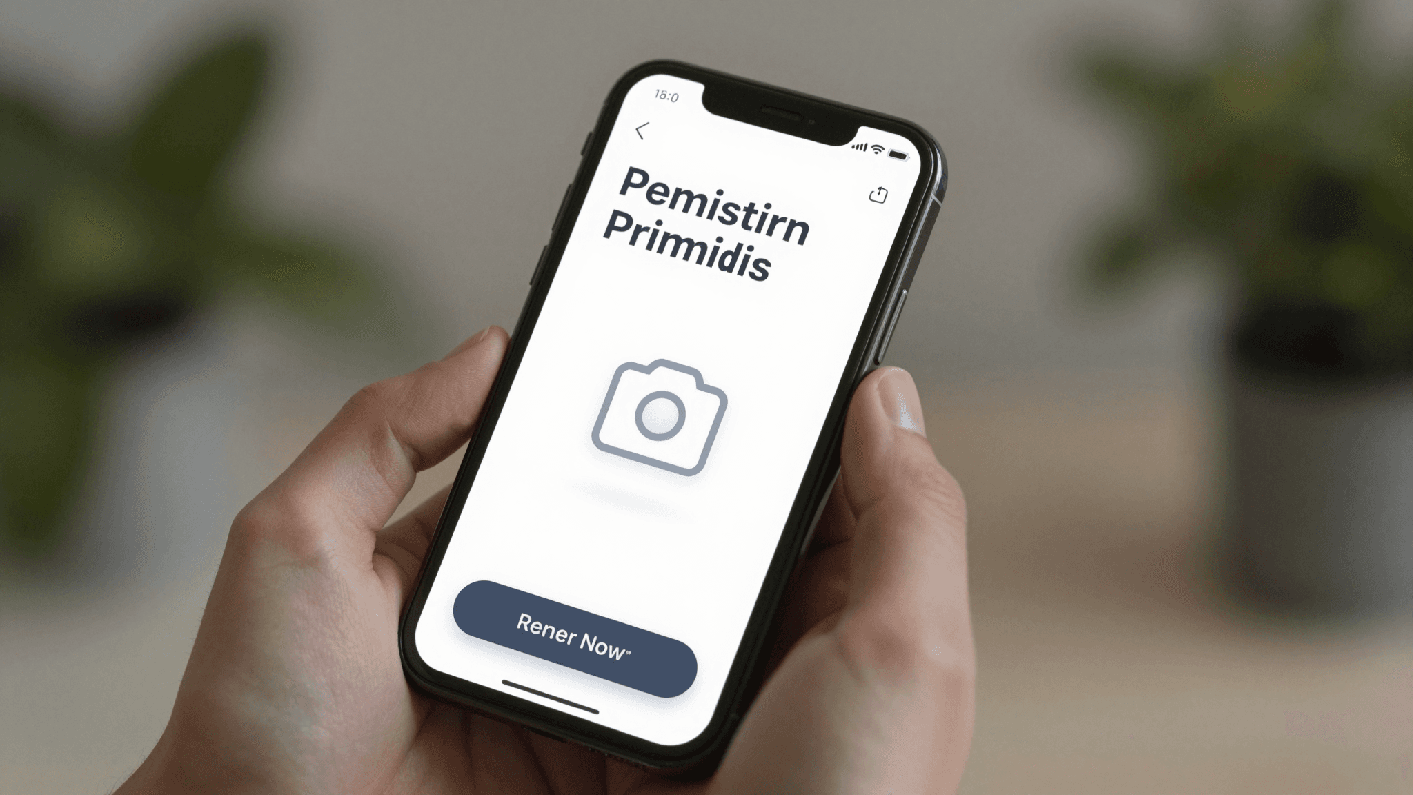
The Permission Prompt Problem: Why Asking for Camera Access Too Early Kills Your Onboarding
You built a feature that needs the camera — maybe it scans receipts, maybe it lets people snap a profile photo, maybe it's the whole point of the app. So on the very first screen after install, before the person has done anything else, your app throws up the system permission dialog: "Allow Camera Access?" Most people tap "Don't Allow." Not because they don't want the feature — because they have no idea yet why a brand-new app they just downloaded needs their camera, their location, or their contacts, and the safe default on a phone is always "no." At Dolfy, the AI-powered mobile app design platform, we call this the permission prompt problem, and it quietly kills more onboarding funnels than a bad color palette ever will.
Key Takeaways
- Permission prompts fired before a user understands why they matter get declined far more often than the same request made in context.
- On iOS, a declined permission can't be re-prompted by your app — the user has to manually dig through Settings, a detour almost nobody takes.
- A custom "priming screen" shown before the OS dialog lets you explain the value first, so the system prompt becomes a formality instead of a gamble.
- The right moment to ask is the moment the user is about to use the feature that needs the permission — not app launch, not onboarding step two.
- Mapping permission moments during the design phase, before a single line of code exists, is far cheaper than retrofitting a priming flow after launch.
Why Do Users Deny Permission Requests They'll Actually Need Later?
Users deny permission requests early in an app's life because the request arrives with zero context. A permission prompt is the operating-system-level pop-up (the native iOS or Android dialog, not anything you designed) that asks for access to a sensitive capability like the camera, microphone, location, or contacts. When that dialog appears on the very first screen, the person has no evidence yet that your app is trustworthy or that the feature behind the ask is worth the access. Mobile UX research has repeatedly found that permission requests fired before any value has been demonstrated see dramatically higher decline rates than the identical request made once a user has already gotten something useful out of the app — often the difference between a majority accepting and a majority declining. Once declined, that decision tends to stick for the life of the install.
That stickiness is the expensive part. On iOS, once a user taps "Don't Allow," your app cannot show the system dialog again — Apple made this a one-shot ask by design, specifically so apps can't nag. The only way back is for the user to open the iOS Settings app, find your app in the list, and manually flip the permission on: a five-tap detour that the overwhelming majority of users will never bother making. Android is slightly more forgiving (it allows a second ask after a decline, with an extra explanatory checkbox), but a second decline locks the door just as hard. In both cases, the cost of asking too early isn't a "try again later" — it's often a permanently disabled feature for that user.
What's the Difference Between a Priming Screen and the OS Permission Dialog?
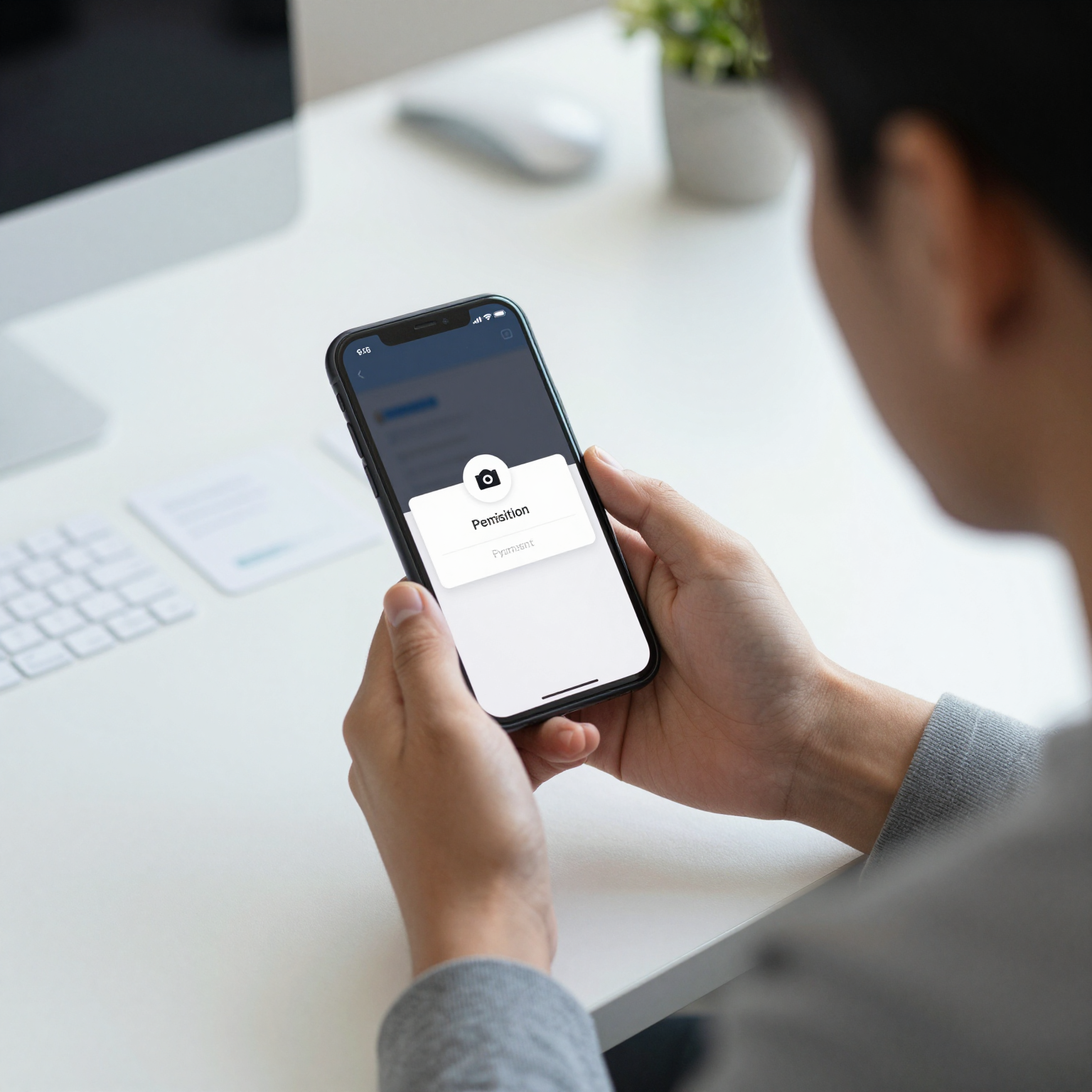
A priming screen is a custom-designed screen inside your own app, built with your own UI components, that explains a permission request before the native OS dialog appears — it looks nothing like the system pop-up and you fully control its copy, imagery, and timing. The OS dialog, by contrast, is fixed: you can't restyle it, you can't add a "here's why" paragraph, and on iOS you get exactly one shot at it per permission. The priming screen is where you do the persuading; the OS dialog becomes a rubber stamp on a decision the user has effectively already made.
A good priming screen for camera access on a receipt-scanning app might show a simple illustration of the scan-and-extract flow with a headline like "Snap a receipt, we'll do the typing" and a single button: "Enable Camera." Only when the user taps that button does your code actually trigger the native permission request. If they tap a "Not now" link instead, you've lost nothing — the OS's one-shot dialog is still unspent, and you can prime them again later at a more relevant moment, like the exact point they try to scan something.
When in the User Journey Should You Actually Ask?
The right time to request a permission is the moment the user is actively trying to use the specific feature that needs it — never app launch, and rarely during a generic onboarding carousel. If your app's core loop is scanning documents, ask for camera access when the user taps "Scan a document," not on screen two of a five-screen welcome tour they're swiping through half-attentively. If location powers a "find nearby" feature, ask when they tap that button, with a priming screen that says exactly what "nearby" will show them.
This is also where a data model — the structured definition of what information your app stores and how those pieces relate to each other, like a User having many Scans, each Scan having an image and extracted text — earns its keep at the design stage rather than the code stage. When you map out which screens actually touch the camera, the microphone, or location before building anything, the permission moments fall out of the flow naturally instead of getting bolted on as an afterthought once QA notices the app asks for contacts access on the splash screen.
How Do You Recover When a User Has Already Said No?
If a permission has already been permanently declined, your app's job shifts from "ask again" to "make the workaround obvious." Detect the declined state (both iOS and Android let you check current permission status without triggering another prompt) and replace the feature's entry point with a short, specific message — "Camera access is off. Enable it in Settings to scan receipts" — ideally with a button that deep-links straight into your app's page in the Settings app rather than making the user hunt for it themselves. This doesn't recover every user, but it removes the ambiguity of a feature that just silently fails to work, which is its own kind of trust damage.

What Does This Look Like in React Native and Expo?
In practice, teams building with React Native (Meta's framework for building native iOS and Android apps from a single TypeScript codebase) typically pair a permissions library with Expo (the toolchain and managed runtime that wraps React Native and adds pre-built native modules) to request camera, location, and media access without writing native Swift or Kotlin code by hand. The priming screen itself is just another screen in your component library — built from the same design tokens (the named, reusable values like spacing, color, and type scale that keep every screen visually consistent) as the rest of your app, so it never looks like a bolted-on interruption. Dolfy's Design OS methodology treats this as part of the fourth step, Screen Design, specifically because permission moments are UX decisions, not engineering afterthoughts — by the time a screen reaches the fifth step, Export, and comes out as production-ready React Native and Tailwind CSS components with TypeScript types, the priming flow is already part of the component export, not a patch a developer adds after the fact.
Frequently Asked Questions
Does asking for fewer permissions overall reduce the problem?
Partially — every permission you don't need is one less moment where a user can say no — but even a single unavoidable permission (camera for a scanning app, location for a delivery app) needs a deliberate priming moment. Cutting requests helps; it doesn't replace timing them correctly.
Should the priming screen appear during onboarding or later?
Later, tied to the specific action that needs the permission, almost always converts better than bundling it into a generic onboarding sequence. Onboarding carousels get swiped through quickly, so a permission ask buried on step three competes with a user's urge to just get to the app.
Can I test which wording works before I build the real screens?
Yes — this is exactly what a clickable prototype (an interactive mockup that simulates real app navigation and taps without any working backend code) is for. Testing two or three priming screen variants as a prototype, with real users tapping through on their own phones, catches a confusing permission explanation before it costs you production users.
What if the platform-specific permission behavior differs between iOS and Android?
Design for the stricter case (iOS's one-shot dialog) and Android inherits the benefit automatically. Treat every permission ask as if you only get one chance to make it land, regardless of platform, and you won't be caught off guard by iOS's tighter rule.
Designing Permission Moments Into Your App From Day One
The permission prompt problem isn't really about permissions — it's about sequencing trust before you ask for access, every single time a native capability enters the flow. Solve it once, at the design stage, and it stays solved through every future screen that needs the camera, the microphone, or the user's location. That's the difference between designing an app screen by screen after the fact and designing a full system where every permission moment, every data model relationship, and every exported component already agrees with each other. Dolfy walks founders and developers through exactly that process — Product Definition, Data Model, Design Foundation, Screen Design, and Export — so the priming screen for your camera permission isn't a scramble two days before launch, it's just another screen your design system already accounted for.