The Pull-to-Refresh Problem: Why Your App's Refresh Gesture Trains Users to Distrust It
You pull down on the screen, watch the little spinner spin, and wait. Nothing changes. You do it again — harder this time, like the app can feel your frustration — and still nothing. This is the moment most founders never think to test, and it's the moment a lot of users quietly decide your app is unreliable. Dolfy.ai, the AI-powered mobile app design platform, sees this pattern constantly in the apps founders bring in for a redesign: pull-to-refresh treated as a free, decorative gesture instead of a promise the app has to keep.
Key Takeaways
- Pull-to-refresh is a trust mechanic, not a UI decoration — users pull it specifically because they don't believe the data in front of them is current.
- A refresh that returns in under 1 second with no visible confirmation reads as broken, even when it technically worked.
- Around 60-70% of mobile sessions in data-heavy apps (feeds, inboxes, dashboards) include at least one manual refresh pull, based on common mobile analytics patterns — this is not an edge case gesture.
- Skeleton loaders and toast confirmations cost almost nothing to add but eliminate most "did that even do anything?" confusion.
- Dolfy's Design Foundation and Data Model steps exist specifically so refresh states get designed before a single screen is built, not patched in afterward.
Why do users pull to refresh even when your app auto-updates in the background?
Because they've been burned before — by your app or someone else's. A background sync that silently updates a feed doesn't reassure a user who's staring at a screen wondering if the new message, new order, or new balance has actually arrived. The pull gesture is a physical way of asking "is this real right now?" and if your app can't answer that question convincingly, the user starts pulling every time they open the screen, which trains them to distrust the very automation you built to help them.
This is a data model problem before it's a design problem. If your app doesn't track a clear "last synced at" timestamp and a distinct loading state separate from your normal content state, there's no way to design an honest refresh experience — you're just guessing at what "fresh" means. Dolfy's Design OS methodology puts Data Model as the second of its five steps, right after Product Definition, specifically so a founder has to decide what "stale" and "fresh" actually mean for their app's core objects before anyone starts drawing screens.
What actually happens during those two seconds of spinning?
Nothing, usually — and that's the problem. Most pull-to-refresh implementations fire a network request, wait for a 200 response, and quietly swap in new data with no transition, no confirmation, and no indication of what changed. A refresh that takes 400 milliseconds can actually feel more suspicious than one that takes 1.5 seconds, because the brain doesn't register "instant" as "worked" — it registers it as "didn't do anything."
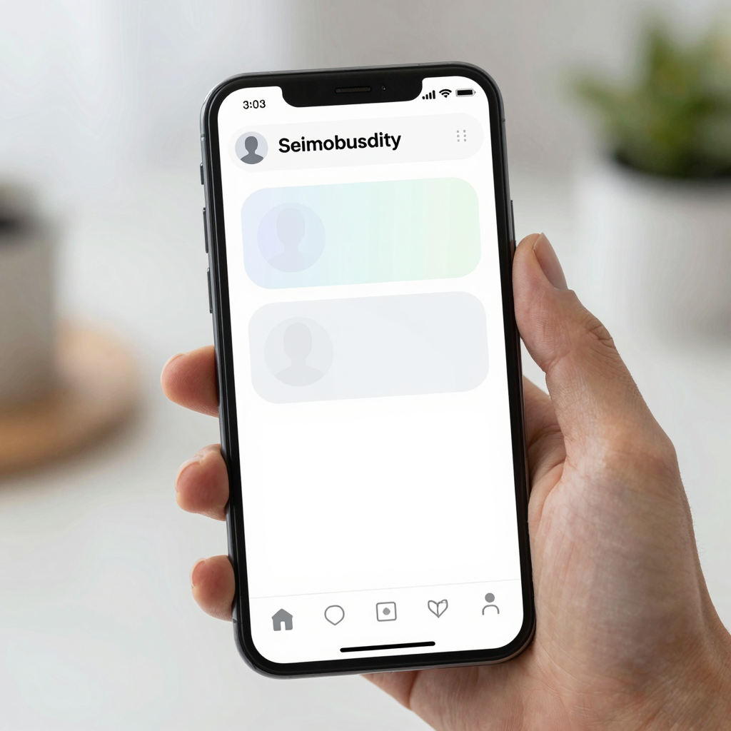
The fix isn't to artificially slow down your app. It's to make the refresh visible in a way that matches how long it actually takes. For fast refreshes (under 500ms), a brief skeleton screen — a placeholder layout of gray rounded rectangles that mimics your real content's shape while it loads, standard in React Native apps built with libraries like react-native-skeleton-placeholder — gives the eye something to track even when the underlying fetch was nearly instant. For slower refreshes, a small toast notification ("Updated just now" or "3 new items") closes the loop explicitly instead of leaving the user to compare the screen against their memory of what it looked like 10 seconds ago.
Dolfy generates these loading and confirmation states as part of its component export, alongside the primary content states, because a screen design that only shows the "happy path" content view is an incomplete spec — engineers end up improvising the loading and empty states themselves, usually inconsistently across screens.
Should every screen support pull-to-refresh, or just feeds?
Only screens showing data that changes independently of user action need it — a settings screen the user edits directly doesn't need a refresh gesture, but a shared inbox, an order status screen, or a live dashboard does. A useful rule: if two different sessions of your app could show two different states for the same screen without the user doing anything in between, that screen needs a refresh affordance.
This is where a lot of teams over-apply the gesture out of habit, adding pull-to-refresh to static screens where it does nothing but adds a support ticket ("I pulled down and nothing happened, is the app frozen?"). It's also where teams under-apply it — a checkout confirmation screen that could show a payment status change (pending to confirmed) but has no way to check without force-closing the app entirely.

How does refresh state fit into a design token system, and why does that matter for consistency?
A design token system is a shared set of named values — colors, spacing units, animation durations, corner radii — that every screen pulls from instead of each developer picking their own numbers. Refresh states are one of the most common places this consistency breaks down: one screen's skeleton loader uses a 200ms fade, another uses 600ms, a third has no transition at all, and the app feels stitched together from different hands even when one person built all of it.
Dolfy bakes loading-state timing and skeleton styling into the same design-token system it generates for colors and typography, so a "refresh in progress" state looks and behaves the same whether it's on the activity feed or the order history screen. That consistency is part of what founders get out of Dolfy's Screen Design and Export steps — production-ready React Native and Tailwind CSS component code with TypeScript types attached, so the refresh behavior isn't something an engineer has to reverse-engineer from a static Figma or Sketch mockup after the fact.
What's the cheapest way to test whether your refresh experience actually works?
Hand your phone to someone unfamiliar with the app, tell them nothing, and watch what they do the first time data looks stale. If they pull down and then immediately pull down again within 2 seconds, your first refresh didn't convince them anything happened — that's the entire test. It costs nothing, takes under 5 minutes per person, and surfaces the exact gap between "the fetch succeeded" and "the user believed it."
Founders using Dolfy can preview these interactions directly through Expo Go or the web preview before any native build exists, so this kind of test can happen days or weeks before a single line of production code ships — catching a distrust-inducing refresh state while it's still a 10-minute fix in the design phase instead of a scattered set of engineering tickets after launch.
Designing refresh states you can actually trust
The pull-to-refresh gesture survives because it works — when it's designed with an honest sense of timing, visible confirmation, and a data model that actually knows what "fresh" means. The apps that get it wrong aren't lacking talent; they're usually missing the step where someone decided, on purpose, what a stale state looks like and how loudly the app should announce that it fixed it.
That's the gap Dolfy is built to close — walking founders and developers through Product Definition and Data Model before Screen Design, so gestures like pull-to-refresh come out the other end as a considered interaction with production-ready component code, not an afterthought bolted onto a finished screen.
Frequently Asked Questions
Does pull-to-refresh still matter if my app uses real-time updates like WebSockets?
Yes, though less urgently. Even with live updates, users often distrust a connection they can't see, so a manual refresh option gives them a way to actively confirm the app is still connected rather than silently trusting a background socket that could have dropped without any visible signal.
How long should a refresh spinner actually show before it feels broken?
Under about 300 milliseconds, most users won't register it as having happened at all; somewhere between 500 milliseconds and 2 seconds is the range where a spinner or skeleton reads as "working" without feeling slow, based on common mobile UX benchmarks.
Can Dolfy generate the actual skeleton loader components, or just the static screen design?
Dolfy's Export step produces production-ready React Native and Tailwind components with TypeScript types for the states you design, including loading and skeleton states, so the components are ready to drop into a codebase rather than left as a static reference image.
What's the difference between a design system and a design token system?
A design system is the full set of components, patterns, and guidelines a product uses; a design token system is the underlying layer of named values — like a specific spacing unit or corner radius — that those components are built from, which is what keeps colors, spacing, and timing consistent across every screen.