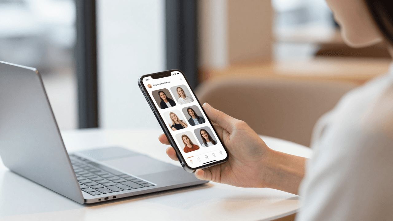
The Pull-to-Refresh Problem: Why Your App's Refresh Gesture Leaves Users Wondering If Anything Happened
You built the feed screen, wired it to your API, and it works. Then a beta tester pulls down to refresh, sees nothing happen for two seconds, pulls again, and again, and finally messages you: "Is it frozen?" Nothing is broken. The data did refresh. But the gesture gave no sign that anything was happening, so the user assumed the worst. Dolfy.ai sees this pattern constantly with founders who ship a technically correct app whose most-used gesture feels dead.
Key Takeaways
- Pull-to-refresh is a conversation: the user asks, the app must visibly answer within about 100 milliseconds.
- Every refresh needs four defined states: idle, pulling, refreshing, and done (including failed).
- A refresh that changes nothing still needs a confirmation, such as "You're up to date."
- Defining refresh behavior once as a shared component beats re-implementing it screen by screen.
- Test on a real device through Expo Go, because simulators rarely reveal how slow a refresh actually feels.
What Is the Pull-to-Refresh Problem?
The pull-to-refresh problem is when the gesture works but the interface fails to acknowledge it. The user drags down, releases, and sees no spinner, no movement, and no result, so they cannot tell whether the app listened.
Pull-to-refresh became a standard mobile pattern because it is cheap to learn: users already scroll, so one more pull feels natural. But a gesture with no visible feedback is worse than no gesture at all. A button that does nothing at least looks inert. A pull that does nothing looks like a bug, and users who think an app is buggy tend to leave. Research on perceived responsiveness has long suggested that feedback arriving within roughly 100 milliseconds feels instant, while delays beyond one second make people start to wonder whether their input registered.
For solo founders, the trap is that you test your own refresh on fast Wi-Fi with a tiny dataset. The request finishes in 150 milliseconds, the list flickers, and you move on. Your users are on a train with one bar of signal, and the same refresh takes four seconds with zero feedback.
What Are the Four States of a Refresh?
A well-designed refresh has four states: idle, pulling, refreshing, and complete. Each one needs its own visual treatment, and skipping any of them is where the dead-gesture feeling comes from.
Idle is the normal list, with nothing extra on screen. Pulling is the live response while the finger is down: the indicator should follow the drag and signal when the threshold has been crossed, typically around 60 to 80 points of travel. Refreshing is the held state after release, with a spinner pinned in place while the request runs. Complete is the part most teams forget: the indicator retracts and the user sees evidence that something happened, whether that is new rows sliding in or a short "Up to date" message.
There is a fifth case hiding inside the fourth: failure. If the network call fails, silently snapping the list back is the same dead-gesture problem in a new costume. The failed state needs a clear, short message and a way to retry.
Why Does a Refresh With No Changes Feel Broken?
A refresh that returns identical data feels broken because the screen looks exactly the same afterward. The user cannot distinguish "nothing new" from "nothing happened," so they pull again.
This is the most common refresh complaint, and it is easy to fix. When the response contains no new items, show a brief confirmation: a small banner or inline text reading "You're up to date," plus an optional "Last updated 2 minutes ago" timestamp near the top of the list. The timestamp is especially valuable because it turns an invisible background fact into something the user can verify. Many well-known apps, including email clients and social feeds, use a variation of this idea.
Keep the confirmation short, around one to two seconds on screen, and never block the list while it is visible.
How Should the Refresh Indicator Behave?
The indicator should follow the finger during the pull, lock in place at the threshold, and stay visible until the request settles. If the request finishes faster than about 400 milliseconds, hold the spinner for a short minimum so the user actually sees it.
In React Native, the built-in RefreshControl component handles much of the platform-native behavior on both iOS and Android, and that is usually the right starting point. The mistakes tend to be in what surrounds it. Common ones include setting the refreshing flag to false before the data has rendered, nesting a scroll view inside another scroll view so the gesture never fires, and styling the spinner with a color that disappears against the background. Spinner color is a design token decision: a design token is a named, reusable design value, such as a color or spacing size, that the whole app references instead of hard-coding. If your spinner color is a token tied to your brand's accent color, it stays visible in both light and dark themes.
What Does a Good Refresh Look Like on Different Screens?
A good refresh is consistent in behavior but adjusted for context. A social feed should insert new items at the top and keep the user's place. A dashboard should update its numbers and show a timestamp. A list with filters should keep the filters applied while refreshing.
Here is a quick checklist founders can run against every scrollable screen:
- Does the pull gesture fire on this screen, even when the list is short or empty?
- Does the indicator appear during the drag, not only after release?
- Does the screen show a result, such as new items or an "up to date" note?
- What happens when offline or when the server returns an error?
- Is the refresh also reachable without gestures, for accessibility, through a button or menu option?
That last point matters. A gesture-only action excludes users who rely on screen readers or switch controls. Offering a visible "Refresh" option in a menu is a small addition that covers a real group of users.
How Does Dolfy Approach Refresh Behavior?
Dolfy treats refresh as part of the screen design step rather than an afterthought bolted on before launch. Dolfy is an AI-powered mobile app design platform from AEGONTECH LLC that walks you through a five-step Design OS process: Product Definition, Data Model, Design Foundation, Screen Design, and Export.
Two of those steps matter directly here. In the Data Model step, you define what content your app holds, which tells you what a refresh actually fetches and what an empty or unchanged result looks like. In the Screen Design step, you design each screen, and this is the right moment to decide that every list screen needs idle, refreshing, and complete states instead of only the happy-path layout.
Because Dolfy exports production-ready React Native components styled with Tailwind and typed with TypeScript, those decisions travel into code instead of staying in a mockup. The Design Foundation step produces a design-token system, so the spinner color, the confirmation banner style, and the spacing are defined once and reused. You can then check the result in Expo Go or the Web Preview before you commit. Note that Web Preview is convenient for layout, but a physical phone is the honest test for gesture feel.
How Do You Test Refresh Before Launch?
Test refresh under bad conditions on a real phone. Throttle your connection, turn on airplane mode, and pull the list in each state. Three scenarios cover most of the risk: a slow response of three to five seconds, an empty or unchanged response, and a failed request.
Ask someone who has never seen the app to pull a list and narrate what they think is happening. If they say "I don't know if it worked," you have a feedback gap. Five testers are usually enough to surface a pattern like this, since feedback problems are obvious rather than subtle.
Also check the edges: pulling while a previous refresh is still running should not stack requests, and rotating the device mid-refresh should not leave a spinner stuck on screen.
Frequently Asked Questions
Do I need pull-to-refresh at all?
Not every screen does. It earns its place on content that changes while the user is away, such as feeds, inboxes, and order lists. If your content updates automatically in real time, a pull gesture may be redundant, though many users still expect it and will try it anyway.
How long should a refresh take before I show a spinner?
Show the indicator immediately on release. Users should see a response within about 100 milliseconds, even if the data takes longer to arrive. If the request completes very quickly, hold the spinner for a few hundred milliseconds so it registers.
Should I use a custom animation or the platform default?
Start with the platform default. It matches what users already know from other apps and costs almost nothing to maintain. Custom animations can add personality, but they also add bugs and can feel slow, so reserve them for later polish.
What is the single most important fix?
Add a visible result state. Whether it is new rows, an "up to date" message, or an error with a retry button, the user must see evidence that their pull was heard.
Make Every Pull Feel Answered
The pull-to-refresh problem is rarely a technical failure. It is a communication gap between a gesture and its result, and closing it takes a few deliberate states rather than a rewrite. Define idle, pulling, refreshing, and complete once, tie the visuals to design tokens, and test on a real device under poor network conditions. If you want to design those states up front and carry them into clean React Native code, you can start with Dolfy and shape every list screen before a single beta tester gets confused.