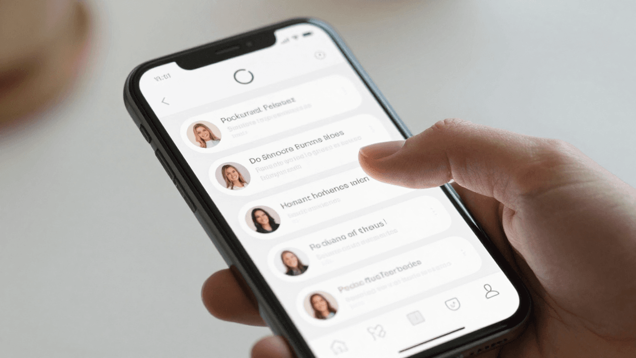
The Pull-to-Refresh Problem: Why Your App's Refresh Gesture Leaves Users Staring at Stale Data
You swipe down on your feed, watch the little spinner spin, and then... nothing looks different. Was it actually new data, or the same five posts re-rendered in a different order? Your users can't tell either, and that's the real damage: after two or three refreshes that don't visibly change anything, they stop trusting the gesture entirely and start force-quitting the app instead. Dolfy.ai has watched this pattern show up in founder screen reviews over and over — pull-to-refresh is one of the most copy-pasted gestures in mobile design, and one of the least thought-through.
Key Takeaways
- Pull-to-refresh fails when the visual feedback (a spinner) is disconnected from the actual data state (what changed, if anything).
- A refresh that takes longer than about 2-3 seconds without any incremental feedback reads as broken, even if the network call is healthy.
- Gesture conflicts with nested scrollable regions (tab bars, horizontal carousels, chat threads) are one of the most common causes of "the app froze" support tickets.
- Your data model — not your animation library — determines whether a refresh can honestly tell the user "here's what's new."
- Dolfy's Design OS treats refresh and loading behavior as a Design Foundation decision, not an afterthought bolted on during Screen Design.
Why Does Pull-to-Refresh Feel Broken Even When the Data Updates?
It feels broken because the spinner is a promise the interface doesn't keep. A loading spinner is a small looping icon that tells the user "something is happening" — but it says nothing about what, and once it disappears, most apps give no signal about whether anything actually changed. If a founder's app fetches new data but re-renders the list in the same visual order, with no "3 new items" banner, no highlight, no timestamp update, users experience a full round trip of waiting for literally no perceptible gain.
This is worse on content-heavy apps — social feeds, marketplaces, dashboards — where "new" is the entire point of refreshing. A fintech founder we worked through in Dolfy's Design Foundation step described this exact bug report from beta testers: "refresh doesn't work," when in fact the API was returning fresh data correctly every single time. The bug wasn't in the backend. It was in the missing 200 milliseconds of visual proof.
What Happens When Your Refresh Gesture Fights Your Scroll Gesture?
It creates the single most common "the app just froze" complaint in mobile support inboxes. Pull-to-refresh relies on detecting an overscroll — dragging past the very top of a scrollable list — and translating that into a refresh trigger. The moment you nest scrollable regions (a horizontal image carousel inside a vertical feed, a swipeable tab bar, an embedded chat thread), the gesture recognizer has to arbitrate between two conflicting drag intentions, and most React Native and Flutter implementations get this wrong by default.
The typical failure mode: a user tries to swipe a horizontal card carousel near the top of the screen, the vertical scroll view intercepts it as a pull-to-refresh gesture instead, the spinner fires, and the carousel never moves. Multiply that by a few thousand users and you get a wave of one-star reviews that all say some version of "buggy, gestures don't work." Fixing it isn't a two-line animation tweak — it requires explicit gesture ownership rules defined before a single screen gets built, which is exactly the kind of decision Dolfy's methodology pushes into the Design Foundation phase rather than leaving it for someone to discover during QA three weeks before launch.
How Should Loading States Communicate What's Actually Happening?
They should show a spectrum of states — idle, refreshing, success-with-new-content, success-with-no-change, and failed — not just an on/off spinner. Most teams build exactly one loading state and reuse it everywhere, which collapses five genuinely different situations into a single ambiguous signal. A refresh that finds zero new items should say so ("You're all caught up") rather than silently doing nothing, and a refresh that fails due to a dropped connection should say that too, rather than spinning forever until a 30-second timeout finally gives up.
Dolfy's Screen Design step generates these states as actual component variants — built in React Native with Tailwind CSS utility classes for styling and TypeScript types enforcing which state props are valid — instead of leaving them as a mental note for whoever implements the screen. That distinction matters more than it sounds: a design system is a shared set of reusable components and rules (colors, spacing, states) that keeps an app visually and behaviorally consistent, and a design token is one atomic value inside that system — a specific color hex code, a spacing unit, a font size — referenced by name instead of hardcoded everywhere. When "refreshing," "empty," and "error" are token-driven variants of one Refresh component instead of three copy-pasted spinners, a founder can change the loading behavior once and have it apply consistently across every screen that pulls data.

Where Does the Data Model Fit Into a Trustworthy Refresh?
It's the difference between an honest refresh and a cosmetic one. A data model is the structural blueprint of your app's information — which fields exist, how records relate to each other, what a "new" item actually means. Without a lastFetchedAt timestamp or a change-tracking field baked into that model from the start, your app has no way to answer the question "did anything actually change since last time?" — it can only re-fetch everything and re-render it, which is exactly the expensive, silent-feeling refresh users learn to distrust.
This is why Dolfy sequences Data Model before Screen Design in its 5-step Design OS methodology (Product Definition, Data Model, Design Foundation, Screen Design, Export): a refresh gesture is a UI decision wearing a data decision's clothes. Teams that design the screen first and the schema second almost always end up bolting on change-detection logic weeks later, at which point it touches every API call in the app instead of one field defined on day one. Founders using Dolfy get production-ready component exports with the data contracts already wired to the design tokens, so "3 new items since your last visit" isn't a follow-up sprint — it's available from the first build.
Making Refresh Feel Instant Without Actually Being Instant
Perceived speed matters more than raw latency here, and it costs nothing extra to get right. A refresh that completes in 800 milliseconds but shows zero visual feedback feels slower than one that takes 1.5 seconds but shows a smooth pull-distance-based spinner animation the whole way — because the second one proves the app is listening to the user's finger in real time. Skeleton screens (gray placeholder shapes that mimic the eventual content's layout while it loads) paired with a subtle "Updated just now" timestamp after a successful pull cost a few hours of implementation and eliminate most of the "is this thing broken" uncertainty.
For an indie hacker shipping an MVP — a minimum viable product, the smallest version of an app that still proves the core idea works — this is exactly the kind of detail that's easy to skip under deadline pressure and expensive to fix after 500 users have already formed an opinion about your app feeling janky. Getting the states, the gesture ownership, and the underlying data model right the first time, inside a tool like Dolfy that treats them as connected decisions rather than three separate tickets, is meaningfully cheaper than retrofitting it into a shipped Expo or SwiftUI app.
Frequently Asked Questions
Is pull-to-refresh still necessary if my app already auto-updates in the background?
Often not as the primary mechanism, but it's still worth keeping as a manual override. Background sync (data quietly updating via push notifications or periodic polling without user action) handles the common case, but users reach for pull-to-refresh specifically in the moment they don't trust that background sync happened — right after opening the app, or after a spotty connection. Removing the gesture entirely tends to increase support tickets asking "how do I refresh this," even when it wasn't strictly needed.
What's a reasonable timeout before a refresh should show an error instead of spinning?
Somewhere around 8-10 seconds for most mobile network conditions, though this depends on the endpoint. Anything longer and users assume the app has frozen rather than assuming the network is slow, and a spinner with no timeout at all is one of the more common causes of one-star "app hangs" reviews — always pair a loading state with an explicit failure state and a retry action.
Can React Native handle nested scroll and pull-to-refresh conflicts natively?
Partially — React Native's ScrollView and RefreshControl handle the simple single-list case well, but nested horizontal carousels or swipeable tabs typically need explicit gesture-priority handling through a library like react-native-gesture-handler, or careful nestedScrollEnabled configuration on Android. It's a solvable problem, but it's one that needs to be decided at the design stage, not discovered during a bug bash.
Does adding a "new items" badge on refresh require a backend change?
Usually a small one: your API needs to return either a count of new records or a timestamp the client can compare against its last fetch, and your data model needs a field that supports that comparison (like createdAt or a monotonically increasing ID). It's a modest addition on the backend and a meaningful trust-builder on the frontend — exactly the kind of small schema decision that's far cheaper to make during the Data Model step than to retrofit later.
Designing Refresh Behavior That Users Actually Trust
Pull-to-refresh looks like a two-hour animation task and behaves like a three-layer problem spanning gesture handling, loading-state design, and data modeling — which is precisely why it gets under-designed so often. Founders and indie hackers rarely have the bandwidth to think through overscroll conflicts, five-state loading logic, and change-tracking schema fields as one coherent decision while also trying to ship a first version. That's the gap Dolfy.ai's Design OS methodology is built to close: it walks a Product Definition through Data Model, Design Foundation, and Screen Design in sequence, so the refresh gesture on screen five is backed by the schema decision made in step two, and the whole thing exports as production-ready React Native and Tailwind components with TypeScript types and a working Expo Go preview you can hand to a developer the same day. If your app's refresh gesture has ever left a user staring at a screen wondering whether anything happened, it's worth designing the fix properly once — start with Dolfy and get the data model and the interaction right together.