
The Review Prompt Problem: Why Your App's Five-Star Ask Gets a One-Star Reply
You built a feature your users love, they used it, and thirty seconds later your app interrupted them with a full-screen dialog begging for five stars. They tapped one star out of irritation and closed the sheet. Multiply that moment by a few hundred users a week and you have a public rating that undersells a genuinely good product. This is the review prompt problem, and it is one of the most common design mistakes indie hackers and small teams make — not because they don't care about their app, but because nobody mapped out when and how to ask. At Dolfy.ai, an AI-powered mobile app design platform, we see this pattern constantly in the apps founders bring into our Design OS methodology: the feature is solid, the review-prompt moment is an afterthought bolted on the night before launch.
Key Takeaways
- A review prompt fired at the wrong moment converts happy users into public one-star reviews, and a low average rating actively hurts your ranking in App Store and Play Store search results.
- Apple's native
SKStoreReviewControllerAPI caps how often you can even show the system prompt — three times in any 365-day period, per app, per device — so every use has to count. - The fix is timing, not copywriting: trigger the prompt after a user completes a meaningful action, not on app launch or after an error.
- A design system with reusable, well-defined components makes it far cheaper to build a dedicated "delight moment" screen instead of hijacking a random tap.
- Dolfy's Design OS methodology treats the review prompt as part of Screen Design and Data Model planning, not a last-minute popup, so the trigger logic and the UI ship together with types already wired up.
Why does a review prompt need a "moment" at all?
A review prompt needs a moment because a rating request is really a question — "are you happy right now?" — and the answer depends entirely on what just happened to the user. If you ask that question in the middle of an onboarding flow, before someone has experienced any real value, you're asking a stranger to vouch for you. If you ask it right after a crash, an error, or a task the user couldn't finish, you're asking someone who's frustrated to tell the world about it. Timing turns the same exact dialog box from a compliment machine into a complaint machine.
Most teams treat the rating prompt as a single line of code dropped into App.tsx on a timer — "show it after 3 launches" — without ever mapping it to a user's actual journey through the product. A data model (the structure that defines what information your app stores and how pieces of it relate to each other, like a user's completed-tasks count or session history) is exactly what you need to know when a user has hit a genuine success moment, and most teams never build that tracking because it feels like extra work for a "just add a popup" feature.
When is the right moment to ask for a rating?
The right moment is right after a user finishes something they came to your app to do — not on launch, not after signup, and not immediately after your onboarding carousel. Concretely: wait until someone completes their third meaningful session, or has just hit a save/export/checkout success state, then show the prompt within a few seconds while the positive feeling is fresh. Waiting even two weeks past install is often better than asking on day one, because by then the user has actually formed an opinion worth capturing.
This is also where platform rules matter. Apple's SKStoreReviewController will only display the native rating sheet up to three times per year per app installation — Apple's own algorithm decides exactly when within that quota, and you have zero control over the visual design of that sheet. Google Play's In-App Review API works the same way: you request it, Google decides if and when it actually renders, based on its own quota logic. That means the actual design decision you control isn't the popup itself — it's the in-app moment and screen that leads up to requesting it. A well-designed "delight" screen (a short, positive confirmation state — think a checkmark animation and a friendly headline after a completed action) that appears before you call the native API is what determines whether the person who sees that system prompt is already smiling.
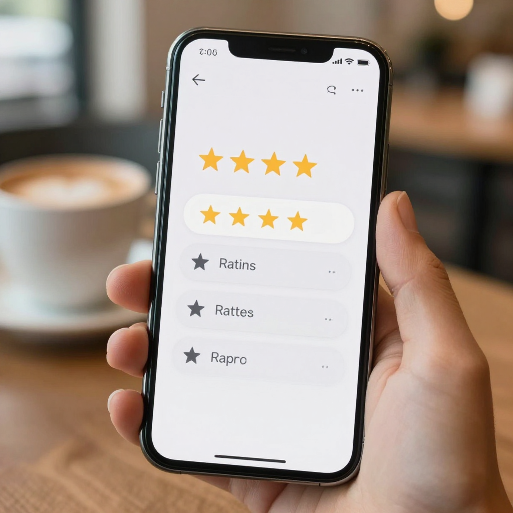
What does a good review-prompt flow actually look like on screen?
A good review-prompt flow looks like a soft, low-pressure moment layered on top of a success screen, not a blocking modal that stops the user from doing anything else. Picture a checkout confirmation, a completed workout, or a finished onboarding checklist — the screen already has a positive wireframe (the basic skeleton layout of a screen before visual polish, showing where the header, content, and buttons sit) built around celebrating that action. The rating ask rides on top of that positive state as a secondary, dismissible card, not a full-screen interrupt with only two buttons and no visible "not now."
Concretely, that means: a rounded card with a short headline ("Enjoying Dolfy so far?"), two clearly tappable options ("Sure!" and "Maybe later"), and — critically — a soft-ask step before the hard system prompt. Route "Sure!" taps into the native API call (which triggers Apple or Google's real dialog), and route "Maybe later" taps into a lightweight in-app feedback form instead of the App Store. That single branch is the difference between a five-star public rating and a private bug report you can actually act on — and it's also why the feature needs its own screen and its own state, not a single conditional wrapped around a native SDK call.
How do design tokens and components make this cheaper to build well?
Design tokens and components make a good review-prompt flow cheaper to build because you're assembling it from pieces you already have instead of designing a one-off popup from scratch. A design token (a named, reusable value — like color.brand.primary or spacing.md — instead of a hard-coded hex code or pixel number scattered across files) means your "delight" card automatically matches your app's existing button styles, corner radius, and spacing without a designer re-deriving them. A design system (the shared library of components, tokens, and rules that keeps every screen in your app visually consistent) turns a five-minute layout job into a five-minute layout job instead of a half-day detour into matching colors by eye.
This is precisely the gap Dolfy's five-step Design OS methodology — Product Definition, Data Model, Design Foundation, Screen Design, and Export — is built to close. Because the data model step forces you to define what a "meaningful action" or "success event" actually is in your schema up front, the review-prompt trigger isn't guesswork bolted on later; it's a field your app already tracks. And because Export produces production-ready React Native and Tailwind CSS components with TypeScript types already attached, the delight-screen card and its two buttons come out as a typed, reusable component (a self-contained, reusable piece of UI, like a button or card, that you can drop into multiple screens) you can drop into every success state in the app — checkout, workout completion, exported project, whatever fits your product — instead of writing four slightly different popups by hand.
What if I'm using Flutter or SwiftUI instead of React Native?
If you're using Flutter or SwiftUI instead of React Native, the same timing and layout principles apply — only the implementation syntax changes, not the design decision. A design system exported as tokens (colors, spacing, type scale) rather than framework-locked code can be re-implemented in SwiftUI's enum constants or Flutter's ThemeData, and the delight-screen wireframe you validate in a tool like Dolfy or Figma before writing any code carries over regardless of what renders it. The expensive part was never the button color — it was deciding what "a good moment to ask" means for your specific app, and that decision is framework-agnostic.

Frequently Asked Questions
How many times can I actually ask a user to rate my app?
On iOS, Apple's SKStoreReviewController will show its native prompt at most three times in a rolling 365-day period per app, and Apple — not you — decides exactly when within that limit. On Android, Google's In-App Review API enforces its own separate quota. Because you can't rely on the native prompt firing every time you request it, treat your in-app "soft ask" card as the real conversion moment, and the native call as a bonus you trigger only when someone has already said yes.
Does a low App Store rating really affect how many people find my app?
Yes — both Apple's App Store and Google Play factor average rating into search ranking and "similar apps" placement, and a rating that drifts under roughly 4.0 stars visibly hurts organic discovery, not just first impressions from people who land on your listing directly.
Can I just use a third-party review-prompt library instead of building this myself?
You can, and several exist, but most only wrap the native SKStoreReviewController / In-App Review calls with a timer — they don't solve the actual design problem of building a positive, on-brand delight screen tied to a real success event in your data model. The library saves you an SDK integration; it doesn't save you the screen design and event-tracking work described above.
Where should the "Maybe later" feedback go instead of the App Store?
Route it to a short in-app form (even two fields: a rating scale and an optional comment) that writes to your own backend or a simple table in your data model, not to a public channel. This turns your worst-case users into a private bug list instead of a public rating, while your best-case users are the only ones who ever see the real App Store or Play Store prompt.
Building the moment, not just the modal
The review prompt isn't a checkbox feature — it's a small piece of product design that depends on a data model that knows what success looks like, a component library that makes the delight screen cheap to build consistently, and restraint about when to actually spend one of your three yearly shots at the native dialog. Teams that treat it as a five-minute afterthought get the public rating to prove it; teams that map it into their onboarding and success states from the start get quiet, compounding five-star reviews instead.
If you're mapping out this kind of flow for your own app — or realizing your data model doesn't yet track the "success events" a good review prompt depends on — that's exactly the kind of gap Dolfy's Design OS is built to surface early, before you're retrofitting tracking code around a popup that already shipped. You can walk through Product Definition and Data Model for your own app, prototype the delight screen, and export typed, ready-to-use components at Dolfy.