The Review Prompt Problem: Why Asking Users to Rate Your App at the Wrong Moment Backfires
You finally ship. Three weeks of nights and weekends, and your app is live on the App Store. Session two ends, and a system dialog pops up asking for a five-star rating — before the person has even finished their first real task. They tap "No, Thanks" out of reflex, or worse, they tap one star just to make the popup go away. Six months later you're staring at a 3.2 average and wondering why nobody trusts your app enough to download it. This is the review prompt problem, and it quietly kills more indie apps than bad onboarding ever does. Getting it right is one of the smaller, less glamorous pieces of mobile app design — but it's exactly the kind of decision that Dolfy.ai is built to help founders and developers get right the first time, instead of learning it the hard way after launch.
Key Takeaways
- Apple's own App Store guidelines cap native in-app rating prompts (via
SKStoreReviewController) at three per year per user — asking more often is a losing strategy, not a growth hack. - The single biggest predictor of a positive review isn't how polished your prompt looks, it's when you show it: after a completed, successful action, not on app open or during onboarding.
- A gate step — a soft in-app question before the system dialog — lets you route unhappy users to private feedback instead of a public one-star review.
- Every rating prompt is a component with states (idle, shown, dismissed, rated) and needs a data model behind it, just like any other screen in your app.
- Teams using a structured design process, like Dolfy's five-step Design OS, tend to spec this kind of "small" flow properly instead of bolting it on as an afterthought two days before launch.
Why Do In-App Review Prompts Backfire So Often?
They backfire because most teams treat the rating prompt as a marketing checkbox instead of a piece of interaction design. It gets added in the last sprint before launch, triggered on a timer or on app open, and shown to every user regardless of what they were actually doing at that moment. A prompt that interrupts someone mid-task — say, while they're trying to finish a checkout or upload a photo — reads as an ambush, not an invitation. The emotional context matters as much as the timing: you're asking someone to do you a favor, and favors land better right after you've done one for them.
There's also a structural problem. On iOS, the native review sheet (SKStoreReviewController, introduced in iOS 10.3) doesn't let you know if the person actually rated you or just dismissed it, and Apple limits how often it can appear — three times in a rolling 365-day window, System-enforced. If you burn one of those three shots on a random cold-open trigger, you don't get it back. Android's in-app review API works similarly through Google Play's review flow, quota-limited and silent on outcome. Waste the ask, and you've lost a scarce, non-renewable resource, not just annoyed one user.
When Is the Right Moment to Ask for a Rating?
The right moment is immediately after a person experiences a clear win inside your app — not immediately after they open it. A "win" is any moment where the app just did something useful and the person can feel it: a workout logged, a design exported, a payment successfully split, an item marked delivered. These moments carry positive emotional residue for a few seconds, and that residue is what you're borrowing when you ask for a rating.
Concretely, most mobile teams look for what's often called an activation milestone — something like the user's third completed core action, or their second session where they returned voluntarily rather than being pushed by a notification. Waiting until session three or four, rather than session one, filters out people who installed the app, poked around for 90 seconds, and were never going to be happy customers anyway. A prompt shown on session one might reach someone who hasn't yet understood what your app even does; a prompt shown after a real success is reaching someone who already decided the app is worth having.
Timeframes matter too. If your core action takes 10-15 seconds to complete, as many mobile utility flows do, firing the prompt within 2-3 seconds of that success — while the checkmark animation or confirmation toast is still visible — keeps the ask tethered to the win. Wait until the next screen and you've lost the emotional connection between the action and the request.
How Should You Design the Prompt Itself?
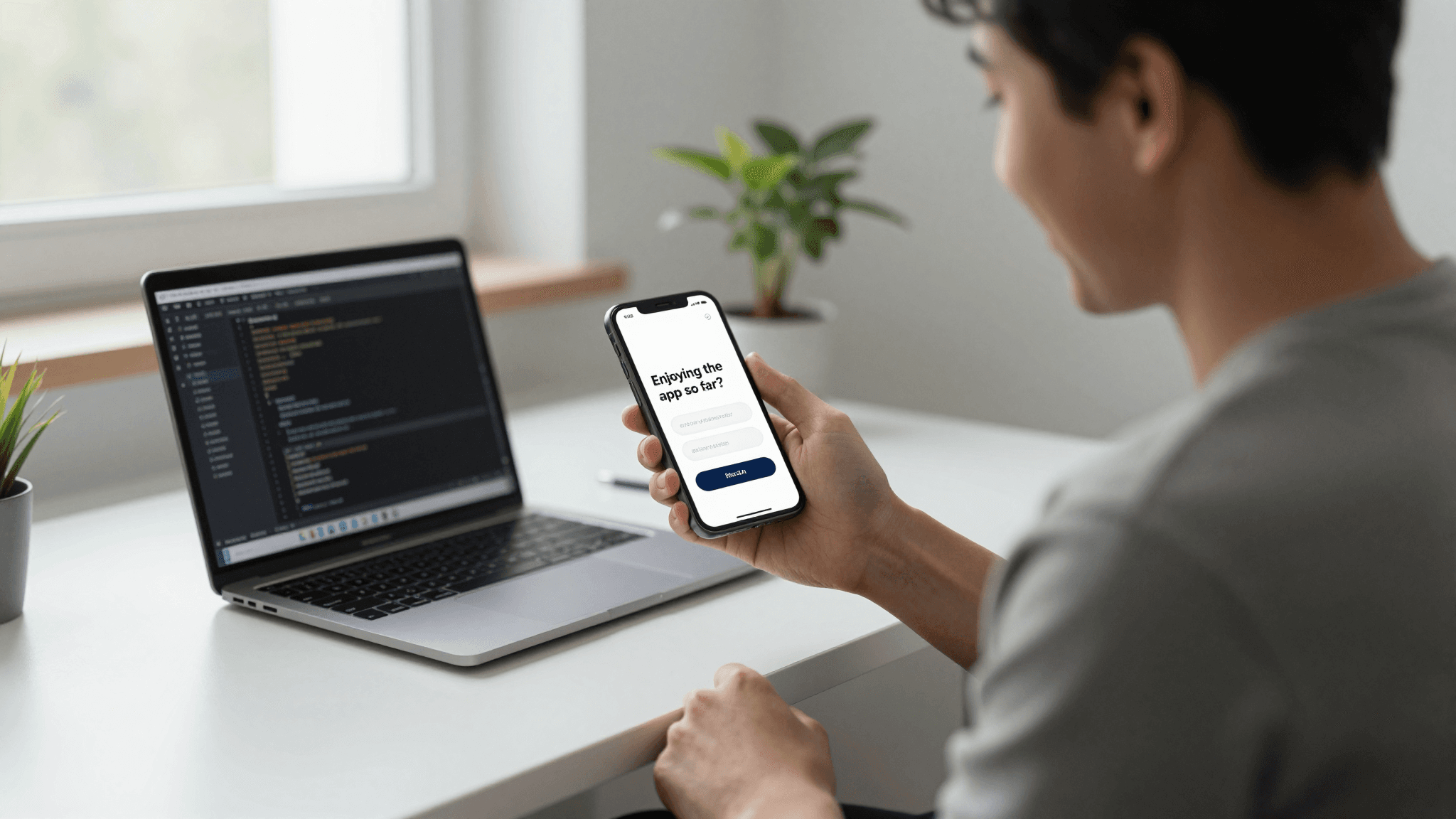
Start with a gate, not the system dialog. A gate is a lightweight in-app question — usually a simple "Are you enjoying [App Name]?" with a thumbs up / thumbs down or Yes/No choice — that appears before you ever call the native rating sheet. If someone taps "Yes," you immediately trigger the real App Store or Play Store prompt while the goodwill is fresh. If they tap "No," you route them to a private feedback form or support email instead of a public storefront review. This single branching decision is why some apps manage to keep 4.5+ star averages while others hover in the 3s: they never let an unhappy moment become a public, permanent rating.
Visually, the gate should look like it belongs to your app, not like a system alert bolted on top of it — rounded card, your own type scale and color tokens, a clear escape route (an X or "Maybe Later," never a forced choice). This is where design tokens matter: a design token is just a named, reusable value — a specific shade of blue, a corner radius, a spacing unit — stored once and referenced everywhere, so your rating card automatically matches the rest of your app instead of looking like a stock component someone copy-pasted in. If your prototyping tool doesn't already have your token system wired up, you end up hand-matching colors on a screen nobody was even planning to spend much time designing, which is exactly how these flows end up feeling off-brand.

What Should Happen After Someone Taps "No" or Ignores It?
Nothing punitive, and nothing immediate. If someone dismisses the gate or the system prompt, the correct behavior is to back off for a meaningful stretch — many teams use a 30 to 60 day cooldown — rather than re-showing it on the next session. Re-prompting too soon reads as nagging and trains people to reflexively dismiss anything that looks like your rating card, which poisons the well for the one time you actually catch them at a good moment.
This is also where the data model — the underlying structure that defines what information your app tracks and how it relates — actually earns its keep. A rating flow needs, at minimum: a timestamp of the last prompt shown, a count of how many times it's been shown, the outcome (rated, dismissed, deferred), and the milestone that triggered it. Skip this modeling step and teams typically end up hardcoding a single boolean flag ("hasSeenRatingPrompt"), which works fine until product wants to add a second trigger condition six months later and there's nowhere for that logic to live. This is a small-scale example of a much bigger pattern in mobile app design: screens get redesigned constantly, but the data model underneath them barely changes once it's right, which is exactly why getting it right early saves a rebuild later.
How Does Dolfy Help You Build This Without Reinventing the Wheel?
Dolfy.ai is an AI-powered app design platform built around a five-step Design OS: Product Definition, Data Model, Design Foundation, Screen Design, and Export. For a flow like the rating prompt, that order matters more than it looks. Product Definition is where you decide the actual trigger rule (which milestone, which cooldown) instead of guessing later. Data Model is where the timestamp/count/outcome fields above get specified before a single screen is drawn, so the design and the underlying logic agree with each other from day one. Design Foundation is where the token system — your spacing scale, your corner radii, your color palette — gets defined once, so the rating card, the paywall screen, and every other card in your app share the same visual language automatically.
Screen Design is where you lay out the gate card and the confirmation state using those established tokens, and Export is where Dolfy turns that into production-ready React Native and Tailwind CSS components with TypeScript types attached — the same component structure a developer would otherwise hand-build from a Figma or Sketch file. Because the components come out fully typed, a developer can wire the trigger logic (session count, milestone check) directly against props that already match the data model from step two, instead of translating a static mockup into code from scratch. You can preview the whole flow instantly in Expo Go on a real device or in a Web Preview in the browser, which matters for something like a rating prompt — you want to feel the actual timing and animation on a phone, not just look at a static frame.
None of this replaces the judgment calls above — you still decide your own trigger milestone and cooldown window — but it removes the busywork of hand-rebuilding a component system for what's ultimately a two-screen flow (the gate, and the routed feedback form) that most teams underinvest in because it feels minor next to onboarding or checkout.
Frequently Asked Questions
How many times can I show the native rating prompt on iOS?
Apple limits SKStoreReviewController to three prompts within a rolling 365-day period per user, and it's an OS-level limit you can't override — calling the API a fourth time in that window simply does nothing. Design your trigger logic assuming you get very few real shots per user per year.
Should I ever ask for a rating during onboarding?
No. Onboarding is before the person has experienced a real win in your app, so a rating request there is asking for credit before you've delivered value. Wait for a completed core action instead, even if that means the prompt doesn't appear until day two or three.
What's the difference between a "gate" and the system rating dialog?
A gate is your own in-app question ("Enjoying the app so far?") that filters sentiment before you spend one of your limited native prompts. Happy users get routed to the real App Store or Play Store dialog; unhappy users get routed to private feedback instead of a public review.
Do I need a backend to build this, or can it be fully client-side?
A basic version can run entirely client-side using local storage for the timestamp, count, and outcome fields, which is enough for most early-stage apps. If you want cross-device consistency or server-side analytics on prompt performance, you'll eventually want those fields synced to your backend, but that's an optimization, not a requirement to ship the first version.
Getting the Small Screens Right, Not Just the Big Ones
The rating prompt is maybe two screens out of the fifty or more in a typical app, and it's exactly the kind of flow that's easy to skip past when you're racing toward launch. But it's also one of the few moments where a design decision directly affects a public, permanent number attached to your app forever. Getting the timing, the gate, and the underlying data model right the first time is a lot cheaper than fixing a 3-star average after the fact. If you're building out flows like this alongside the rest of your app and want the screens, the tokens, and the typed components to stay in sync from Product Definition through Export, that's the exact gap Dolfy was built to close for indie hackers and small teams who don't have a dedicated design hire.