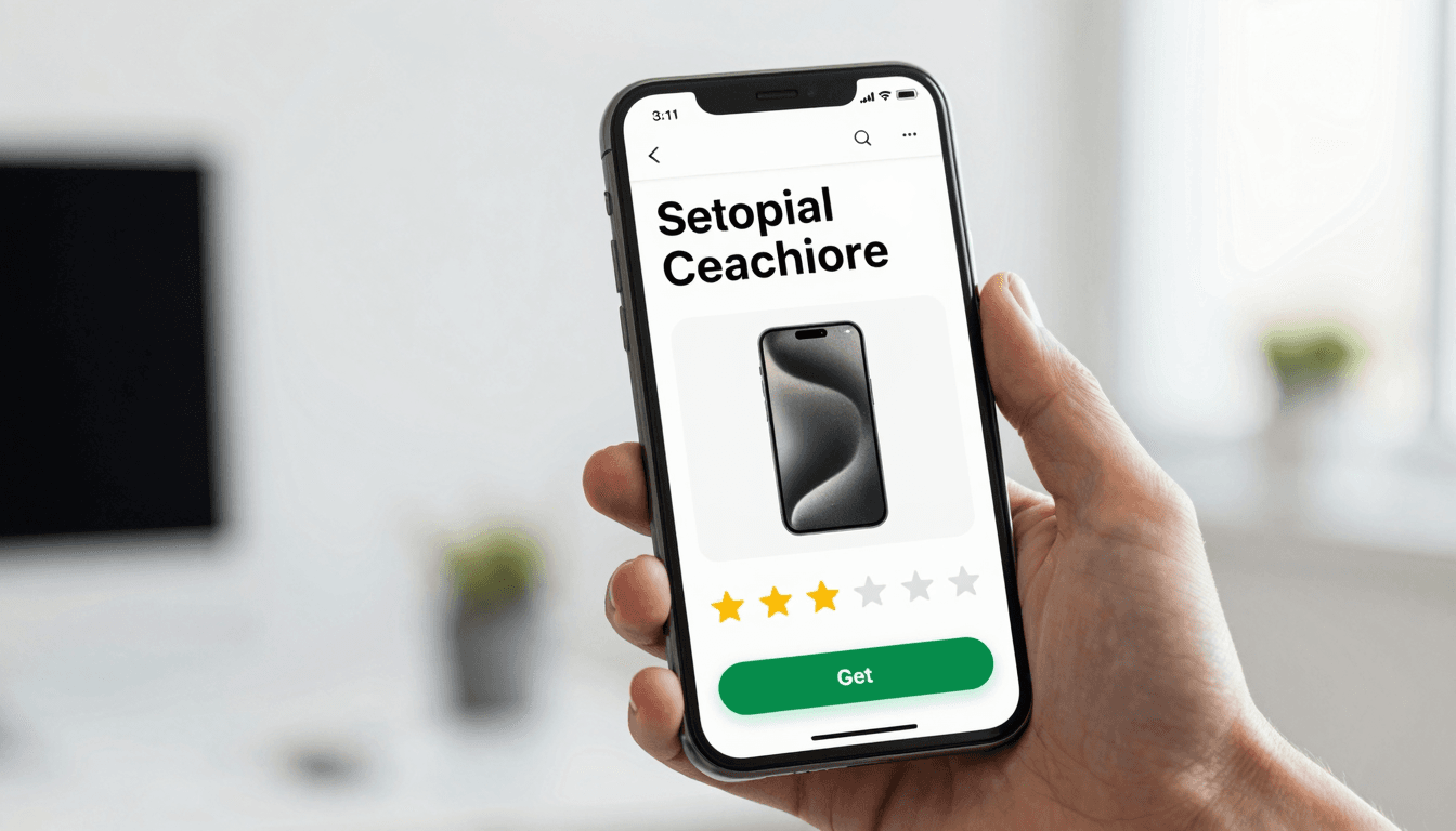
The Screenshot Problem: Why Your Best-Designed App Still Loses Downloads
You spent three weeks getting the onboarding flow right, tuned every corner radius in your design system, and shipped a build that finally feels like a real product. Then you check your App Store analytics and the numbers are brutal: thousands of people land on your product page, and fewer than one in five ever tap "Get." They never even opened the app. They scrolled through your screenshots, decided in about three seconds, and left. That's the moment Dolfy.ai was built to help founders win, because the app you designed and the app people judge you on before downloading are often two completely different design problems.
Key Takeaways
- App Store and Google Play screenshots are evaluated in roughly 3-7 seconds per user, which means your first 2 screenshots do more conversion work than your entire onboarding flow combined.
- Apple allows up to 10 screenshots per device size and Google Play allows up to 8 — most founders use 3 and leave the rest of the "shelf space" empty.
- A consistent design system (a shared set of colors, type, spacing, and components) makes screenshots look like one coherent product instead of five unrelated mockups.
- Design tokens — the named values (like
color.primaryorspace.16) that drive your design system — let you restyle every screenshot for a seasonal promotion in minutes, not days. - Dolfy's Screen Design and Export steps produce real, on-brand screens you can screenshot directly, so your store listing and your shipped app never drift apart.
Why Do App Store Screenshots Matter More Than the App Itself?
Screenshots matter more than the app itself in the one moment that decides whether the app gets a chance at all: the decision to download. A user browsing the App Store or Google Play never sees your empty states, your loading spinners, or your carefully considered error messages before they decide to tap install — they see five or six static images and a 30-second video, if you have one. Research on mobile conversion consistently points to the same pattern: the first two screenshots carry the majority of the persuasive weight, because most users don't scroll the full carousel before deciding. If your first image is a generic splash screen with your logo centered on a gradient, you've spent your most valuable real estate on something that could belong to any app in any category.
This is exactly the gap Dolfy.ai was built to close. Dolfy is an AI-powered mobile app design platform that walks founders and developers through a structured, 5-step process — Product Definition, Data Model, Design Foundation, Screen Design, and Export — so that by the time you're ready to capture screenshots, you already have real, production-quality screens instead of rough wireframes (low-fidelity sketches that show layout without final visual polish).
What Makes a Screenshot Convert Instead of Get Scrolled Past?
A screenshot converts when it shows a real benefit inside a real interface within the first half-second of glance time, not when it looks pretty in isolation. The strongest App Store screenshots pair a short, benefit-driven headline (5-8 words, not a feature list) with an actual screen from the product, framed inside a device mockup so it reads as "this is what you get" rather than "this is a marketing graphic." Weak screenshots tend to make one of two mistakes: they're 100% abstract marketing art with no app screen at all, or they're a raw, unedited screenshot with no headline, no context, and tiny text nobody can read at thumbnail size.
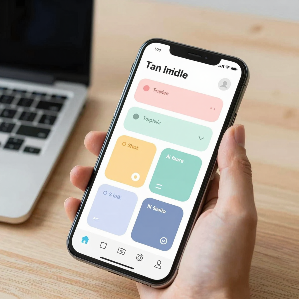
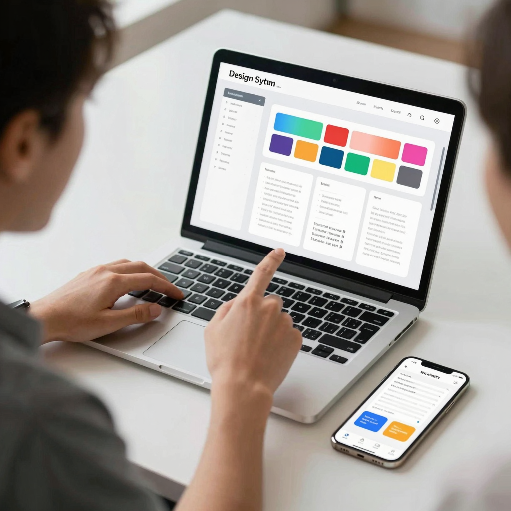
The fix is consistency of craft, not more decoration. Every screenshot in your set should use the same headline typography, the same device frame angle, and the same background treatment, so the six images read as one story told in six chapters instead of six competing ads. This is where a shared design system — one library of type styles, spacing rules, and colors reused across every surface of your product, including marketing screens — pays for itself immediately.
How Do You Design Screenshots When You're a Solo Founder With No Design Team?
You design screenshots the same way you'd want a design team to: by starting from your actual product screens and your actual design tokens, not from scratch in a separate tool. Most solo founders build their app screens in one tool (or in code directly) and then jump into Figma or Canva to build "marketing" screenshots from memory, which is how you end up with a store listing that shows a version of your app that doesn't quite match what ships. It's a believable trap — you're moving fast, the deadline for your launch is real, and reconstructing your UI pixel-for-pixel in a second tool feels like a reasonable shortcut until the two versions drift.
Dolfy addresses this directly in its Screen Design and Export steps: once your data model (the structure of your app's core objects and how they relate — a user, a project, a task, and so on) and design foundation are set, Dolfy generates production-ready React Native and Tailwind CSS components with TypeScript types, so the screens you screenshot are the actual screens your app renders, not a lookalike built in a separate design tool. You can preview them instantly through Expo Go or a Web Preview link before you ever touch a device mockup generator, which typically shaves hours off the usual "redesign it twice, once for the app and once for the store" cycle.
What Role Do Design Tokens Play in Screenshot Consistency?
Design tokens are the single biggest reason a five-screenshot set looks like one product instead of five separate hackathon projects glued together. A token is a named, reusable design decision — color.brand.primary, space.md, radius.card — that every screen and every component pulls from instead of hardcoding a hex code or a pixel value locally. When your screenshots are captured directly from screens built on the same token system, changing your brand's accent color from blue to green for a holiday promotion, or adjusting corner radius across the board, takes one edit instead of an afternoon of manually re-touching six exported images in Photoshop.
This matters more than it sounds like on paper. Teams without a token system commonly report spending 3-5 hours per app update just to keep marketing screenshots visually aligned with a UI that shipped changes; teams working from a token-driven system typically cut that down to under 30 minutes, because the screenshots are pulled from the same source of truth as the shipped build rather than recreated by hand.
How Many Screenshots Should You Actually Show, and in What Order?
You should show enough screenshots to tell a complete story of the core value loop, and order them so the strongest benefit leads. Apple's App Store supports up to 10 screenshots per device size, and Google Play supports up to 8, but very few successful apps use all of them — most settle on 5 to 7 that each earn their place. A reliable structure for a first-time SaaS or consumer app: screenshot one leads with the single biggest outcome your app delivers, stated as a headline over the actual primary screen; screenshot two shows the core workflow in action; screenshots three and four handle secondary features or social proof; and the final screenshot addresses a common objection (price, setup time, platform support) head-on. Treat the sequence like a landing page, not a photo album, because that's functionally what it is.
Frequently Asked Questions
Do App Store screenshots actually affect download conversion rates?
Yes — app store optimization (ASO) research consistently shows screenshots as one of the highest-leverage elements on a store listing page, often influencing conversion more than the app description text, because most users decide visually before reading a single sentence.
What's the difference between a wireframe and a screenshot-ready screen?
A wireframe is a low-fidelity layout sketch used to plan structure and flow before visual design is finalized; a screenshot-ready screen is the final, styled interface — real colors, real type, real components — that's actually safe to show a prospective user, which is the stage Dolfy's Screen Design step is built to reach quickly.
Do I need a professional designer to make good App Store screenshots?
Not necessarily. A consistent design system and a clear headline-per-screen structure will get a solo founder or small technical team most of the way there; a designer adds polish, but the biggest conversion gains usually come from consistency and clarity, not decoration.
How often should screenshots be updated after launch?
Update them whenever your core UI changes meaningfully, and revisit them at least quarterly even if nothing changed, since a screenshot set that's a year old often no longer matches the shipped product and quietly erodes trust with new users who notice the mismatch after downloading.
Design the First Screen Users Actually See
The irony of App Store screenshots is that they're the most-seen screen in your entire app, and most teams design them last, in a rush, in a separate tool, disconnected from everything else they built. Treating your store listing as just another set of screens in your design system — built from the same data model, the same tokens, and the same components as the app itself — turns your screenshots from an afterthought into your highest-converting surface. That's the workflow Dolfy.ai is built around: take a product from Product Definition through Data Model, Design Foundation, and Screen Design, then Export real, on-brand screens you can screenshot directly, with nothing lost in translation between what you designed and what a prospective user actually sees first. If your download numbers don't match how good your app actually is, the fix might not be your app at all — it might be the six images standing between a stranger and their first tap. Start your next screen inside Dolfy and design that first impression on purpose.