
The Search Bar Problem: Why Your App's Search Returns Nothing the Moment a User Makes a Typo
You shipped the search bar in an afternoon. A text field, a filter over the list, done. Then a user types "reciepe" instead of "recipe", sees a blank screen, and quietly closes your app. If that sounds familiar, you're in good company: search is one of the features most often built as an afterthought and most often blamed for churn. Dolfy.ai was built around the idea that screens like this should be designed on purpose, before a single line of code is written, so this post walks through how to design a search screen that forgives typos, explains itself, and keeps users moving.
Key Takeaways
- A search screen has at least five states (idle, typing, loading, results, no results), and most apps only design one of them.
- Typos, partial words and synonyms are normal input, not edge cases, so plan for fuzzy matching from day one.
- A "no results" screen should always offer a next step, never a dead end.
- Recent searches and suggestions reduce typing on small keyboards and raise the odds that a query succeeds.
- Defining search states in your design foundation and data model first prevents the rewrite that usually arrives around week six.
Why does a broken search screen make users leave so quickly?
Because search is a promise: "tell us what you want and we'll find it." When the screen returns nothing, users don't assume they made a typo. They assume your app doesn't have what they need. A commonly cited rule of thumb in product circles is that people who use search are far more likely to convert than people who browse, which means a failed search hurts your most motivated users first.
The problem is rarely the algorithm. It's that the design stopped at the happy path. Someone drew a search bar and a list of results, and nobody drew what happens when the list is empty, slow, or wrong. Developers then improvise those states under deadline pressure, and the improvisation shows.
What are the five states every search screen needs?
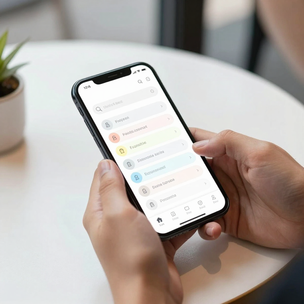
Every search screen needs an idle state, a typing state, a loading state, a results state and a no-results state. Skipping any of them leaves a gap that users will fall into.
- Idle: the screen before anyone types. This is prime real estate for recent searches, popular items, or category shortcuts.
- Typing: suggestions or live-filtered results appear as characters are entered. Keep the clear (x) button visible so a user can reset in one tap.
- Loading: if results come from a server, show a skeleton (a grey placeholder shaped like the content) instead of a blank screen, so the app never looks frozen.
- Results: the list itself, with the matching part of each result highlighted and a visible count such as "24 results."
- No results: the most neglected state, covered in detail below.
If you use React Native, each state maps cleanly onto a single status value in your component, for example idle | typing | loading | success | empty. Naming the states up front also gives your TypeScript types something precise to enforce, which means the compiler will remind you when a state is unhandled.
How should search handle typos and partial words?
Search should tolerate a small number of mistakes by default. The simplest version is fuzzy matching, which means comparing what the user typed to your data by similarity rather than exact letters, so "reciepe" still finds "recipe." Libraries such as Fuse.js do this on the client in a few lines, and most hosted search services offer it as a setting.
Three habits catch most real-world queries:
- Ignore case and accents. "cafe" should match "Café."
- Match the start of words. Typing "pho" should surface "photography" before the user finishes.
- Allow one or two character errors for words longer than about four letters. Shorter words produce too many false matches.
Think about the keyboard too. On a phone, thumb typing produces errors at a much higher rate than a full keyboard, so a search that is fine on your laptop during testing can feel punishing in the real world. Test with your actual phone, in one hand, while walking.
What should a "no results" screen actually say?
A no-results screen should say what happened, why it might have happened, and what to do next, in plain language and in that order. "No results found" alone is the digital equivalent of a shrug.
A better pattern has four parts:
- Echo the query back ("Nothing for 'reciepe'") so users can spot their own typo.
- Offer a correction when you have one ("Did you mean 'recipe'?").
- Suggest broader options, such as removing a filter or browsing a category.
- Give an escape hatch: a button to clear the search, or contact support if the content should exist.
This is the same thinking behind good empty states elsewhere in an app, and it costs almost nothing to build once it has been designed. The expensive version is discovering the gap after launch, when every fix needs a release.

Do recent searches and suggestions really matter?
Yes, because typing on a phone is slow and error-prone, and every character you save is a chance to avoid a failed query. Showing the last five to ten searches on the idle screen turns a blank page into a shortcut. Showing suggestions after two or three typed characters steers users toward queries your data can actually answer.
There are a few small rules worth following:
- Let users remove a single recent search with a swipe or a small x, and offer "clear all."
- Store recent searches on the device and keep them short, since long histories become clutter.
- Keep suggestions to about five rows so they never push the keyboard-covered results out of reach.
- Make tap targets at least 44 points tall, the size Apple's Human Interface Guidelines recommend, so the wrong row isn't hit by accident.
How do you decide what to search before you build it?
Start from your data model, which is the blueprint of what information your app stores and how the pieces relate. Search is only as good as the fields you let it look at. If users search for "Italian," but your data model stores cuisine as a code, no amount of clever UI will save the query.
Before building, answer three questions: Which fields are searchable? Which fields are filters instead? Which results should rank higher? A recipe title probably outranks an ingredient in the description. A product name outranks a tag. Writing these decisions down takes about an hour and prevents days of rework.
This is where Dolfy's approach helps. Dolfy guides you through a five-step Design OS methodology: Product Definition, Data Model, Design Foundation, Screen Design and Export. Search touches nearly all of them. The Data Model step is where you decide what is searchable. The Design Foundation step, where design tokens (named, reusable values for colors, spacing and type) are set, keeps your highlight color, placeholder text and empty-state styling consistent. The Screen Design step is where the five states above become actual screens instead of a single mockup.
What does a good search screen look like in React Native?
A good search screen in React Native is a small, predictable component: a controlled text input, a debounced query, a status value, and a list. Debouncing means waiting a short moment after the last keystroke, typically 250 to 300 milliseconds, before running the search, so you aren't firing a request on every letter.
A few implementation notes that save time:
- Debounce the query rather than throttling it, so the last thing the user typed always wins.
- Cancel the previous request when a new one starts, otherwise a slow old response can overwrite a newer one.
- Use a
FlatListfor results so long lists stay smooth. - Set
keyboardShouldPersistTapsso tapping a result doesn't need a second tap to dismiss the keyboard. - Keep search text in state that survives navigation, so returning from a detail screen doesn't erase what the user typed.
If you use Tailwind CSS styling through a React Native library such as NativeWind, keep the spacing and color values from your design tokens rather than hard-coding them in each component. That's how the search screen ends up looking like the rest of your app instead of a bolted-on extra. Dolfy's export produces React Native and Tailwind components with TypeScript types, which gives you a consistent starting point to wire up your real data.
How can you test a search screen without a big team?
You can test it with ten queries and one afternoon. Write down ten searches: two exact matches, two typos, two partial words, two that should return nothing, and two with unusual characters or very long text. Run them on a real device, then look at each of the five states.
Ask one person who has never seen your app to find something specific and watch where they hesitate. You'll learn more from three minutes of silent observation than from a week of analytics. If you use Expo, scanning a QR code with Expo Go lets testers try the screen on their own phones without waiting for a store build, and a web preview lets teammates try it from a browser.
Frequently Asked Questions
Do I need a separate search service, or is client-side filtering enough?
For a few hundred items, client-side filtering with a fuzzy-matching library is usually enough and avoids extra cost. Once your data reaches thousands of records or lives on a server, a hosted search service or a database with full-text search becomes the better choice.
How many characters should a user type before suggestions appear?
Two or three characters is a good default. One character produces noisy suggestions, while waiting for five makes the feature feel unresponsive.
Should search live in the tab bar or at the top of the screen?
It depends on how central search is to your app. If people search more than they browse, give it a dedicated tab or a prominent header field. If search is a secondary tool, a search icon in the header is enough and saves bottom-bar space.
What's the most common search mistake in early-stage apps?
Designing only the results state. Teams build the list, ship it, and discover the idle, loading and no-results states only when users complain, which is exactly when changes are most expensive.
Turn search from an afterthought into a feature
Search works when it forgives mistakes, explains itself, and always leaves the user with a next step. Designing all five states, choosing searchable fields from your data model, and reusing your design tokens gets you most of the way there before any code exists. If you'd like a structured way to plan those screens and export them as production-ready React Native components, take a look at Dolfy and start with your product definition.