
The Search Screen Problem: Why Your App's Search Bar Returns Nothing Users Know Exists
Someone opens your app, taps the search icon, types the name of a thing they've used before — a saved item, a past order, a contact they messaged last week — and gets "No results found." They know it exists. They saw it three days ago. Now they're refreshing, retyping, second-guessing the spelling, and eventually giving up and closing the app. That moment quietly costs more retention than almost any other screen in your product, and it's one Dolfy.ai sees teams get wrong again and again: search isn't a search bar, it's a data problem wearing a search bar's clothes.
Most teams design the search bar last and the underlying data model never at all — they bolt a text input onto a screen and assume matching "just works." It doesn't. A search experience that feels instant and accurate is actually the output of decisions made three steps earlier, in how your data is structured, indexed, and returned. Dolfy's Design OS methodology puts Data Model before Screen Design specifically because problems like this one are nearly impossible to fix after the UI is built — you end up patching a symptom instead of the cause.
Key Takeaways
- Search failures are usually data-modeling failures, not UI failures — fuzzy matching, synonyms, and typo tolerance have to be planned before a single screen is designed.
- A true empty state (zero results, by design) should never look identical to a broken one (a query bug or an API timeout) — users can't tell the difference and assume the app is broken either way.
- Debounce search input by roughly 250-400 milliseconds so you're not firing a network request on every keystroke, which both wastes calls and makes results flicker.
- Filters should default to collapsed with a visible count of active filters, not an open panel that eats the first screen users see.
- Recent searches and suggested queries reduce blank-search abandonment because they give hesitant users a starting point instead of a cursor blinking in an empty field.
Why Does Search Feel Broken Even When the Data Is There?
It feels broken because most search implementations do exact or near-exact string matching against a single field, while users type from memory — misspelled, abbreviated, or worded differently than however the record was originally saved. If a user saved a contact as "Alexandra Reyes" and searches "Alex R," a naive LIKE '%query%' query against one column returns nothing, even though the record is sitting right there. This is where a wireframe (a low-fidelity sketch of a screen's layout, before visual design is applied) can trick a team into thinking search is "done" — the box exists, it visually works, and nobody notices the matching logic underneath is too rigid until real users with real typos show up.
The fix isn't a smarter search bar. It's tokenizing searchable fields at the data layer, supporting partial and fuzzy matches, and deciding up front which fields are even searchable — name, tags, notes, dates — versus which aren't. That decision belongs in your data model (the structure defining what information your app stores and how those pieces relate to each other), not in a frontend component.
What Should Actually Happen When a Search Returns Zero Results?
A genuine zero-results state should tell the user three things fast: that the search actually ran, that nothing matched, and what to try next. That third part is the one almost every app skips. Instead of a flat "No results found," a well-designed empty state might say "No matches for 'invocie' — did you mean 'invoice'?" or offer one-tap suggestions pulled from recent or popular queries. Teams that add even simple typo-correction hints typically see meaningfully fewer abandoned searches, because the user gets a next action instead of a dead end.
Equally important: a true empty result and a failed request need visually distinct states. If your API times out or throws a 500 error and you silently render the same "no results" screen you use for an honest empty search, users have no way to know whether to retry, wait, or assume the feature doesn't exist. That distinction takes maybe an extra hour of engineering time and prevents a genuinely broken experience from masquerading as a working one.
How Do You Design Filters That Don't Overwhelm Users?
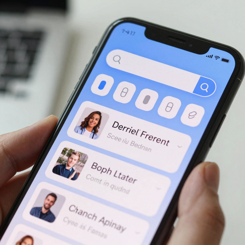
Filters solve a real problem — narrowing a large result set — but a filter panel that opens with twelve categories, six toggles, and a price-range slider all visible at once creates decision fatigue before the user even sees a result. A more approachable pattern is a single "Filters" button showing a numeric badge (like "Filters (2)") that expands into a bottom sheet (a panel that slides up from the bottom edge of the screen, sitting on top of the current content) only when tapped, with the two or three most commonly used filters surfaced first and the rest tucked under "More filters."
Order matters too. Filters used by roughly 70-80% of your users — price, category, date — should sit above the fold in the panel; edge-case filters go below. This is a case where a component library with consistent, reusable pieces (buttons, chips, sheets) pays off, because you're not redesigning filter UI from scratch for every screen that needs it — you're composing it from a design system (a shared library of components and rules that keeps an app visually and behaviorally consistent) you already built once.

Why Does Search UX Start With Your Data Model, Not Your Search Bar?
Because every promise your search bar makes — fuzzy matching, filtering by category, sorting by relevance, showing recent searches — is a query your backend has to be able to answer efficiently. If "sort by relevance" wasn't planned into your data model, you're either hardcoding a fake sort order or shipping a feature that silently doesn't do what it claims. This is the exact sequencing problem Dolfy's 5-step Design OS methodology (Product Definition, Data Model, Design Foundation, Screen Design, Export) is built to prevent: Data Model comes second, before a single screen is drawn, so that by the time you're designing the search results screen, you already know which fields are indexed, which are filterable, and what a "no results" state genuinely needs to communicate.
Skipping that step is how teams end up needing a rebuild six months in — not because the UI was ugly, but because the underlying structure couldn't support the features the UI was already promising users.
How Should Search Results Be Structured on Screen?
Once matching works, presentation is what makes results scannable. Group results by type when your app spans multiple content categories (people, items, messages) rather than mixing them in one flat list — users scan much faster when they can jump straight to the section relevant to them. Show 2-3 lines of context per result (a subtitle, a date, a matching snippet) so users aren't clicking into results just to figure out which one they meant. And keep the search input itself visible and editable at the top of the results screen — forcing a user back to a separate search screen to refine their query is a small but real source of friction that adds up across a session.
For teams exporting these patterns into code, this is where production-ready component structure matters: a search results list built as a typed, reusable React Native component with Tailwind CSS styling and TypeScript types is something you can extend later (adding a new result type, say) without rebuilding the screen. Dolfy's Export step produces exactly that — components ready to drop into a real codebase, previewable instantly through Expo Go or Web Preview, rather than a static mockup someone still has to translate into code by hand.
Frequently Asked Questions
Does every app need fuzzy search, or is exact matching sometimes fine?
Exact matching is fine for small, well-known datasets — a settings menu with 15 items, for instance — where users aren't relying on memory. Once a dataset grows past roughly 50-100 items or users are searching by partial memory (a name, a rough date, a topic), fuzzy and partial matching become necessary to avoid false "no results" states.
How fast should search results appear after a user stops typing?
Aim for results within 200-500 milliseconds of the user pausing, using a debounce of around 250-400 milliseconds on the input itself. Anything slower and search starts to feel laggy; firing a request on every keystroke without debouncing wastes API calls and causes results to flicker as they arrive out of order.
Should search include a loading state?
Yes — a brief skeleton or subtle spinner matters even for fast searches, because an instant, unexplained flash of new content can look like a glitch rather than a result. Keep it short and consistent with the rest of your app's loading patterns so it doesn't feel like a separate, bolted-on feature.
Can Dolfy help redesign an existing broken search experience, or only new apps?
Dolfy's methodology applies to redesigns just as much as greenfield builds — you can run an existing app's search feature back through the Data Model and Design Foundation steps to identify what the current structure can't support, then export corrected, production-ready components without starting the whole app over.
Getting Search Right Before You Design the Screen
Search is one of the fastest ways for an app to feel either effortless or broken, and the difference rarely comes down to visual polish. It comes down to whether the data underneath was structured to answer the questions your search bar promises to answer. Teams that treat search as a late-stage UI task keep ending up back at the same wall: a pretty input field sitting on top of matching logic that can't do what the design implies. Starting with the data model instead — deciding what's searchable, filterable, and sortable before a screen exists — is what turns a search bar from a decorative box into a feature users actually trust. That's the sequencing Dolfy builds into every project from the first step, so the screens you design are ones your data can actually back up.