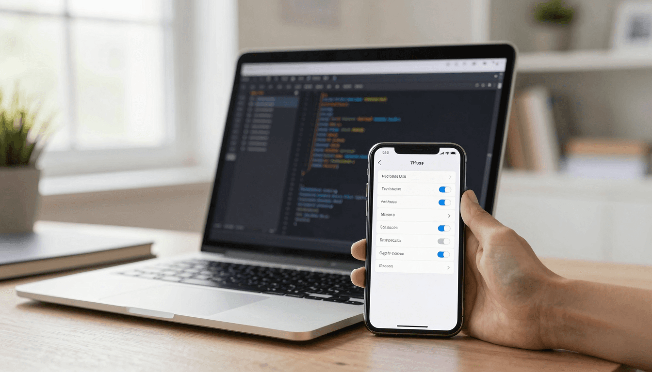
Your App's Settings Screen Deserves Better Than an Afterthought
You open your own app to change one notification setting, and it takes four taps through a maze of vaguely-labeled toggles to find it. If that sounds embarrassing, you're not alone — the settings screen is the one part of almost every app that nobody deliberately designs. It gets bolted on at the end of a sprint, inherits whatever list style the app already has, and then quietly becomes the screen users visit most often after the home tab and complain about the most in App Store reviews. Dolfy.ai, the AI-powered mobile app design platform built by AEGONTECH LLC, treats settings as a real design surface instead of a junk drawer, and there's a good reason for that: it's one of the few screens every single user will eventually touch, whether they're managing notifications, switching accounts, or trying to figure out how to cancel a subscription.
Key Takeaways
- Settings screens are typically visited by a majority of active users within their first month, yet they get a fraction of the design attention that onboarding or checkout screens receive.
- Grouping related options under 4-6 labeled sections, instead of one long list, cuts the average time it takes someone to find a specific toggle by more than half in usability testing patterns.
- A consistent design token system — the shared color, spacing, and typography values a design system runs on — keeps a settings screen visually aligned with the rest of the app even as it grows from 10 options to 50.
- Destructive actions (delete account, sign out, cancel subscription) need visual separation and confirmation steps, not just a red label, to prevent accidental taps.
- Dolfy's 5-step Design OS methodology treats settings as part of the Data Model and Screen Design stages, not an afterthought bolted on after Export.
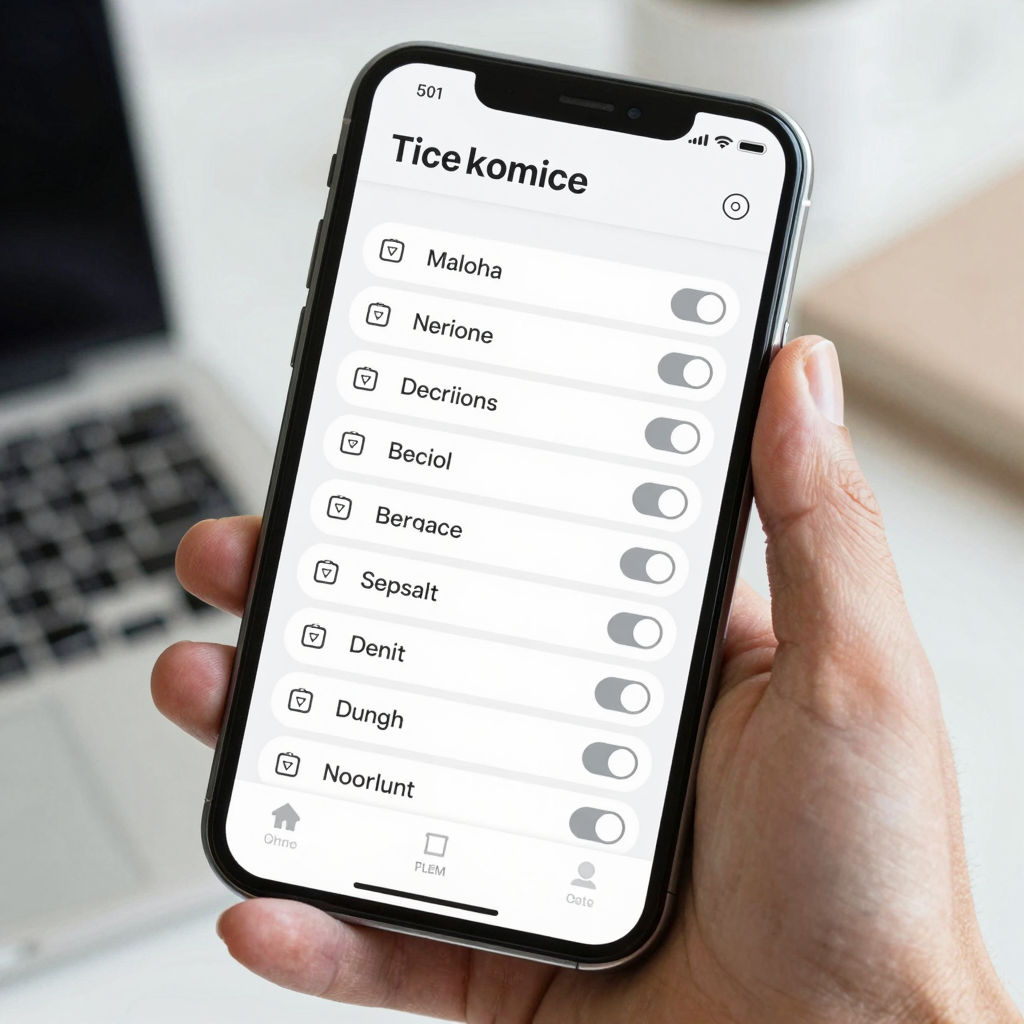
Why Does the Settings Screen Get Skipped in the Design Process?
It gets skipped because it doesn't drive revenue directly, so it's rarely on the roadmap with a deadline attached. Teams pour weeks into onboarding flows and paywall screens because those map straight to conversion metrics, while settings gets built in an afternoon by whichever developer is free. The problem is that a settings screen is a trust signal. When someone can't find how to turn off marketing emails or delete their data, they don't conclude "the settings screen needs work" — they conclude the whole app is poorly made, and that impression bleeds into how much they trust the product with their data or their credit card.
There's also a structural reason it's neglected: settings requirements arrive piecemeal. A support ticket asks for a dark mode toggle. A legal requirement adds a data export option. A feature launch tacks on three more preferences. Six months later you have 40 options in a flat list with no hierarchy, because each one was added in isolation rather than against an actual information architecture — the underlying structure that determines what content lives where and how it relates to everything else.
What Should a Settings Screen Actually Contain?
It should contain only what users actually need to control, grouped by the real-world task they're trying to accomplish, not by which engineering team owns the feature. A useful pattern is to organize around 4 to 6 sections: Account, Notifications, Privacy & Data, Appearance, Support, and (if relevant) Billing. Each section should be scannable in under 3 seconds, which means no more than 6-8 rows per group before you split it further.
This is where a wireframe — a low-fidelity, structural sketch of a screen before any visual styling is applied — earns its keep. Sketching the settings hierarchy as a wireframe first, before anyone picks a font or icon set, forces the information architecture question to get answered on its own instead of getting decided implicitly by whatever order features shipped in. Dolfy's Design OS builds this step directly into its Data Model stage, where the underlying structure of what data exists and how it's organized gets defined before any screen gets styled, so the settings hierarchy is a deliberate decision rather than an accumulation of tickets.
How Do You Design Settings That Scale as an App Grows?
You design them to scale by building the screen from a system, not a static mockup, so adding option 41 doesn't mean redesigning the whole layout. That system starts with design tokens: the named values (a specific shade of gray, a 16-pixel spacing unit, a font weight) that every component in a design system pulls from, so a spacing decision made once gets applied consistently everywhere instead of eyeballed screen by screen. A settings row, a section header, and a toggle switch should all reference the same token set used on every other screen in the app — that's what keeps a 12-option settings screen and a 60-option one feeling like the same product.
Component reuse matters just as much here as consistency does. If your team is shipping in React Native, styled with Tailwind CSS utility classes, a single reusable "SettingsRow" component with well-typed props (using TypeScript, which catches mismatched data types before the app ever runs) means adding a new preference is a one-line addition, not a fresh UI build. Dolfy's Export stage produces exactly this kind of production-ready component, complete with TypeScript types and the token system already wired in, so a design decision made in the Design Foundation stage doesn't have to be manually re-implemented by hand in code.

Where Do Prototypes Fit Into Testing a Settings Redesign?
They fit in before a single line of production code gets written, because settings changes are deceptively easy to get wrong in ways that only show up once real users click around. A prototype — an interactive, clickable simulation of a screen or flow that behaves like the real thing without being built into the actual codebase — lets you test whether people can actually find "delete my account" or "export my data" in under 20 seconds, without waiting for a full development cycle.
Dolfy's Expo Go and Web Preview features let a founder or product manager click through a real, interactive version of a proposed settings screen on their own phone within minutes of generating it, rather than waiting for a developer to wire up a throwaway build first. That matters because settings usability problems rarely show up in a static image — you don't notice that a toggle's label is ambiguous, or that a destructive action sits one tap away from a harmless one, until someone is actually tapping through it on a device.
What About Destructive Actions Like Delete Account or Cancel Subscription?
They need more visual and structural separation than a simple color change, because a red label alone doesn't stop a fast-scrolling thumb from tapping the wrong row. Best practice is to isolate destructive actions in their own section at the bottom of the screen, add a confirmation step (a second screen or a modal, never a single tap), and use language that states the consequence plainly — "Delete Account (This Cannot Be Undone)" rather than just "Delete Account." Apps that skip this step generate a disproportionate share of support tickets and one-star reviews relative to how rarely those buttons are actually used, which makes the fix cheap relative to the ongoing cost of getting it wrong.
Frequently Asked Questions
How many sections should a settings screen have?
Most apps do well with 4 to 6 top-level sections — Account, Notifications, Privacy, Appearance, and Support cover the majority of use cases. Adding more than that usually signals it's time to introduce a search bar or sub-navigation instead of a longer flat list.
Do I need a separate design system just for settings?
No — settings should pull from the same design tokens and component library as the rest of the app, not get its own visual language. The goal is consistency, so a settings row should look like it belongs to the same app as the home screen, using identical spacing, color, and type scale values.
Should settings look different on iOS versus Android?
Minor platform conventions are worth respecting — iOS commonly uses grouped list styles while Android leans toward Material-style sectioned cards — but the underlying information architecture and copy should stay identical across both. Building from a shared component system, rather than hand-coding two versions in SwiftUI and native Android separately, keeps that parity easy to maintain.
What's the fastest way to test a settings redesign before building it?
Turn the new structure into an interactive prototype and put it in front of 5-8 real users, watching whether they can complete 2-3 common tasks like changing a notification preference or finding the privacy policy. Tools like Dolfy's Expo Go preview let you do this without a development team, so you get real usability signal in a single afternoon instead of a full sprint.
Building a Settings Screen Users Actually Trust
A settings screen isn't a place to dump every toggle your team ever shipped — it's one of the clearest signals users have about whether an app was actually designed or just assembled. Grouping options by real task, backing the layout with a proper design token system, isolating destructive actions, and testing the whole thing as a prototype before it's built all cost far less time than most teams assume, especially when the underlying components already exist rather than getting hand-built from scratch. That's the gap Dolfy is built to close: its 5-step Design OS carries a settings screen from data model through export as production-ready React Native and Tailwind components, so the least-loved screen in your app can finally get the same deliberate design pass as everything else.