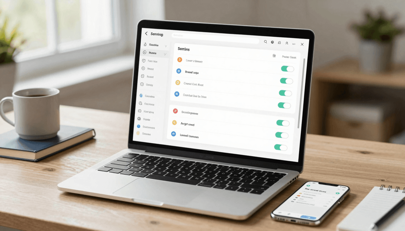
The Settings Screen Problem: Why Your App's Settings Page Becomes a Junk Drawer
You open your app's settings screen to add one new toggle, and you stop. There's already a notifications section with six sub-rows, a random "Restore Purchases" button wedged between "Dark Mode" and "Delete Account," and a legal links block that somehow ended up above your profile settings. Nobody designed this screen — it grew, one shipped feature at a time, until it became the junk drawer of your app. If you're building with Dolfy or any other tool, this is one of the most common places an otherwise clean app starts to feel amateur, and it's almost always a design-system problem, not a content problem.
Key Takeaways
- Settings screens rot because each new feature gets bolted on as its own row instead of being placed inside a real information architecture.
- A junk-drawer settings screen isn't a content problem — it's a missing pattern library problem, and design tokens (the reusable colors, spacing, and typography values behind a UI) are what fix it.
- Group settings into no more than 5-7 top-level sections; anything you can't categorize in three seconds probably belongs in a sub-screen, not the root list.
- Reusable row components (toggle row, navigation row, destructive-action row) prevent visual drift as your settings list grows from 10 rows to 40.
- Dolfy's Design OS methodology treats the settings screen as a component-and-data-model problem from day one, so it scales instead of sprawling.
Why Do Settings Screens Turn Into Junk Drawers?
Settings screens rot because they're almost never designed as a single screen — they're assembled, feature by feature, over months. A solo founder ships push notifications in week two, adds a subscription management row in week six, bolts on a "Contact Support" link after the first angry review, and by month four the screen has 30+ rows with no hierarchy. Each addition made sense in isolation. The problem is nobody stepped back to ask what the whole screen should feel like.
This is a structural issue, not a content issue. When you don't have a defined data model (the structure that describes what information your app stores and how it relates — in this case, which settings exist, how they're grouped, and what type each one is) for your settings, you end up hardcoding rows one at a time instead of rendering them from a list. That's how you get inconsistent spacing, three different toggle styles, and a "Log Out" button that's sometimes red and sometimes blue depending on which sprint it shipped in.
What Should Actually Live on Your Settings Screen?
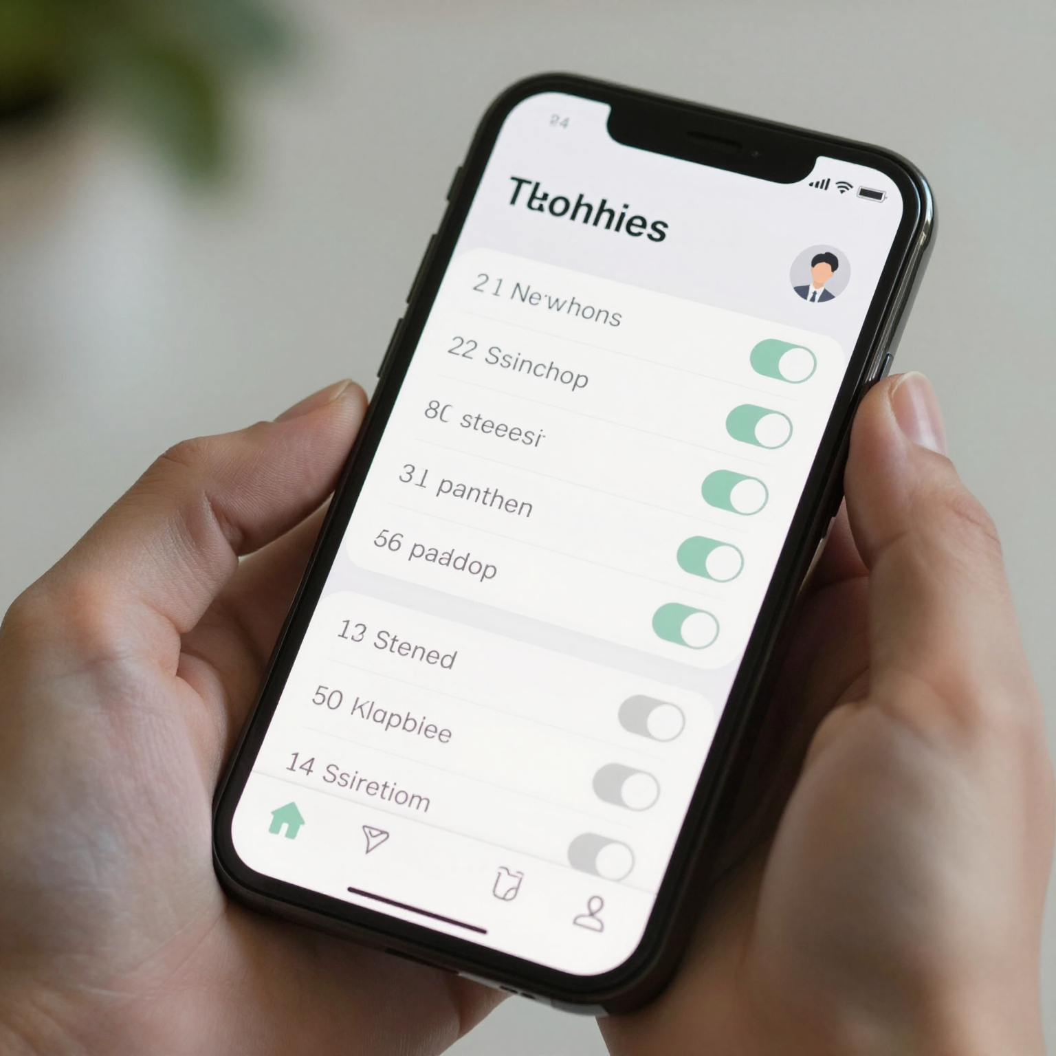
Your root settings screen should answer exactly three questions for the user: who am I in this app, what can I control, and how do I get help or leave. Everything else belongs in a sub-screen, not the main list.
A useful mental model, borrowed from how Dolfy structures its own Design OS process, is to separate settings into three tiers before you draw a single wireframe (a low-fidelity sketch of a screen's layout, used to plan structure before visual design). Tier one is account and identity: profile, email, password, linked accounts. Tier two is app behavior: notifications, appearance, privacy, data usage. Tier three is support and legal: help center, contact, terms, privacy policy, app version. Founders who skip this exercise typically end up with 25-35 ungrouped rows within six months of shipping their first version — we've seen it across enough early-stage mobile apps that it's basically a pattern. Founders who do the exercise up front usually ship a settings screen with 5-7 top-level sections that can absorb another two years of feature growth without a redesign.
How Do You Group Settings So Users Can Actually Find Things?
You group settings by mapping each item to one of those three tiers, then further splitting any tier with more than seven rows into its own sub-screen. If "Notifications" alone has six toggles (push, email, marketing, order updates, comments, weekly digest), that's not six rows on your root screen — that's one "Notifications" row that navigates to its own dedicated screen.
This is where a real design system (a documented, reusable set of components, colors, spacing rules, and typography that keeps an app visually consistent) earns its keep. Instead of custom-building every row, you define a small set of reusable components once: a navigation row (label, optional subtitle, chevron), a toggle row (label, switch), a destructive row (red text, confirmation required), and a value row (label plus current value, like "Language: English"). Every settings screen in your app, no matter how many features you ship over the next 18 months, gets built from those four components. Tools like Figma or Sketch are fine for exploring the visual direction, but the moment you move to code — whether that's React Native, Flutter, or SwiftUI — those four patterns should exist as actual reusable components with TypeScript types (a way of defining the exact shape and type of data a component expects, which catches mismatched props at build time instead of runtime), not copy-pasted JSX.

How Does a Design System Keep Settings Screens Consistent as You Add Features?
A design system keeps settings screens consistent by making the "add a row" decision boring and repeatable instead of a fresh design exercise every time. This is exactly the gap Dolfy.ai was built to close for indie hackers and small teams who don't have a dedicated designer on staff.
Dolfy is an AI-powered mobile app design platform from AEGONTECH LLC that walks founders and developers through a five-step Design OS: Product Definition, Data Model, Design Foundation, Screen Design, and Export. The Data Model step is where a settings screen actually gets planned properly — instead of designers or developers guessing at rows as they go, you define your settings as structured data (which options exist, what type each is, which tier it belongs to) before any pixels get placed. The Design Foundation step establishes your design tokens (the underlying values — spacing scale, color palette, corner radius, type sizes — that every component pulls from, so a button or row looks the same everywhere it's used) up front, so your toggle rows and navigation rows are visually consistent by construction, not by someone remembering to check. By the time you reach Screen Design, you're arranging pre-built, on-brand components rather than inventing a new row style for every feature.
The Export step then hands you production-ready React Native and Tailwind CSS components, typed with TypeScript, plus an Expo Go and web preview so you can see the actual settings screen on a real device within minutes of finishing the layout — not after a separate handoff cycle to an engineer. For a solo founder or a two-person team, that compresses what's traditionally a multi-week design-to-code cycle for something as "simple" as a settings screen into an afternoon.
Designing a Settings Screen That Scales With Your App
The junk-drawer settings screen isn't inevitable — it's what happens by default when a screen is assembled feature-by-feature with no underlying data model or component system. The fix isn't a redesign sprint every year; it's front-loading the structure once, defining your row components and design tokens, and letting every future feature slot into a pattern that already exists.
If you're starting a new app or staring down a settings screen that's already gotten away from you, Dolfy's Design OS is built specifically for this kind of structural problem — it forces the data model and component thinking before you're 40 rows deep and dreading the cleanup. You can walk through Product Definition, Data Model, Design Foundation, Screen Design, and Export at Dolfy and come out the other side with a settings screen — and a whole design system — built to absorb the next two years of features instead of collapsing under them.
Frequently Asked Questions
How many items should a settings screen have before I split it into sub-screens?
Once a single tier — like notifications or privacy — exceeds about five to seven related toggles or options, move it to its own sub-screen. Keeping the root settings list to five to seven top-level sections is a good target for most apps, regardless of how many individual options exist underneath.
What's the difference between a design system and just reusing components?
Reusing components is copying a button here and there; a design system is a documented, centrally maintained set of components and design tokens (colors, spacing, typography values) that every screen pulls from, so a change in one place updates everywhere consistently. Dolfy generates this as an actual token system and component library, not just a style guide document.
Do I need a designer to fix a messy settings screen?
Not necessarily. The core fix — defining a data model for your settings and building four or five reusable row components — is a structural exercise that tools like Dolfy are designed to guide non-designers through, producing production-ready components without a separate design-to-code handoff.
Will restructuring my settings screen require a full rebuild?
Usually not. Because the fix is about introducing reusable components and a clear grouping structure rather than changing functionality, most teams can migrate their existing rows into the new pattern incrementally, screen section by screen section, without a full rebuild.