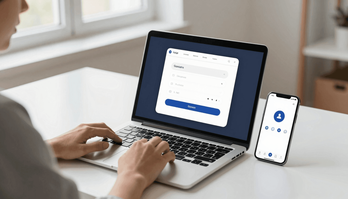
The Sign-Up Screen Problem: Why Auth Flows Lose Users Before They Ever Open Your App
Every founder obsesses over the "aha moment" — the screen where a new user finally sees what your app can do for them. But most people never get there. They quit on the screen before it: the sign-up form. You spent three weeks polishing your core feature, and you lose a third of your prospective users to a clunky email field and a password rule nobody reads. That is the quiet failure mode of mobile app design, and it is one Dolfy.ai was built to prevent. Dolfy is an AI-powered mobile app design platform by AEGONTECH LLC that walks founders and developers through a structured 5-step process — Product Definition, Data Model, Design Foundation, Screen Design, and Export — so that the screens people meet first, like sign-up and login, get the same rigor as your flagship feature.
Key Takeaways
- Sign-up and login screens are commonly cited as one of the highest-drop-off points in a mobile app's funnel, often losing 20-30% of interested users before they ever reach the home screen.
- Every additional required form field adds friction; teams that cut sign-up down to 2-3 fields (or replace them with social login) consistently see faster completion.
- Guest mode, social login, and passwordless "magic link" flows can shrink account creation from over a minute of typing to roughly 10 seconds of tapping.
- A design system with reusable, pre-styled components (buttons, inputs, error states) prevents your auth screen from looking like a rushed afterthought bolted onto a polished app.
- Dolfy's Screen Design step generates production-ready React Native and Tailwind CSS components with TypeScript types, so your sign-up screen ships from the same design-token system as the rest of the app instead of being hand-coded separately under deadline pressure.
Why Do So Many Users Abandon the Sign-Up Screen?
Most abandonment on a sign-up screen comes down to perceived cost versus perceived value — and at that point in the funnel, the user hasn't experienced any value yet. They're being asked to commit (an email, a password, sometimes a phone number) before they've seen a single feature work. Add a slow-loading form, a password rule that only reveals itself after a failed attempt, or a screen that doesn't clearly explain why an account is even needed, and the math tips toward "not worth it."
This is a design problem as much as it's a copy problem. A wireframe (a low-fidelity sketch of a screen's layout, used to plan structure before visual design) for a sign-up flow often looks deceptively simple: two fields and a button. What gets lost in that simplicity is state — what does the screen look like while it's validating, when it errors, when the network is slow on a train platform. Founders who skip this planning end up patching those states in code weeks later, usually after users have already complained.
Should You Require Email Sign-Up, or Lead With Social Login?
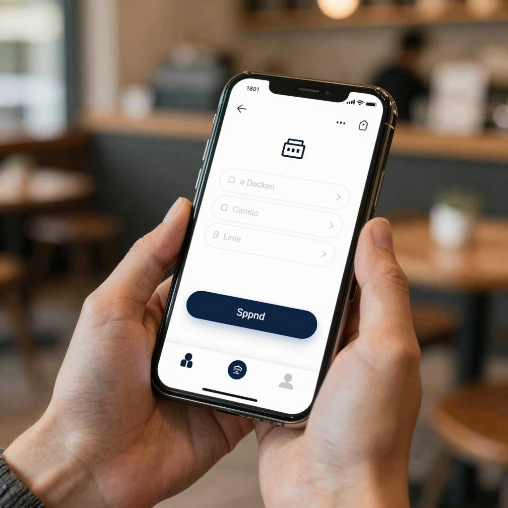
Lead with the lowest-friction option your app can support, and treat email/password as the fallback, not the default. Social login buttons (using an existing Google, Apple, or Facebook account to create a profile in one tap) routinely cut account-creation time from over 60 seconds of typing to around 10 seconds of tapping, because the user never touches a keyboard.
That said, social login isn't free of trade-offs — it ties your user data to a third-party identity provider, and some users specifically distrust it for privacy reasons. The practical answer for most consumer apps is to offer both: a primary social button up top, with "or continue with email" underneath in smaller, secondary styling. Guest mode (letting someone explore core functionality before creating any account at all) is worth considering too, especially for utility or productivity apps where the value can be demonstrated before you ask for a commitment.
How Many Form Fields Should a Sign-Up Screen Actually Have?
As few as your business logic can survive on — ideally two to three. Every field you add (email, password, confirm password, full name, phone number, birthdate) is a fresh decision point where a distracted thumb can close the app instead of continuing. If you need a full name or a phone number for a good reason — shipping, SMS verification, account recovery — collect it later, inside the app, once the user already has a reason to trust you.
Password fields deserve special attention. Show password strength requirements before the user starts typing, not as a red error message after they submit. Add a "show password" toggle (an eye icon that reveals the typed characters) so users aren't guessing whether caps lock ruined their attempt. These are small details, but they're the difference between a form that feels considerate and one that feels like a test.

What Makes an Auth Screen Feel Trustworthy Instead of Sketchy?
Consistency with the rest of your app's design system (the shared library of colors, type styles, spacing rules, and components that keep every screen feeling like it belongs to the same product) is what separates a trustworthy auth screen from one that quietly makes users nervous. If your onboarding screens have soft rounded corners, a specific accent color, and a particular button shadow, and then the sign-up screen looks like unstyled HTML with a generic gray button, users notice — even if they can't articulate why.
This is where design tokens (a system of named values — a specific blue, a specific corner radius, a specific spacing unit — reused across every screen instead of hardcoded per-screen) matter most. A token-based system means your sign-up button automatically inherits the same primary color and radius as your onboarding CTA and your paywall button, because they all pull from the same source. Dolfy's Design Foundation step establishes that token system early, before any individual screen gets built, specifically so screens like auth — which teams tend to deprioritize under deadline — don't end up visually orphaned from the rest of the product.
How Does a Data Model Decision Affect Your Sign-Up Screen?
It determines exactly which fields you're legally and practically required to collect at sign-up versus later. A data model (the structural blueprint of what information your app stores and how those pieces relate to each other — a user, their profile, their preferences) decided up front tells you whether "phone number" belongs on the sign-up form or in a settings screen three taps deep. Teams that skip this step tend to guess, and guessing usually means over-collecting on the first screen because "we might need it eventually."
Dolfy sequences Data Model before Screen Design for exactly this reason: once you know a phone number exists only to enable optional SMS reminders, it's an obvious call to move it out of the sign-up form entirely. That single decision can be the difference between a three-field form and a six-field one — and, per the abandonment patterns above, that's a meaningfully different completion rate.
Frequently Asked Questions
Do I need a native mobile design tool, or can I design an auth screen in Figma?
You can absolutely start in Figma or Sketch, and many teams do for early exploration. The gap shows up at handoff: a Figma mockup of a sign-up screen still needs to become working React Native or Flutter code with real validation logic, and that translation step is where a lot of visual polish gets lost or delayed. Dolfy is built for developers who want to skip that gap by generating production-ready components directly.
What's the difference between a wireframe and a prototype for a sign-up flow?
A wireframe is a rough layout sketch — boxes and labels showing where the email field and button sit. A prototype is clickable and shows real interaction: what happens when you tap "sign up," what an error state looks like, how the keyboard pushes the form up on a small screen. Testing a prototype before writing production code catches auth-flow problems (like a submit button hidden behind the keyboard) far cheaper than catching them after launch.
Should I use SwiftUI, Flutter, or React Native for building the actual auth screens?
That depends on your broader stack, not on the auth screen specifically — pick whichever your team already uses. Dolfy exports React Native components with Tailwind CSS styling and TypeScript types, which fits teams already committed to a JavaScript-based cross-platform stack and want auth screens that match the rest of the app's export without hand-translating a design file.
How long should a sign-up flow realistically take a new user to complete?
Under 30 seconds is a reasonable target for a social-login path, and under 60 seconds for an email/password path with just 2-3 fields. If your current flow is taking noticeably longer than that in testing, that's usually a sign there are more fields, more screens, or more required steps than the app actually needs at this stage of the relationship with the user.
Building a Sign-Up Flow People Actually Finish
The sign-up screen isn't a formality standing between your user and your product — for a large share of users, it is the product, at least for the first 30 to 60 seconds. Treating it with the same design rigor as your core feature, backed by a real data model and a consistent token system rather than a last-minute patch job, is what turns that screen from a leak in your funnel into a smooth first impression. Dolfy's 5-step Design OS methodology — Product Definition, Data Model, Design Foundation, Screen Design, and Export — is built specifically so foundational screens like sign-up and login don't get shortchanged relative to the features you're most excited about. If you're planning your app's Design Foundation and want your auth flow, and everything after it, generated from one consistent system, Dolfy is worth a look.