The Spinner Trap: Why Skeleton Screens Make Your App Feel Twice as Fast
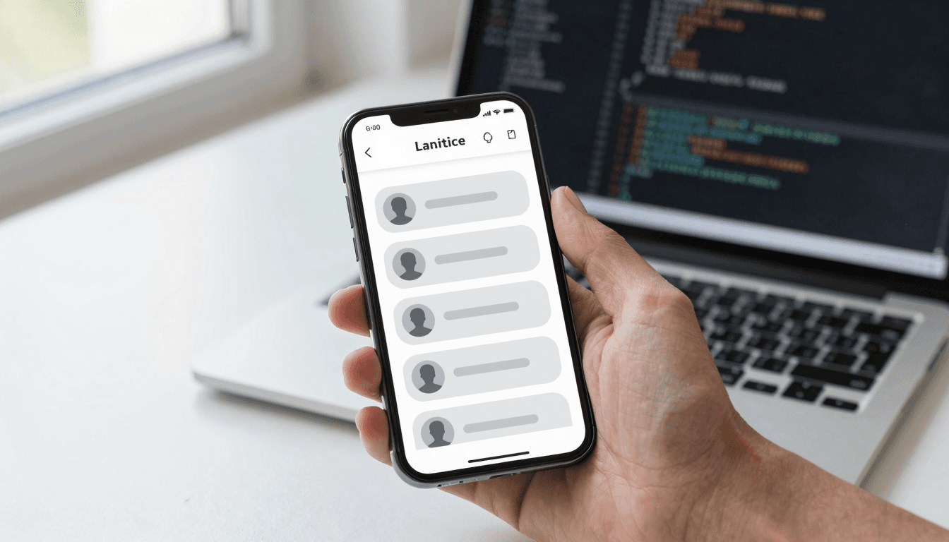
You tap into a social app, and for 400 milliseconds the screen goes blank except for a spinning circle. It's not long. It's barely longer than a blink. But your brain, starved of any visual anchor, treats that blank moment as dead time — and dead time reads as slow. Now picture the same 400 milliseconds filled with soft gray rectangles shaped like the post cards, avatars, and headlines about to load. Same wait, same server, same network. Completely different feeling. That gap between actual load time and felt load time is the whole game, and it's one of the first things Dolfy.ai pushes founders to think about before a single screen gets built.
Dolfy is an AI-powered mobile app design platform built by AEGONTECH LLC that walks founders and developers through a 5-step Design OS: Product Definition, Data Model, Design Foundation, Screen Design, and Export. The reason loading states show up early in that process — inside Data Model and Design Foundation, not bolted on at the end — is that a loading state is really a data-fetching problem wearing a UI costume. If you don't know what shape your data takes before it arrives, you can't design a convincing placeholder for it.
Key Takeaways
- Skeleton screens (gray placeholder shapes matching your real content's layout) consistently test as faster-feeling than spinners, even at identical load times, because they give the brain a visual anchor instead of an abstract wait.
- Perceived performance is a design problem, not just an engineering one — a 2-second load with a well-designed skeleton screen can feel shorter than a 1-second load with a bare spinner.
- Your loading state should mirror your real layout's structure (card shapes, avatar circles, text-line widths), not just show generic gray boxes — mismatched skeletons cause a jarring "pop" when real content swaps in.
- Skip the skeleton entirely for anything under roughly 300 milliseconds; a flash of gray shapes that vanish almost instantly reads as more glitchy than a plain instant render.
- Dolfy's Design Foundation and Data Model steps generate the token system and component structure that make skeleton states nearly free to build, because the placeholder shapes come straight from the same layout data as the real content.
Why do spinners make apps feel slower than they actually are?
Spinners make apps feel slower because they give users nothing to predict from — just motion with no relationship to what's coming. Human perception of time is elastic: unfilled intervals (a blank wait) consistently get remembered as longer than filled intervals (a wait with something happening), a finding UX researchers have leaned on since long before mobile apps existed. A spinner technically "fills" the wait with animation, but the animation carries zero information about the content underneath it, so your brain still logs it as empty time.
Skeleton screens flip this. When a placeholder rectangle is already shaped like a profile photo, a headline, and two lines of body text, your brain starts previewing the content before it exists. You're not staring at abstract motion — you're watching a page assemble itself. That's a subtly different cognitive experience, and it's why teams at companies like Facebook and LinkedIn moved away from spinners for feed-based content years ago. Dolfy's Screen Design step treats this as a first-class layout concern rather than an afterthought engineers patch in during a sprint.
What actually goes into a good skeleton screen?
A good skeleton screen mirrors the exact structure of the content it's standing in for — same card sizes, same avatar shapes, same number of text lines, same spacing. If your real feed card has a circular avatar, a bold headline, and two lines of gray body text, your skeleton card needs a circle, one thick bar, and two thin bars in the same positions. Anything looser than that creates a visual "jump" the moment real content loads in, which undoes most of the perceived-speed benefit you were going for.
This is where a design-token system earns its keep. Design tokens are the named, reusable values behind your interface — a spacing unit, a corner radius, a shade of gray — stored once and referenced everywhere instead of hardcoded into every screen. Dolfy generates this token system automatically as part of Design Foundation, which means the same radius and spacing values driving your real card automatically drive its skeleton twin. You're not maintaining two parallel design decisions; you're maintaining one, applied twice. Teams building by hand in Figma often skip this step because building a matching skeleton component manually takes real time — usually 2-3 extra hours per screen when done properly, which is exactly the kind of tax that gets cut under deadline pressure.
When should you skip the skeleton screen entirely?
Skip the skeleton screen when the expected wait is under roughly 300 milliseconds — at that speed, rendering any loading state at all just adds a visual flicker with no benefit. Research on perceived latency generally puts the "instant" threshold around 100 milliseconds and the "still feels responsive" threshold around 1 second; below the first number, users don't register a delay at all, so throwing a skeleton screen onto a near-instant fetch just adds noise. The pattern only pays off in that middle zone — roughly 300 milliseconds to 3 seconds — where a wait is long enough to notice but short enough that a good placeholder can mask most of the discomfort.
Beyond about 3 seconds, skeleton screens alone stop being enough, and you need a progress indicator or explicit messaging ("Fetching your data...") so users don't wonder if the app has frozen. This is a case where knowing your actual data model matters: an API call to a lightweight endpoint and a call that joins five database tables behave very differently, and your loading state design should match the real-world latency, not an assumption about it.
How does this connect to prototyping and handoff, not just visual polish?
Loading states connect directly to prototyping because a prototype that skips them tests the wrong thing — a click-through demo with instant screen transitions trains stakeholders to expect a snappier app than engineering can actually ship. A wireframe (a low-fidelity sketch of a screen's layout, before visual styling is applied) that never shows a loading moment lets a founder walk into a pitch meeting having never seen how the app behaves on a slow connection, which is exactly when first impressions get made.
On the handoff side, this is where component export earns its value. Component export means turning a finished design into working code — in Dolfy's case, production-ready React Native and Tailwind CSS components with TypeScript types attached, so a developer isn't manually rebuilding what a designer already specified. When skeleton states are designed alongside real content states from the start, the exported component ships with both variants wired up, instead of a developer improvising a loading state weeks later because nobody thought to design one. Whether your stack is React Native, Flutter, or SwiftUI, the underlying principle — design the wait, don't just design the destination — holds regardless of framework.
Frequently Asked Questions
Do skeleton screens work for every type of content, or just feeds?
They work best for structured, repeating content like feeds, lists, and card grids, where the shape of incoming data is predictable. For highly variable content — a search results page where result types differ wildly — a simpler progress indicator or partial-content reveal often communicates more honestly than a generic skeleton shape.
Can I test if a skeleton screen is actually helping, or is it just theory?
Yes — the most direct signal is bounce rate or abandonment during load, tracked before and after adding skeleton states on the same screen. If you don't have analytics infrastructure yet, even informal user testing (watching 5-6 people load the screen and asking how long the wait felt) tends to surface a clear preference fast.
Does adding skeleton screens slow down my actual development timeline?
Building the first one takes longer — often a half-day for the first screen while you establish the pattern — but every subsequent skeleton reuses the same token-driven shapes, so the marginal cost drops fast. Prototyping the pattern in a tool that already generates your component structure and tokens, rather than hand-coding it per screen, is what keeps that cost from compounding.
Should the skeleton animate, or just sit static?
A subtle shimmer or pulse (a slow opacity fade, not a spinning motion) generally outperforms a fully static gray shape, because it signals "actively loading" rather than "broken." Keep the animation slow and low-contrast — anything fast or high-contrast reads as an error state instead of a loading one.
Designing the Wait, Not Just the Destination
Every screen in your app has two states nobody puts on the pitch deck: the moment before the data arrives, and the moment it doesn't arrive at all. Most teams design the happy path first and treat everything else as cleanup work, which is exactly backwards — the loading state is often the very first thing a new user sees. Getting it right doesn't require a bigger engineering budget; it requires designing the placeholder and the real content from the same underlying data model and token system, so the two never drift apart. That's the structural bet Dolfy makes by putting Data Model and Design Foundation before Screen Design in its workflow — by the time you're placing a skeleton card on a canvas, the spacing, radius, and layout values already exist and just need to be reused. If you're building a founder-first app or a solo developer project and want the loading moment to feel as considered as the destination screen, Dolfy is built to make that the default, not the extra step you run out of time for.