The Swipe Action Problem: Why Your App's Swipe-to-Delete Gesture Deletes the Wrong Thing
You built a delete button that works fine in testing. Then a real user swipes left on their grocery list to archive last week's items, misjudges the swipe distance by a few pixels, and permanently deletes the one list they actually needed for tonight's dinner party. They don't file a bug report. They just leave a one-star review that says "ate my data" and quietly uninstalls. If you're building a mobile app and haven't specifically designed your swipe-to-delete gesture — not just wired it up, designed it — you have this bug waiting in production right now. This is exactly the kind of interaction-level problem Dolfy.ai exists to catch before a single line of code gets written, because a platform that only checks whether a button fires an event will never catch a gesture that fires the wrong intent.
Key Takeaways
- Swipe actions have zero visual affordance by default — nothing on screen tells a first-time user the gesture exists, so they discover it by accident, often at the worst moment.
- Destructive swipe actions (delete, archive, remove) need a different confirmation pattern than tap-triggered destructive actions, because adding a modal dialog defeats the entire point of a fast gesture.
- Undo, not confirmation, is usually the right safety net for swipe actions — it preserves speed for the 95%+ of swipes that are intentional while still protecting the rare mis-swipe.
- Swipe direction and action mapping (left-to-delete vs. right-to-archive) must be consistent across every list in your app, or users build the wrong muscle memory in one screen and use it destructively in another.
- This is a data-model and design-token decision as much as a visual one — the same underlying list-item component and its "destructive" vs. "safe" action tokens should be reused everywhere lists appear.
Why Do Swipe Actions Feel Invisible Until Someone Deletes the Wrong Thing?
They feel invisible because, unlike a button, a swipe gesture has no static visual representation — there's nothing sitting on the screen when the list first renders that says "this row responds to a horizontal drag." A button is a wireframe element you can literally draw: a rectangle with a label. A swipe action only exists in motion, which means roughly a third of first-time users in usability sessions never discover it without an in-app hint, and the ones who do discover it usually do so by accident, mid-task, with no idea how far they need to drag before the action commits.
That "how far" question matters more than most teams budget for. Most native list components ship with two swipe thresholds: a reveal threshold (drag far enough and an action button appears) and a commit threshold (drag past a second point and the action fires without requiring a tap on that button). If those two thresholds sit close together — a common default — a slightly overzealous swipe intended only to peek at the options triggers the destructive action directly. That's the exact failure mode in the grocery-list example above, and it's a tuning problem, not a code problem, which is why it rarely shows up in a functional QA pass.
What Makes a Destructive Swipe Discoverable Without Cluttering the List?
The fix isn't a permanent visible icon-array (that just recreates the clutter swipe actions were meant to avoid) — it's a one-time, low-friction hint. A subtle "peek" animation the first time a list of this type renders (the row nudges 8-12 pixels to reveal the edge of an action button, then settles back) teaches the gesture exists without a tutorial screen or coach mark the user has to dismiss. Pair that with a persistent but minimal affordance: a slightly rounded row edge or a faint background color shift on the trailing side of the row, so an attentive user has a visual clue even without the animated hint.
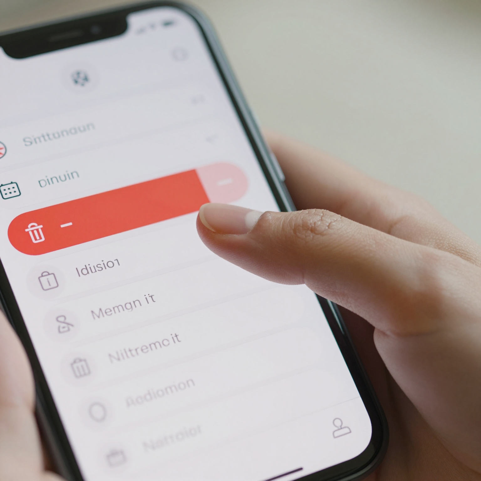
The other lever is color and icon convention, borrowed from years of Sketch and Figma component libraries: red backgrounds and a trash icon read as "delete" almost universally across iOS and Android users at this point, while a neutral gray or blue with an archive-box icon reads as "safe, reversible." If your swipe action's background color doesn't match the severity of what it does, users misjudge the risk of the gesture entirely — which is its own way of deleting the wrong thing.
How Do You Confirm a Delete Without Killing the Speed That Makes Swiping Useful?
A confirmation modal ("Are you sure you want to delete this?") technically prevents the accidental delete, but it also adds a tap-and-wait step to every single delete, intentional or not — which defeats the reason someone chose a swipe gesture over a menu item in the first place. The better pattern, used by most mature email and task-management apps, is to let the swipe commit immediately but surface a toast-style undo bar for four to six seconds afterward: "Item deleted. Undo." This keeps the fast path fast for the vast majority of correct swipes while giving the rare mis-swipe a low-cost recovery window that doesn't require a support ticket or a database restore.
If the action is catastrophic and irreversible at the data layer — deleting an account, not archiving a to-do item — that's the one case where a swipe should require a secondary tap-to-confirm step on the revealed button rather than committing on drag alone. The rule of thumb: reversible actions get speed and undo; irreversible actions get one extra deliberate tap.
Should Every List in Your App Use the Same Swipe Direction and Meaning?
Yes, and this is where a lot of otherwise well-designed apps quietly break their own users' trust. If your messages list uses left-swipe for delete and right-swipe for archive, but your notifications list flips that mapping because a different contractor or a later sprint built it, users who've built muscle memory on one screen will swipe destructively on the other without looking. This isn't a hypothetical edge case — it's one of the most common consistency failures found in mobile UX audits, precisely because each list usually gets built and shipped independently, on its own timeline, by whoever owned that feature that quarter.

How Does a Design System Keep Swipe Actions Consistent as an App Grows?
This is fundamentally a design system problem, not a per-screen decision. A design system is the shared library of components, colors, spacing rules, and interaction patterns that every screen in an app draws from, so that a button, a list row, or a swipe action behaves and looks the same everywhere it appears, regardless of which developer or designer built that particular screen. Inside a design system, the swipe-to-delete behavior should live as a documented component — with its own design tokens (the reusable named values like color.destructive.background or motion.swipe.threshold that keep colors, spacing, and animation timing consistent instead of hardcoded per screen) — rather than being reinvented by each engineer who happens to build a new list.
This is precisely the gap Dolfy.ai's Design OS methodology is built to close for indie hackers and small teams who don't have a dedicated design system owner. Dolfy walks a founder through five stages — Product Definition, Data Model, Design Foundation, Screen Design, and Export — and the Design Foundation stage is exactly where interaction patterns like swipe actions, their color tokens, and their motion timing get defined once, before any individual screen is designed. Because Dolfy's Data Model stage already understands which entities in your app are user-generated content versus system records, it can flag which list items are safe to make swipe-deletable with undo and which need a harder confirmation step, before you've built a single screen.
When you reach the Export stage, Dolfy generates production-ready React Native components with Tailwind CSS styling and full TypeScript types, so the swipe-action component — thresholds, colors, and undo behavior included — comes out consistent across every list in the app, not re-implemented by hand five separate times. You can preview the exported screens instantly in Expo Go or the Web Preview, dragging on an actual device to confirm the swipe thresholds feel right, rather than guessing from a static prototype (a prototype being a clickable, non-production mockup used to test flows before real code is written).
Frequently Asked Questions
Should swipe-to-delete be the only way to remove an item, or do I need a backup?
Always provide a backup path — a long-press menu, an edit-mode with checkboxes, or a three-dot overflow menu — for accessibility and for users who genuinely cannot perform a precise horizontal swipe, including many users relying on assistive touch or motor-impairment accommodations on iOS and Android.
Does this apply to Flutter and SwiftUI apps too, or is it a React Native-specific issue?
It applies everywhere. Swipe-to-delete is a platform-level interaction pattern, not a framework-specific one — Flutter's Dismissible widget and SwiftUI's .swipeActions modifier have the exact same discoverability and threshold-tuning problems described here, so the same undo-over-confirmation and consistent-token approach applies regardless of which framework renders the final component.
How long should the undo window stay open after a swipe delete?
Four to six seconds is the common range in production apps — long enough for a user to notice and react, short enough that the row doesn't feel like it's stuck in limbo. Some apps extend this if the deleted item is large (a whole project vs. a single task), which is worth defining per entity type in your data model rather than using one blanket timer everywhere.
Can I test swipe gesture thresholds before writing any code?
Yes — this is exactly what a clickable prototype and a live device preview are for. Testing swipe thresholds on an actual phone screen, not a mouse-based desktop mockup, is critical because touch precision differs meaningfully from cursor precision, which is why Dolfy's Expo Go preview step exists between the Design Foundation and Export stages.
Getting Swipe Actions Right Before They Cost You a User
Swipe-to-delete is a genuinely good pattern — fast, low-friction, and familiar to almost every smartphone user — but only when the threshold tuning, color language, and undo safety net are designed deliberately rather than left to a framework's default settings. The cost of getting it wrong isn't a crash report; it's a quiet uninstall from a user who now associates your app with losing their data. If you're mapping out how list interactions, destructive actions, and their underlying data model should behave before your team writes a single React Native component, that's exactly the kind of decision Dolfy is designed to walk you through — turning a gesture that's easy to get wrong into a documented, reusable part of your design system from day one.