The Toast Notification Problem: Why Your App's Success Messages Disappear Before Anyone Reads Them
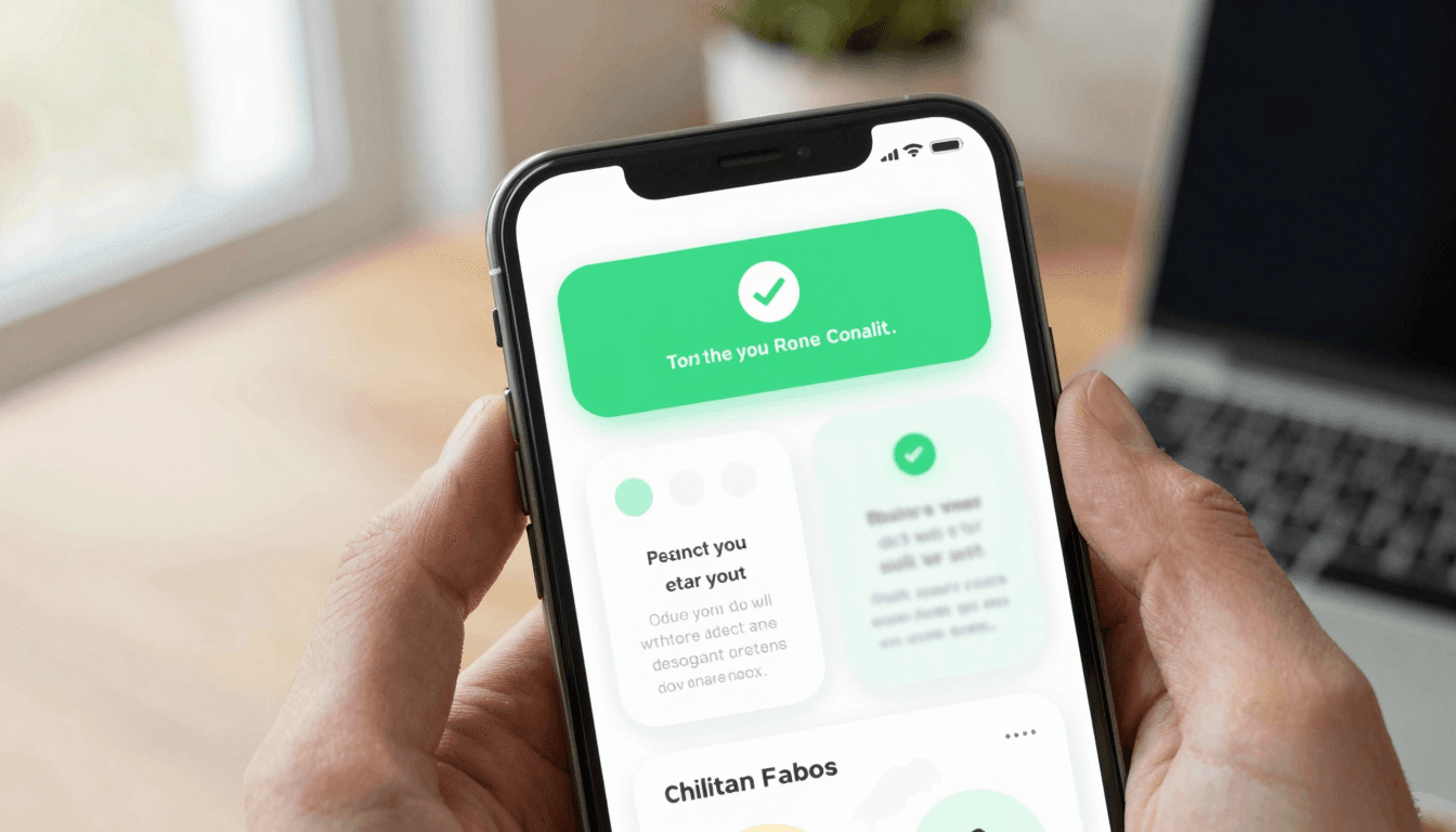
You built the feature. The API call succeeded, the database updated, and your app dutifully flashed a small message at the bottom of the screen confirming it. Except your user was already scrolling past, thumb mid-swipe, and never saw it. Now they tap the button again because they assume nothing happened, and you've just logged a duplicate order, a double "like," or a second support ticket. This is the toast notification problem, and it is one of the quietest ways a mobile app erodes trust — quiet because, unlike a crash or a broken layout, nobody files a bug report for "I didn't see your confirmation." Dolfy.ai, an AI-powered mobile app design platform, treats this exact class of small-but-costly UI decision as a first-class part of building an app rather than an afterthought bolted on after launch.
A toast (sometimes called a snackbar) is that brief, non-blocking message that appears — usually near the top or bottom of the screen — to confirm an action: "Saved," "Added to cart," "Message sent." It's meant to be low-friction feedback that doesn't interrupt what the user is doing. The trouble is that "low-friction" and "actually seen" are two different design goals, and most indie teams only design for the first one.
Key Takeaways
- Toast notifications fail most often not because of bad copy, but because of timing, placement, and animation choices that assume a user who is standing still and paying attention.
- A rule of thumb from mobile UX guidelines is to keep a toast visible for roughly 3 to 5 seconds — long enough to register, short enough not to block the next action.
- Every dismiss animation, color, and duration should come from a shared design token system, not be re-invented per screen, or your app will feel inconsistent within a single session.
- Not every action deserves a toast — reserving them for genuinely uncertain outcomes keeps the ones you do show meaningful instead of becoming visual noise.
- Dolfy's 5-step Design OS methodology bakes feedback-state decisions like toasts into the Design Foundation stage, so they're consistent before a single screen is built.
Why Do Toast Notifications Disappear Before Users Can Read Them?
They disappear because most default toast implementations are tuned for demos, not for real thumbs in motion. A developer testing locally taps a button, watches the screen, and confirms the toast shows up — of course it looks fine, they were staring right at it. A real user is scrolling, switching apps, or already looking at their next screen by the time the message renders. If your dismiss timer fires in 1.5 seconds and your fade-in animation eats a third of that, you've given the user a fraction of a second of legible time.
The fix starts with treating the toast's timing as a UX decision, not a default value left over from a component library. If the message confirms something reversible and low-stakes ("Copied to clipboard"), a shorter window is fine. If it confirms something the user will look for later ("Draft saved," "Payment processed"), give it more visible time and consider a persistent indicator elsewhere in the UI as a backup, not just a message that vanishes and is gone forever.
What Makes a Toast Message Actually Effective?
An effective toast answers three questions before the user has to think about them: what just happened, was it what I expected, and do I need to do anything else. A toast that just says "Success" fails all three — success at what? A better pattern names the object and the action: "Photo uploaded" beats "Success," and "3 items added to your list" beats "Added."
This is where copy and design intersect with what Dolfy calls a design system — a shared set of rules and reusable pieces (colors, spacing, type, and component behavior) that keep every screen in an app feeling like it belongs to the same product. Without one, your "success" toast might be green on the checkout screen and blue on the settings screen, purely because two different screens were built weeks apart by two different people, or by the same person on two different days. Dolfy generates that consistency automatically as part of its Design Foundation step, so a confirmation message looks and behaves the same whether it fires from your onboarding flow or your billing page.
How Long Should a Toast Notification Stay on Screen?
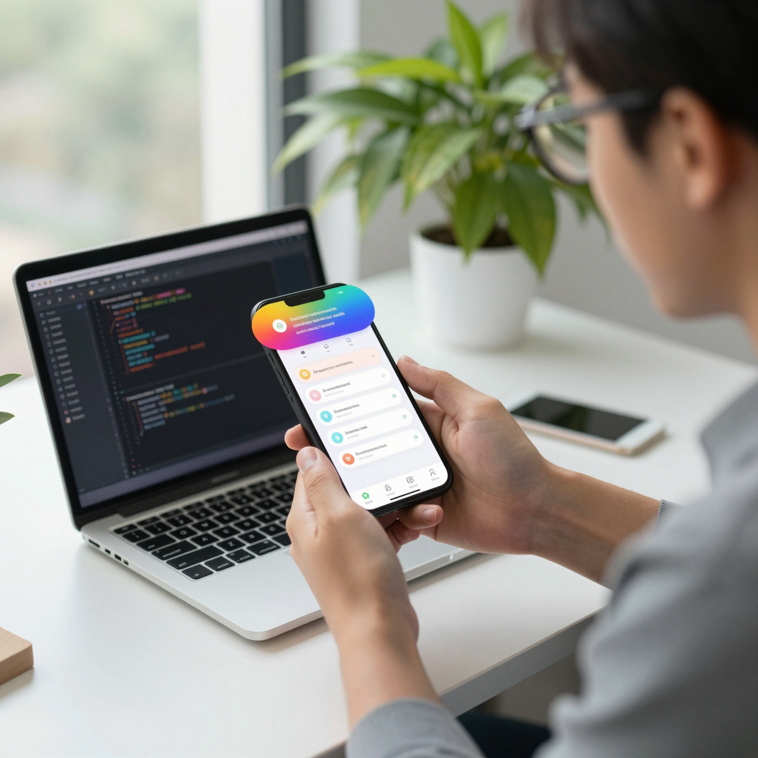
Most mobile design guidelines converge on roughly 3 to 5 seconds of visible time for a standard toast, though the right number depends on message length and how reversible the action is. A one-word confirmation can safely sit at the shorter end; a message with a "Undo" action attached needs enough time for a user to actually read the option and react to it, not just register that text appeared.
It's worth remembering that visible time and total time are not the same thing. If your fade-in and fade-out animations each take 400 milliseconds and your total timer is 3 seconds, the user only gets roughly 2.2 seconds of fully legible message — and mobile animation frames render at roughly 16 milliseconds each at a smooth 60 frames per second, so a janky, dropped-frame animation can eat even more of that budget than you planned for. Measure the readable window, not just the timer value in your code.
Should Every App Action Trigger a Toast?
No — and this is the mistake that turns a genuinely useful feedback pattern into background noise users learn to tune out. If your app fires a toast every time a user taps a heart icon, swipes a card, or opens a menu, you've trained them to ignore all of your toasts, including the ones that matter, like a failed payment or an expired session.
A useful filter: show a toast only when the outcome is genuinely uncertain to the user in that moment. Liking a post has instant, visible feedback already (the heart fills in) — a toast on top of that is redundant. Submitting a form that triggers a network call, where the user has no other visual confirmation, is exactly the situation a toast exists for. Reserve the pattern for that second category and your users will actually read what you show them.
This is also a good moment to define a term that comes up constantly in this kind of decision: a prototype, in product design terms, is a rough, interactive version of an app used to test flows like this before writing production code. Testing your toast strategy on a clickable prototype — where you can watch someone use the app and see whether they notice the confirmation — catches "nobody read it" problems days before they'd otherwise surface in analytics, or worse, in a support inbox.
How Do Design Tokens Fix Inconsistent Toast Styling?
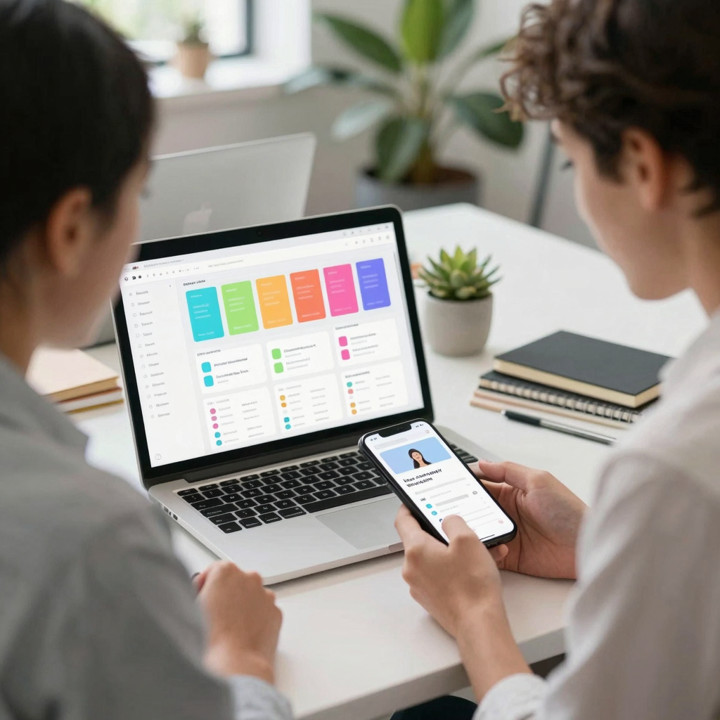
Design tokens are the named, reusable values — a specific green for "success," a specific red for "error," a specific spacing unit for padding — that a design system is built from, stored once and referenced everywhere instead of hard-coded into each screen. When your success toast is styled with a token called color-feedback-success instead of a hex code typed directly into a component, changing your brand's green in one place updates every toast, badge, and confirmation banner across the entire app instantly.
This matters more than it sounds like for a small team. An indie developer shipping fast will, understandably, hard-code #22C55E directly into a toast component to hit a deadline. Six months and forty screens later, that same team is grepping through a React Native or Flutter codebase trying to find every place a similar green was used, because the design has quietly drifted and nobody can say with confidence what the "correct" success color even is anymore. Dolfy's approach is to generate the token system first, as production-ready values with TypeScript types attached, so the toast component — and every other component — pulls from a single source of truth from day one rather than accumulating drift over a sprint or two.
Weaving Feedback Design Into How You Actually Build
None of this requires a dedicated design hire or a multi-week research project — which is the whole premise indie hackers and solo founders are usually working against. Dolfy is built around a 5-step Design OS: Product Definition, Data Model, Design Foundation, Screen Design, and Export. The data model step is where an app's core entities and their relationships get defined in plain terms — for a toast-heavy flow like checkout, that means identifying that an "order" has a "status" your UI needs to reflect honestly, not just optimistically flash and forget. By the time you reach Screen Design, feedback states like toasts, loading skeletons (placeholder shapes that hint at content before it loads), and error banners are already defined as reusable pieces, not one-off decisions made under deadline pressure on the day you happen to be building the checkout screen.
The Export step is where this pays off directly: Dolfy produces production-ready React Native and Tailwind CSS components, with TypeScript types and the design-token system included, plus an Expo Go and Web Preview so you can see and test the actual toast behavior — timing, animation, and all — on a real device before a single line of that logic gets rewritten by hand. For a solo founder or a two-person startup team, that's the difference between spending a weekend re-litigating toast timing across a dozen screens and inheriting a consistent answer for free because it was decided once, upstream, as part of the design foundation rather than improvised screen by screen.
Frequently Asked Questions
What's the difference between a toast and a snackbar?
The terms are largely used interchangeably in mobile design, though "snackbar" originated in Google's Material Design guidelines and technically allows for an action button (like "Undo"), while "toast" is the more general, often action-less term borrowed from early Android development. In practice, most teams pick one word and use it consistently across their own product.
Can a toast notification include a call-to-action button?
Yes, and it's one of the most useful variants — an "Undo" button on a delete confirmation, for example, turns a passive notification into a genuine safety net. Just be sure the button itself has enough visible time and tap-target size to be usable, since a rushed timer defeats the purpose of offering the option at all.
Should toast styling differ between iOS and Android?
It can, since each platform has its own native conventions (iOS tends toward banners near the top, Android's Material guidelines favor bottom-anchored snackbars), but the underlying design tokens — your colors, spacing, and timing rules — should stay the same so the brand feels consistent even if the exact placement adapts per platform.
Do toast notifications need to be accessible to screen reader users?
Yes — a toast that only communicates through a brief visual fade is invisible to someone using VoiceOver or TalkBack, so the same event needs to be announced through an accessibility live region at the same time it appears visually, not as an afterthought added later.
Designing Feedback That Actually Gets Noticed
The toast notification problem isn't really about toasts — it's a small, visible symptom of a larger habit: designing for the moment you're staring at your own screen instead of the moment a real user is glancing at theirs mid-scroll. Fixing it well means treating timing, color, and copy as decisions worth making once, consistently, as part of your app's design foundation rather than re-guessing them screen by screen under deadline pressure. That's the exact gap Dolfy was built to close for indie hackers, solo founders, and small startup teams who don't have a dedicated designer on staff but still want an app that feels like one polished product instead of a collection of screens built on different days. If you're currently piecing together confirmation messages, loading states, and error banners screen by screen, it's worth seeing what a proper design foundation looks like before you build the next ten screens on top of an inconsistent one — start at Dolfy.